
Whistles Turns 50 by Making Its Customers Part of the Brand
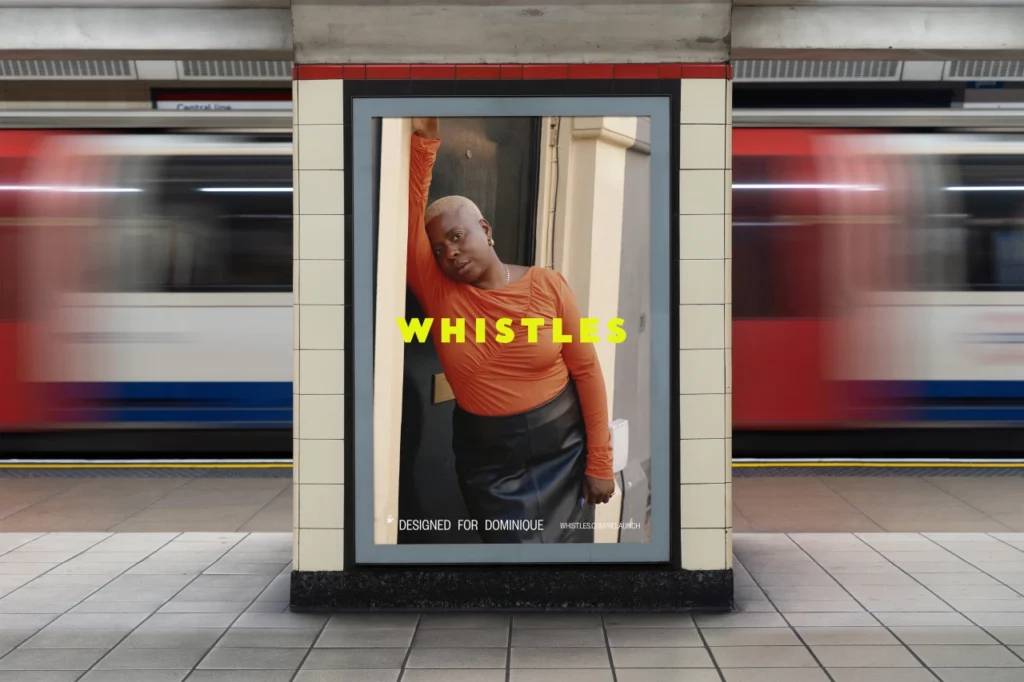
For a 50th birthday, Whistles could have opened its archive and replayed old campaigns. Instead, the British fashion brand started with a much simpler question: who should represent it now?
The answer came from the street. Working with London creative agency Weirdo, Whistles put up cryptic posters around the city asking for open-minded women. The posters did not lead with the brand name. More than 2,000 people responded, and 50 women aged 19 to 72 were eventually chosen for the anniversary project.
The casting call became part of the design
This was not only a search for faces. The casting process itself became the first public part of Whistles’ new identity. London streets, walls and transport spaces acted like an open front door to the campaign before the clothes appeared.
The 50 participants were photographed in a single day wearing the Autumn/Winter 2026 collection. Most had little or no modelling experience. Six women lead the launch campaign, while the wider group appears across social, digital and in-store material. Fashion photographer Alice Neale made the hero portraits, and Archi Shah filmed the campaign.
That choice gives the work a different feel from a conventional anniversary shoot. The people are not presented as a polished historical timeline. They are used to show what the brand wants to look like now: broader in age, more personal and less dependent on the usual fashion-campaign distance between the viewer and the model.
A new identity without throwing everything away
The campaign sits inside a wider Whistles refresh called Designed for an Open Mind. Weirdo also helped develop the visual language, including a citrus-toned colour called Lemonade and a lighter, less formal approach to campaign production.
Brand refreshes often begin with a new logo or typeface and then explain the idea afterward. This one works in the opposite direction. The behaviour came first: open casting, customer participation and small collaborative projects. The graphic system then gives those actions a consistent frame.
That approach is not unique to fashion. ARCHCOD has also looked at how Big Cartel used a deliberately rough visual identity to communicate the culture of its makers rather than simply making the company look newer.
Why London matters here
The city is more than a background. Fly-posting made the first stage of the campaign part of everyday urban life. The finished work then moved into outdoor advertising, the Underground, shops and digital screens. In other words, the identity travels through the same spaces as the people it is trying to reach.
That movement between graphic design and physical space is worth noticing. A brand is not experienced only on a website. It is also encountered on a station wall, in a shop window, on a street or inside a room. ARCHCOD recently explored a more architectural version of that idea at the BIGX Super Sports Playground, where colour, graphics, lighting and circulation are used together to build a recognisable identity.
The real test comes after the anniversary
Using real customers is easy to describe as authentic, but that word can become another marketing label. The more interesting question is whether Whistles keeps working this way once the 50th-anniversary moment passes.
The brand says the campaign follows a year of smaller experiments, including collaborative shoots and customer-led projects. If that continues, the anniversary may matter less as a one-off advertisement and more as a change in how the company makes and presents its work.
For ordinary shoppers, the result is easy to read. Whistles is not asking people to admire 50 years of history from a distance. It is trying to make its current customers part of the picture.
Editorial review: ARCHCOD checked the campaign details against Whistles, Creative Boom and TheIndustry.fashion. Campaign creative by Whistles and Weirdo. Hero photography by Alice Neale; film by Archi Shah.