Stonia Ice Creamland // Mínimo Arquitetura e Design
Text description provided by the architects.
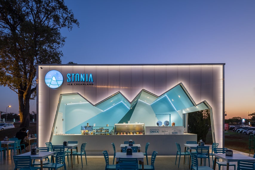
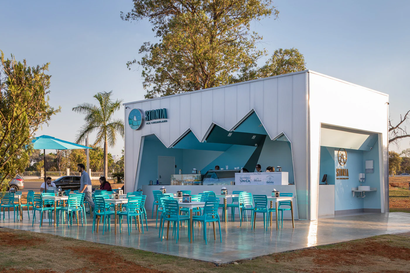
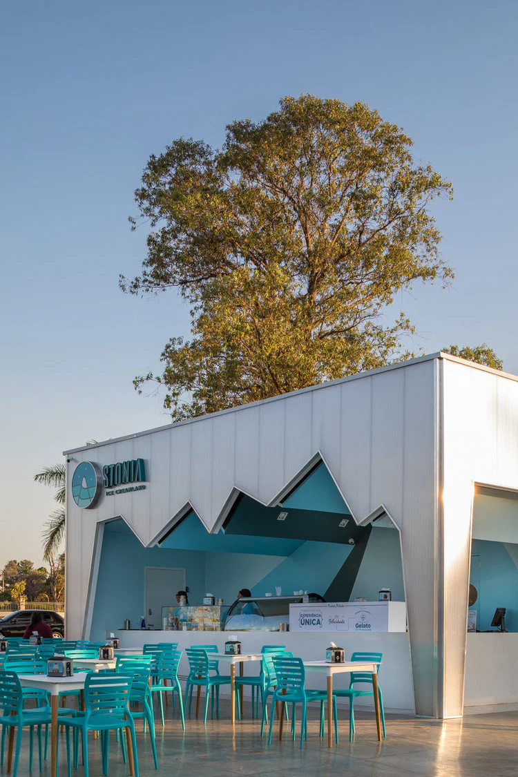
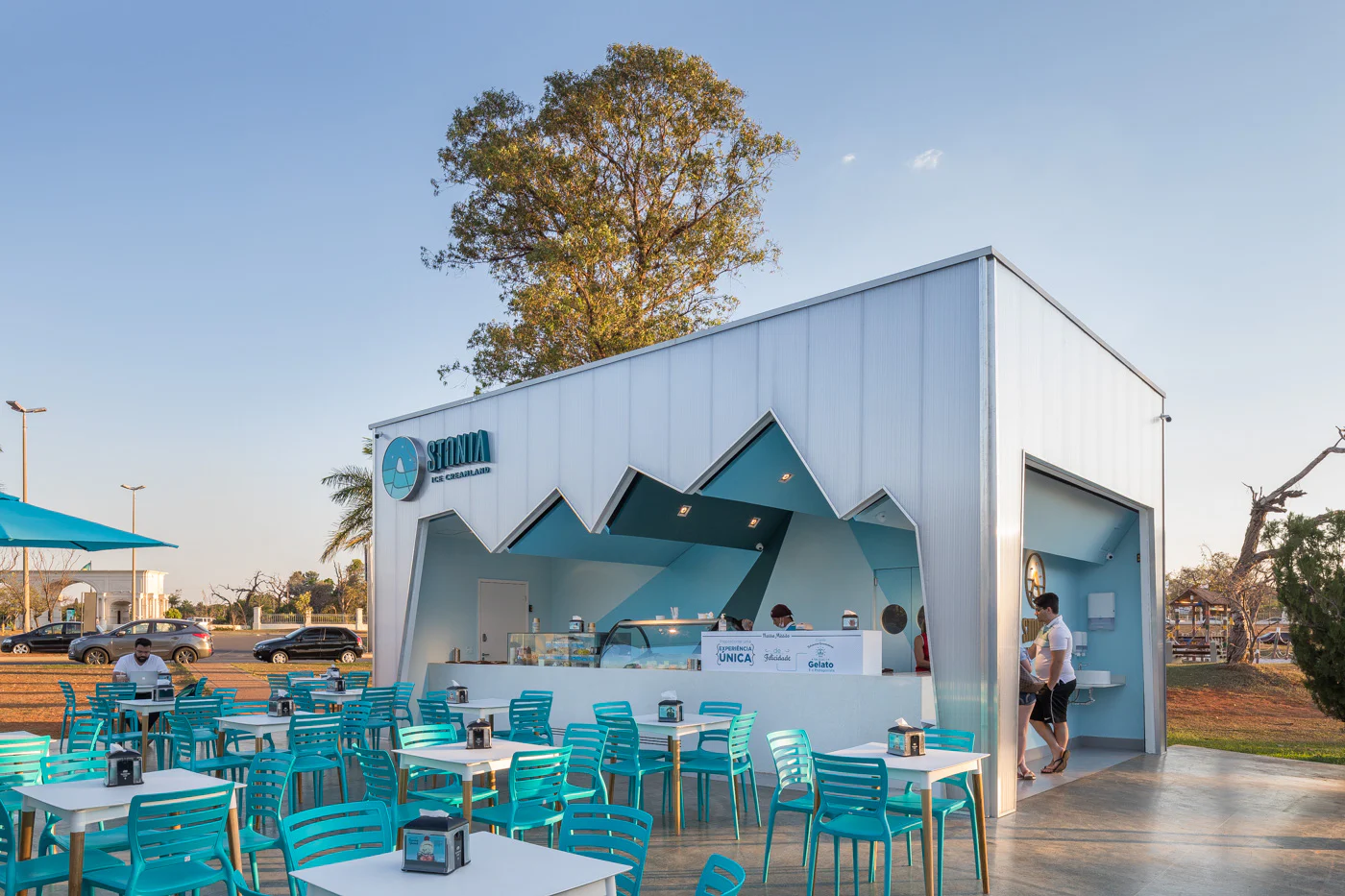
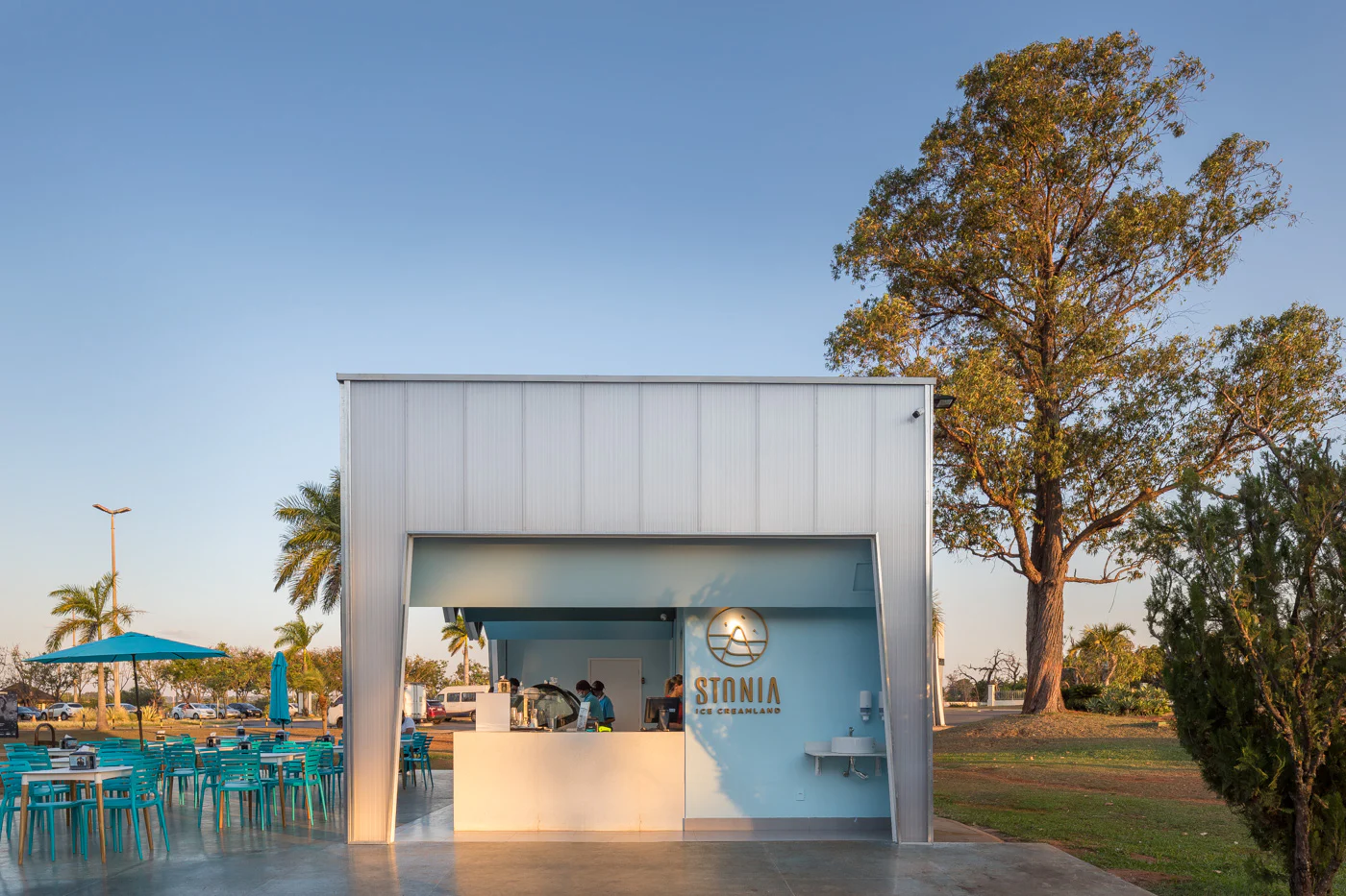
The great challenge of this project was to create an architecture that at the same time translated the brand experience, but also stood out for its shape. As an ice cream shop, the inspiration was the shape of an iceberg, however, we chose to design a cube and invert the vertices for the internal part of the building, as if this “iceberg” had been extracted to form the interior of the store.
© Mínimo Arquitetura e Design
© Mínimo Arquitetura e Design
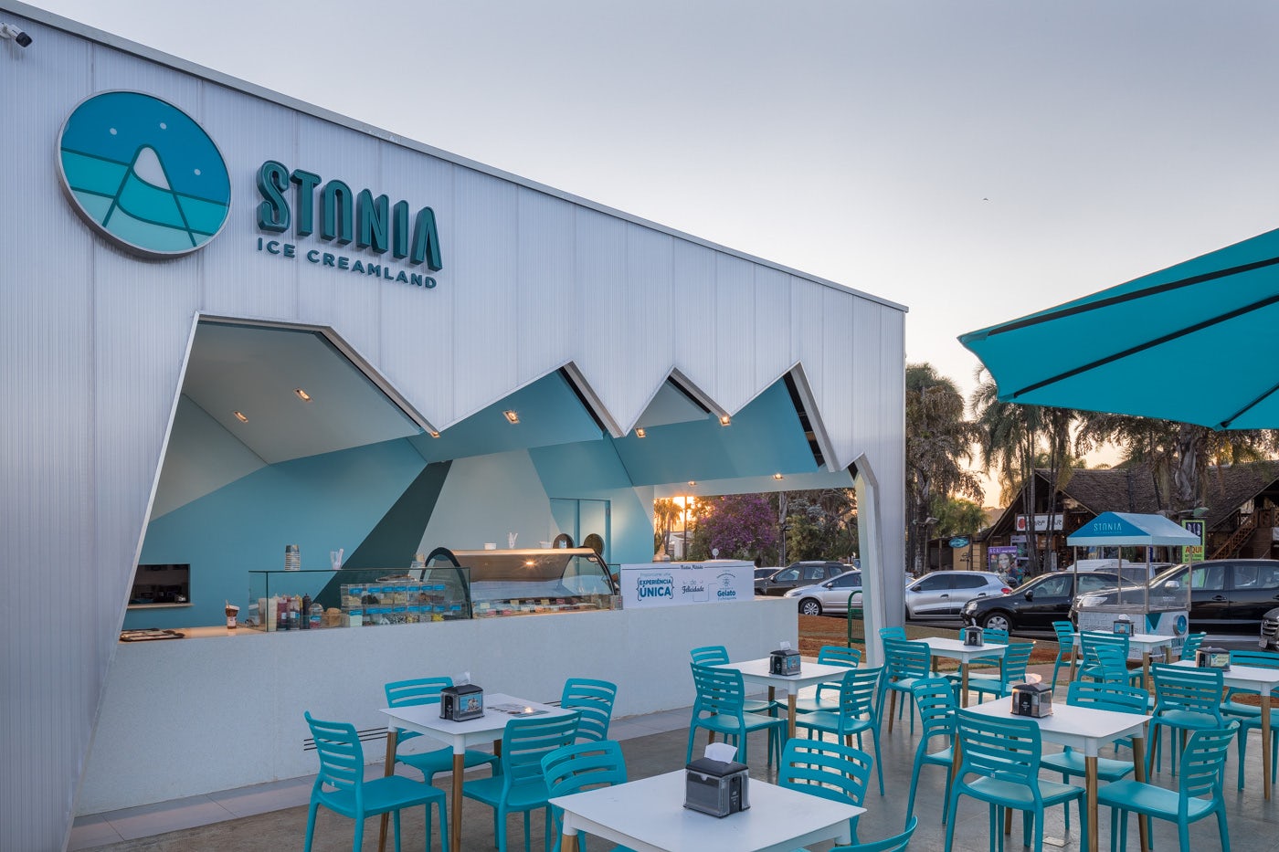
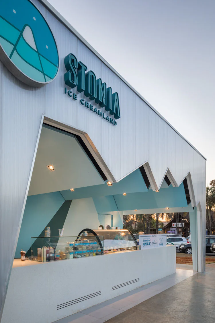
The facades, all covered in translucent polycarbonate, received LED lighting at all vertices, in order to enhance the shape of the building. Between the inner plaster lining and the outer polycarbonate sheet, there is a gap where the roller door hides. On the back wall, the geometric design follows the same alignment angle as the ceiling cutout, and the colors are the same used in the brand’s visual communication.
© Mínimo Arquitetura e Design
© Mínimo Arquitetura e Design
The white quartz counters do not overlap and help to highlight the shape of the building. Because of the translucent facade, the building undergoes a true metamorphosis between day and night, which is when the allusion of its shape to that of an “iceberg” can be better observed. Authors: Heloísa Moura, William Veras, Alessandra LeitePhotos: Haruo MikamiCollaborators: Mariana Oliveira, Constanza Manzochi, Henrique Lobo, Gustavo Johan, Giovanna Canellas.
© Mínimo Arquitetura e Design
© Mínimo Arquitetura e Design