The Sherwin-Williams 2024 Color of the Year Is Revealed—Here’s How Designers (and a Pastry Chef!) Plan to Use It
Kelly Finley, of Joy Street Design, believes the sense of gray lurking beneath Upward’s soft (but not baby-like) blue makes it fit for “a space where you don’t want to be oversaturated but still have an air of freshness, like a laundry room or bathroom.” Finley also feels it’d be “great on the ceiling to mimic the sky,” a notion that Margaret Cashman, of Cashman Interiors, suggests taking even further to create a true sense of immersion.
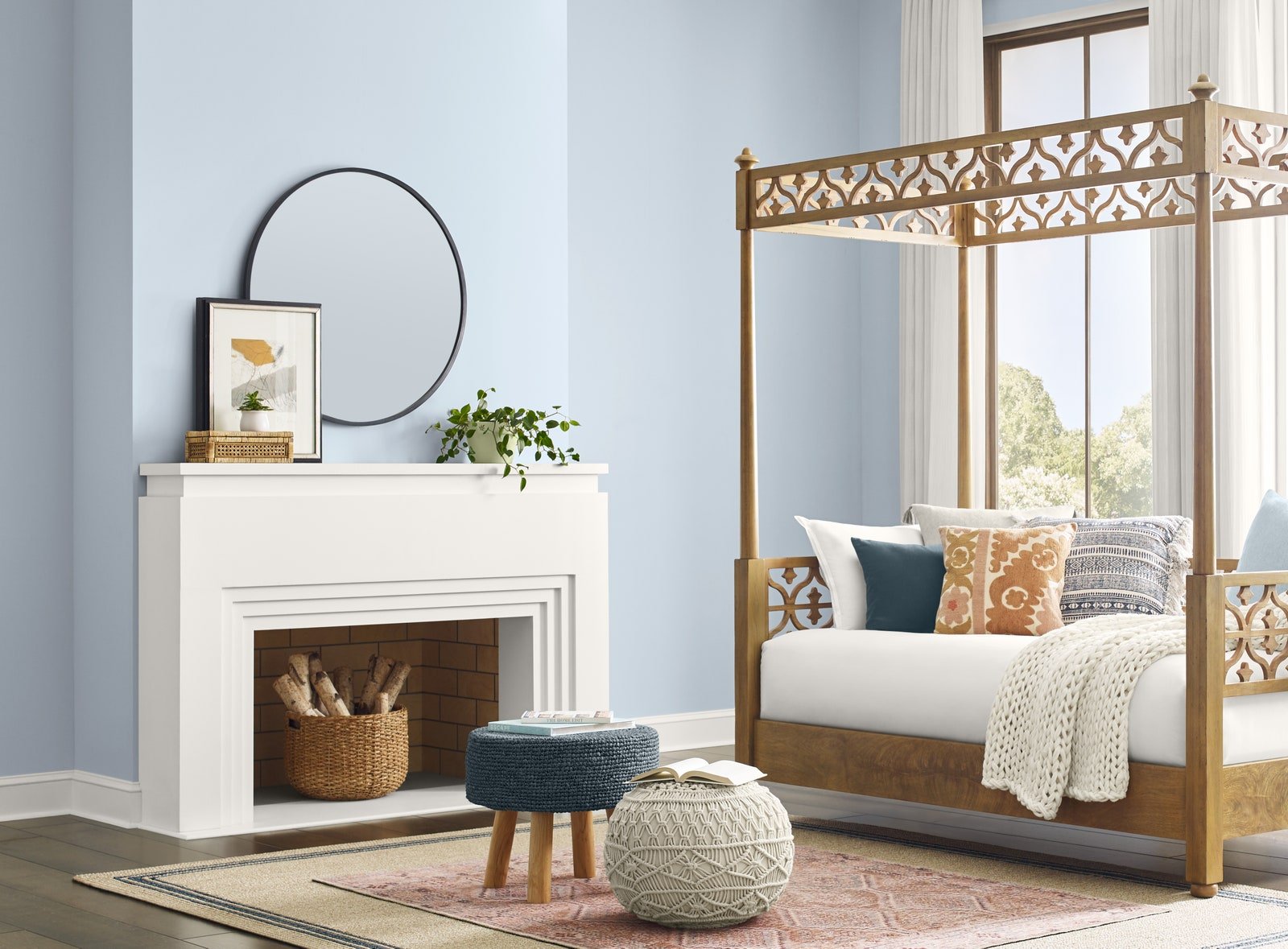
“For a more dramatic and enveloping feel, I would suggest Upward as the wall, trim, and ceiling color. The overall blue/gray feel would provide a deep sense of calm; “it would pair” beautifully with accent colors, like tone-on-tone navy or a yellow that can add a happy spark to a calm room,” Cashman tells AD PRO.
As a color that Cashman regards as “the perfect backdrop color for allowing color, art, and textures to stand out,” Upward can effortlessly slot into many disparate design visions. To conjure the coastal vibes that Wadden sees coming to the fore, one can consider pairing Upward with a white like Alabaster or Snowbound and light-to-mid-toned fumed woods.
For those in the mood for something that’s a little more contemporary than coastal, darker grays like Peppercorn or Iron Ore can create eye-catching moments of contrast, giving the color a particularly alluring architectural quality when paired with clean lines. In commercial spaces, Upward can tie together a positive postindustrial look when matched with elements like metallic windows or gray concrete floors. Regardless of where it’s used, however, Wadden suggests boucléd fabrics as a useful textural anchor.
If you don’t already have a sense of how Upward can slot into your own home, skip the color samples and order a Cronut from Dominique Ansel instead. In celebration of Upward’s natural qualities, the James Beard–winning pastry chef has introduced the first-ever vegan version of his croissant/doughnut hybrid, topped with a glaze color-matched to the 2024 Color of the Year thanks to an infusion of Butterfly Pea Flower Tea. A sweet finish, indeed.


