The Old Money Aesthetic: Can WASPy Interior Style Be Reclaimed by a New Generation?
The overall experience of the store, to Estelle, is warm and approachable. And the art is a far cry from the dusty framed portraits in the headmaster’s office: “We’re mixing in David Bowie posters with some beautiful classic artwork, and then some modern nudes and other great rock-and-roll photography in the mix to make it feel more contemporary and modern-day prep.” It’s a more eclectic, complex, and unexpected look than what one might assume the Tanners of the world would do with the space. “It just felt a little sexier, a little edgier, which is more inclusive. And that’s what people of color in culture tend to be,” she remarks. “It is more progressive, more bold and dynamic. And the fact that they tapped me, a woman of color, to reinterpret or to at least bring the J.Crew heritage up-to-date in the physical form of the shop, that says a lot too.”
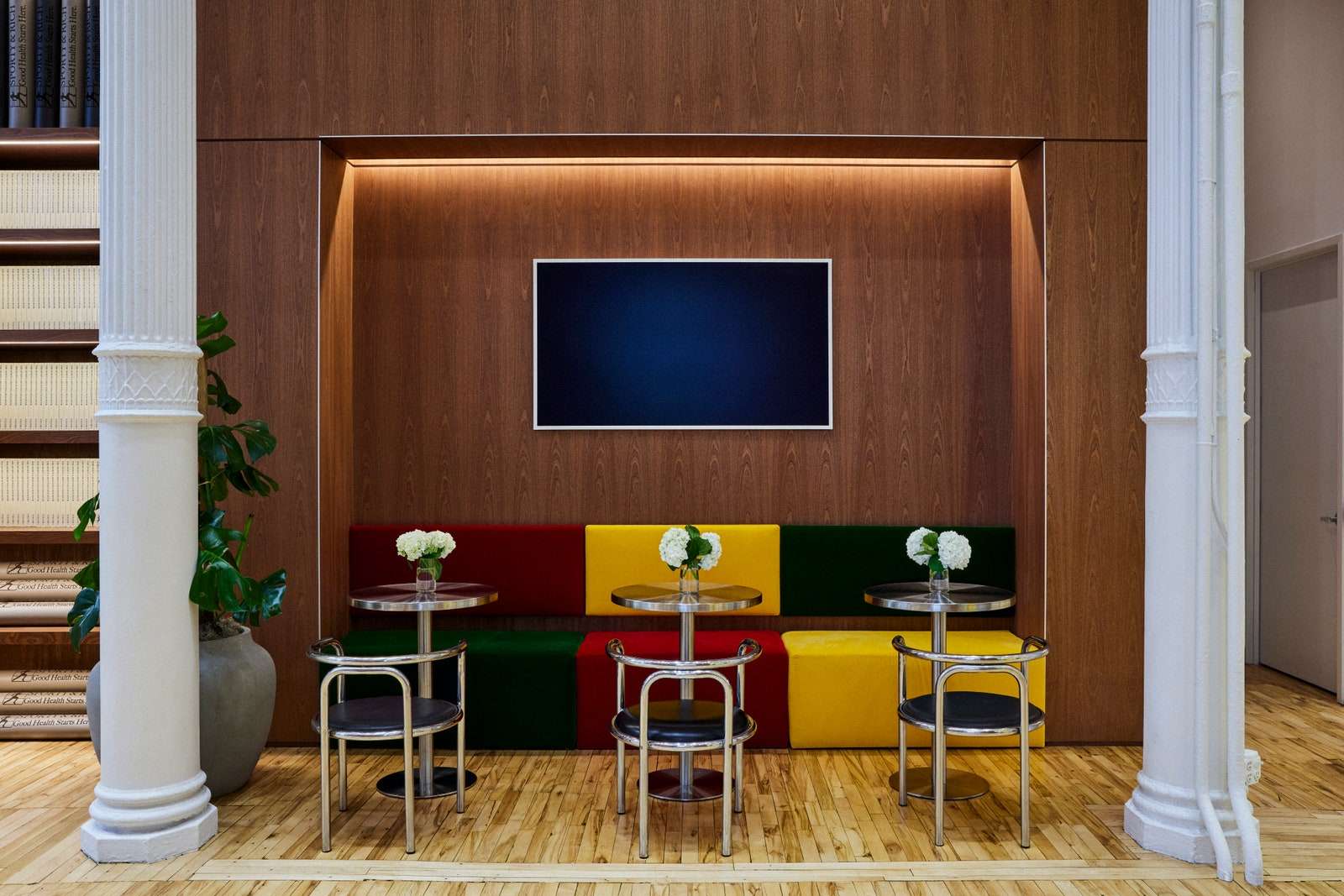
Perhaps the new prep is generally more tongue-in-cheek than previous iterations. Where the traditional prep is all about subtlety, fashion brands like Sporty & Rich are leaning all the way in. When founder Emily Oberg was conceptualizing the brand’s first-ever brick-and-mortar storefront in Soho, New York, the millennial wanted to curate an atmosphere that felt like old health clubs from the ’90s with a modern twist in the form of bright colors and stainless steel accents. Though she invokes the two major elements of classic prep right in the name of the label, the 30-year-old hopes to signal a departure from the white-bread associations with old money prep. “Obviously, old country clubs—even current ones, they’re very WASPy and old in the sense of the ideas and the mindset. But with our brand, I’m a woman of color, so I want it to be inclusive,” Emily says. “I don’t think you walk into the store and feel intimidated.”
What prep shares with a lot of the aesthetics that have struck gold on TikTok is its basis in nostalgia, though its timing does feel peculiar given its not-at-all-subtle exaltation of affluence during an era of a marked “Eat the Rich” sentiment. “It’s intriguing to see a trend based around the display of wealth peaking during a worldwide cost-of-living crisis,” Jen, the design lead from Magnet, observes. Many of the “-cores” that reach (micro) trend status via social media harken back to a certain time: the Y2K look that’s only recently begun to die down after several years of internet dominance. The trend is of course named after the time period of its relevance, and indie sleaze is quintessentially Obama-administration-era. But considering the time and sentiment that old money style is referencing evokes discomfort. Why do so many young people feel nostalgia for a look so inextricably linked to racism, sexism, and exclusion?
But despite its very fraught associations, prep is not truly a style that creatives of color need be tasked with reclaiming, given that generations have left their mark in the space, a legacy that continues today. To completely reject prep on the basis of the racism and classism of East Coast boarding schools and country clubs erases the people of color who have contributed to the style outside of those venues, and it also reinforces the protagonism of those who excluded them. Perhaps modern takes on the prep aesthetic, many of which are generated by BIPOC and other marginalized demographics, are forging something wholly new—an edgier, brighter, more playful version that doesn’t worship the past without question. Regardless, the first step in the right direction would probably be to stop calling it old money.


