Interior Paint Buying Guide | Architectural Digest
It doesn’t stop there. You also need to consider what’s outside the windows and how it affects the light. For example, Levy says, if you have a tree outside the window, the color from the leaves will suffuse the room with greenish light at certain times of day, pulling the paints on the walls toward the greenish end of the color wheel and influencing the paint sheen you choose.
How big is the room?
In general, darker colors make spaces look smaller, while lighter colors make spaces look bigger.
“A dark color will make a room feel smaller,” LaBoda says. “Paints with higher sheens will encourage natural lights to bounce around the space and make it feel larger. Matte finishes will absorb light and make a room feel smaller.”
There are instances when you may actually want to use darker colors in small rooms, for instance, to use ceiling paint to good effect.
“Smaller rooms where you don’t spend a lot of time, like a powder room, can really be enhanced by a rich coat of paint,” Levy says. “The fifth wall is the ceiling—I’ve used light pastels or even darker, richer colors on the ceiling to add a lot of atmosphere, and it can really bring a high ceiling down. Sometimes a really high ceiling can feel too high, not to human scale—a small bathroom with a nine-foot, 10-foot ceiling can feel like a pit or a corridor—so dark paint can make it feel cozier.”
What do you use the room for?
The function of the room you’re painting will be a huge factor in the finish you choose—and could affect your color choice, as well.
High-traffic areas and areas that see a lot of messes, splatters, handprints, and sticky little fingers—kitchens, family rooms, living rooms, laundry rooms, bathrooms, and anywhere little kids like to congregate—will require different paint finishes than rooms that are more sedate. (Think semi-gloss paints and above on the stain-resistance scale.)
You’ll also want to consider whether the colors you pick match the activities the room will support.
“Is it used to work, play, or relax? Because colors can have a direct effect on how you feel,” LaBoda says. “Blues and grays and greens are calming. Yellow is energetic. Red is intense and passionate. How would that color reflect how you feel as you use it? What mood do you want to set aesthetically? Classy? Funky? Playful?”
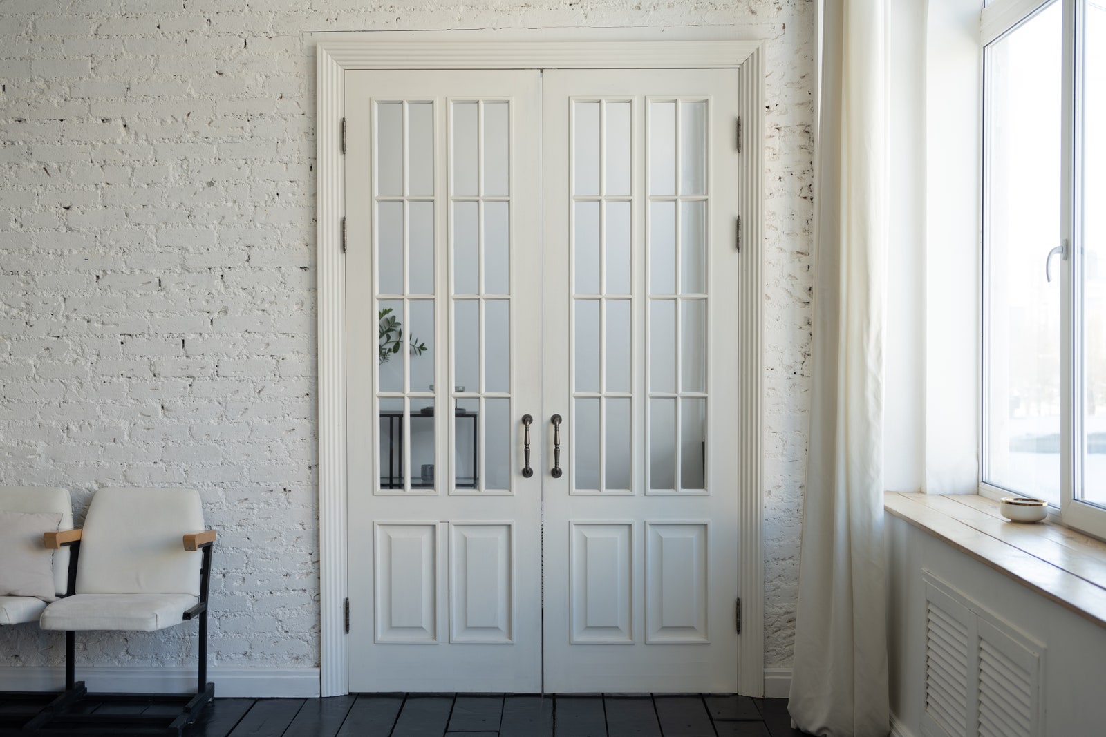
What paint is best to buy for trim and architectural details?
Crown molding, wainscoting, cornices, balustrades, custom wall panels, and other architectural details are usually painted a different color and finish than standard walls. They’re typically painted white or some other color that complements the wall paint, which is a safe choice if you don’t want these features to be accentuated because of flaws you don’t want to highlight or because you just feel like it.
