Westmount Building // Dubbeldam Architecture + Design
Text description provided by the architects.
With the acquisition of a century-old, three-storey brick building in which to house their own studio, Dubbeldam Architecture + Design embarked on a major renovation, providing an opportunity to not only custom design their own workspace but to develop a creative and entrepreneurial community, integrating complementary businesses under the same roof.

© Dubbeldam Architecture + Design
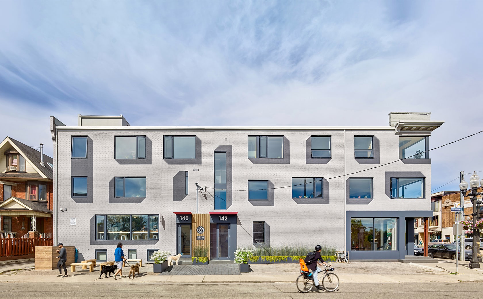
It also presented an opportunity for the firm to demonstrate one of their beliefs about urban renewal – that well-designed architecture can catalyse change and have a positive impact on a community.Occupying a corner site on St. Clair West at the edge of Corso Italia, the under-utilized building was in decline and disrepair from more than a decade of neglect before the studio began the process of transformation.

© Dubbeldam Architecture + Design
Dubbeldam’s studio occupies the top floor of the building. To strengthen a community purpose within the building, principal Heather Dubbeldam and her partner Kevin McIntosh established Lokaal, a collegial and inclusive co-working space for creatives on the second floor. On the ground floor, a marketing agency is joined by an indie coffee shop to form the critical retail anchor that not only serves the building’s inhabitants, but the surrounding community as well.

© Dubbeldam Architecture + Design
In the raised basement, a residential unit provides a much-needed opportunity for rental accommodation.Before the renovation, the building façades were a patchwork of decades-old neglect: mismatched bricks, delaminated stucco and undersized, randomly positioned windows. Newly enlarged openings look out onto St. Clair Avenue and the adjacent neighbourhood bringing in abundant natural light and increasing the transparency of the building to establish a more open and inviting presence on the corner.

© Dubbeldam Architecture + Design
Suggestive of the creative inhabitants working within, the two public-facing elevations activate the streetscape with a bold and playful graphic presence; painted drop shadows surrounding the windows create a three-dimensional trompe l’oeil effect to passersby. The striking exterior graphics continue throughout the project, from the distinctive and eye-catching signage at the building’s entrance to the materially rich wayfinding on all three floors of the interior.

© Dubbeldam Architecture + Design
A custom Baltic birch pegboard panel on the first-floor landing not only provides a directory for the businesses in the building, but doubles as a thriving green wall populated with lush plants in fragrant cedar boxes. Lipstick pink and terra cotta paint are applied to the underside of the stair to add colour and energy.

© Dubbeldam Architecture + Design
Essential to Dubbeldam’s vision, the design of her studio must be reflective of her firm’s philosophy, working methodology, and commitment to sustainability. A champion of design excellence and innovation herself, she ensured that the studio and coworking workspaces were designed to embody this ethos. The design provides opportunities for staff, clients and visitors to exchange ideas around architecture and design while demonstrating principles of sustainability and adaptive reuse.

© Dubbeldam Architecture + Design
Collaboration is key to the firm’s working methodology, so open workstations occupy most of the office to reinforce collaboration along with a breakout space equipped with a large table for group work and discussion. This space doubles as a library of reference books and material samples on shelving around the perimeter with natural daylight pouring in from the expansive corner window cut out of the north and east façades.

© Dubbeldam Architecture + Design
The boardroom and light-filled kitchen/lunchroom create additional spaces for discussion while high ceilings and sliding walls in the studio provide ample room for pinup, essential for sharing and exchanging ideas.Interior details are as considered as the building exterior. A Scandinavian-inspired natural material palette of exposed brick, maple floors, Baltic birch slats and millwork is timeless, textured and warm, contrasting with darker accents such as charcoal-grey doors and furniture.

© Dubbeldam Architecture + Design
A white Corian waterfall panel greets visitors with an inscribed “hello” at the reception desk, and the wall and ceiling-mounted eco-felt panels provide acoustical benefits. The work of local designers and fabricators was incorporated into the project as much as possible: light fixtures, furniture, workstations and textiles were sourced locally.

© Dubbeldam Architecture + Design
Thinking more broadly about sustainable approaches and supporting local independent businesses, 80% of materials came from retailers and suppliers in the area; even wood from the lumber yard was obtained a mere five-minute drive away. A number of the consultants and tradespeople–including the structural engineer, millworkers, carpenters and metalworkers–lived or worked within walking distance to the job site.
The building has established itself as a landmark and has become a creative hub and kick-starter of local business and a catalyst for other neighbouring renewal.

© Dubbeldam Architecture + Design
A prime example of urban revitalization, it has dramatically improved the local urban fabric, bringing a new kind vibrancy and diversity to the neighbourhood..

© Dubbeldam Architecture + Design

