we+’s aluminium vortex installation exudes dynamic iridescent colors at milan design week
We+ and toyo aluminum collaborate for milan design week 2022
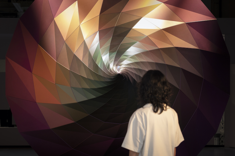
At Milan Design Week 2022, contemporary design studio we+ unveiled their aluminum installation ‘Resonance: Vortex to Diversity’ – a large vortex-shaped volume coated in a single metallic pigment revealing several colors at once. In collaboration with Toyo Aluminum, the large-scale artwork’s surface becomes accentuated in dynamic, unpredictable displays. Distinct and diverse nuances and iridescent hues of color are exuded when observed from different angles and lighting condition, embodying vibrant diversity and nurturing new values.

all images by Takumi Ota
dynamic displays of color + light embody diversity
‘Resonance: Vortex to Diversity’ is coated purely in CHROMASHINE, an interference aluminium pigment developed by Japanese manufacturer Toyo Aluminum. Reveals countless vibrant colors in a single pigment, CHROMASHINE has been developed from aluminium flakes and colored by ‘light interference’ such as soap bubbles, peacock feathers and butterfly wings. As the vortex installation’s surface generates shifting color and light depending on the angle of view, rich nuances and distinct stirring experiences are unfolded for observers. ‘It presents itself as a colourful embodiment of a world full of diversity, where new values are nurtured as a result of different aspects meeting and resonating’, comments the team at we+.

the colourful installation is coated with only a single pigment
the vortex installation evokes iridescent hues + tones
By combining the vortex form with the CHROMASHINE coated surface, the dynamic iridescent color effects are multiplied and enhanced, and a multi-layered nuance emerges. From we+’s installation, a representation of the world where new values are created out of diversity emerges in a poignant, vibrant display. The design team explains: ‘In nature, a vortex is formed when two qualitatively different states come into contact: liquid and gas, fast and slow, warm and cold, thick and thin, heavy and light. In other words, a vortex can be described as a shape that represents the process where different entities meet and fuse together to create something completely different’.
we+ and Toyo Aluminum collaborated to create ‘Resonance: Vortex to Diversity’ for the world’s largest design fair — Milan Design Week – from 6-12 June 2022. The aluminium art piece was exhibited at Superstudio Più Iin the heart of Milan’s Tortona district, and it was awarded the Special mention Fuorisalone Award 2022.

the colourful installation is coated with only a single pigment developed by Toyo Aluminium

different viewing angles create different nuances combined with a vortex form

the pigment is coloured by ‘light interference’ to transform into a variety of colours

the vortex represents the process where different entities fuse together to create something completely different

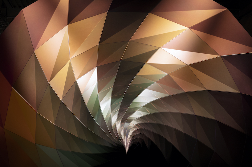

combining a vortex with CHROMASHINE, various colours are produced on the viewing angle
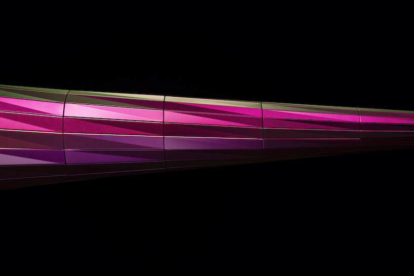
project info:
name: Resonance: Vortex to Diversity
designer: we+
collaboration: Toyo Aluminium
program: Milan Design Week 2022
designboom has received this project from our ‘DIY submissions’ feature, where we welcome our readers to submit their own work for publication. see more project submissions from our readers here.
edited by: ravail khan | designboom
