these reflective kiosks in budapest seamlessly mix into their historic environment
the new buda castle visitor center and infopoints are the perfect selfie mirrors
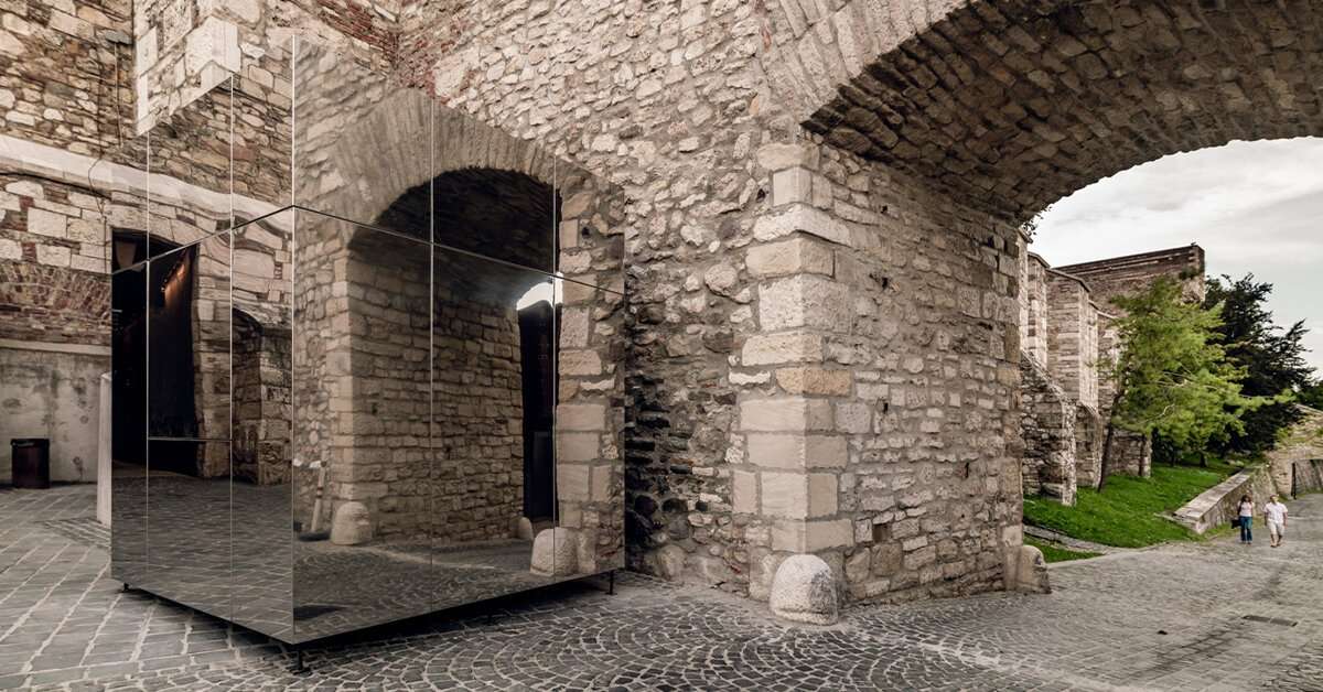
hello wood and BLOKK architect studio have recently completed the new visitor center and infopoints of the historic buda castle district in hungary. designed as fully reflective and near-perfect cubes, the pavilions blend seamlessly with their surroundings by mirroring back a crystal clear image — making them perfect spots for passersby to snap a selfie.
the use of mirror-like surfaces also comes from the need to respect the district’s cultural context. in other words, the architects were tasked to expand the historic city quarter with contemporary buildings that did not break the existing architectural harmony. and what better way to respect the district than by reflecting it literally?
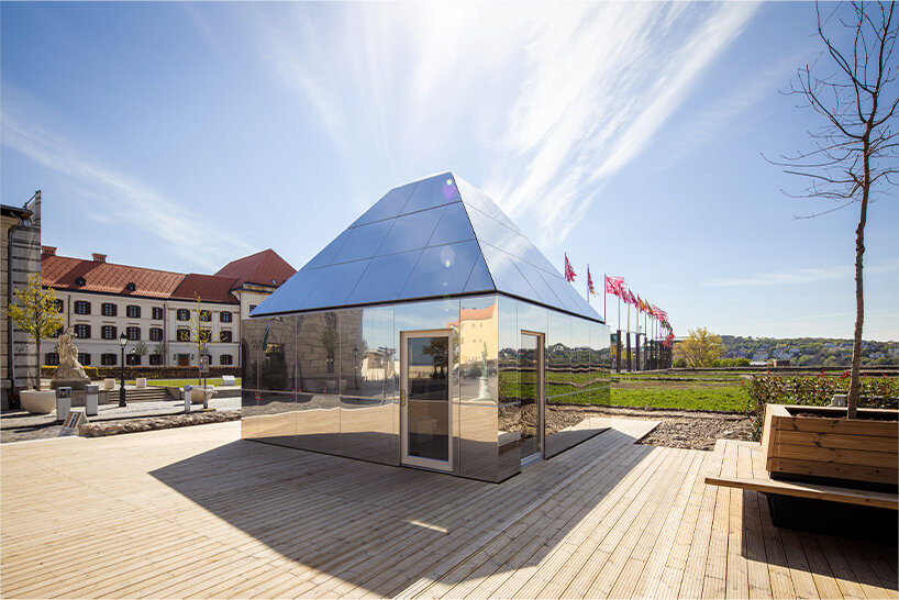
the new visitor center | images © tamás bata, zsuzsa darab, máté lakos
a playful contrast: mirror-like, cool exteriors elevated by warm-toned interiors
the 30 sqm visitor hub sits like a square body at the district’s center, near the buda castle. during the design process, the architects focused on creating a building that fits and responds to its surroundings. the center was therefore crowned with a high and tapered roof, characteristic of the neighboring buildings. the final design presents a fully reflective pavilion that serves as a modern version of the heritage site. the infopoints, meanwhile, function as both information desks and souvenir shops scattered across three different locations.
but that’s not all; a playful contrast between the exterior and interior makes the visitor center and infopoints even more intriguing. the reflective steel façade’s cold feel is paired with a bright and warm interior defined by natural-colored pine plywood cladding. additionally, a skylight atop the visitor center ensures a generous inflow of natural light while emphasizing the monolithic appearance of the building.
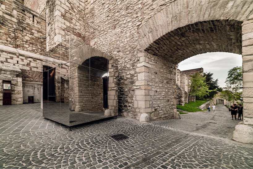
no handles visible when doors are closed, giving the cubes a playful + chamelelon-like quality
for easy transport and on-site assembling, all structures were built out of four steel-framed modules lifted into place by a crane. the pavilions were first conceptualized by BLOKK architect studio (see more here), then implemented by hello wood (see works here).
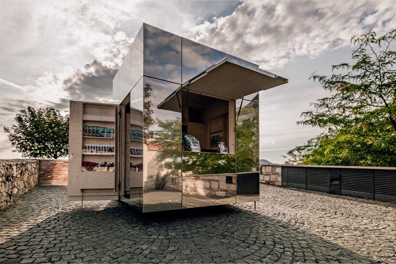
all infopoints function as information desks and souvenir shops
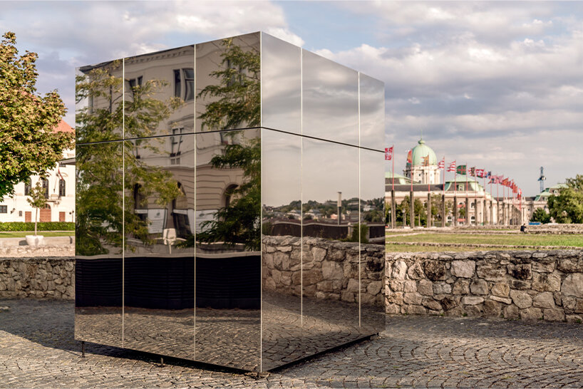
each pavilion serves as a perfect spot to snap a selfie
