the kotobuki resort revealed as a placing, architectural collage in japan
kotobuki hotel is set to revive the old city centre of kanoya
architect katada tomoki from micelle ltd. led the design of the kotobuki hotel in the old city center of kanoya, japan. completed as a low-budget project, the hotel will cater to and increase business demands in an area where transport links and touristic resources are initially scarce. with that in mind, and despite its simple overall aesthetic, the final architecture presents a multilayered composition — merging different textures, shapes, materials, and openings to reflect a space where people and objects from different backgrounds can come and go without eliminating the city’s historical value.
all images © shimizu ken
a balanced contrast of materials, shapes and gaps
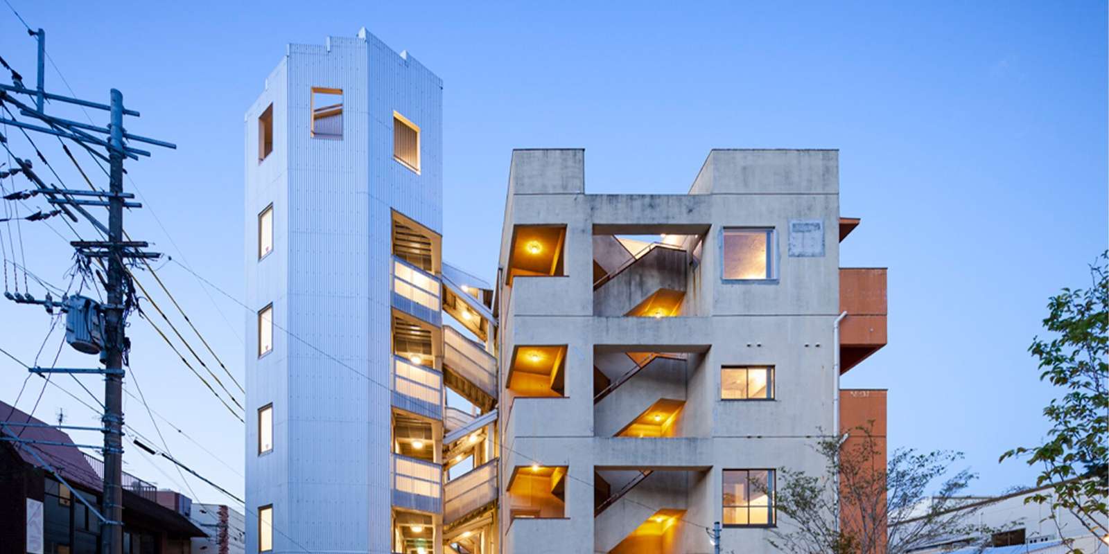
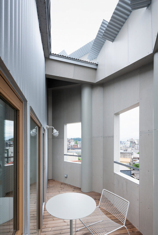
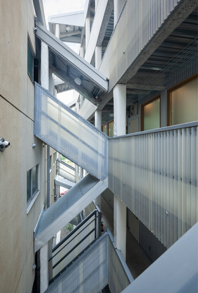
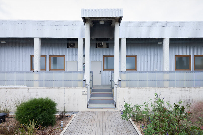
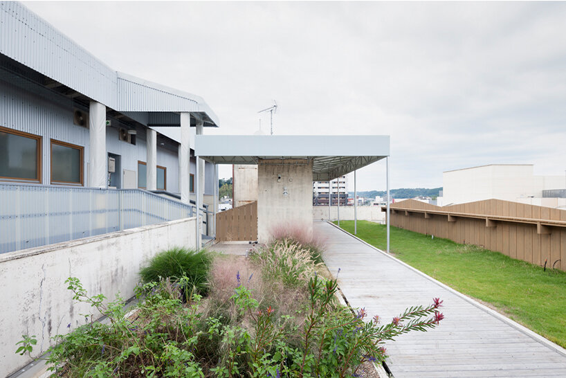
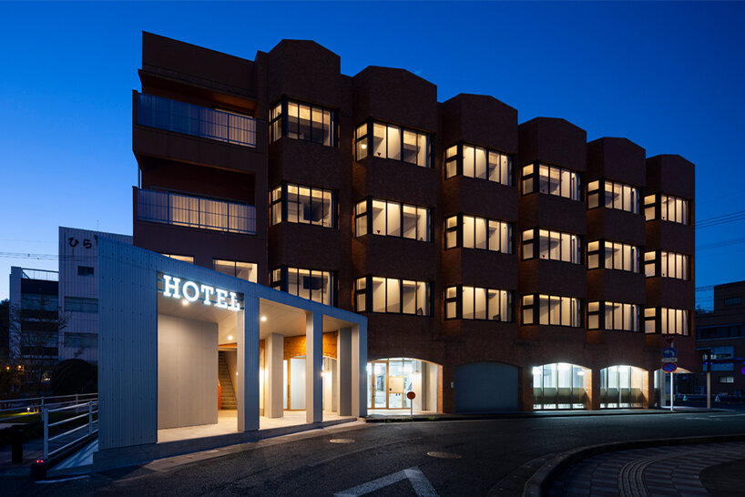
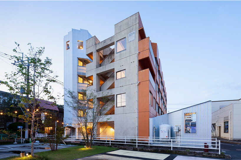
the process began with micelle acquiring the car park at the back of the site and building an extension of the existing structure, now the kotobuki hotel, to increase floor space. with its delicate, shed-like, and corrugated white façade that is uncommon in the city context, the extension steadily injects novelty into the area while contrasting its bulky neighbor made of bricks and concrete. further asserting that spatial distinction is the gap created between both buildings, which the architect highlighted through landscaped features. on that note, tomoki states that: ‘when you leave your room, you feel the outdoors, the smell of the farm, the illusion of the morning mist, and when you move to the next building you feel the layers of its history. the composition is simple but full of richness.’
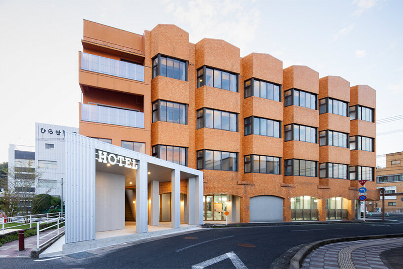
the existing building follows the tripartite composition (base, shaft, crown) of architect louis sullivan
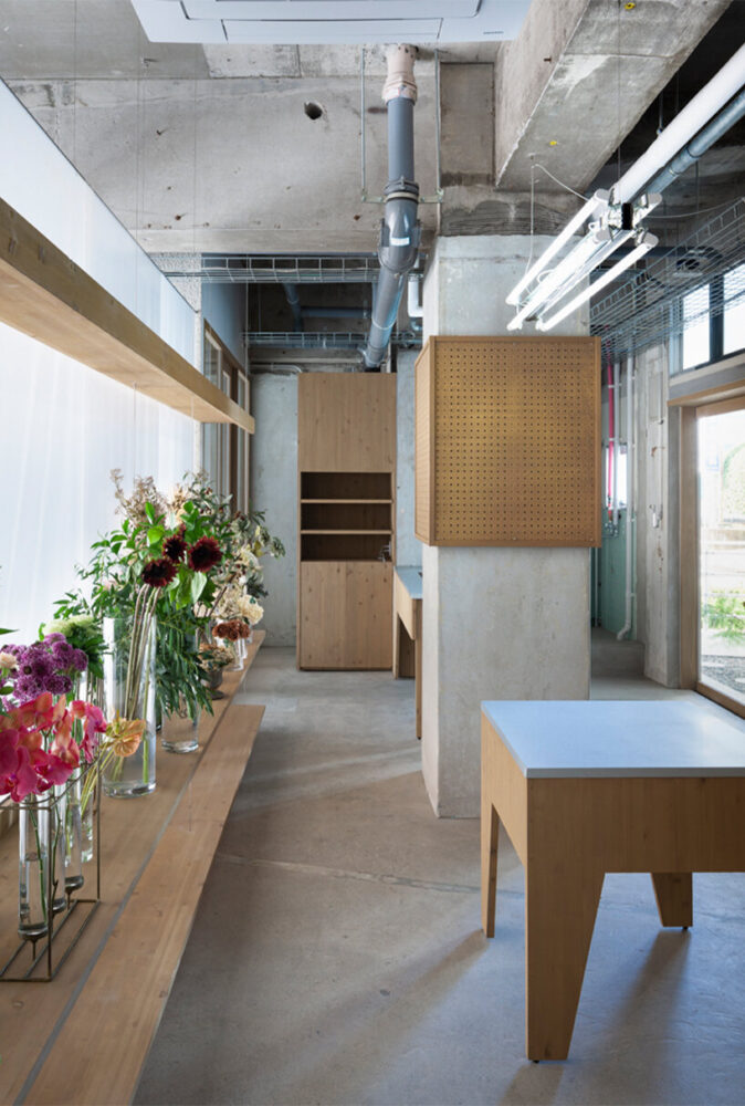
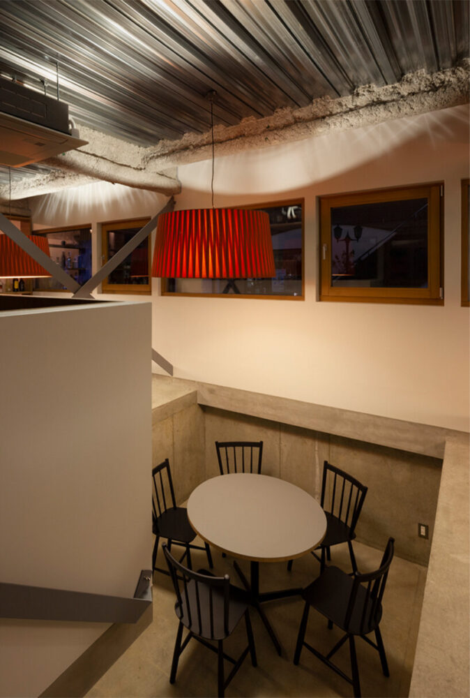
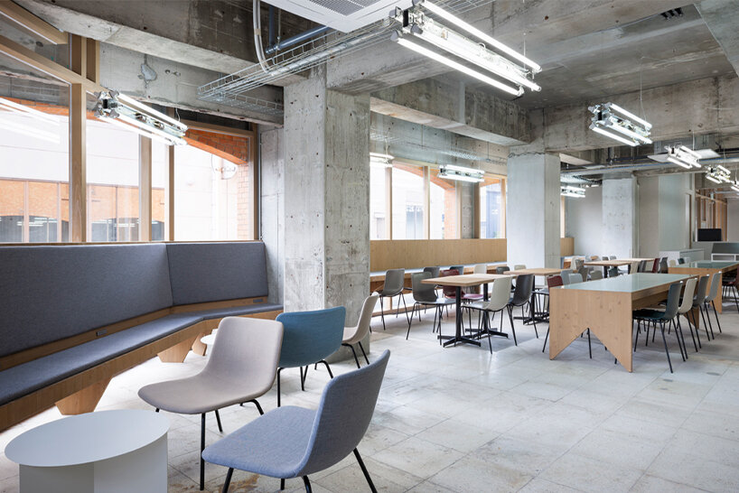
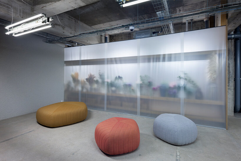
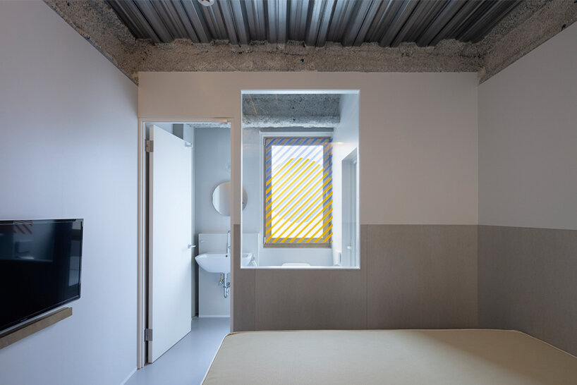
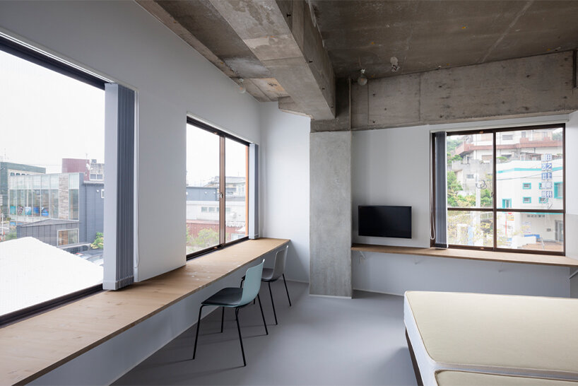
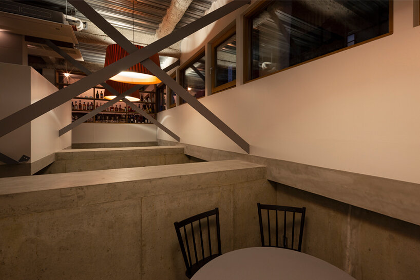
indeed, that richness comes forth in designing and selecting the kotobuki hotel’s materials, shapes, and object sizes. these final components were organized in a way that allowed the concrete frame, the large wooden and ready-made furniture, and fittings, to come together without disturbing their ‘independent melodies’. for example, interior objects that portray similar size, texture, and style are grouped into three or more clusters in each space to create an overall harmony. that said, each object within the group features enough differences and contradictions that reflect the identity of the hotel. ‘we thought that these differences and contradictions would become ‘clues’, ‘gaps’, that would make people feel both comfortable and tense — so we left them as they were without unifying them,’ explains the team.
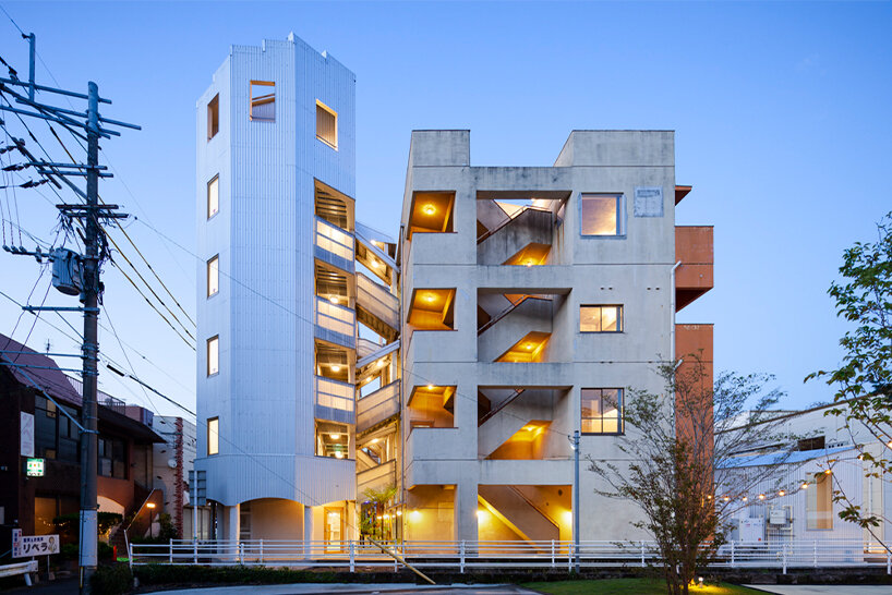
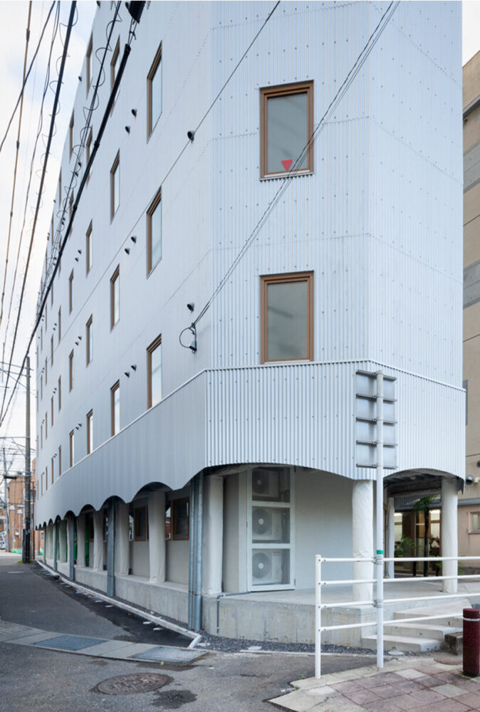
the corrugated extension presents a light, shed-like form that contrasts the boldness of the existing building
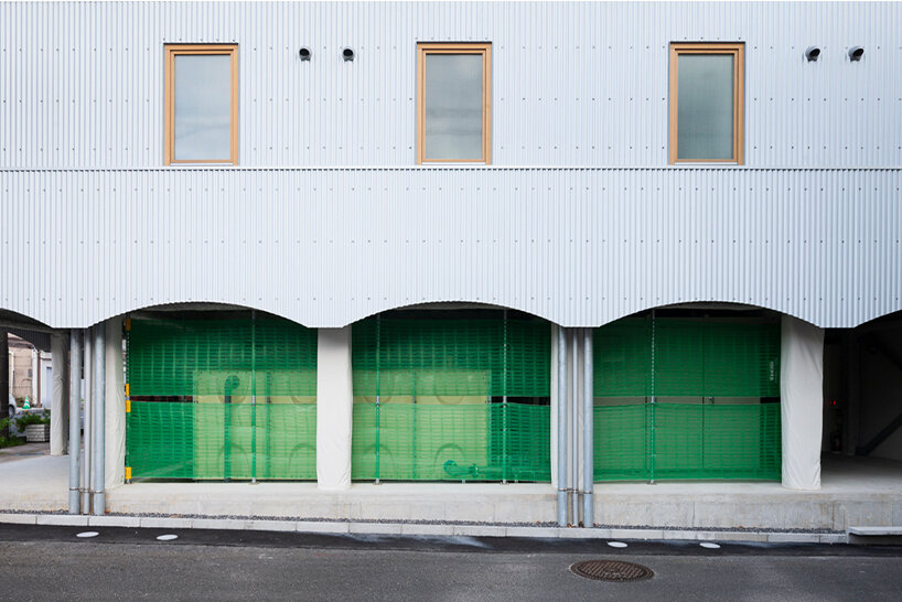
the extension has an arched sequence, similar to the one at the plinth of the existing building
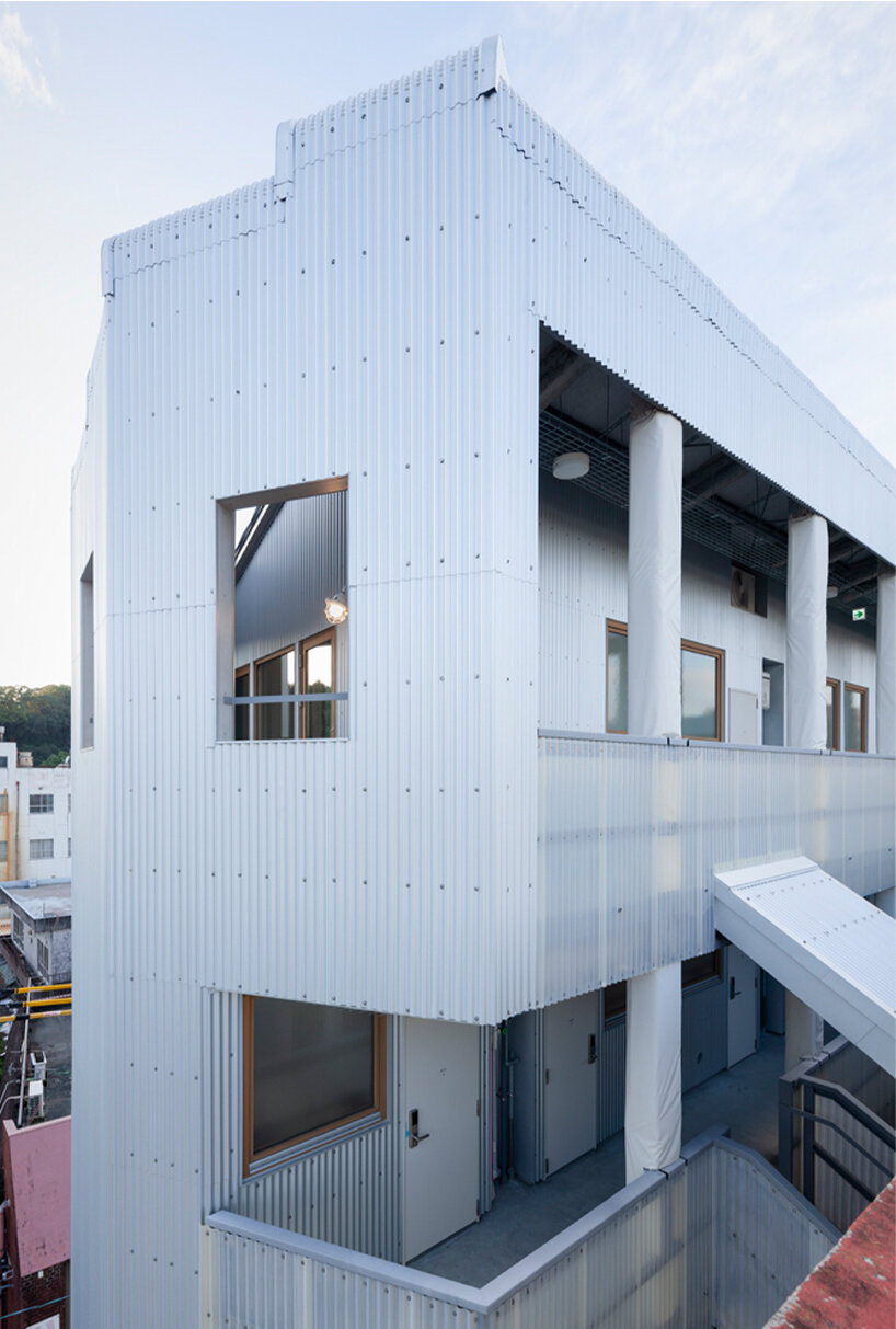
corrugated steel sheets, a common material in farmlands and suburbs, are a novelty in this city context
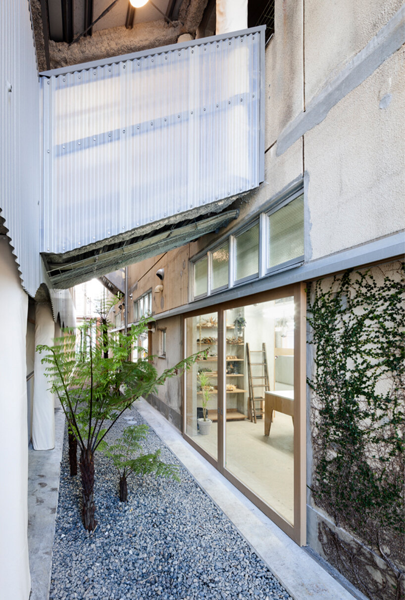
the gap between both buildings is accentuated with landscaped features
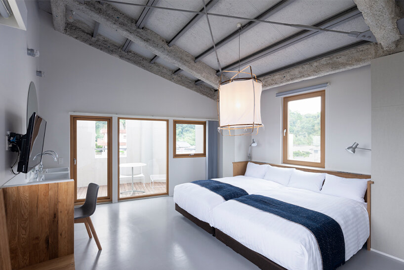
hotel room with rich mix of materials that work well together while maintaining their independent qualities
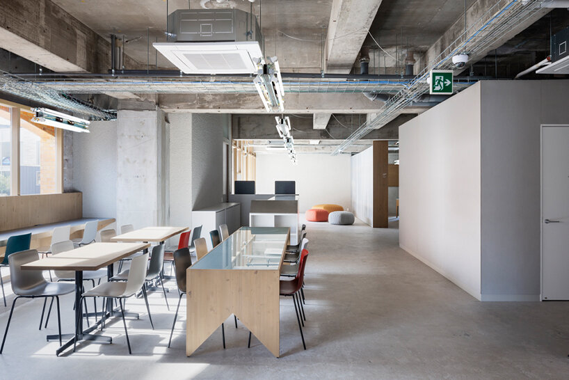
similar objects, with enough differences, are grouped together in each space
project info:
name: kotobuki hotel
location: kagoshima, japan
area: 1889 sqm
architecture: micelle ltd. / katada tomoki
structural engineers: testsuya tanaka structural engineers
construction: uenodan kensetsu, kuroki kagu
graphic design: F&S creations / inoue hironori
artwork: teppei soutome
planting design: araheam
photography: shimizu ken
1/13
