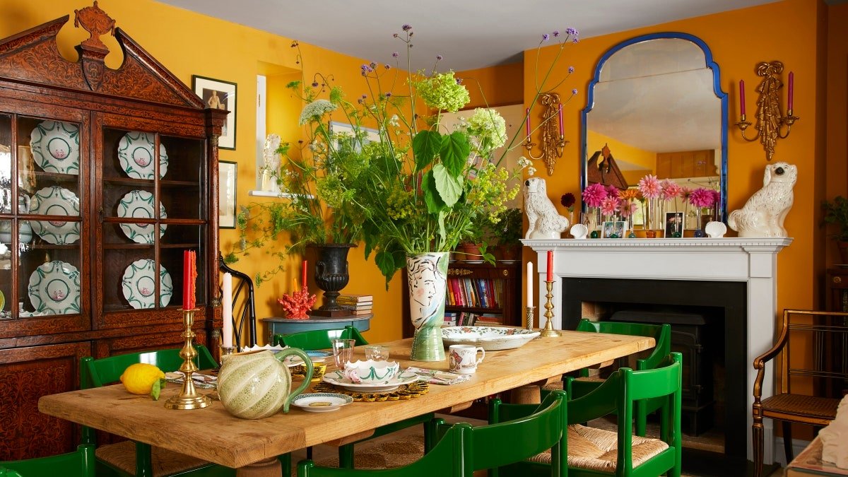
The 7 Absolute Best Yellow Paint Shades, According to Designers
From a daffodil staircase in a moody farmhouse to a taxi yellow–tinged living room, designers seem to be in a frenzy to find—and spec—the best yellow paint. A surge of product collaborations, eye-catching home tours, and appearances in a handful of color-of-the-year schemes all make the case: In 2022, yellow is in. Though the statement shade has become a pièce de résistance in many an interior, swathing a room in a canary hue is arguably less conventional than, say, a soothing blue or of-the-moment pink. Despite its sunny disposition, choosing the wrong shade—or even using too much of the right one—can be cloying, blinding, or just plain too much. The secret? Finding the ideal undertones to match a room’s size and natural light.
Ready to embrace the color yourself? AD PRO asked seven designers about the best yellow paint options—here are the ones they feel deserve the spotlight.
Funky Yellow by Sherwin-Williams
“This yellow has so much depth. It seems a little, well, funky at first, but it’s the kind of color that changes in the light. It has a little bit of a green undertone, but it’s still warm and is great for kids’ rooms. Yellow fades easily, so it’s better to start more saturated!” —Jessica Davis, Atelier Davis
Goldfield by Benjamin Moore
“Our favorite go to yellow is Goldfield from Benjamin Moore. It is the perfect sunshine yellow that is not too strong or too saturated, and has a lovely softness to it. We recently used this color for our entry and kitchen ceiling in the Kips Bay Palm Beach Show House. We had a rainbow of colors in our spaces and this yellow worked beautifully with every shade we put next to it.” —Catherine M. Austin, Catherine M. Austin Interior Design
Beeswax by Domingue Finishes
“Hadley Wiggins had the most beautiful range of fabrics that steered us to this lovely yellow. It’s a color that I developed for Domingue Finishes. Called Beeswax, it’s a limewash paint and it just glows when the sun hits it. It seemed like the perfect choice for this small, waterfront bedroom.” —Eve Ashcraft
French Quarter Gold by Benjamin Moore
“I love this shade of yellow. It’s a rich, glowy hue, and its earthy green undertone adds complexity to the color, which changes as the sun moves throughout the day. It’s not a color we typically associate with bedrooms, but waking up into a room this color feels like being greeted with a morning person’s smile each day.” —Noz Nozawa, Noz Design
India Yellow by Farrow & Ball
“We love this striking, punchy yellow as the deep mustard tones give it an earthiness, making it a fitting color for both town and country homes. To create an immersive experience in a small room, we used India Yellow in full gloss on the ceiling and below the dado rail to let light bounce playfully around the space.” —Katie Glaister, K&H Design
Babouche by Farrow & Ball
“I see yellow as a neutral—it literally goes with jewel tones of all shades, browns, blacks, and primaries. I even like yellow with pastels. Yellow is happiness in a color, for sure.” —Katie Rosenfeld, Katie Rosenfeld and Company
Curry by C2 Paint
“I love the shade Curry by C2. It has a saffron, henna quality that makes it feel old-world even though its saturation is robust. It adds color, depth, and warmth to a space without it feeling bright or chaotic, and it plays well with a lot of different colors. Although it has a lot of personality, it reads somewhat neutral, making you feel warm and ensconced, which is why we often use it in a jewel box manner.” —Zoe Feldman, Zoe Feldman Design
Buy now for unlimited access and all of the benefits that only members get to experience.


