Teiknistofan Tröð Design The Salvation Army’s headquarters in Iceland
The Salvation Army’s headquarters – The Salvation Army in Iceland contacted us in spring 2016. They had recently sold their 100 years old headquarter, which no longer served its purpose and they wanted a modern building for The Salvation Army activities. At that time, they were operating in several locations in Reykjavik. The brief was to gather the main activities in the capital area in a new building. The site is located on the outskirts of Reykjavik city centre. The client had a rough program proposal and asked if we would help them create a headquarter for the next century. The building should serve as a church, for social services, a community centre, and the main office for The Salvation Army in Iceland. Later a second-hand shop was added to the program. The client wanted a tailor-made building created around the diverse activities they are offering to the community. The brief included all phases of a building project from programming, adjusting the local regulation plan, the design and building phases, to assistance in choosing furniture and signage design in the building.
Architizer chatted with Sigríður Magnúsdóttir and Hans-Olav Andersen, owners of Teiknistofan Tröð to learn more about this project. The company was established in Reykjavik, Iceland in 1990 after winning its first open architectural competition and has been operating since.
Architizer: What inspired the initial concept for your design?
Sigríður Magnúsdóttir and Hans-Olav Andersen: The Salvation Army has a long reputation of supporting great architecture. The Cité de Refuge in Paris by Le Corbusier was well known to us and we learned quickly a lot of extraordinary buildings belonged to them all over the world.
The client wanted a friendly and welcoming building that would be open to the public. The plot is close to Reykjavík main access road from the east and it was important to them to have a building highly visible from the road. The building committee was presented with several design options from the start and the development of the project was in close cooperation with the client.

© Teiknistofan Tröð
What do you believe is the most unique or ‘standout’ component of the project?
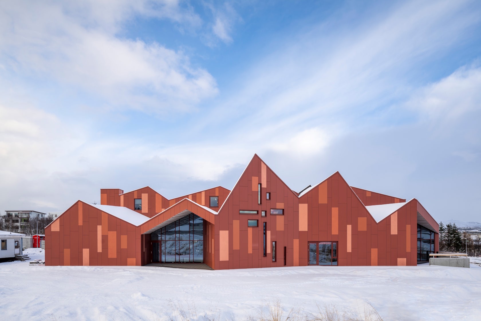
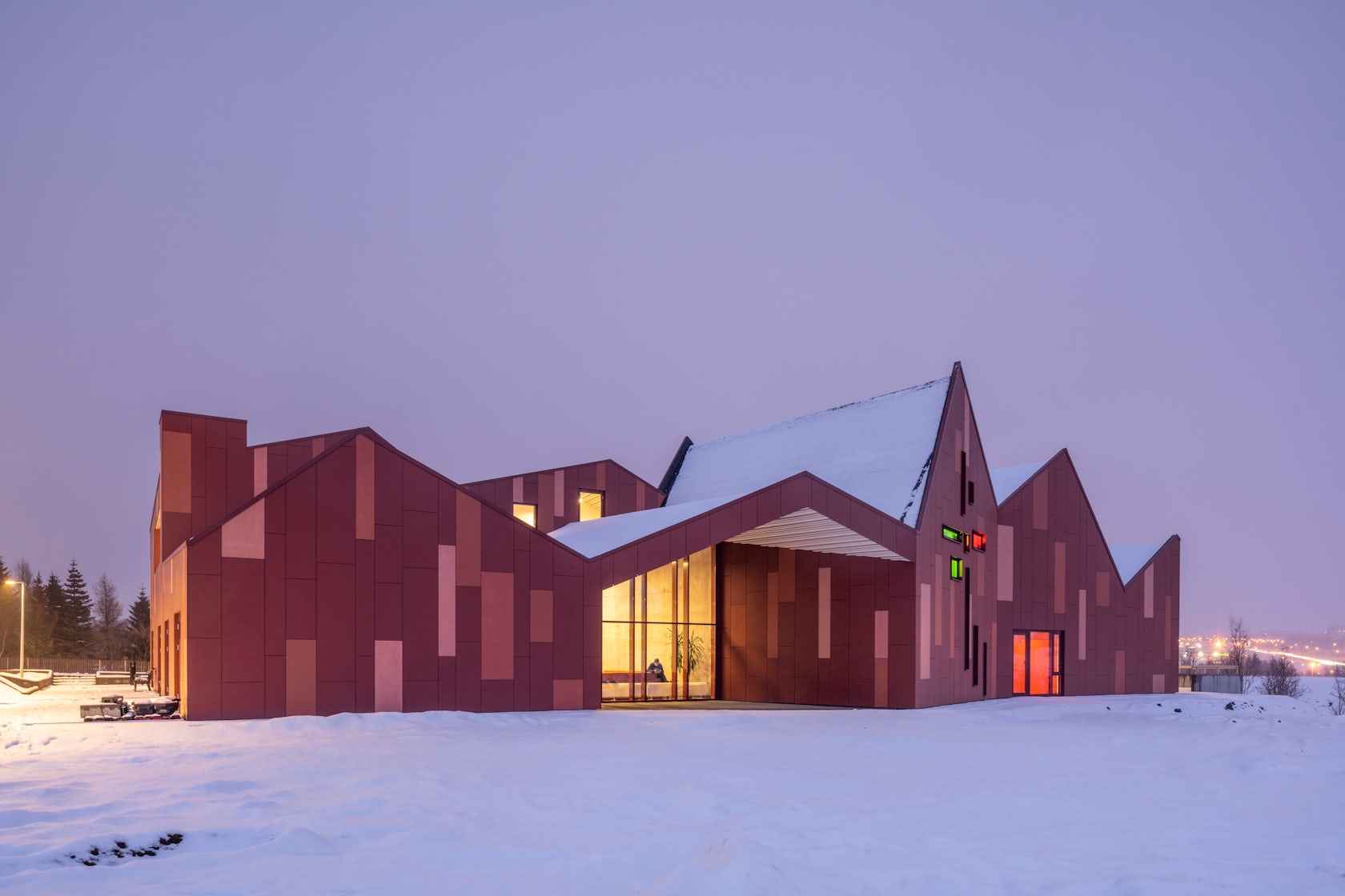
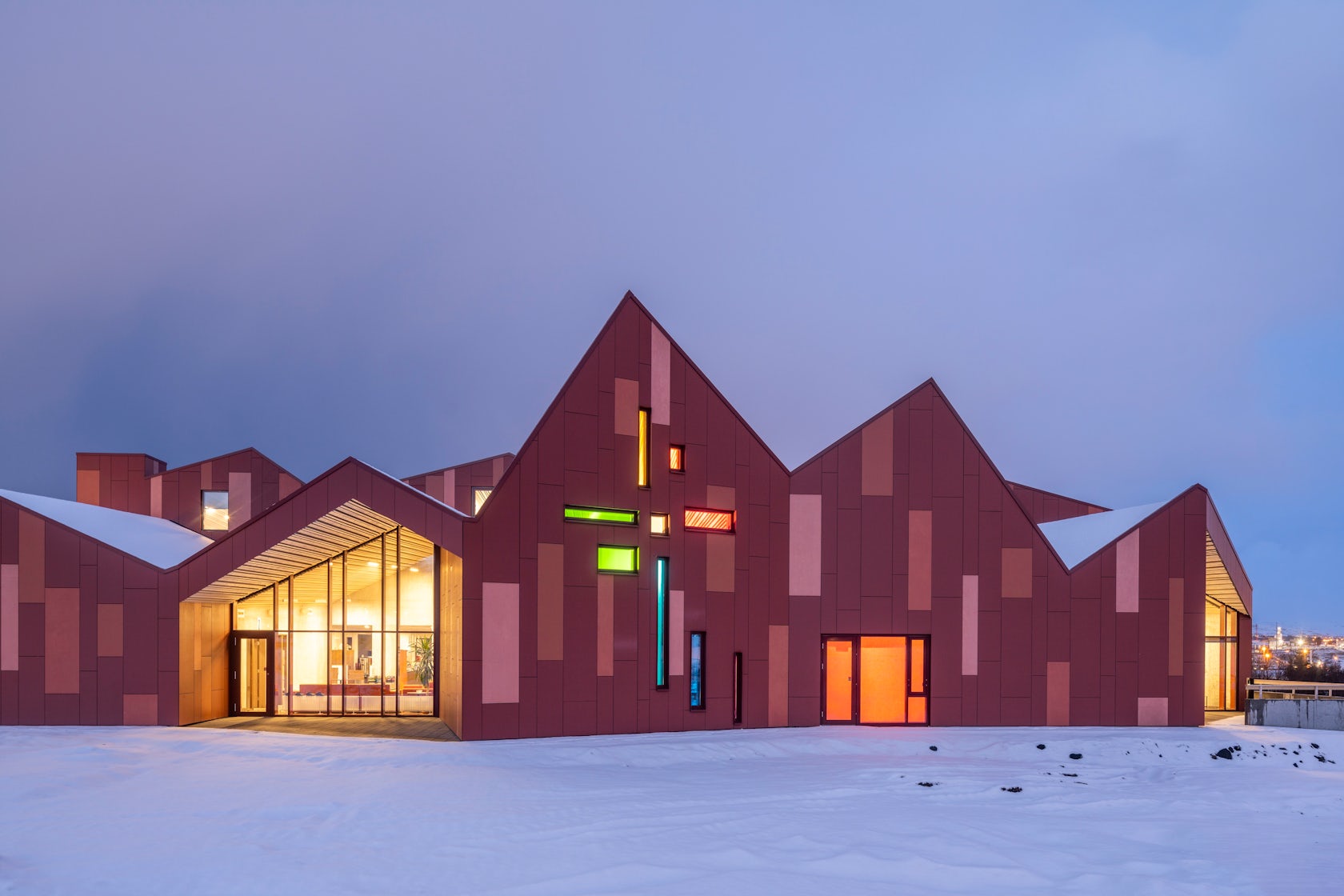
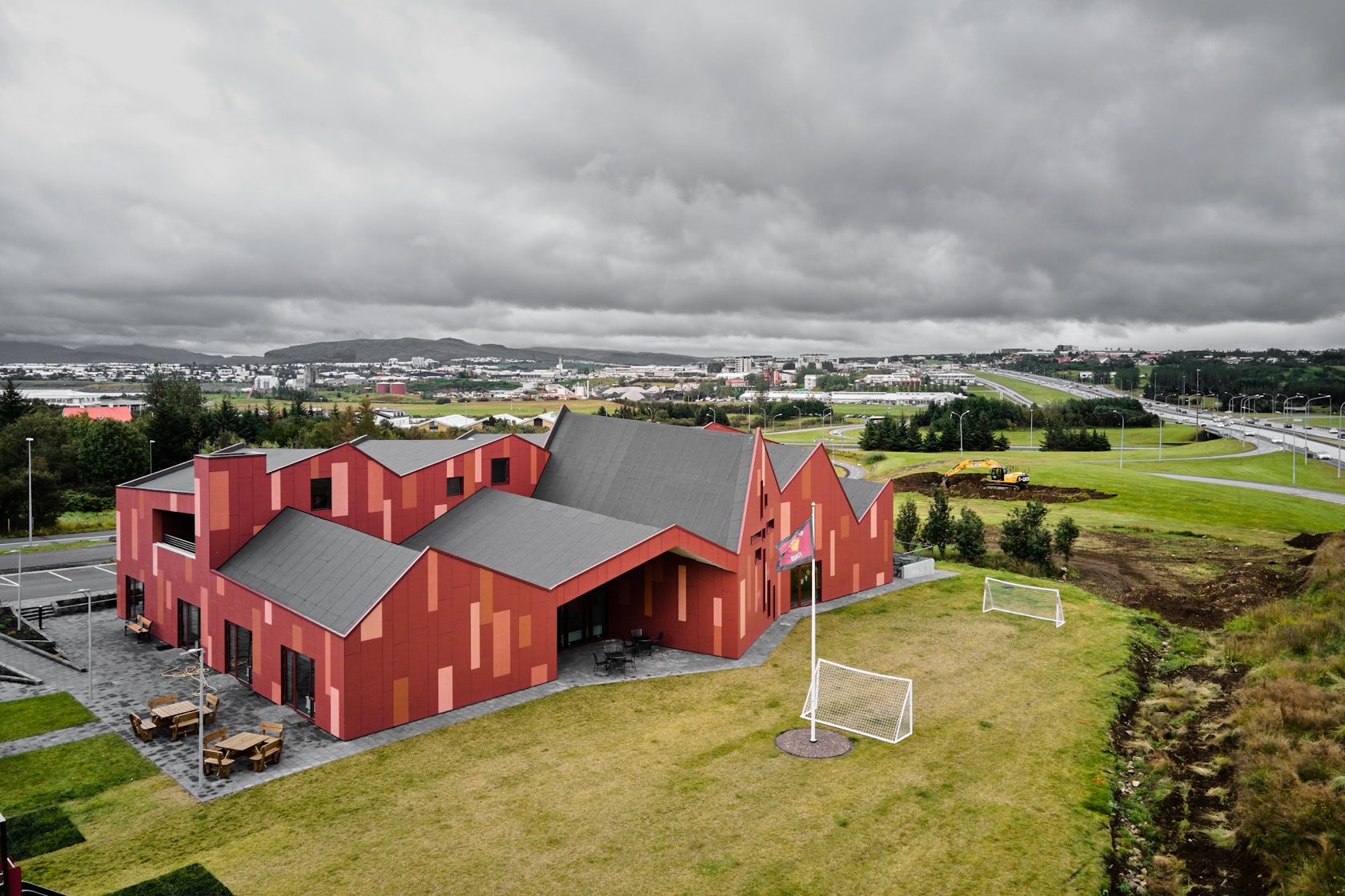
The overall form of the building with its active roofscape has two main purposes, to create a landmark building, functioning as a focus point in the area and to form distinct and memorable interiors for the client and visitors. The acoustic aspect was important throughout the whole design process. It was crucial to have good sound insulation between the different spaces and to model the right type of acoustical atmosphere in each room adapted to its functions. The form of the roofs and the variable ceiling heights helped when dealing with the acoustics. Although we presented various material and cladding options, it was clear from early on that the red colour was important to them.

© Teiknistofan Tröð
What was the greatest design challenge you faced during the project, and how did you navigate it?
The main challenges during the design process were to create a diverse series of spaces that could adapt to the many functions of the program. Flexibility is important and we decided to focus on spaces not trimmed to the minimum but of a size large enough to be flexible in use. Equally important was to cope with the fixed budget based on the property they had already sold. At every major milestone the budget was checked and project adjusted.
© Teiknistofan Tröð
How did the context of your project — environmental, social or cultural — influence your design?
It was clear from the start that the building should welcome all kinds of people. Visitors may join a concert or celebrate at a wedding. Others are homeless, in need of a shower, a meal and financial assistance. You can enter through the main entrance or a smaller side entrance depending on your situation. You can enjoy coffee or a meal together with fellow citizens or hide in a corner. There is room for everyone.

© Teiknistofan Tröð
What drove the selection of materials used in the project?
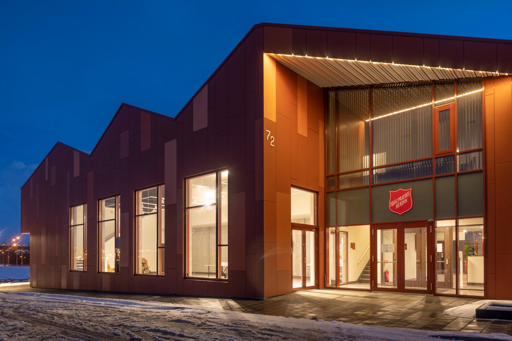
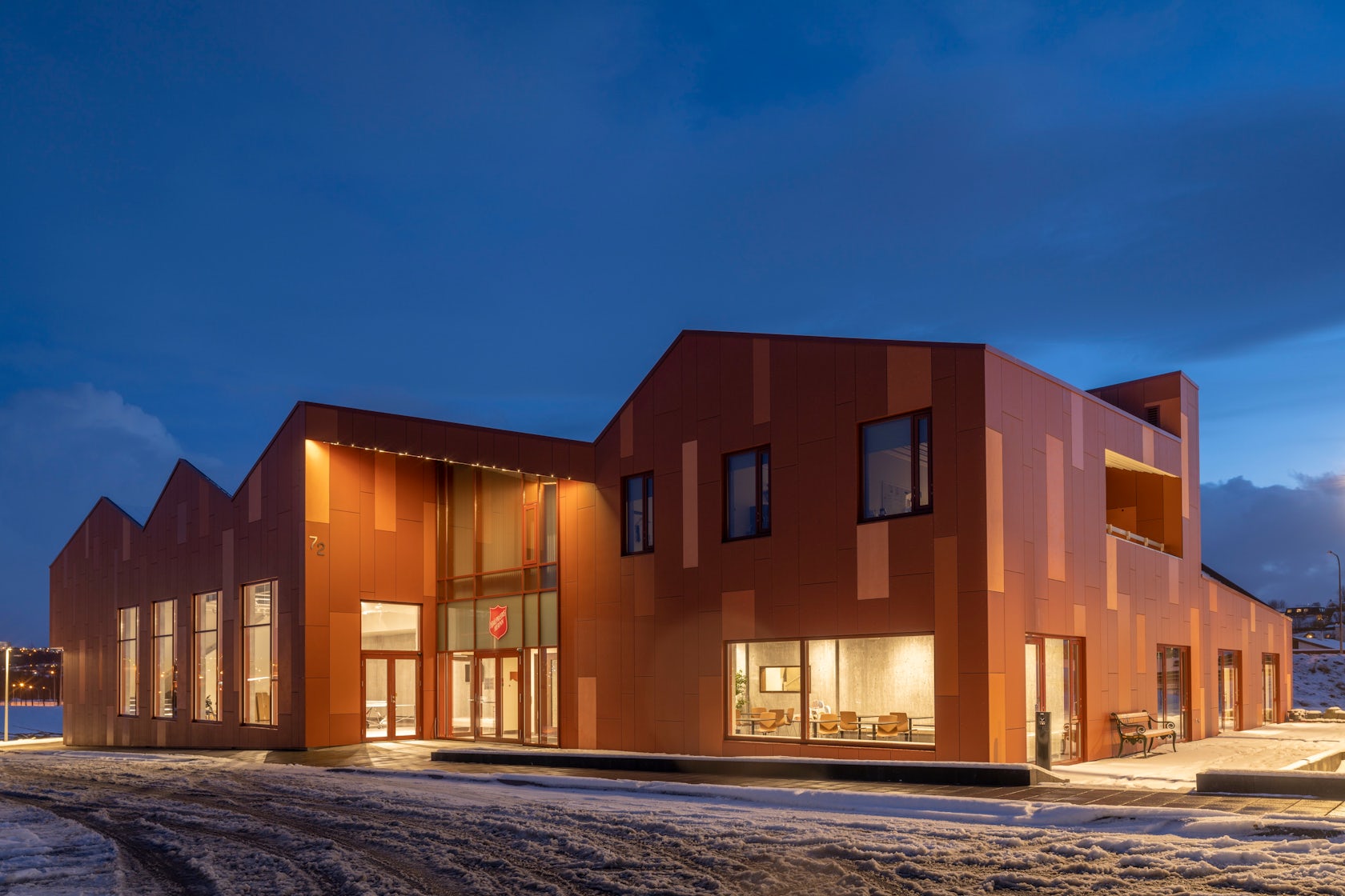
We wanted the house to be robust and capable of heavy use, not too shiny or perfect. The client had mentioned children playing softball, and possible activities could include bicycle repair, retrofitting furniture, carpentry, sewing and maintaining clothes. Concerts, weddings and religious activities were equally important. Most buildings in Iceland have a structure of in situ concrete. Although different options were tested and calculated the result was to have all exterior walls, most interior walls and all slabs and roofs in concrete. The structure is insulated on the outside with local mineral wool and facades clad in fibre cement boards. It was more economical to give the raw concrete surfaces in the interior a transparent coating than to render every surface in plaster and paint. To balance the composition and give warmth to the interiors most ceilings are custom made of fire impregnated spruce.

© Teiknistofan Tröð
What is your favorite detail in the project and why?
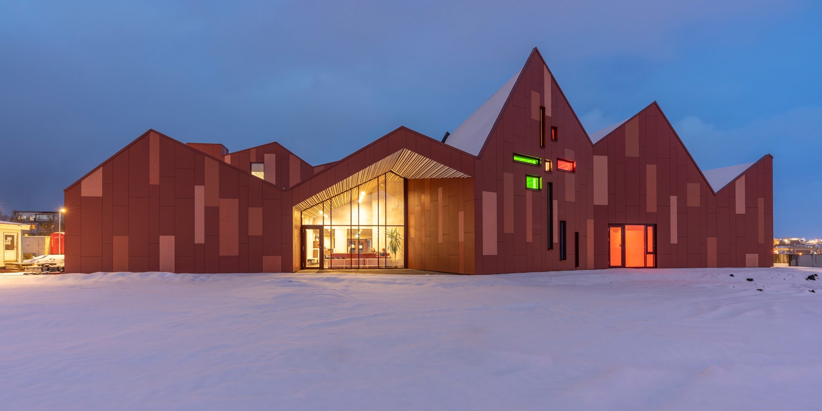
Red fibre-cement was chosen for the exteriors, and we decided to use some leftover panels in the central reception and coffee shop, and letters and pictograms were laser cut out of the panels for signage for restrooms and throughout the building. The same colours are also used in window profiles and furniture, bringing the exterior inside.
The cross shaped window composition in the main hall is also a favourite with rainbow coloured glass. For some it gives meaning to vision a cross shape and others associate it with the rainbow. It was also a requirement from the client to make restrooms gender neutral. Everyone should feel welcome here.

© Teiknistofan Tröð
How important was sustainability as a design criteria as you worked on this project?
Although the building is not gone through a formal certification, sustainability is always important for us. We try to choose healthy materials with less environmental impact. Electricity in Reykjavik is green and as well the geothermal heating. The building is insulated better than the code and when it is an option, we choose local materials or products. For example, all interior doors and windows cabinets are custom made by a local workshop. It turned out to be a good option when Covid put restrictions on transport in the final part of the construction phase.
© Teiknistofan Tröð
In what ways did you collaborate with others, and how did that add value to the project?
Work in the office is always teamwork. In this project it was special how much input we got from the client. They have been involved in the whole process on every level. and guiding us simplifying the project to stay inside the cost limit. The client has been inspiring and of great help.
© Teiknistofan Tröð
Were any parts of the project dramatically altered from conception to construction, and if so, why?
When the preliminary project was ready and agreed upon, the client wanted to add retail space for their Salvation Army Thrift store. It was necessary to add volume on both floors. Later when the building was almost finished the situation was changed. The pandemic increased the demand for helping and feeding people and also to have more space between people so the area was renamed multipurpose hall and are currently used for dining.
© Teiknistofan Tröð
How have your clients responded to the finished project?
The client is proud and very pleased with the project and the attention it gets in the media.
What key lesson did you learn in the process of conceiving the project?
The tight user cooperation was very inspiring and the cost constraints was a good way to stay focused on the main design and stay true to it.
© Teiknistofan Tröð
How do you believe this project represents you or your firm as a whole?
“Beauty | Permanence | Utility are the main values of the company, which operates in the spirit of sustainable development. Each project is one of a kind where local conditions and activities play a key role in the design process. Emphasis is placed on the architecture and technical aspects, utility and efficiency in implementation and operation” The text is a statement from our homepage.
We think it fits well for The Salvation Army’s building.
© Teiknistofan Tröð
How do you imagine this project influencing your work in the future?
We hope that this project will further the office reputation, not just locally but also abroad. The experience from the process is invaluable, the tight knit cooperation with the client and positive response from the users is inspiring and will add further value to our designs in the future.
© Teiknistofan Tröð
Credits / Team Members
Sigríður Magnúsdóttir Arch FAÍ, Hans-Olav Andersen Arch FAÍ MNAL, Laufey Agnarsdóttir Arch FAÍ, Ragnhildur Kristjánsdóttir Arch FAÍ, Böðvar Jónsson Arch, Hrafnhildur Sverrisdóttir Arch FAÍ, Sveinn Bjarki Þórarinsson Arch FAÍ
Representants of the Salvation army in Iceland and Norway, Hjördís, Kristinsdóttir, Ingvi Kristinn Skjaldarson, Gunnar Eide, Kolbjørn Ørsnes
STRUCTURAL ENGINEERING : Ferill verkfræðistofa
ACOUSTICS : Verkís verkfræðistofa
LIGHTING : Lota verkfræðistofa
HVAC : Ferill verkfræðistofa
ELECTRICAL DESIGN : Lota verkfræðistofa
FIRE ENGINEERING : Mannvit verkfræðistofa
LANDSCAPE : Kanon arkitektar
CONSTRUCTION MANAGER : VMB
Products / Materials
Structure: Concrete
Facade cladding: Cembrit fibre-cement panels
Flooring: Forbo Marmoleum Vivace Linoleum and ceramic tiles Ci.Si.
Interior walls: Exposed concrete and gypsum wall
Mobile walls: Mobila Habila SWG 600
Interior ceiling: Moelven FireGuard Spruce and Ecophone acoustics panels
Exterior ceiling: Moelven FireGuard Pine
Exterior curtainwalls: Schüco
Roofing: Icopal on mineral wool
Furniture and interior doors and windows : Custom designed with Egger laminate
For more on the Salvation Army’s headquarters in Iceland Gallery, please visit the in-depth project page on Architizer.
