Summerfest Pavilion Context Illustrations | Visualizing Architecture
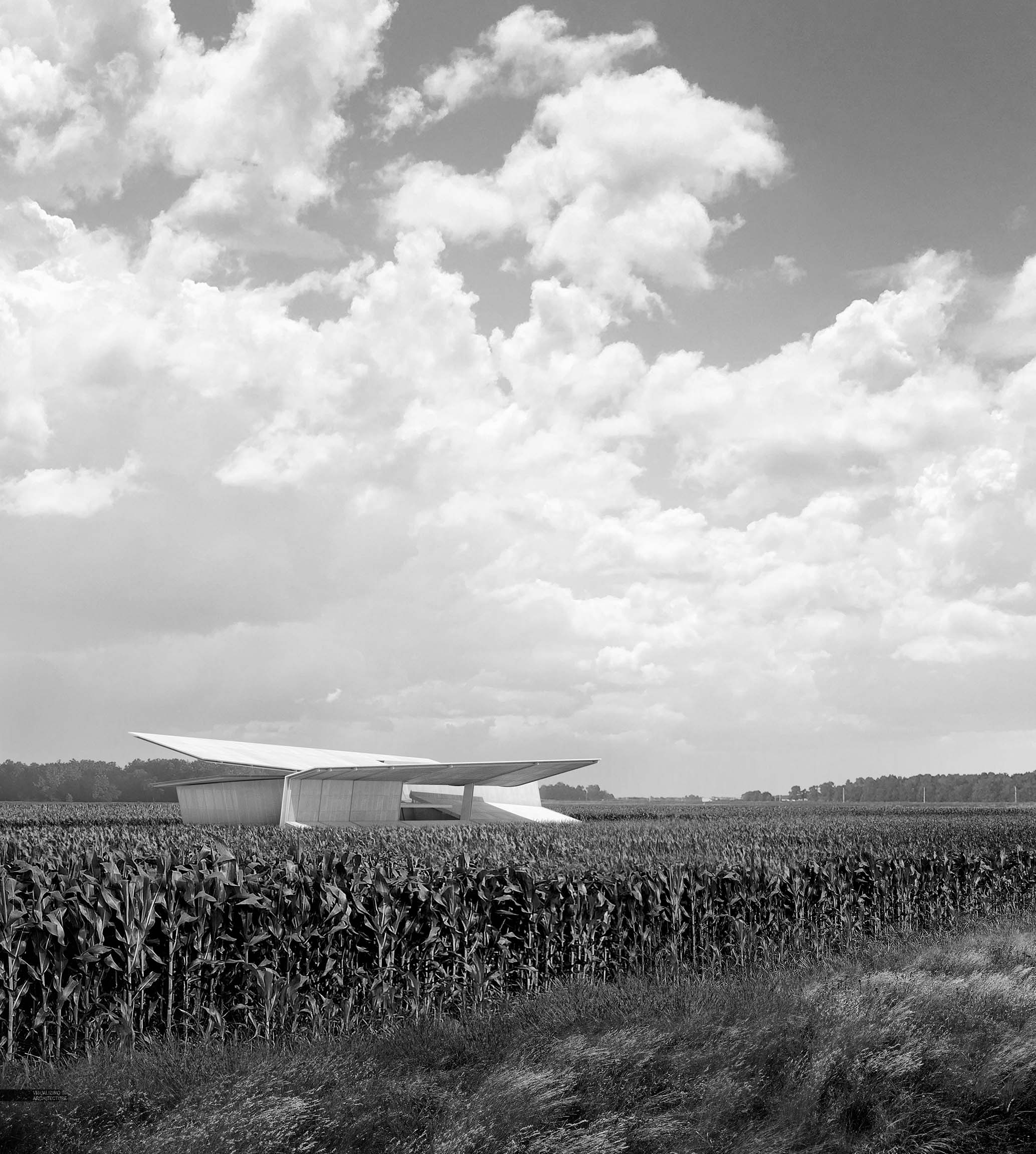
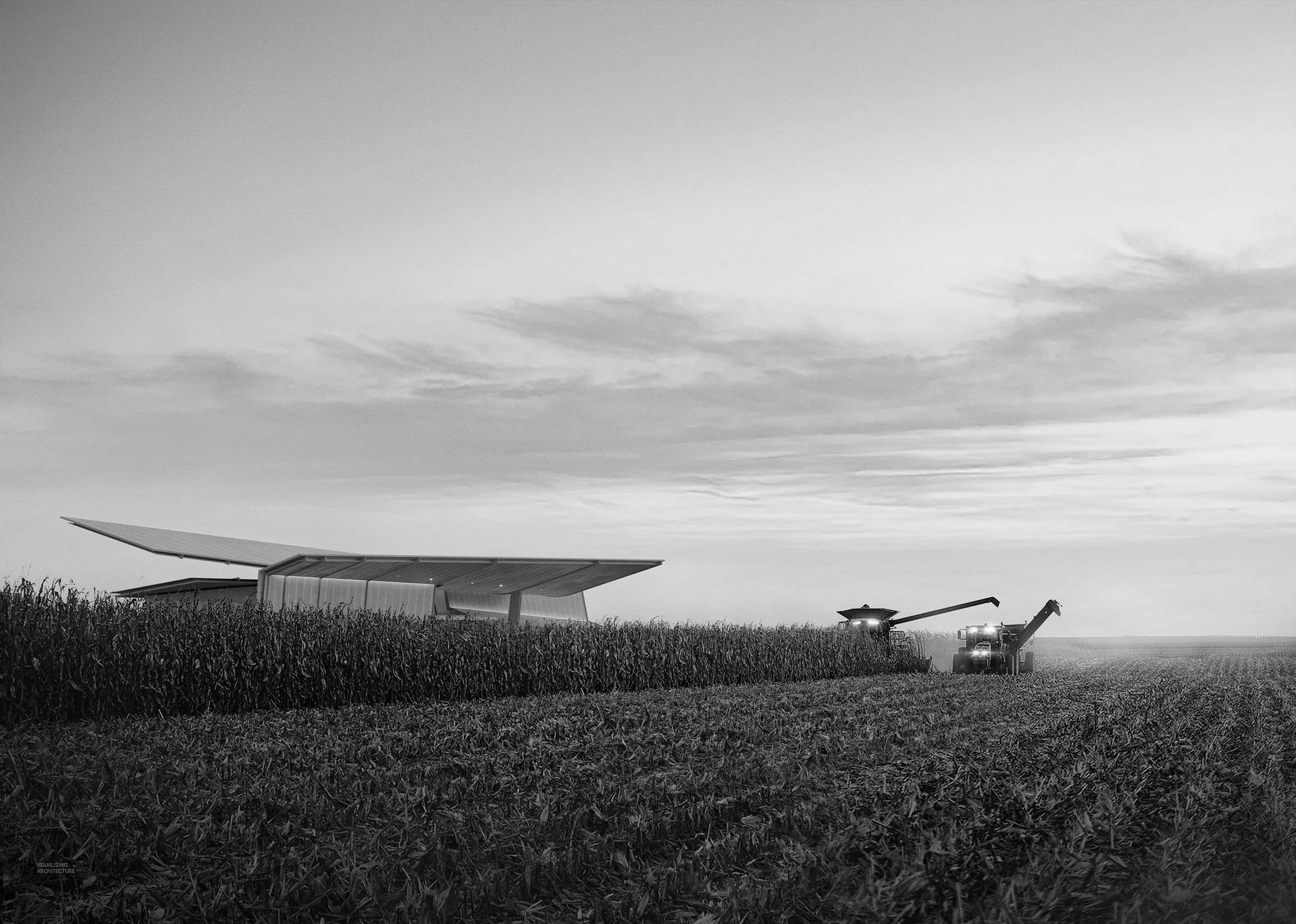
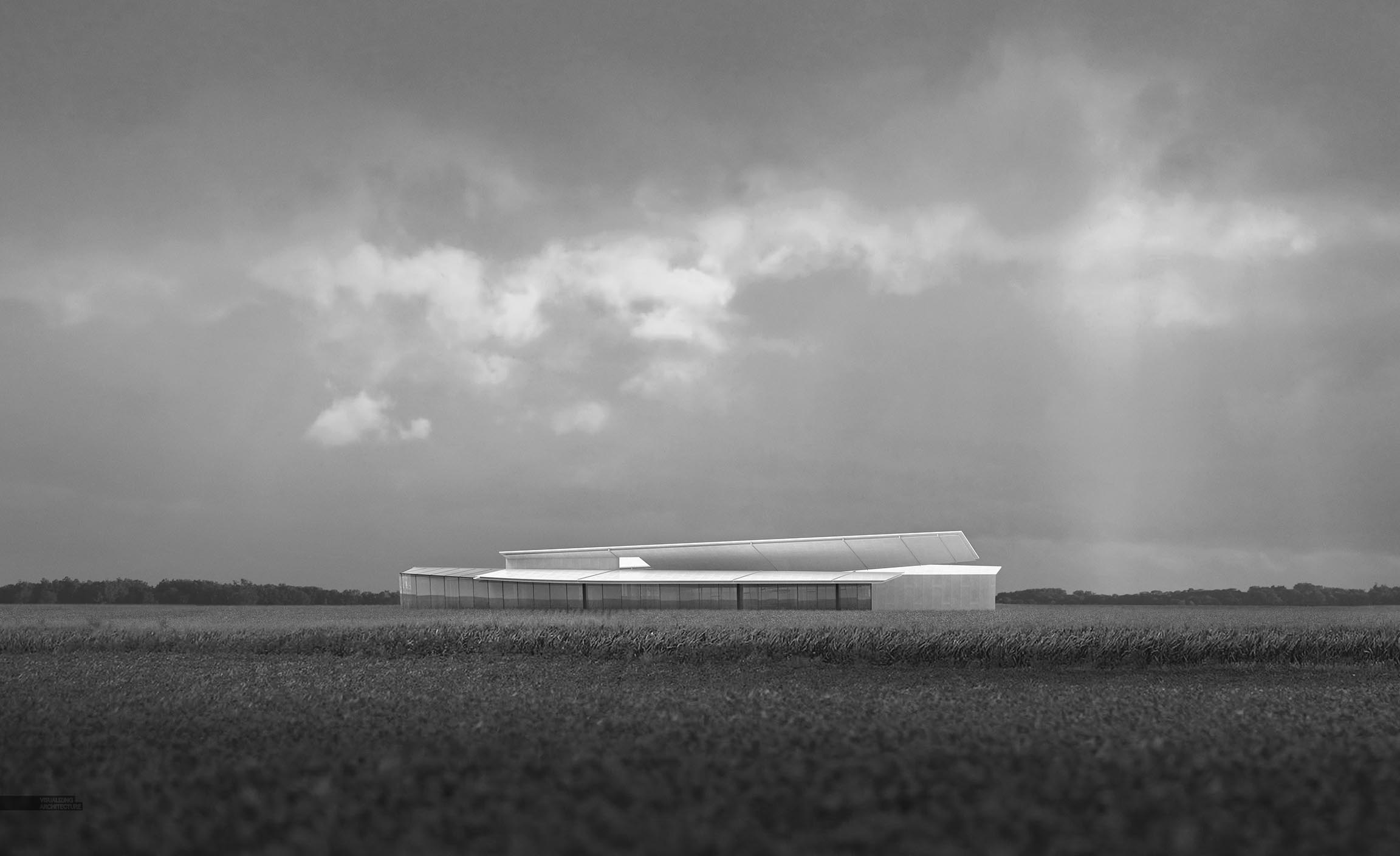
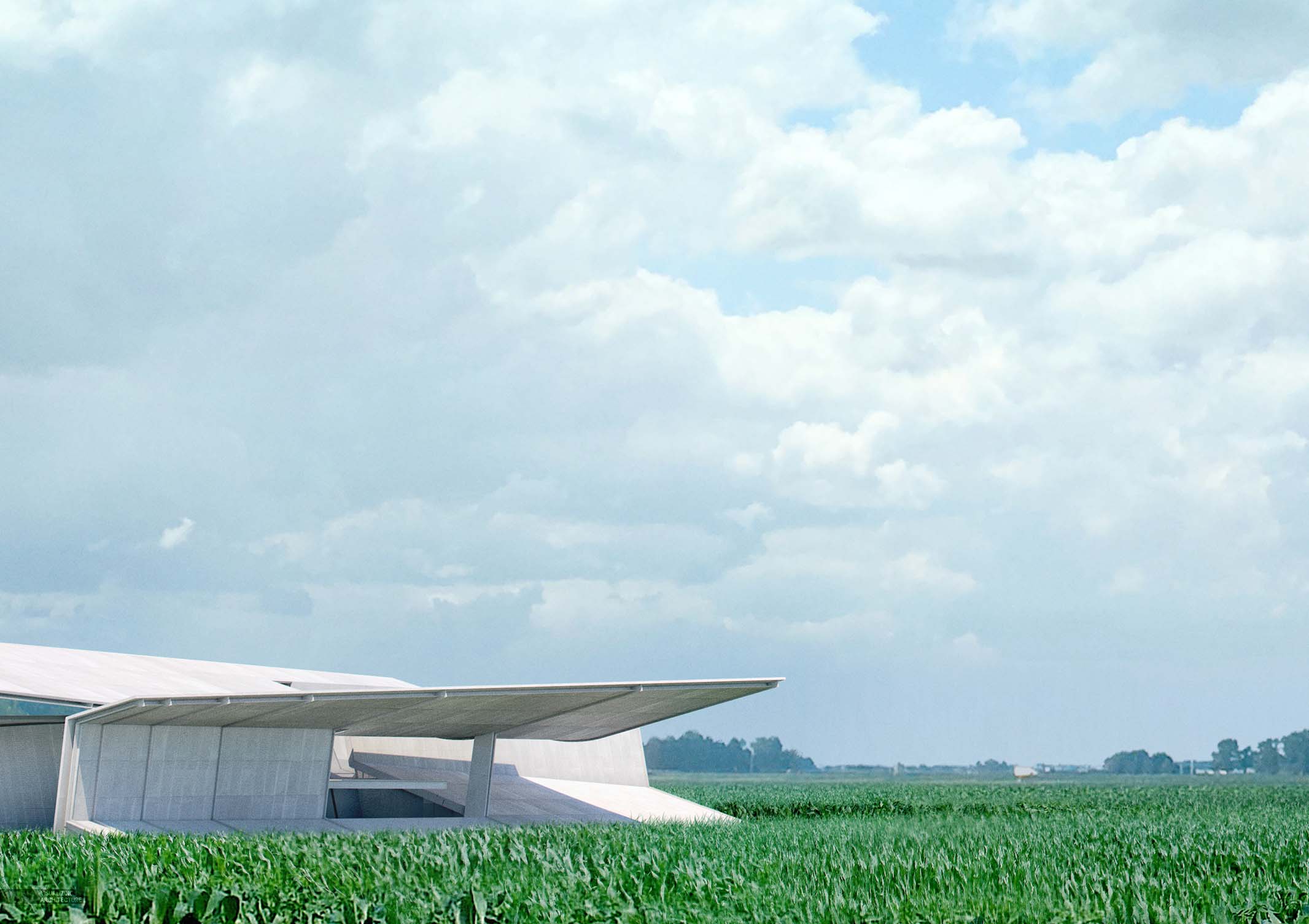
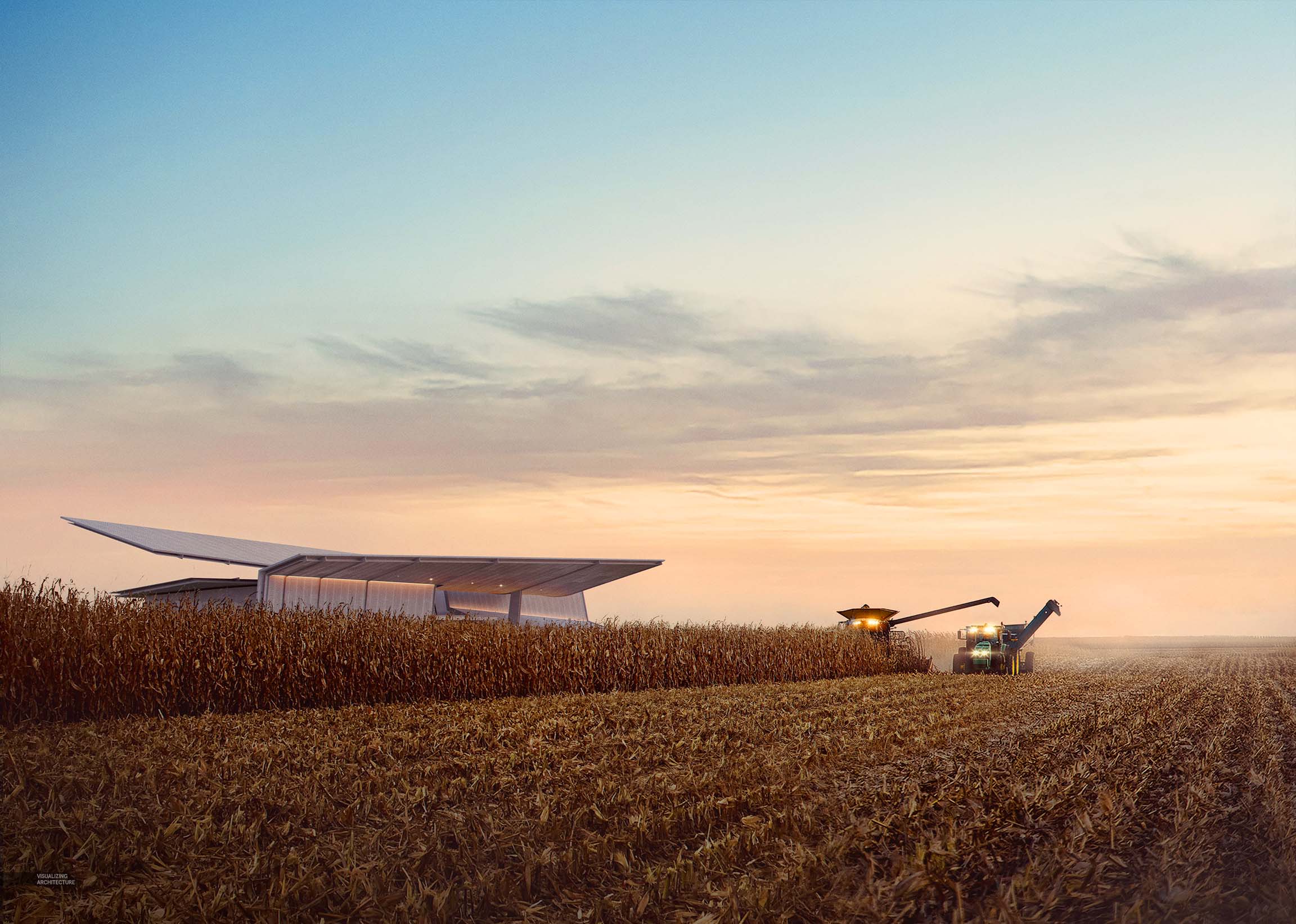
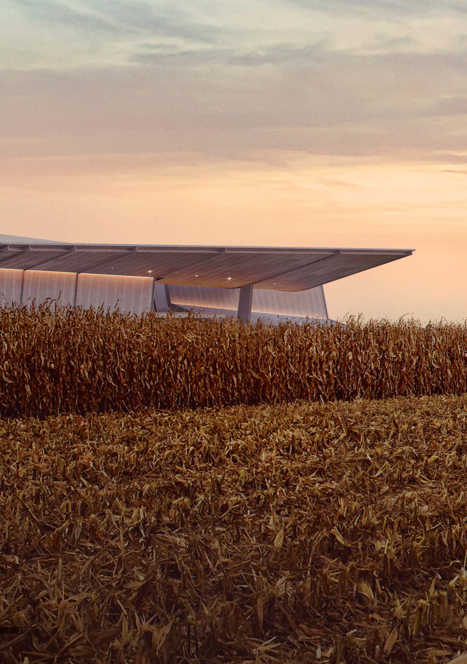
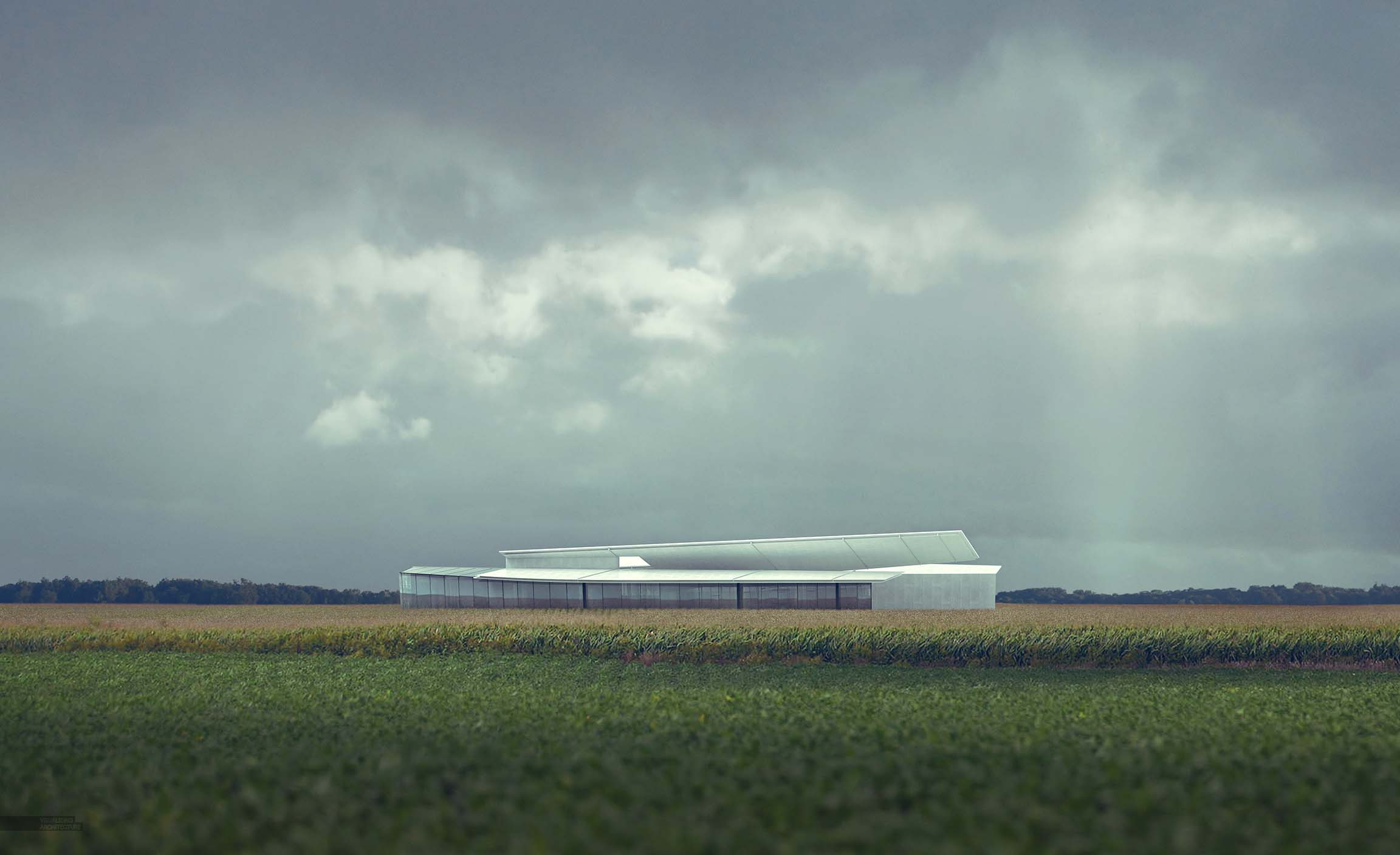
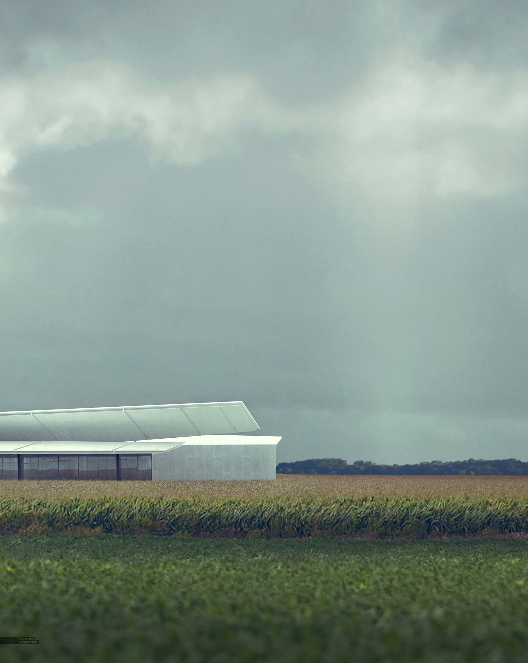
This series of illustrations were initially meant to be a quick study of the contextual environment. However, I ended up really pouring a lot of time into them, constantly reworking the images, changing views, changing lighting, reworking the images again, etc. Additionally, I continued to develop the design and to be honest, I still don’t think it is there yet.
Part of the reason for the constant changes to the illustrations was that I had some ideas in my head of the sort of environment that I wanted to portray. After visiting Ohio and spending some time driving through the backroads and seeing the landscape, there were some specific feelings and atmosphere that I wanted to get right. I struggled to strike the right balance and kept tweaking and editing to match what I saw in my head. I also wanted to represent the changing landscape via the farming season and how the planting, growing, and harvesting of the crops alter how the site is experienced. What started out as six images ended up as three as I abandoned some and ran out of time with others. The narrative of the farming season is somewhat lost now, though I may revisit this idea later.
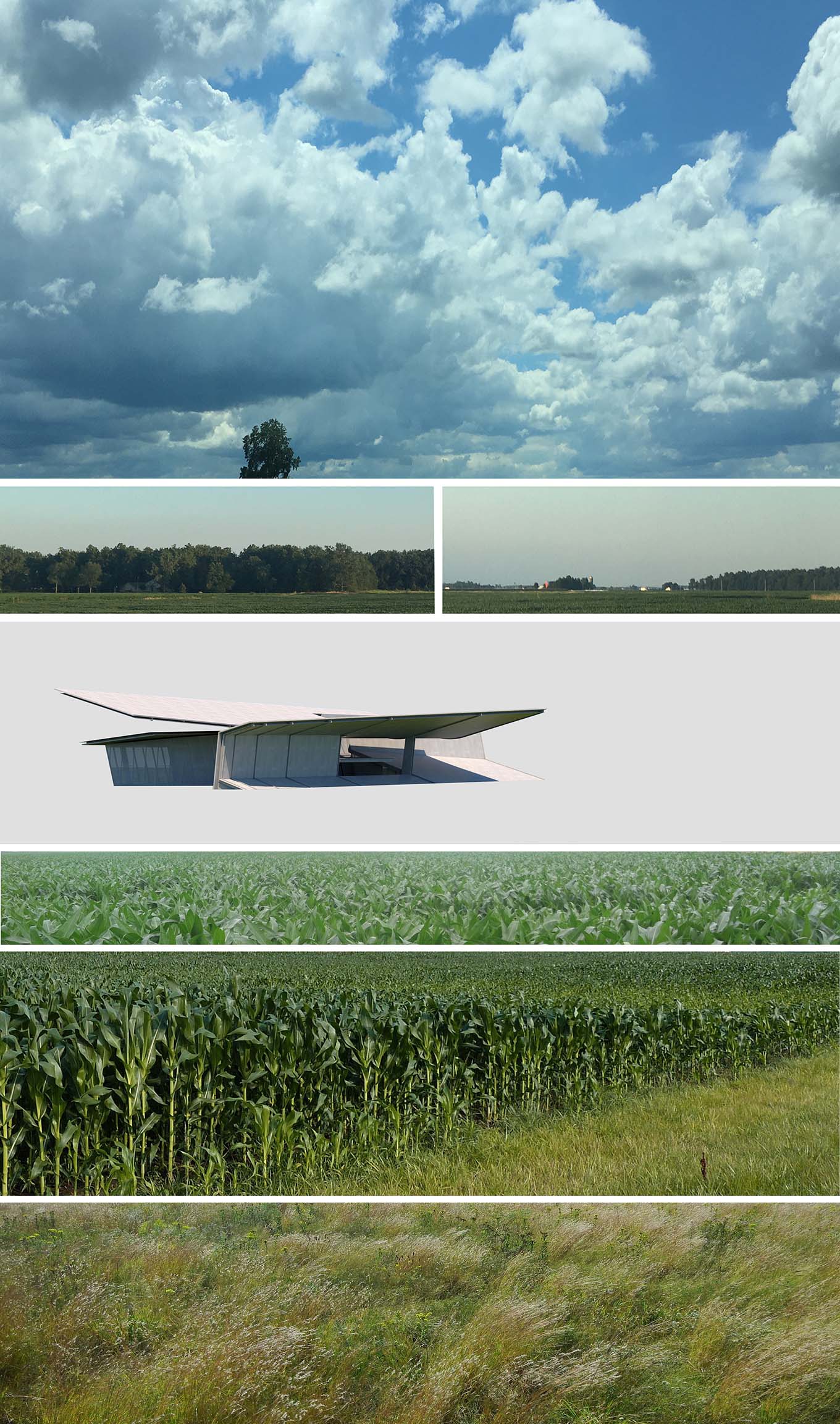
Each of the three illustrations contain very little 3d and instead relied heavily on large textures of each of the image landscape elements. Generally, it doesn’t really take long to stitch all of the components together. The secret is finding the elements at a high enough resolution or with the correct lighting and perspective. Once the textures are compiled, it is all about toning. I have come to realize that careful toning of each component plays a significant role in getting the image as a whole to feel cohesive and natural. The more I create images, the larger percentage of my time is spent adjusting color, lighting, and levels of each individual texture. In the past, I would rely on general effects and atmosphere to hide the discontinuity of the textures but this approach leads to unnatural and “Photoshopped” looking images.
Below are the final images followed by the Black and White versions.
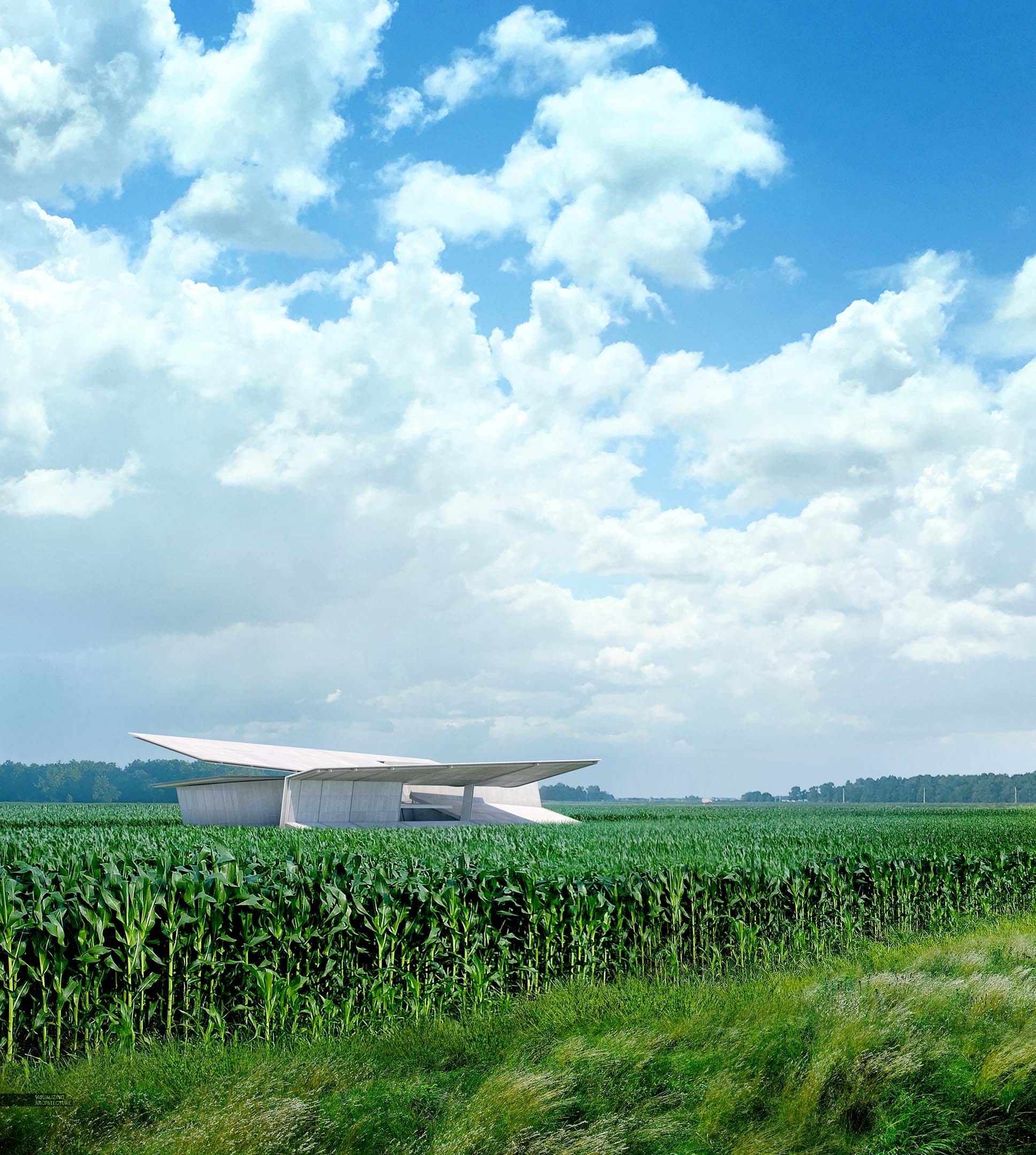
Black and White
