SOM’s green terra-cotta facade for Disney’s New York headquarters takes shape
Now under construction, Skidmore, Owings & Merrill’s (SOM) 4 Hudson Square seems poised to become a new destination in Hudson Square, an emerging neighborhood west of Soho in Manhattan. As the forthcoming headquarters for Disney in New York, the building is the first purpose-built location for the company in the city in decades. The neighborhood formerly supported New York’s printing industry, but today it primarily consists of buildings with massive floorplates, many of which have been transformed into offices and arts spaces. Occupying the block bounded by Vandam, Varick, Spring, and Hudson Streets, SOM’s design reflects the area’s zoning and building code requirements in a classic Manhattan fashion while incorporating a more modern facade.
4 Hudson Square is expected to wrap construction in 2024. The podium of Disney’s new home rises ten stories before sprouting two terra-cotta–clad towers that extend upwards an additional nine stories, topping out at 320 feet above the street. The building will host offices, production, newsrooms, executive spaces, a screening room, and a pair of outdoor terraces. Live production studios are to be located below-grade in an environment that is isolated from exterior sounds and vibrations. Once complete, the complex’s 1.2 million square feet of space will become, as SOM partner Colin Koop described to AN, a “vertical city of all things Disney.”
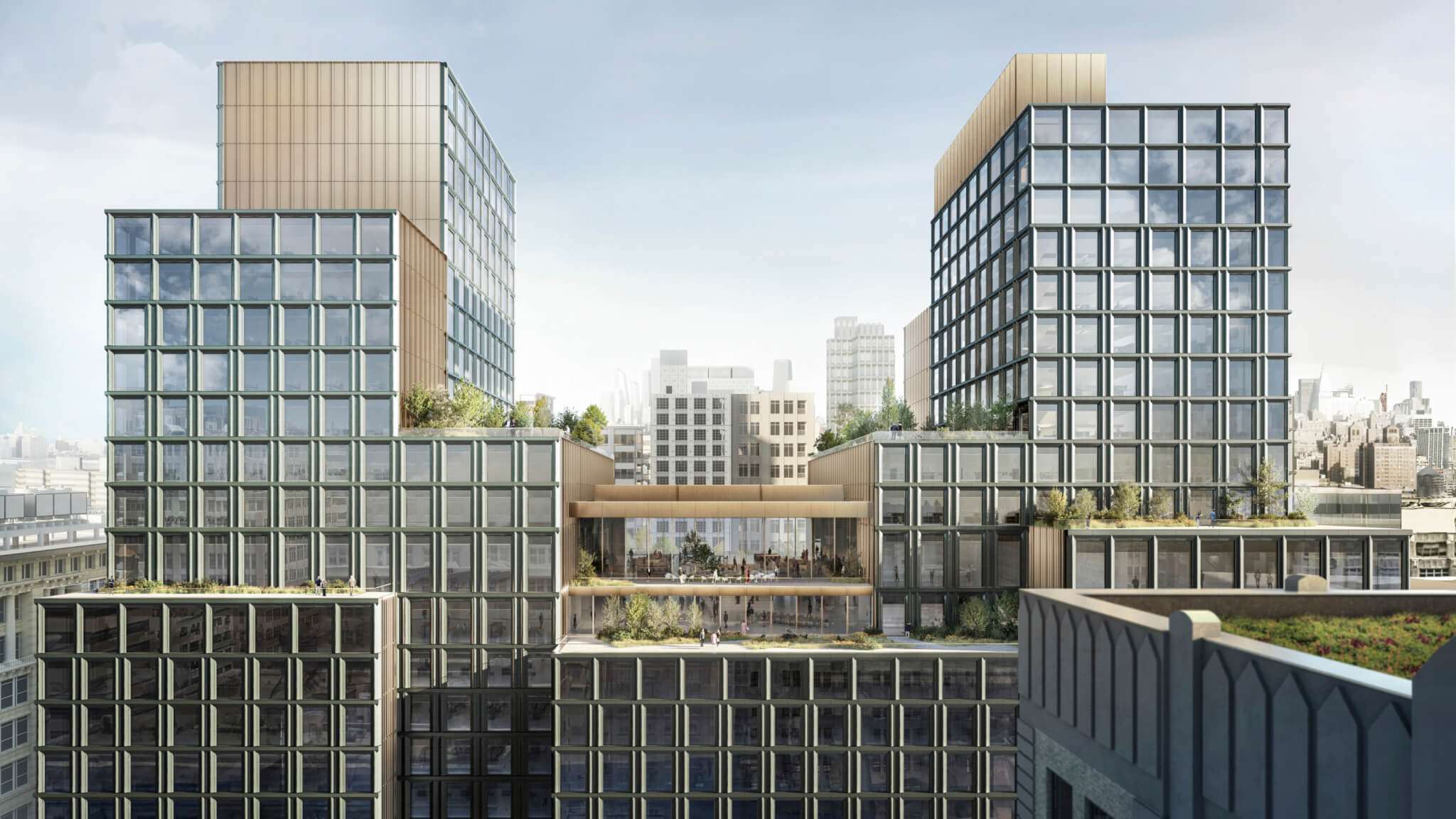
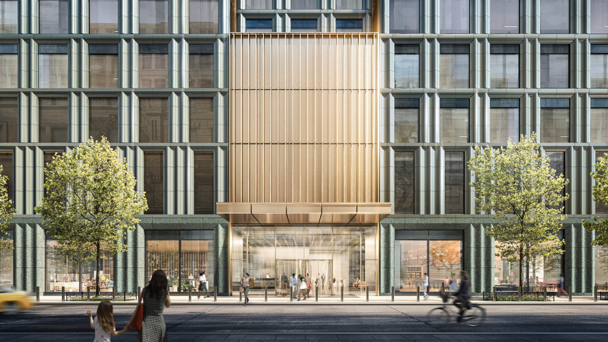
Koop said that Disney “wanted to let the public into the building” with an active ground floor, and cognizant of its mass, seeks to “stand out by fitting in.” The ground floor contains space for food and other public-facing amenities, and in order to “fit in,” the design team closely surveyed the surrounding historic buildings. Koop described many of the buildings as “muscular,” noting that there was an extensive amount of unornamented masonry, and that most buildings have punched windows. Facades and massing are defined by flat faces that set back in the shape of a wedding cake, reflective of the setback requirements that have shaped taller structures since 1916. The decision to extend the two towers past the tenth floor was enabled by zoning, with taller heights allowed along avenues. Koop said that while the zoning initially seemed very restrictive, it “unlocked a lot of creativity,” as it gave the design team a set of parameters within which to experiment.
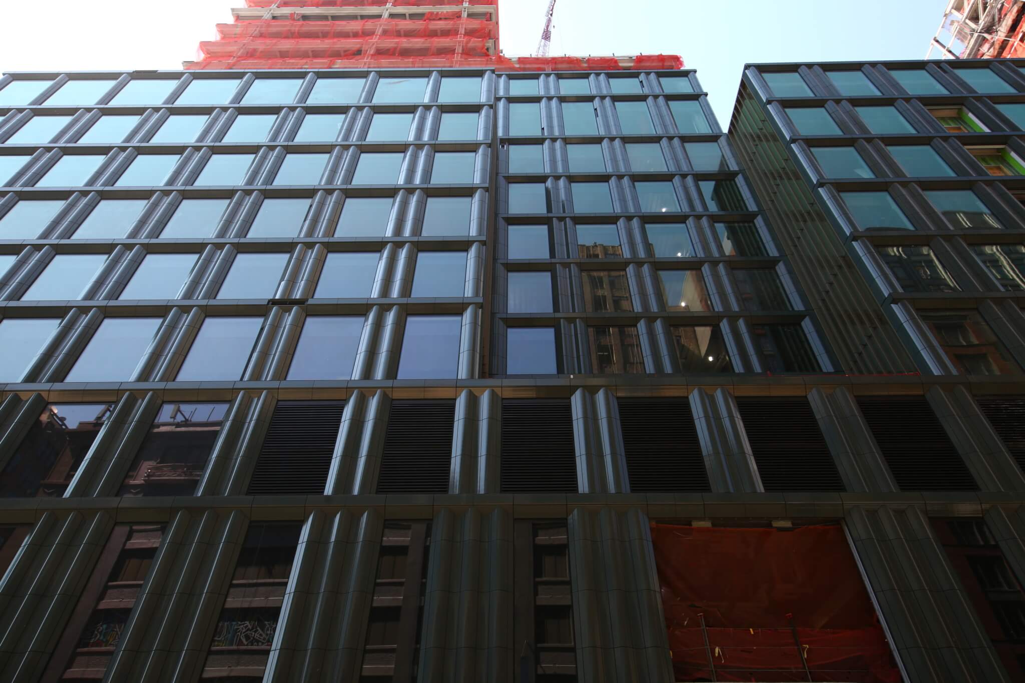
The design team wanted a more “opaque” building, again reflecting Disney’s intent to establish a more public-facing anchor to the area, but not one that was all glass, like the newer towers west of it. Terra-cotta offered a solution in that it allowed significant room for windows and ornamentation that was materially consistent with historic buildings and also in line with the project’s environmental performance goals. The double- and triple-columned terra-cotta panels will give the building a sense of scale that can be lost on the all-glass facades it stands in contrast with, and will establish a visual continuity of squared windows that travels from the second floor to the top of the towers.
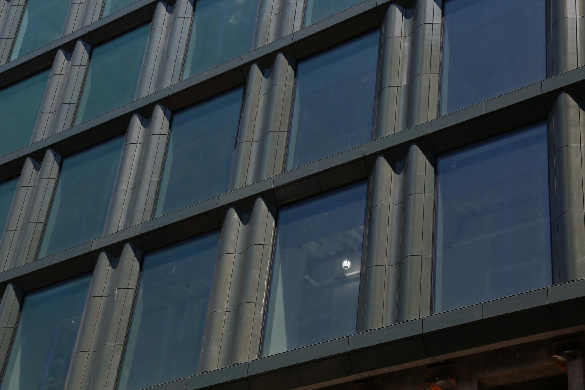
Koop said that green color was chosen for the terra-cotta early in the design process, to maintain a sense of belonging with the older terra-cotta facades in the neighborhood. The design team examined “hundreds” of samples of green, experimenting with variances in color and transparency. The final choice, manufactured by NBK, is darker, richer, and less saturated than the terra-cotta found on nearby facades. The design team elected for a matte finish rather than glossy, a texture that encapsulated the modernized aesthetic of the printmaking district’s history that they were seeking to echo. Koop noted that the color of the glaze shifts in the sunlight, making for a more dynamic facade than the nearby masonry ones.
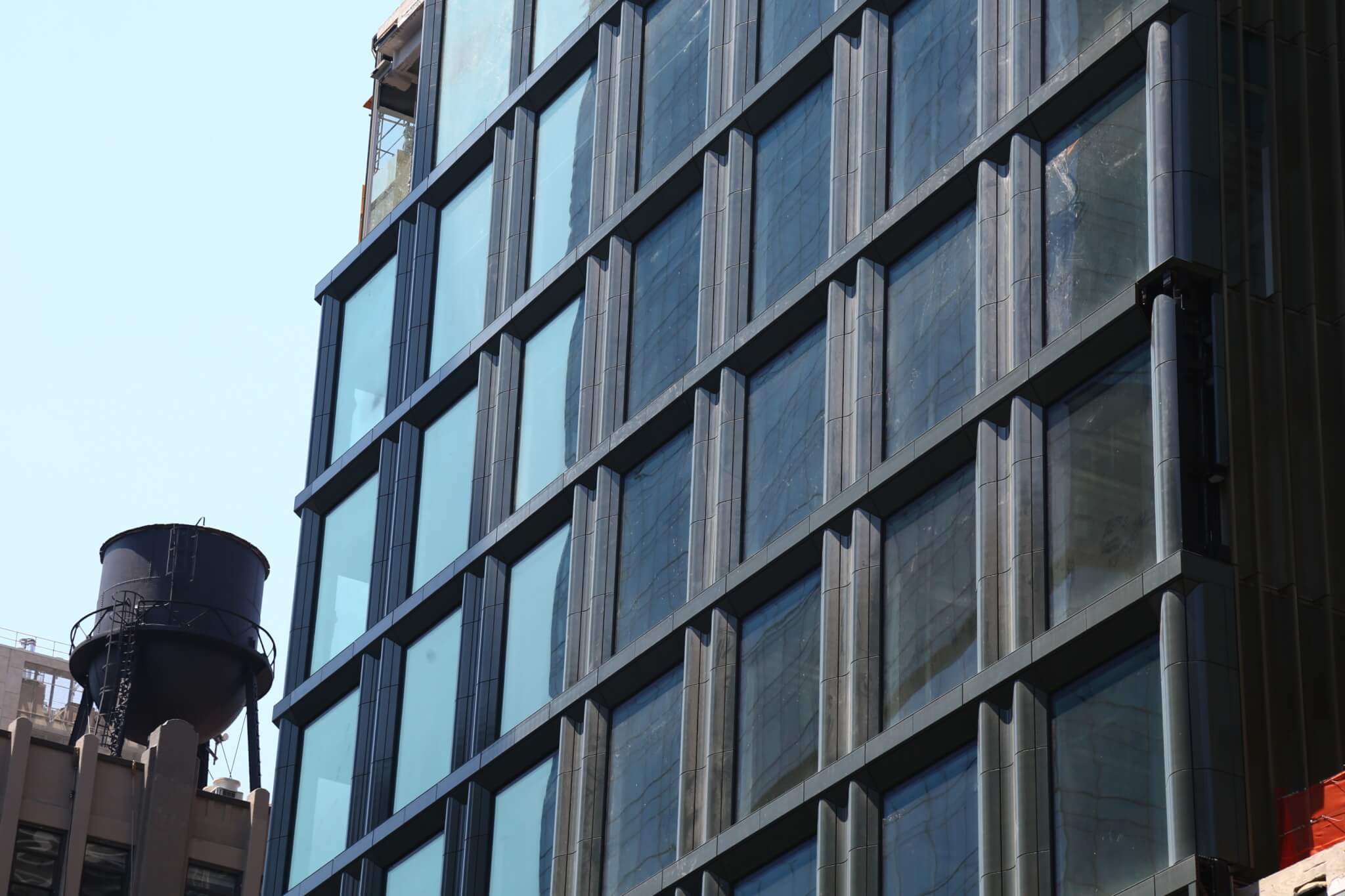
Apart from the local context, terra-cotta has taken off as a facade product for many firms in the city. SOM has previously used the material on its 28&7, an office building in Chelsea, and Park Loggia, a 32-story tower on the Upper West Side. As for the benefits of choosing terra-cotta as a facade material, Koop told AN that many manufacturers have production lines that can produce unitized facades with the material, and that even with high quality products, prices are lower as there are better supply chains. The shift away from double-glazed glass facades also has environmental benefits, especially in terms of energy use and heat gain, with Koop mentioning that the design team had New York City’s new code requirements in mind when designing 4 Hudson Square. Although the project was grandfathered into old code regulations due to its initial approval date, Koops said that they wanted to design a “sustainable emblem,” noting that “a tremendous amount of thought was put into that.” The building runs entirely on electricity, and is targeting LEED Platinum certification.
