SHAU Models Commercial Center DipoMuria After Urban Village Typology
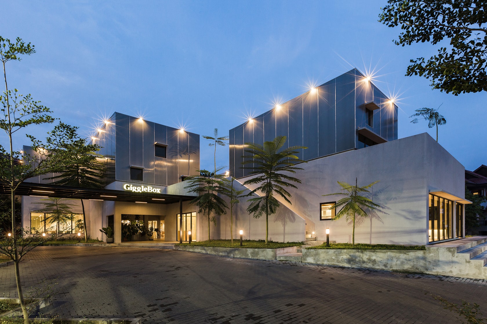
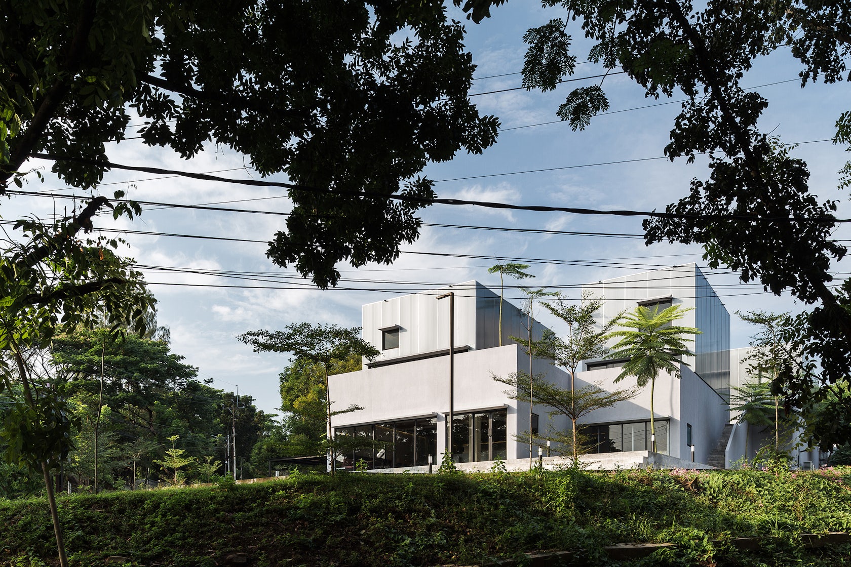
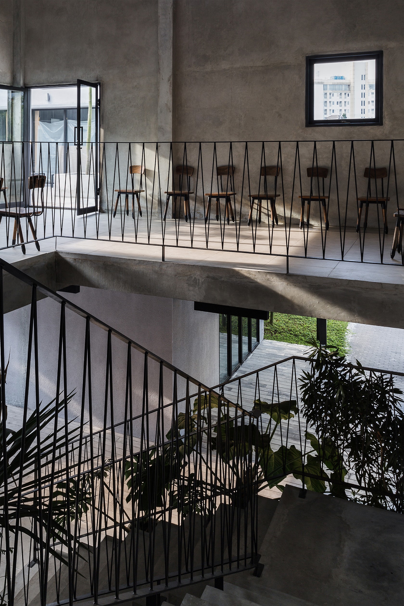
DipoMuria commercial center in Semarang, Central Java, Indonesia, hosts a photo studio, restaurant, café and retail shop and is modeled after an urban village typology. On one hand this makes the design fit better into the low rise and small-scale residential neighborhood and on the other hand also gives the possibility to play with the volumes and provide more experienceable sequences of in-between spaces to explore and hang out.
Architizer chatted with Florian Heinzelmann & Daliana Suryawinata at SHAU to learn more about this project.
Architizer: Please summarize the project brief and creative vision behind your project.
Florian Heinzelmann & Daliana Suryawinata: We were commissioned by a well-known family photo studio from Bandung, Indonesia to design a branch in the city of Semarang. Usually, a photo studio offers an indoor experience. We wanted to enhance the experience for the customers. Rather than only spending time inside we grouped the different functions in smaller volumes where people can walk around the in between spaces, go up and down and explore. With that the whole ensemble can also function as a backdrop for photo shootings and it further relates itself with the smaller volumes to the scale of the neighbourhood.

© andreaswidi
What inspired the initial concept for your design?
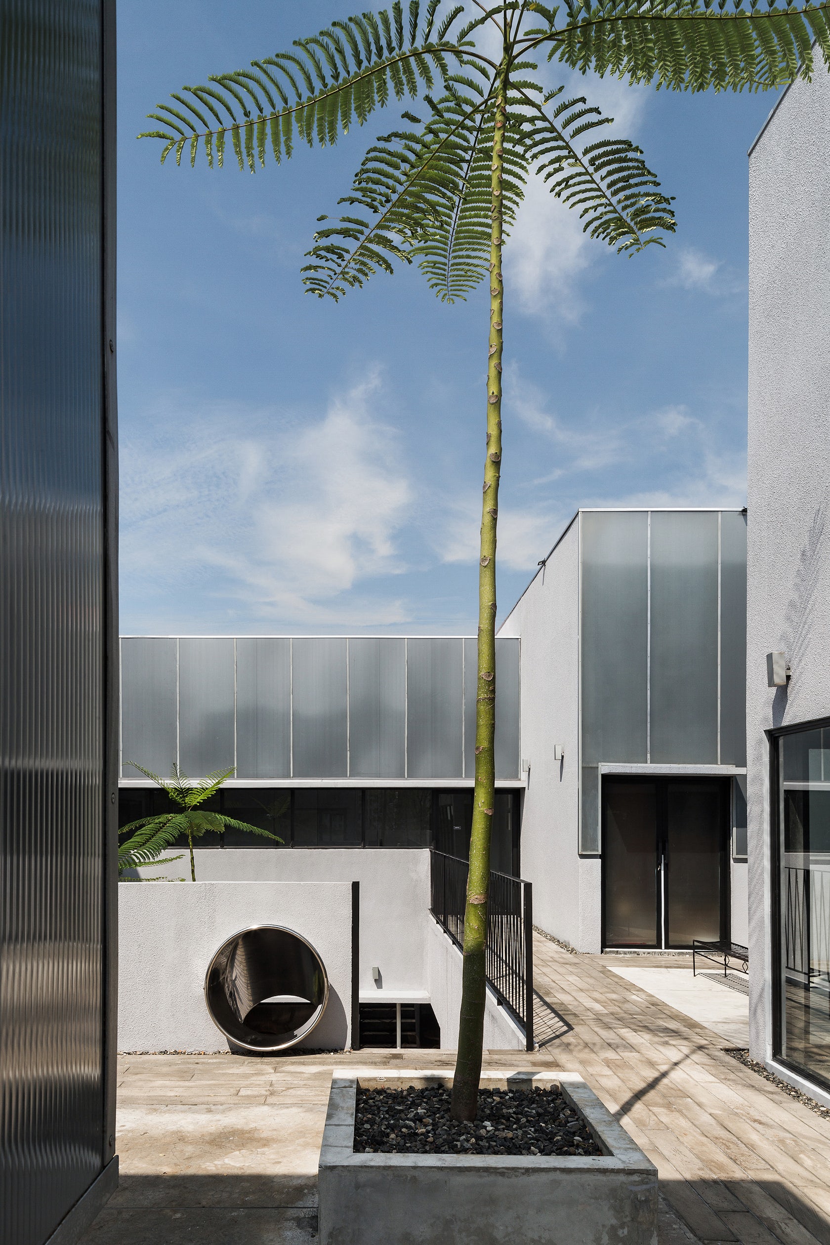
We went often hiking on the weekends and came across several kampungs (villages) in the hills around Bandung. Kampungs are present all over Indonesia in rural and urban settings. They are often composed of plastered brick structures. Smaller volumes which offer a great diversity of spatial experiences with narrow alleys, crooked stairs and unexpected little squares hidden inside the kampung fabric. We wanted to recreate such an experience and started to play with volumes around a central courtyard and possibly trigger visitors to explore.
© andreaswidi
What do you believe is the most unique or ‘standout’ component of the project?
Although we worked with a rather tight budget, we were able create a set of buildings which tell a different story. For that reason, we limited the material palette to plaster, concrete, and polycarbonate which we developed into a composition of simple volumes. That resulted in a project which not necessarily has a flashy design sometimes found in commercial projects but more of a minimal approach of cultural architecture.
© andreaswidi
What was the greatest design challenge you faced during the project, and how did you navigate it?
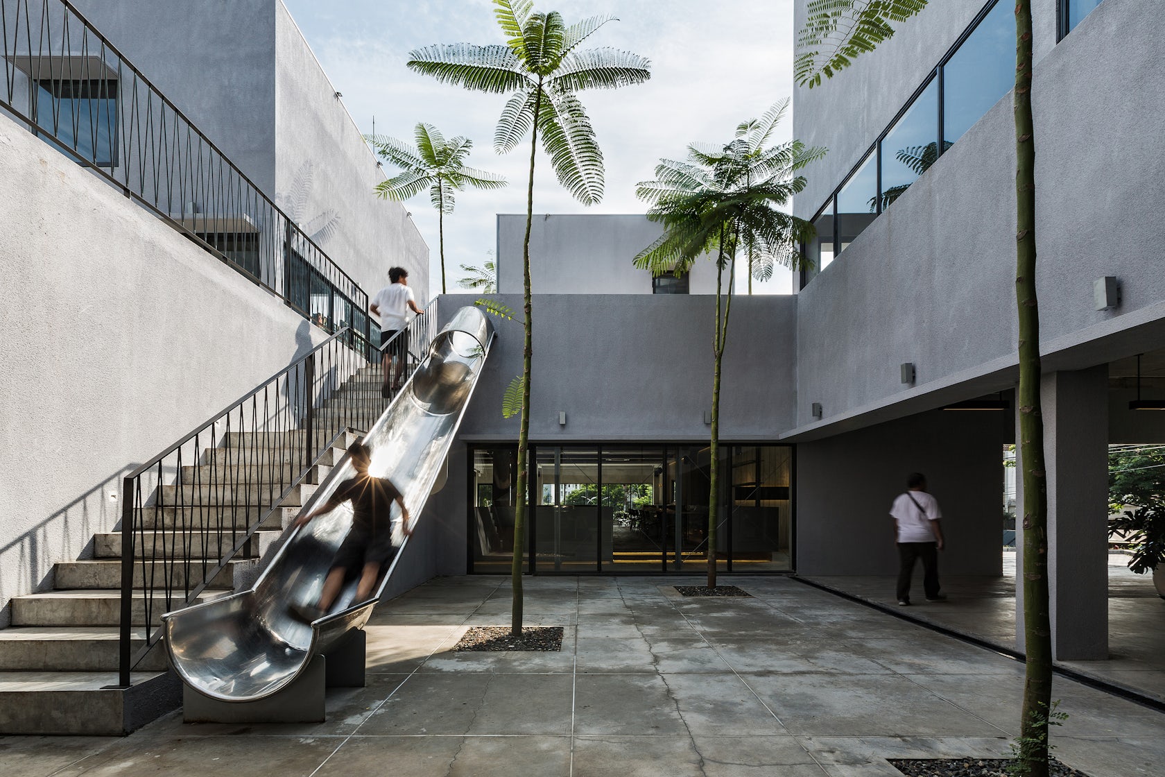
Budget was a big issue. Not that we were over budget at all but there was often a request to be cheaper. Certain elements like the two exterior stairs were scrutinized several times. We and our team had to do a lot of convincing so that the stairs remained. The extra budget requests also pressured us and the team and it costed additional time to overcome those challenges.
© andreaswidi
How did the context of your project — environmental, social or cultural — influence your design?
We modeled the project in reference to local kampung (village) typology. We also paid attention to sun angles to minimize solar heat gains in a tropical context. The exposed larger openings of the building are oriented towards North and South. Those can be shaded with overhangs due to high sun altitude around noon and direct light won’t penetrate rooms that deep. East and especially West façade openings are kept to a minimum unless they were obstructed by the other volumes as is the case on the ground floor towards the courtyard.
What drove the selection of materials used in the project?
Construction budget was one aspect. Another one was how to create large solid like volumes. Here we chose two different materials. The upper outer facades are made from polycarbonate with a smooth surface reflecting the sky. The lower part is coated in rough plaster, being more grounded but also being able to cover possible imprecisions.
© andreaswidi
What is your favorite detail in the project and why?
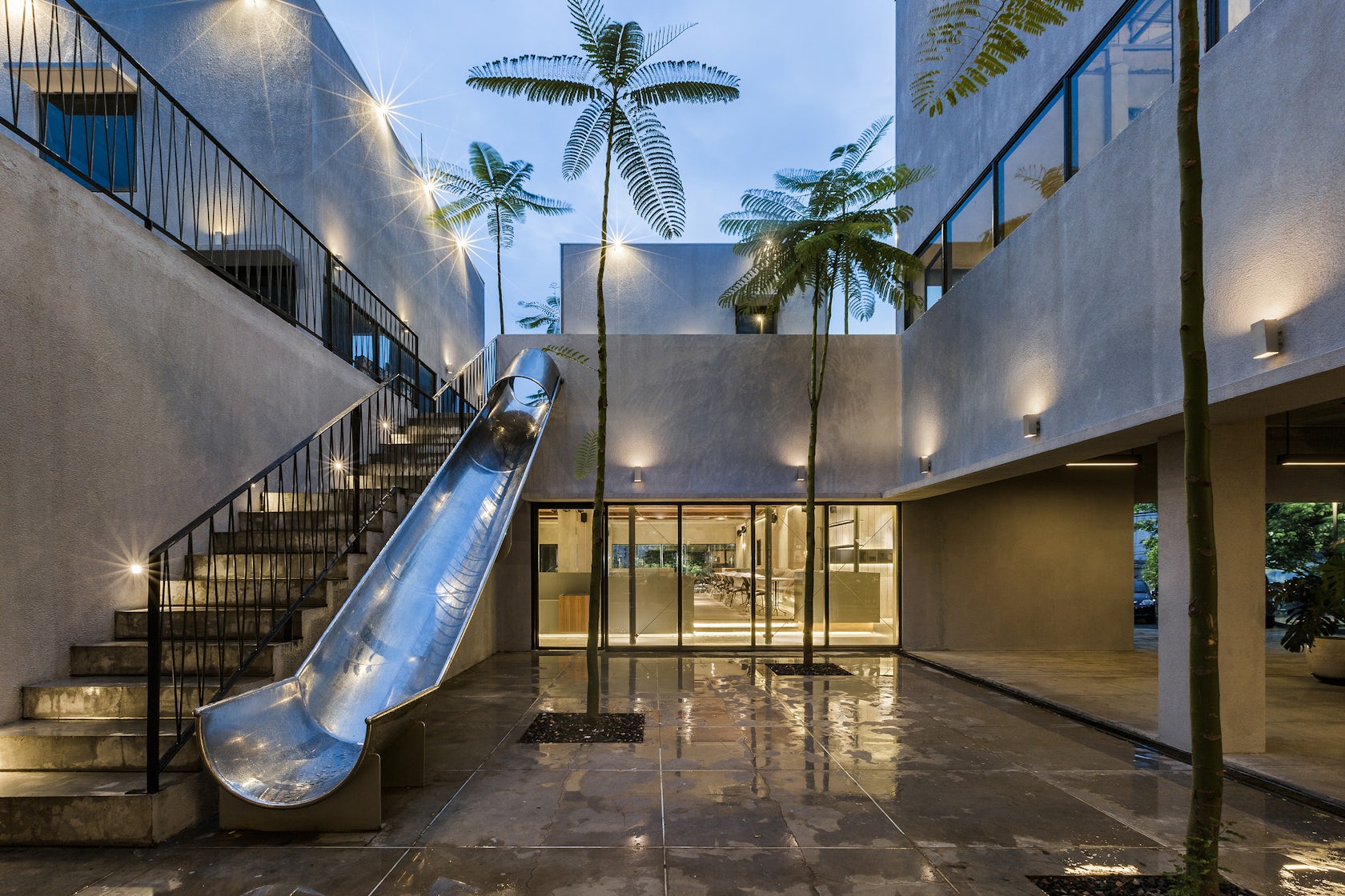
We love the slide. This playful element provides children with a good time, while they may have to wait for a photo session, or their parents have a coffee or tea. It lures them away from the screens. It also adds value to the photo studio because they can use the slide as backdrop or for action shots. We think it is nicely integrated with the hole in the upper balustrade next to the stairs leading into the central courtyard of the ensemble.
© andreaswidi
How important was sustainability as a design criteria as you worked on this project?
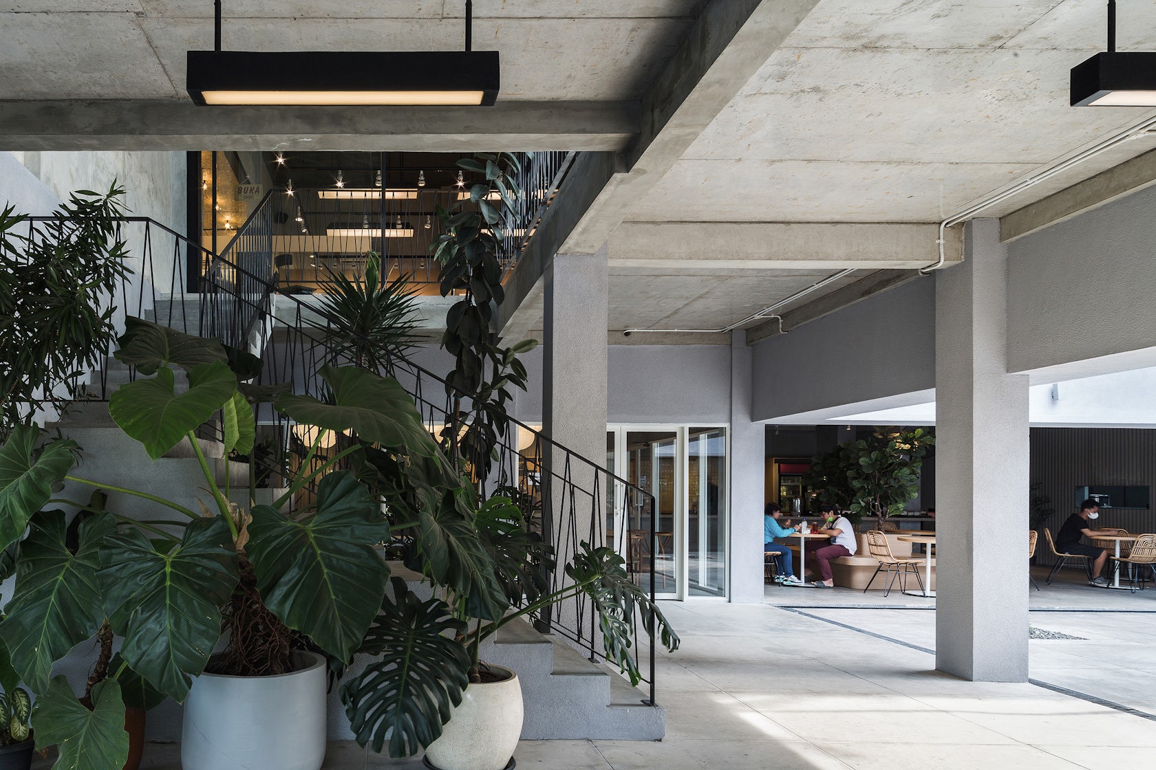
Operational energy usage was of concern by orienting the openings and placing the building volumes in such a way to reduce solar heat gains in a tropical climate. With that some of the air-conditioned spaces receive less solar heat and do not need to run all the time. Semi outdoor spaces for the café are roofed and shaded and therefore provide a pleasant climate which can be enhanced with the usage of fans in case needed.
How do you believe this project represents you or your firm as a whole?
We were doing a lot of public space projects in Indonesia as well as our series of community project micro-libraries. Here we always want to give people the opportunity to learn, discover and experience. Play is also an important element for placemaking, which is providing the users with a great experience and meaningful time together with their children. We think we managed to bring all these elements into this project too.
© andreaswidi
© andreaswidi
Credits:
SHAU Indonesia: Florian Heinzelmann, Daliana Suryawinata with Rizki M. Supratman, Ignatius Aditya Kusuma, Ben Barukh Kurniawan, Aprilea S. Ariadi, Alfian Reza Almadjid, Miftah Adisunu N. Alui, Prisca Bicawasti B.; Photographs: Andreaswidi Contractor: ME db LabStudio/mustekeph, Kyriacon (interior); Interior Design: Willis Kusuma Architects (Byron), TSO Architects (Giggle box & Jonas); Structural Engineer: Joko Agus Catur Wibowo; MEP: ME db LabStudio/mustekeph; Signage Graphic Design: Nusae
For more information on DipoMuria, visit the in-depth project profile on Architizer.
