Scintillating Sirens: 6 Fire Stations That Light Up the Landscape
The latest edition of “Architizer: The World’s Best Architecture” — a stunning, hardbound book celebrating the most inspiring contemporary architecture from around the globe — is now available. Order your copy today.
The fusion of form and function is the crux of many architectural projects, but nowhere is it more vital than in the design of emergency service buildings. For fire stations in particular, spatial planning is crucial. Schemes must be shaped by the urgent rhythms of first responders — streamlined circulation equates to quicker dispatch.
But fire stations are also emblems of community, and this oft-overlooked typology gives scope for unexpected creativity. Famously, the first major design by the late Dame Zaha Hadid was the Vitra Fire Station in Germany. A bold, deconstructivist icon, its collision of angular lines and sloping planes capture the frenzied movement within, cementing Hadid’s indelible mark on the industry.
Continuing this legacy, architects around the world are elevating the humble fire station into magnificent monuments to motion. Discover the ways these six scintillating structures skillfully combine life-saving functionality with dynamic design.
By West-line Studio, Guizhou, China
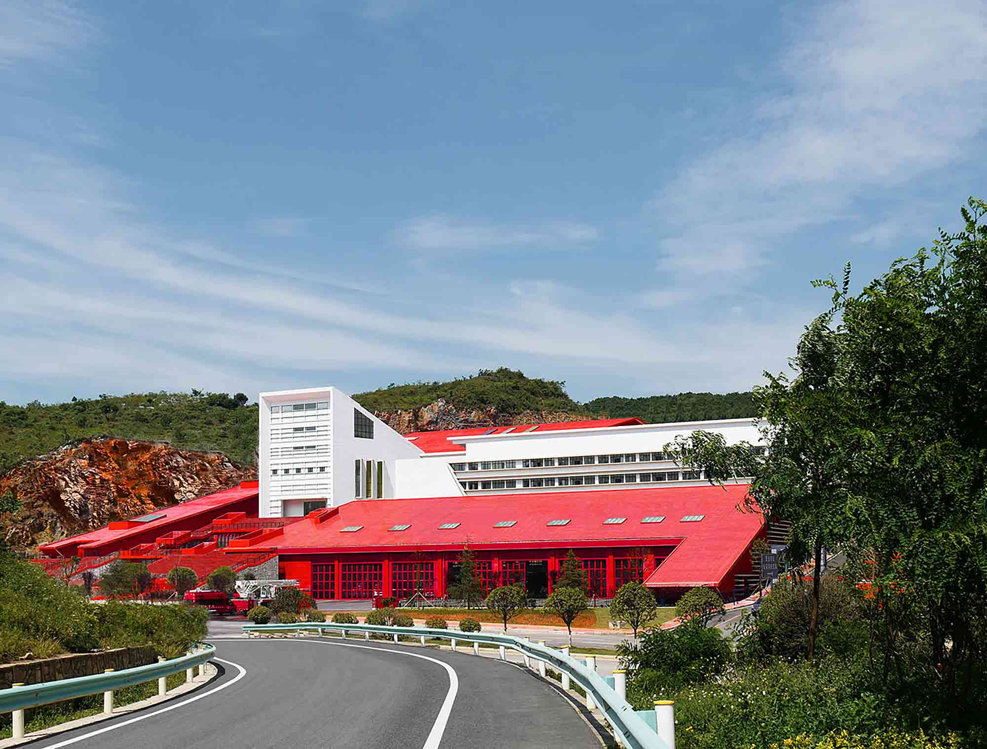
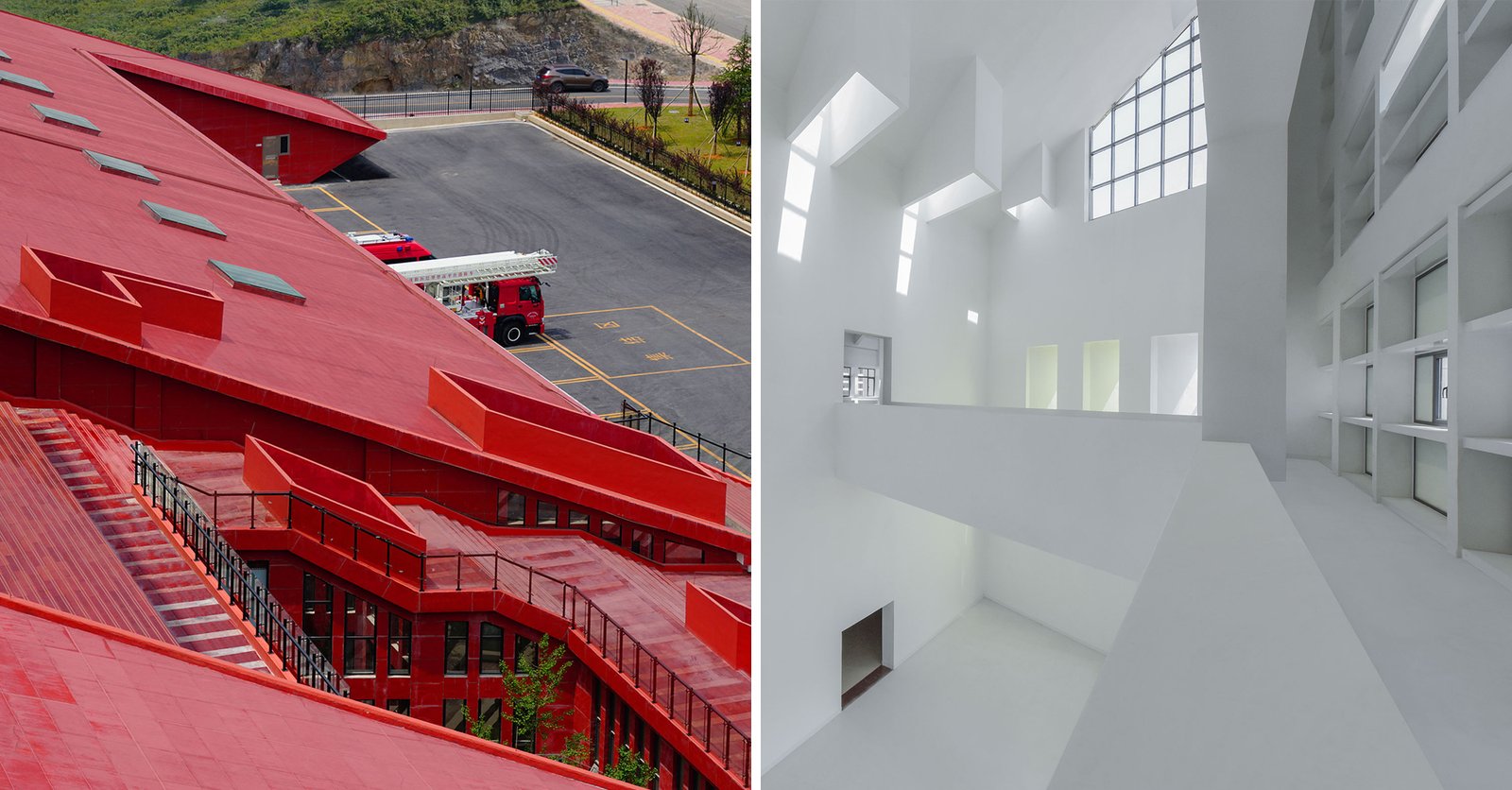
 Here, the traditional red hue of the firehouse has been translated onto a striking modern canvas. Guizhou Fire Station rises between mountainous verges bordering one of the city’s artillery roads. The trapezoidal form mirrors the organic slope of the existing topography. The building’s mass is fractured into a sprawling complex, spanning administrative offices, a vehicle garage, a training tower, numerous gyms, a swimming pool, a tennis court and enclosed courtyards.
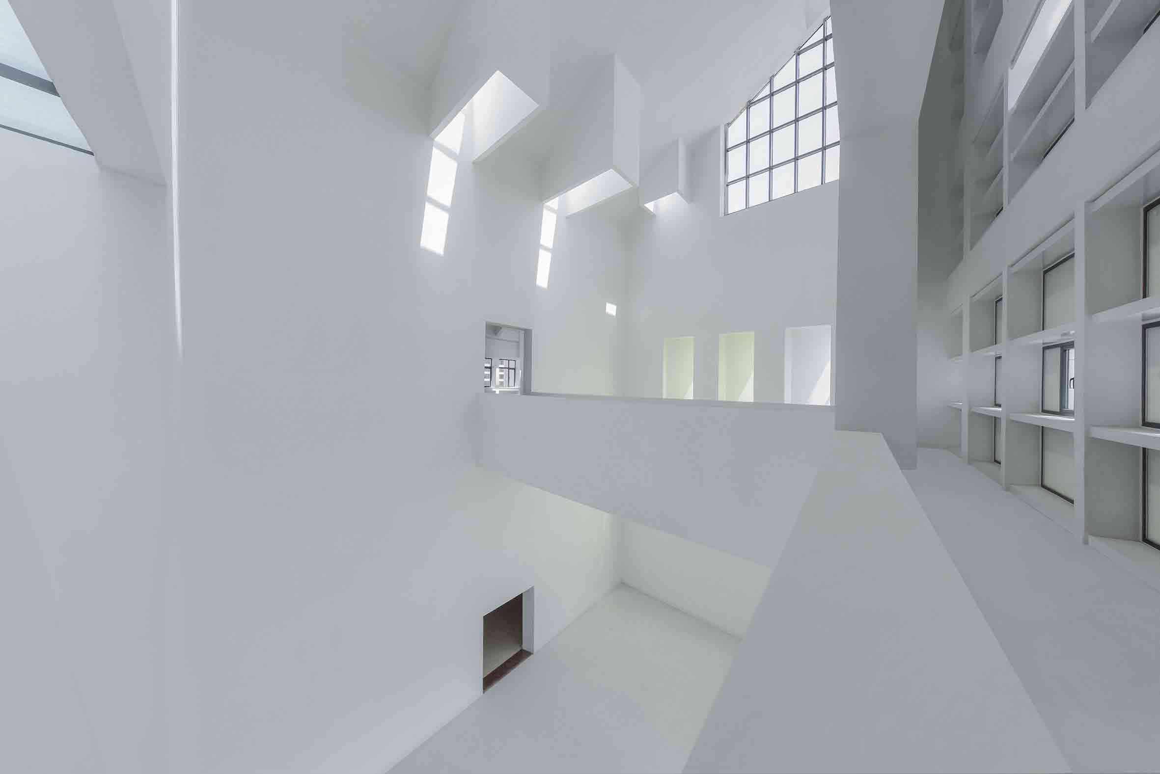
However, a contrasting white wing, protruding from the station’s red expanse like a beacon, signifies a shift in architectural tone. This section houses the ‘Honor Hall’, a cavernous double-height space framed by angular, protruding skylights that cast atmospheric shadows. The ethereal design language evokes the typology of a church — a hallowed space for hosting award ceremonies and recognizing the bravery of firefighters.
By Yong Ju Lee Architecture, Seoul, South Korea
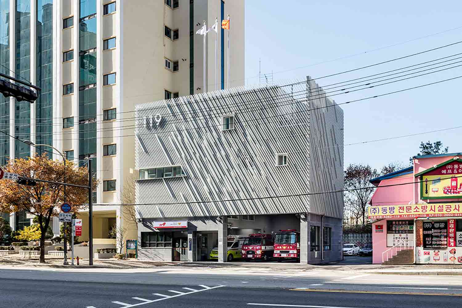
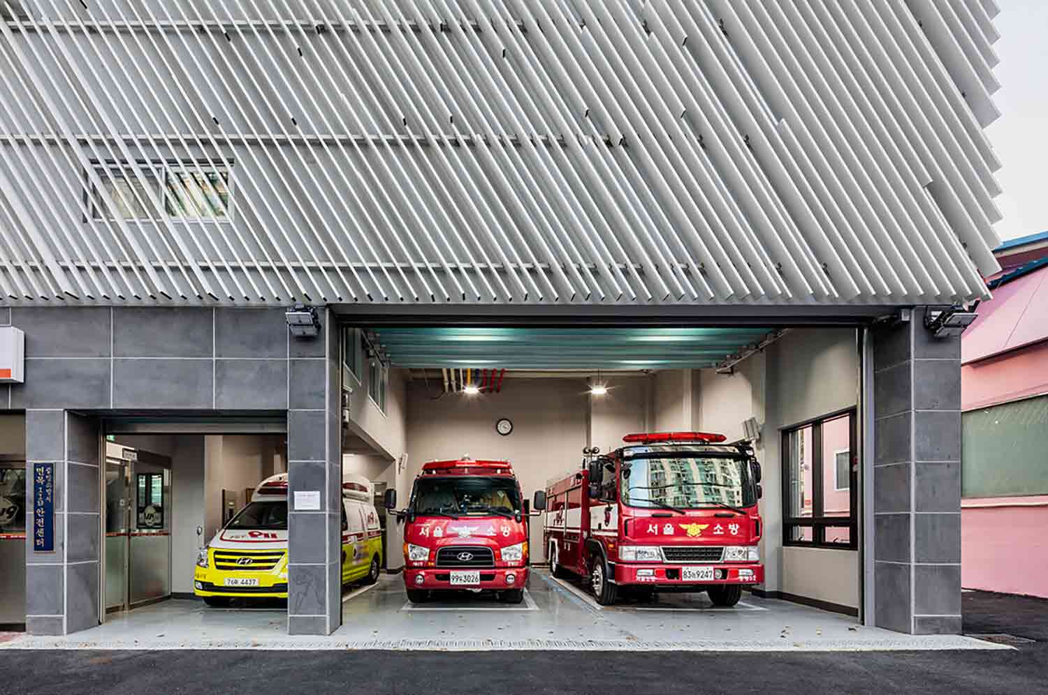 Eschewing the conventional color palette of the fire station, this spectacular structure in Seoul communicates its function through its textured façade. Diagonal light gray louvers envelop the municipal building in a tactile skin. The louvers vary in depth, rendering a raised-relief map of sorts that evokes the speed and acuity of the fire department’s deployment. A number of apertures are concealed beneath the slatted exterior, which offers shading from direct sunlight without impeding illumination.
The station replaced an older facility that was inefficient and outdated for contemporary usage. The new spatial layout prioritizes short circulation so first responders can quickly react to emergency calls. On the upper floors, operational spaces are within easy reach of mobilization areas, while bedrooms are tucked away at the back of the building at a distance from the hubbub.
By HDR, Galveston, Texas
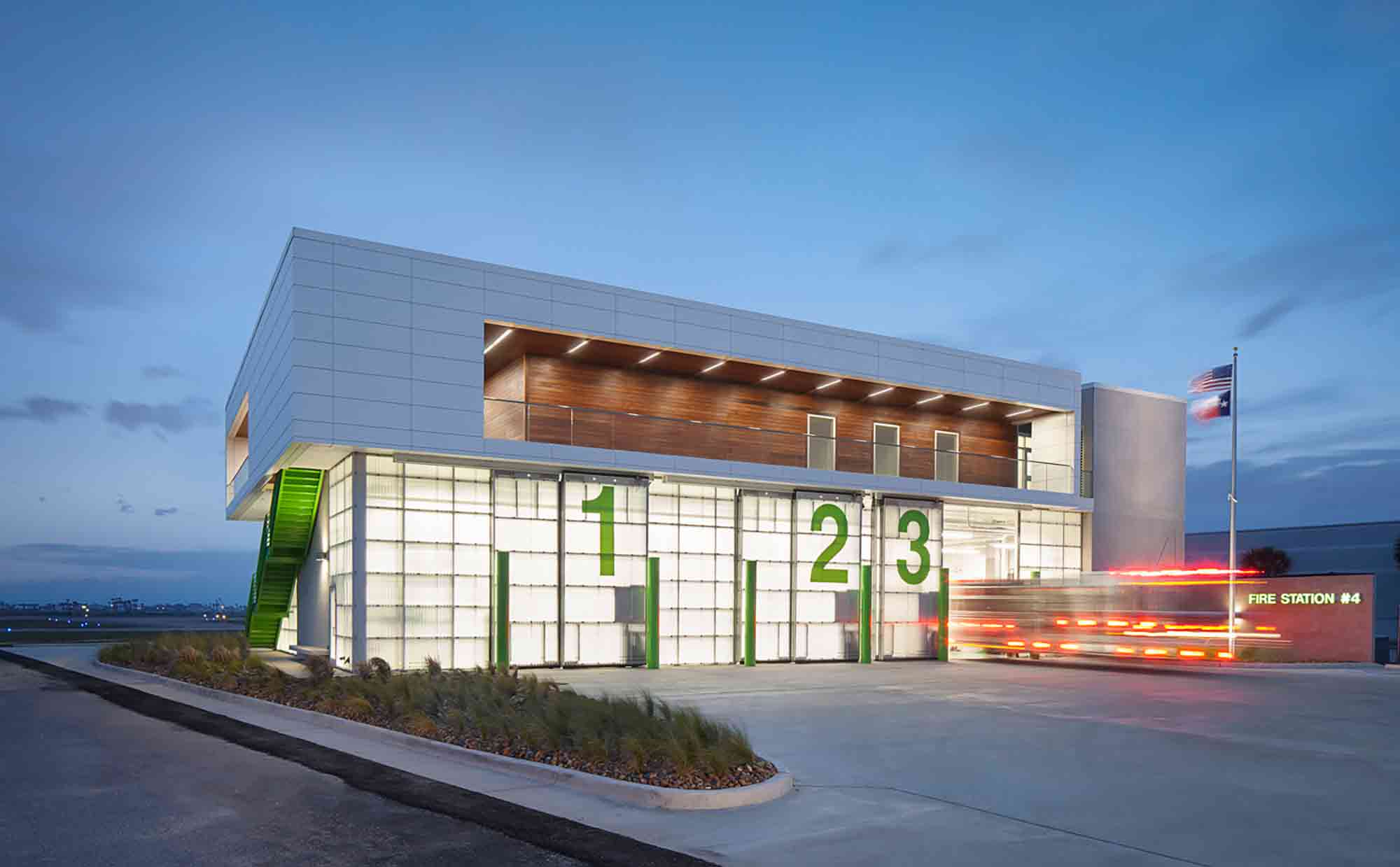
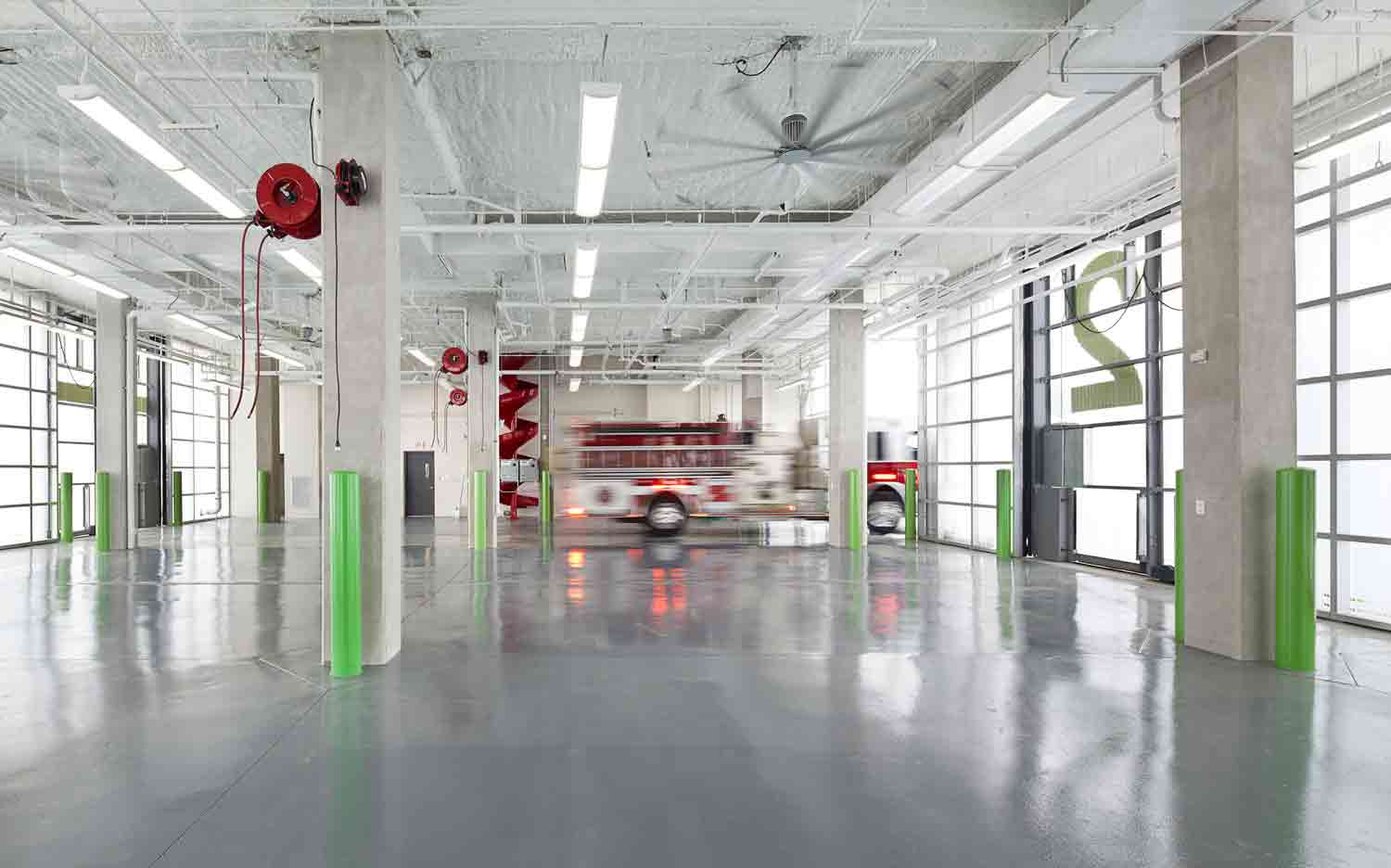 The predecessor of this coastal fire station was damaged beyond repair by the wrath of Hurricane Ike. Consequently, its exciting new iteration is designed to fight more than just fires. Arranged across two stories, the upper level features an elevated command center, observation decks and living quarters. Below it, the lower floor houses utilities and vehicle bays, which are clad in an innovative, impact-resistant acrylic layer. Adding to the project’s resilience, a hardened, bunker-style volume anchors the scheme at one end, minimizing torsional stress in the face of a hurricane.
The pioneering station’s magic trick, however, is a stroke of genius. While architects usually devise buildings to withstand the brunt of nature, a section of the lower level is designed to do precisely the opposite. When the horizontal force on the building reaches 35 pounds per square foot, the doors of the apparatus bay release, creating a bypass channel for surging water and alleviating pressure on the structure’s fabric.
By STUDIO GARDONI architectures, Chamonix, France
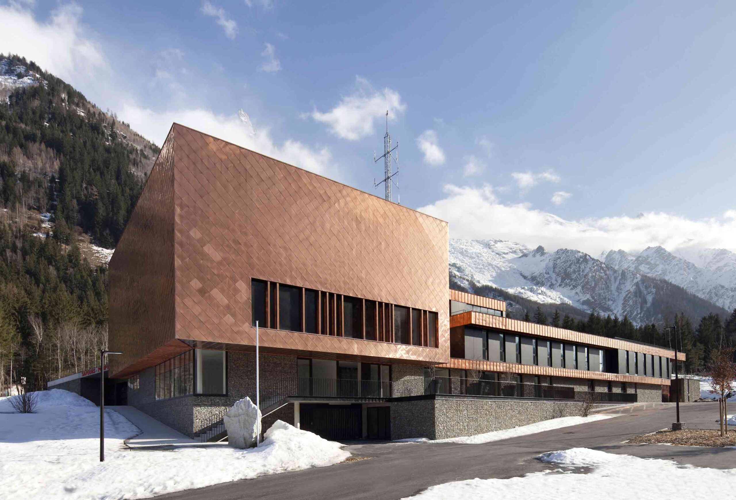
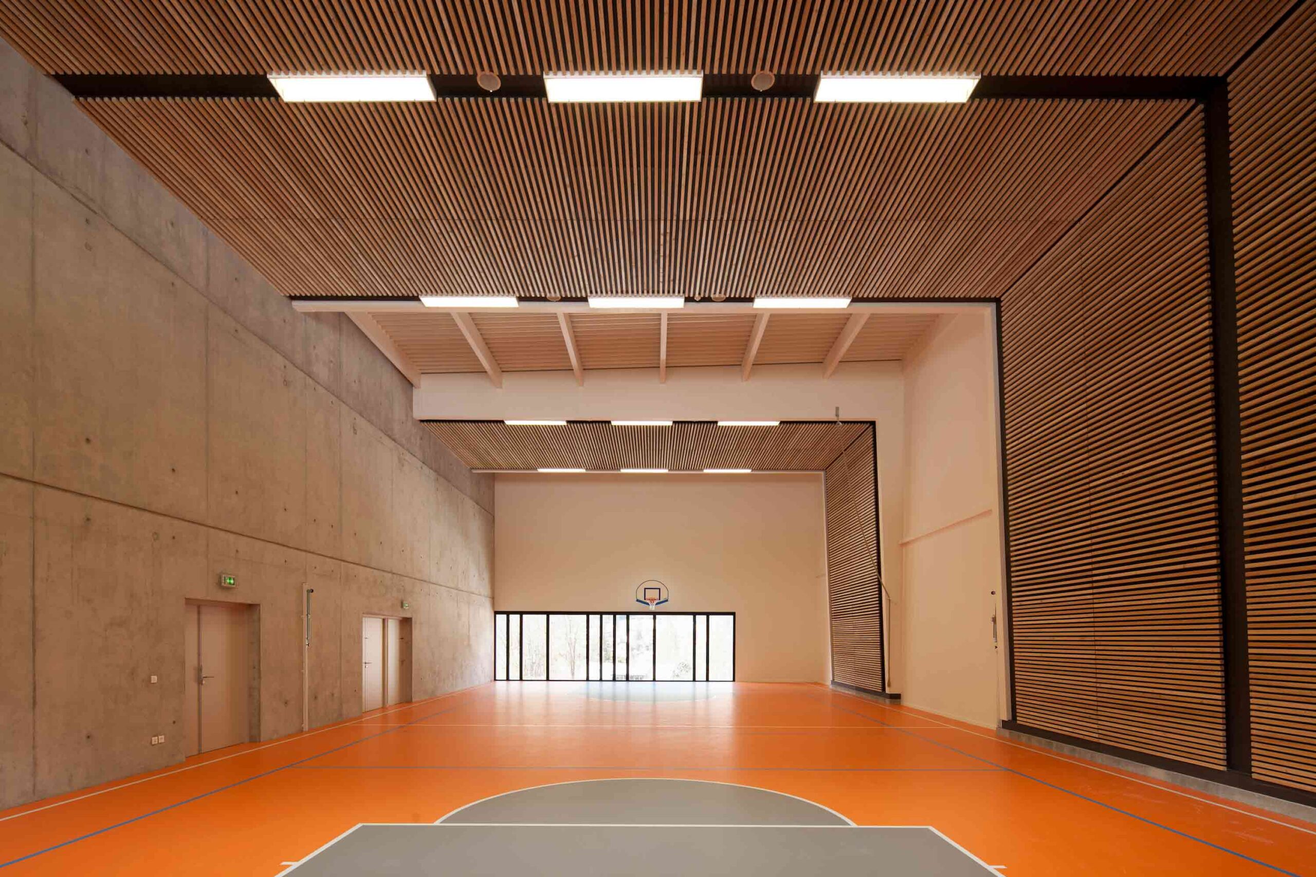 Some contemporary firehouses embrace bold, dramatic forms, yet others, like this compelling project in the mountains of France, strive for invisibility. Sequestered into the slope of a hill, it seeks to minimize its impact on the native terrain. Under the earth, a large vehicle bay hides the frenetic activity of the station from sight. From ground level, the only signifier of the complex is an enigmatic box clad in a metallic scaled façade. The opaque volume houses the gymnasium — a cloistered space cocooned in warming wood slats.
The most powerful ingredient in this scheme is the passage of time. The station was built, ostensibly, to disappear. As the years pass, the organic terrain will reclaim the building’s roof, softening it back into the hillside. Meanwhile, the copper exterior will weather and fade to a brown patina that merges with the surrounding peaks.
By Hennebery Eddy Architects, Gresham, Oregon
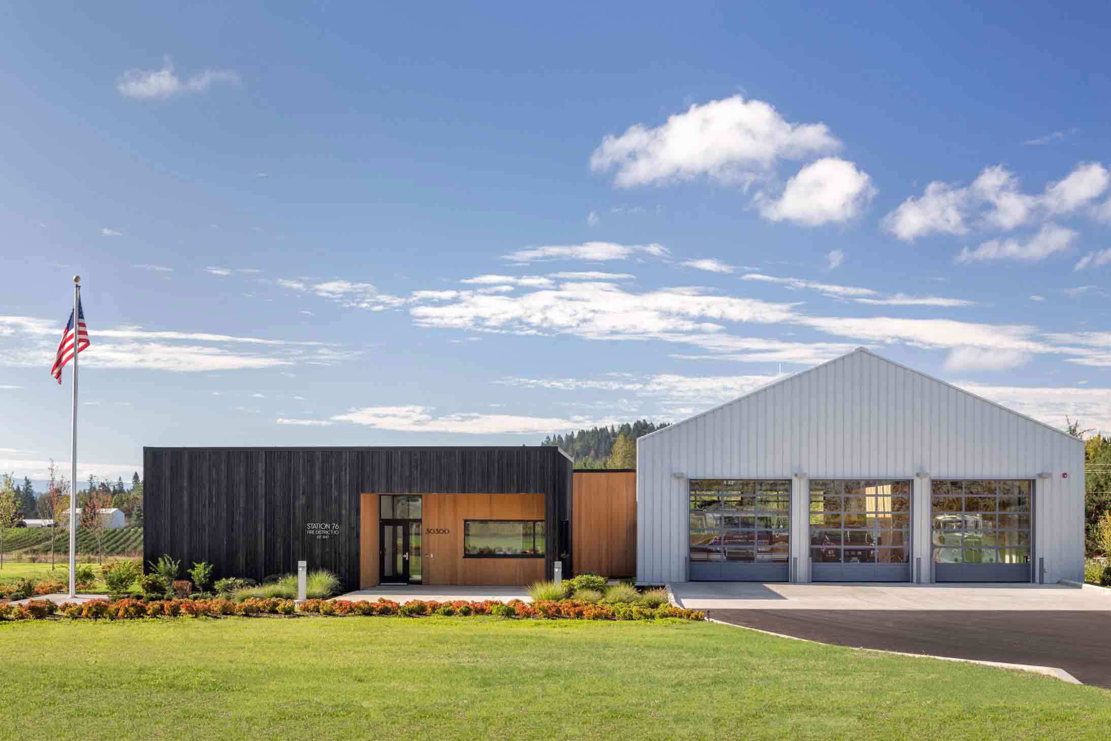
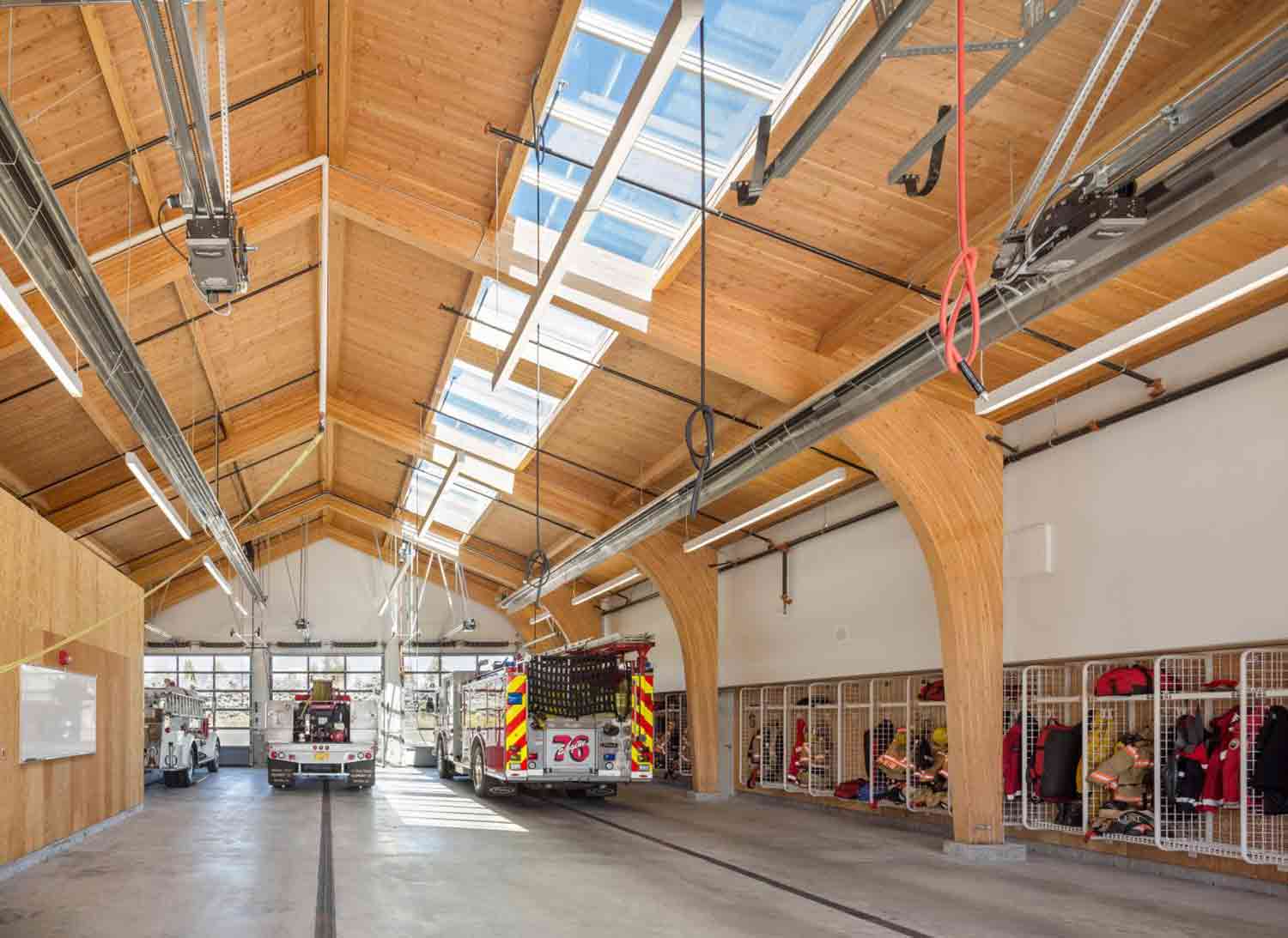 Nestled in the shadow of the Cascade mountain range amongst rolling picturesque fields, this extraordinary small-town fire station is both a space of life-saving service and emotive storytelling. Its pared-back structure comprises humble materials, including metal and reclaimed timber from a nearby barn. Meanwhile, the traditional gable form of the vehicle garage takes on the guise of a cattle shed. The project pays homage to the agricultural buildings that pepper the local region — it acknowledges the history of the land it was built to protect.
The station’s deceptively simple design is quietly subversive too. Firefighters are trained to battle the destructive power of fire, yet a different narrative is told through the building’s fabric. Shou sugi ban, a historic Japanese fire treatment, was used to burn the surface of the wood used throughout. The charring process strengthens the timber and defends again rot, decay and infestation. In a space dedicated to fending off flames, the flame is utilized as an instrument of protection.
By Roland Baldi Architects, Trentino-Alto Adige, Italy
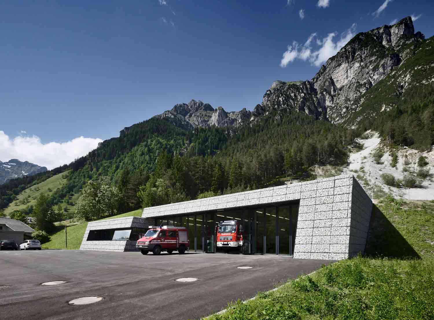
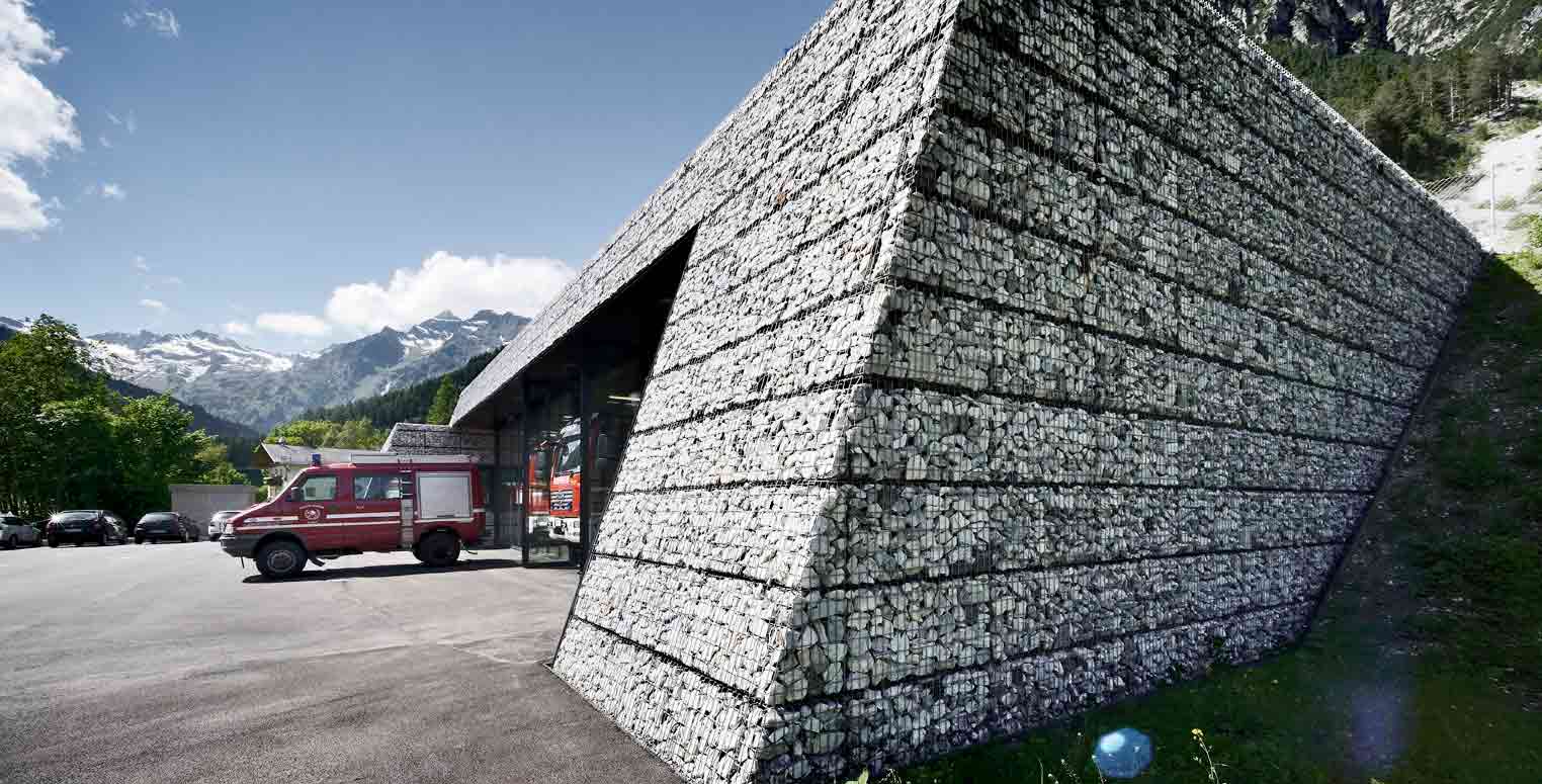 This rural Italian fire station is an architectural chameleon, blurring the lines between the built and organic spheres. From above, its pale monolithic stone form reads as an extension of the abutting mountain scree. Rocks from the site’s excavation and the surrounding Dolomite peaks were used in the construction, tightly packed into wire baskets to form gabion walls, punctuated by expansive swaths of glass.
While the design is streamlined and futuristic in shape, the material transparency is a clear declaration that this is a space built in synthesis with the landscape. Situated in an area prone to mudflows, the building is partially embedded into a retaining landslide dam. In this way, the protective essence of the station is two-fold: shielding structures at lower elevations from debris flows and housing the operations of a crucial emergency service.
The latest edition of “Architizer: The World’s Best Architecture” — a stunning, hardbound book celebrating the most inspiring contemporary architecture from around the globe — is now available. Order your copy today.

