ROOVICE’s new office space in japan blends modern and mid-century designs
new roovice office: a renovated interior with ‘domestic’ spaces
Architecture firm ROOVICE recently relocated its office on the 11th floor of a 55-year-old commercial building in Kannai, Yokohama, Japan. Together with work desks and meeting rooms, the renovated interiors include ‘domestic’ spaces where employees can relax, rest, and socialize during the day. ‘We reject the idea of a merely efficient and undistracting workplace: instead, we encourage everyone to take time for themselves and avoid stress at all cost,’ explains the firm. Overall, with old and new furniture mixed, the ROOVICE office becomes a timeless and welcoming space embodying the company’s philosophy at best.
all images © Akira Nakamura
featuring mid-century, vintage accents
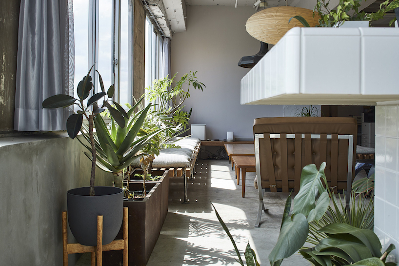
For maximum enjoyability, ROOVICE’s lead architect Maoko Sato (see more here) built that ‘stress-free’ zone to include a kitchen with a large counter, a living area, a small gym, a locker, and a shower. Occupying the office’s central space are desks custom-made with SPF wood, resembling a western-style antique table. Meanwhiles, large windows extend across the entire facade, bringing a touch of Shōwa Era character thanks to their rounded corners, a feature commonly used during that period.
Just in front of the openings, the living area features tailored mid-century-style coffee tables, surrounded by crafted ita-uba timber benches. Between the living and kitchen areas, various plants and flower pots transmit a calming sensation. Combined with the majestic sight of Mount Fuji behind Yokohama’s high-rise buildings, the living room becomes a comfortable spot for receiving informal meetings.
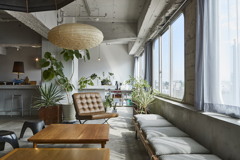
the living area is for resting and hosting informal meetings with clients
between old and new: a timeless design
The kitchen develops along the southeast side of the office, perpendicularly to the staff desks, creating a disconnection between the two. The custom-made kitchen table encloses the room to provide enough space for sharing a meal or hosting parties with guests. The dining area is covered in white 10cm square tiles predominantly used during the Shōwa Era. These grant a pleasant and calm feeling as opposed to the raw texture that characterizes other parts of the office.
The furniture has been carefully chosen and designed to include elements of different ages and tastes, encouraging coexistence in a timeless space. For instance, the Zabuton (a typical cushion used for tatami rooms) covering benches is an example of merging traditional elements with newly crafted furniture. The same approach applies to the Noren (traditional Japanese fabric divider) concealing the storage shelf. ‘This contrast between old and new is meant to express our philosophy towards renovation: a vintage element without its typical environment still has potential and can mold a space,’ writes ROOVICE.
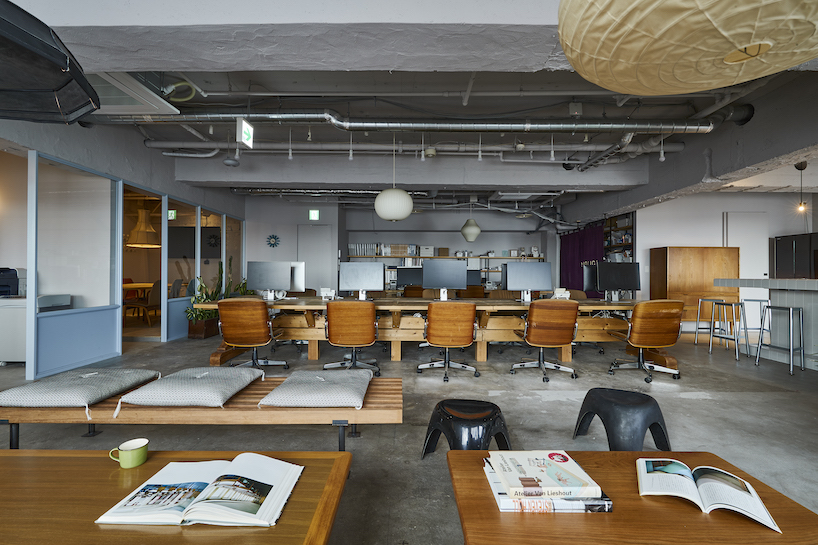
a view of the office desks from the living area
To block out noise from the outside public units, Sato ensured that the entrance hall didn’t lead directly to the main office. Instead, two doors lead to different spaces; a front door to the workplace and a side door to the meeting room. The latter is also accessible from the main space and provides guests with a domestic, welcoming atmosphere. ‘Indeed, the entry and meeting room pavements are the only finished floor, as opposed to the raw concrete used for the other spaces,’ notes ROOVICE.
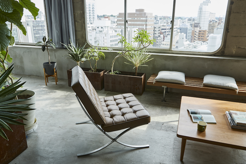
plants and windows exude quietude

