Quay Quarter Lanes Designed by Studio Bright Rejuvenates the City Block in the Heart of Sydney
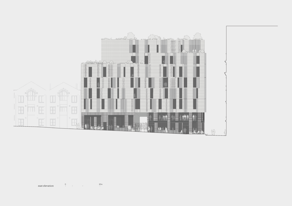
Quay Quarter Lanes – is the rejuvenation of a city block in the heart of Sydney City at Circular Quay. Our building at 8 Loftus Street squeezes itself between Customs House and the Gallipoli Memorial Club, maintaining continuity of the building line and massing of this historic thoroughfare. Two levels of retail spaces form a base for 31 apartments housed over six upper levels. An arcade link marries the busy street to the inner laneway refuge. Upper-level restaurants lead the eye up to tucked-away spaces for exploration and respite. The whole is capped by a roof space brought to life with a recreational roof garden for the use of all residents. As a component of a bigger scheme and of a greater cityscape, this building attempts a worthy contribution to the continuity of Sydney’s built texture, playing its part in a healthy, vibrant pedestrian precinct.
Architizer chatted with Mel Bright, Director at Studio Bright, to learn more about this project.
Architizer: What inspired the initial concept for your design?
Mel Bright: Developing a considered response to the rich site context formed the basis for the initial design concepts. Formally, the new building shifts and folds, fluidly responding to spatial influences and contextual constraints. Mass appears polished and ‘ground away’ with setbacks swelling and receding, softening the transitions by gently sliding back from the street facade line. In reference to nearby heritage buildings, corners gently curve and sweep, suggestive of quieter spaces in the laneway just around the corner. Richly inhabited edges provide spaces to sit with your back to the wall.
The receded upper levels present a softened roofscape form to positively contribute to the quality of the outlook of the adjoining buildings. Tiered private outdoor spaces climb to the shared roof garden.

© Studio Bright

© Studio Bright
What do you believe is the most unique or ‘standout’ component of the project?
The resolution of the facade involving many complex components contributing to the coherent whole is a unique aspect of the project. The Loftus Street façade at footpath level is framed by a flowing awning projection that swells out at the corner where seating recesses give stopping and sitting points. The awning projection is punctuated by the popped-up opening that marks the arcade entry. This link incises the building to carve an entry point for the apartments and an alluring pathway through to Loftus Lane. Compressing down in plan and section only to expand again coming into the lane, the arcade ceiling incorporates ‘Weerong’ an integrated sound and light artwork by Wiradjuri-Kamilaroi artist Jonathan Jones.

© Studio Bright

© Studio Bright
What was the greatest design challenge you faced during the project, and how did you navigate it?
The project has civic ambitions that extend beyond the apartments, aspiring to contribute to the city with communal rooftop gardens and an arcade thoroughfare linking adjacent lanes, whilst also offering a high level of amenity. Rigorous planning resulted in full-width apartments with dual aspects, offering excellent cross-ventilation, unique city vignettes & the pleasure of shifting diurnal light within apartments. All living spaces have views to the park, with bedrooms on the quieter laneway. The building is mirrored in plan with two lift cores, creating rare intimacy as lobbies service just three residents per floor. Lush planted gardens & fresh air service each lobby. An apartment does not need to compromise on meaningful garden spaces or fresh air.

© Studio Bright

© Studio Bright
What drove the selection of materials used in the project?
The grey bricks have been developed as a custom size and colour with custom radiused bricks used to ensure smooth corner transitions and an urban form that ‘dissolves’ at the building edges. To the street base, the charcoal brickwork pattern directly references the deeply textured sandstone block pattern of the adjacent heritage buildings.

© Studio Bright

© Studio Bright
How important was sustainability as a design criteria as you worked on this project?
This high-density, mixed-use precinct has sustainability principles at its core. From its proximity to active and public transport, to its role in providing a range of housing, activation and employment opportunities in the heart of the CBD, to sensitively extending the life of a series of existing heritage buildings. The project is planned around a series of public lanes which provide opportunities for all users to positively participate in city life and to create a new destination in this pocket of Circular Quay.
The extensive accessible green roofs slow the movement of water, improve the heat island effect and increase urban habitats for native flora and fauna. This greening approach also improves the amenity for all users, creating a foreground and a buffer between residential, retail and public uses, optimising comfort levels for residents of all ages living in this vibrant precinct

© Studio Bright

© Studio Bright
How do you believe this project represents you or your firm as a whole?
The building responds to a marketing imperative for high-quality without excess. Materials were selected on a ‘built to last’ basis, with solid brick walls, travertine stone flooring, and granite floors and walls in the lobby. Durable material choices ensure long-term value. This is also apparent with the careful consideration of key light fittings, with local and international designers celebrated. Open-air lift lobby gardens are essential for pleasant air quality. With its prominent location right in the heart of Sydney, with consequent implications for the value of floor space, the design holds to the ideology of ‘less.. but better’.
“We think of apartments as supportive homes; they might be in the city, but we’ve designed them to be comfortable, private and very personal.” —Mel Bright, Studio Bright

© Studio Bright
Team Members
Melissa Bright, Director. Rob McIntyre, Director for Design Realisation. Ryan de Winnaar, Associate. Emily Watson, Associate. Jaxon Webb, Architect. Annie Suratt, Associate. Todd De Hoog, Architect. Pei She Lee, Graduate
Photography: Rory Gardiner.
Consultants
Landscape and Urban Design: ASPECT Studios. Public Art: Jonathan Jones. Planning/Heritage Consultant: Urbis. BCA: Group DLA. Design Engineer: Arup. Structural and Civil Engineer: SCP. Facade Engineer: Inhabit. Mechanical Engineer: Air Conditioning Engineering Services. Hydraulic Consultant: Harris Page & Associates. Electrical Engineer: Simpson Kotzman. Acoustic Consultant: Acoustic Logic

© Studio Bright
Products / Materials
Furniture: Grazia & Co, Grazia & Co, ‘Iva’ stool. Tait,Tait, ‘Jak’ chair, ‘Jil’ table & ‘Linear’ sunlounge. Lighting: Apparatus, Apparatus, ‘Lariat’ pendant light and ‘Trapeze’ wall light. Lambert & Fils, Living Edge, ‘Laurent 03 / 07’ pendant light Vibia, Koda Lighting, ‘North 5640’ wall light Anchor Ceramics, Anchor Ceramics, ‘Potter’ pendant light Grazia & Co, Grazia & Co, ‘Traffic’ wall light Flos, Euroluce, ‘Belvedere spot double’ bollard light Astro, ‘Bianco 5657’ downlight Caribou, Caribou, ‘Tricky’ surface mount can light Finishes: Austral Bricks, Brickworks Building Products, ‘Grey Dane’ custom brick Austral Bricks, Brickworks Building Products, ‘La Paloma Gaudi’ Metrix, Shutterflex, ‘Round Hole 60° M30-38.5’ perforated aluminium screens Austral black granite paver & tiles Projecting horizontal plate aluminium Interpon, ‘Sable medium bronze’ ‘Monument matt’ & ‘Grey silver’ powdercoat Briggs Veneer, American oak timber veneer crown cut, Dulux ‘Grey Pebble 1/2’ & ‘Kades Cabin’ 2pac joinery, Silver honed carrara marble Plank, ‘European oak in Gris’ timber floor boards Silver travertine stone flooring, filled and honed Blackbutt timber decking Fittings & Fixtures: Miele appliances Gaggenau appliances Fisher & Paykel fridge Blum joinery fittings Astrawalker, Astrawalker, ‘A95.98.50’ basin, ‘A69.06.48’ tapware, ’A69.24.V5’ shower

For more on Quay Quarter Lanes – 8 Loftus St, please visit the in-depth project page on Architizer.

