peter gluck on designing ‘california house’ and why architects need to get back on site
in conversation with peter gluck
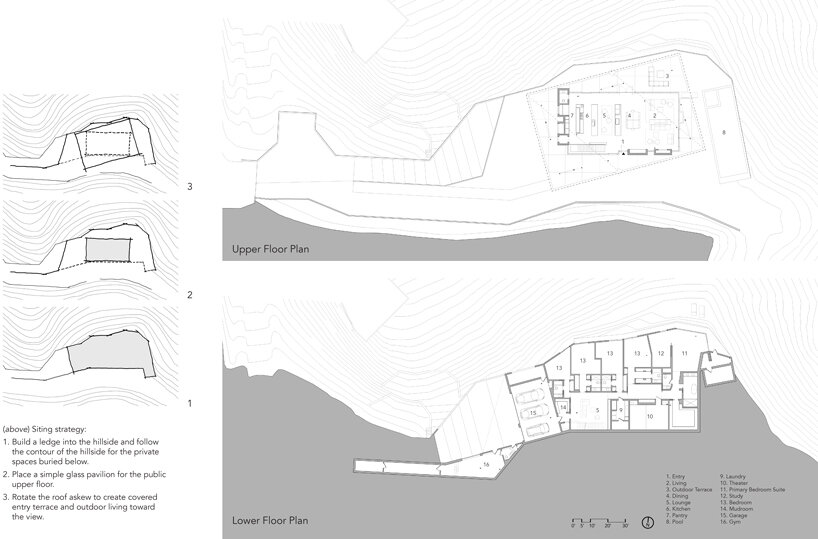
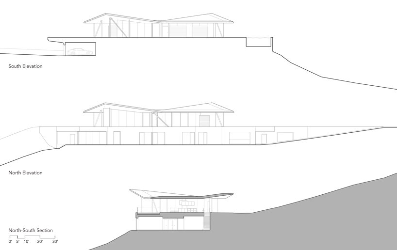
When architect Peter Gluck of GLUCK+ stood on the empty lot for ‘California House‘ in the Hollywood Hills, the views were so spectacular that the design concept came to him in just 15 minutes. ‘Well, the site was seemingly impossible to build on. It had previously been considered unbuildable. But when I was standing there, I realized that the section would work. If we were to take a slice through the site, it would be perfect for having two levels in which the lower level is completely hidden from the upper level,’ Gluck tells designboom.
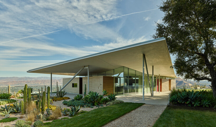
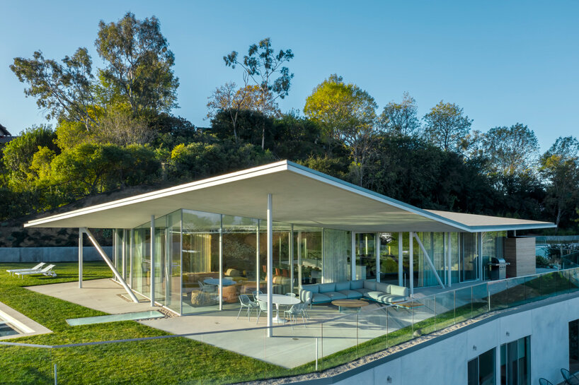
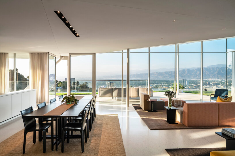
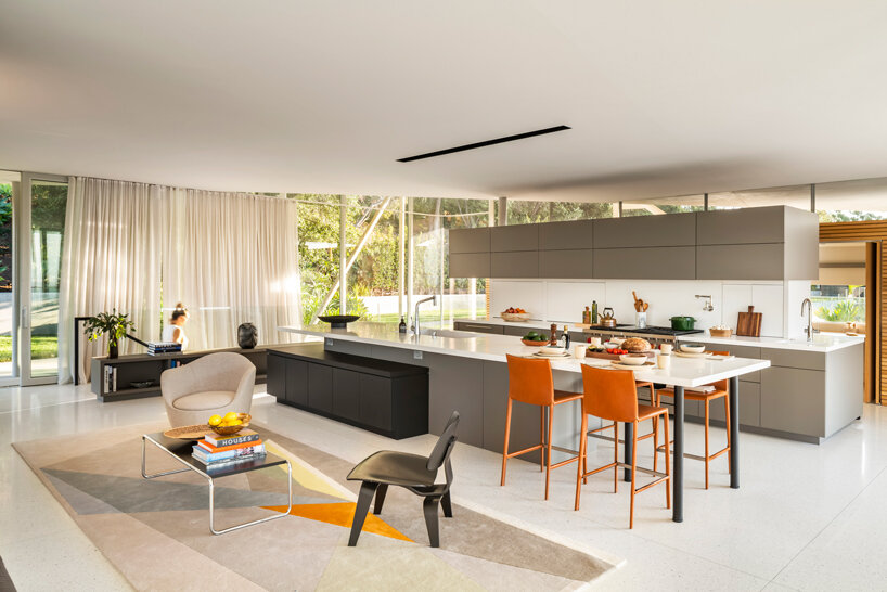
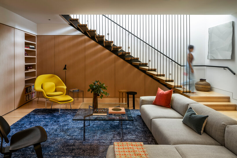
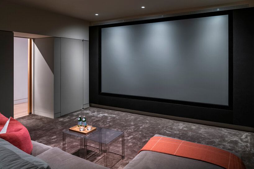
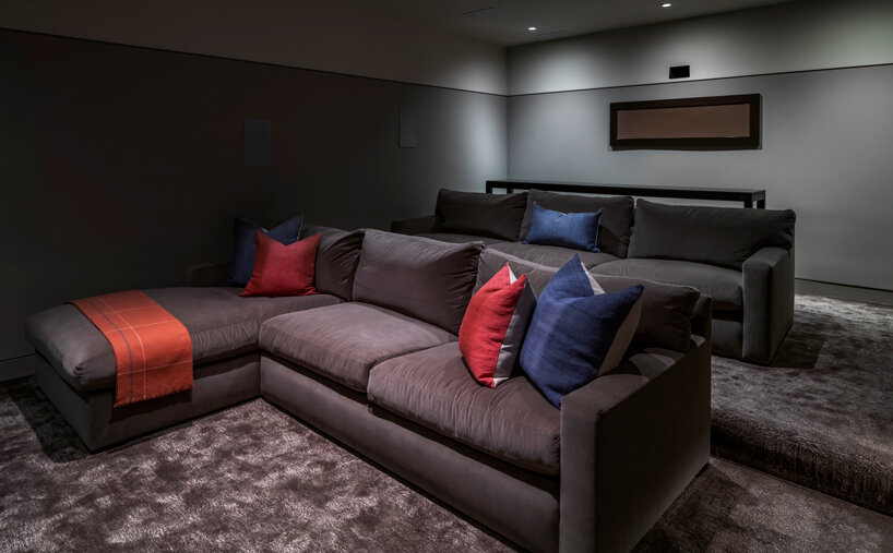
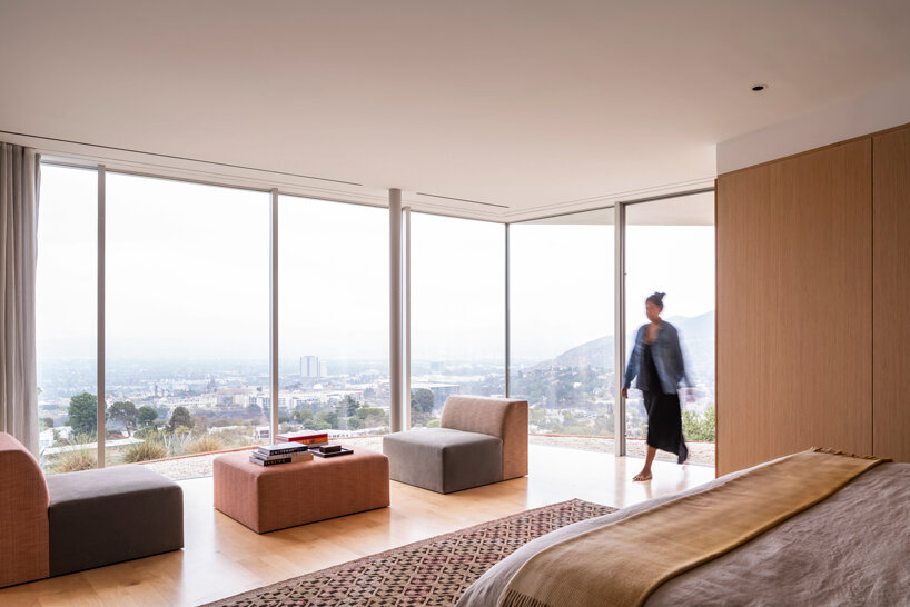
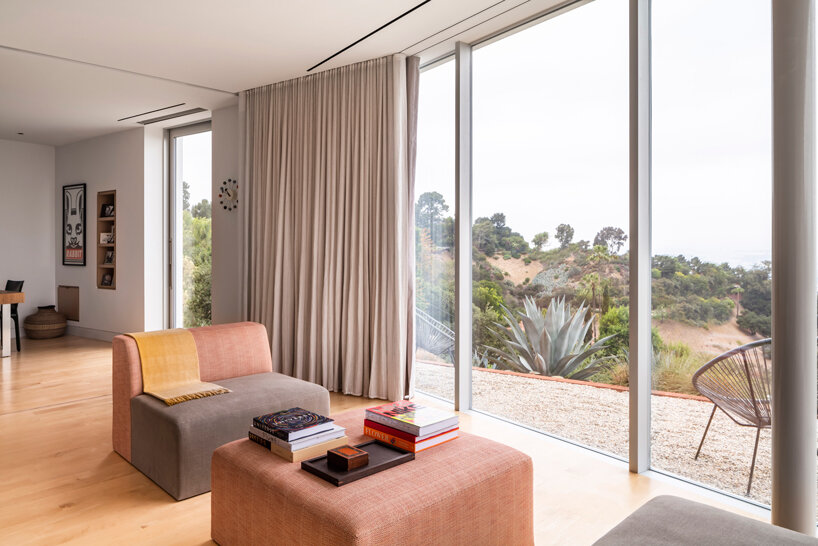
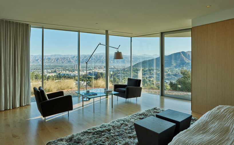
Designed for his film director son, Will, the 697 sqm (7,500 sqft) residence boasts an 180-degree view that pans from the Hollywood sign in the east to Burbank airport in the west, with rolling mountains in the distance. To make the most of this panoramic vista, Gluck and his team decided to flip the program, putting bedrooms, bathrooms and storage on a sunken lower floor and creating a glass-clad pavilion on top where all the social functions of living, cooking, dining and entertaining are accommodated. This palatial Hollywood home also features an outdoor swimming pool up top and a cinema screening room down below: ‘my son is a film guy, so he actually can work from home,’ adds Gluck.
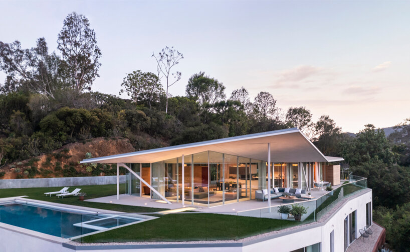
California House with a prime position in the Hollywood Hills
image by Paul Vu
The architect continues, ‘So from both floors you get all of those views by digging into the hill. The idea was to make the upper level appear as though it was on top of a cliff, and the views would just go up into infinity. You can see that when you look at the section, if you walk out on the balcony, which is to the left on the upper floor, it’s like you’re on a cliff but the cliff is actually made by the lower floor. It’s very counterintuitive when you’re there because you arrive on the upper level, and the lower level is completely hidden. So what you really see is a pavilion and you wonder, Where is the rest of the house?’
‘We had done several of what we call ‘buried’ buildings and that section was evident that I could do that. And there are lots of advantages to it. Not only from an architectural point of view, but also from a sustainability point of view. It seemed to me to be just perfect.’
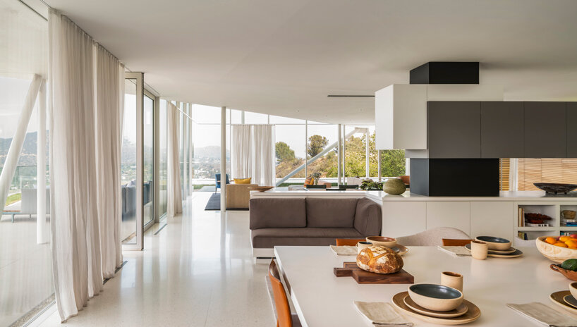
image by Paul Vu
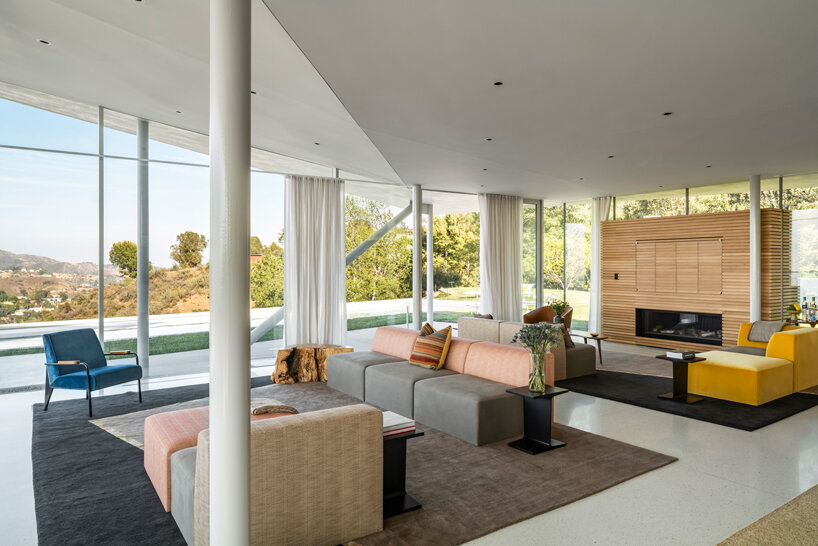
image by Paul Vu
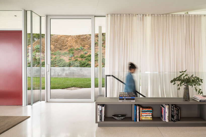
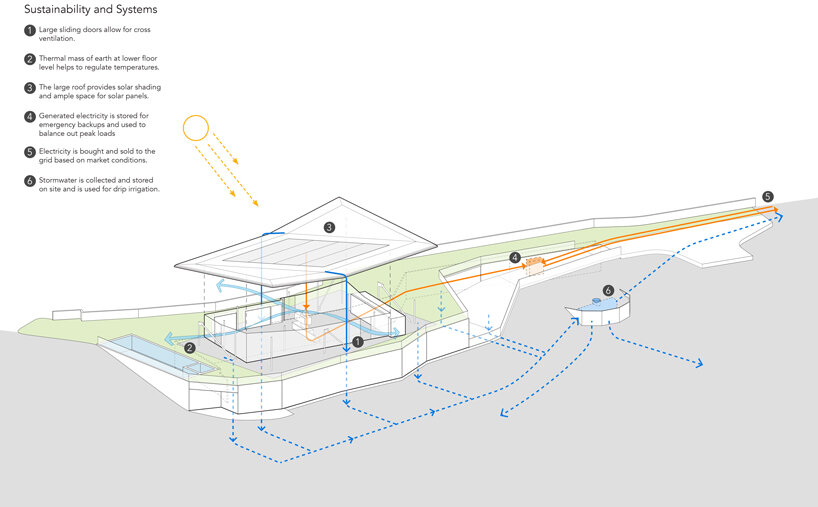
On the subject of sustainability, the half sunken nature of the design helps passively cool and heat the house. The need for mechanical air conditioning is reduced thanks to large sliding glass panels that open on all sides of the top floor, allowing for cross ventilation. Other low-impact strategies include solar panels on the roof, rainwater collection for the garden, skylights in the floor to bring natural light downstairs, and roof overhangs to provide shade from the hot LA sun.
Gluck explains, ‘The other idea is that there’s this floating roof, like a parasol roof, and it’s skewed off the rectangle of the plan of the main floor, which allows for shade. It can be very hot in LA, so there’s always shade from one of the four corners of the building.’
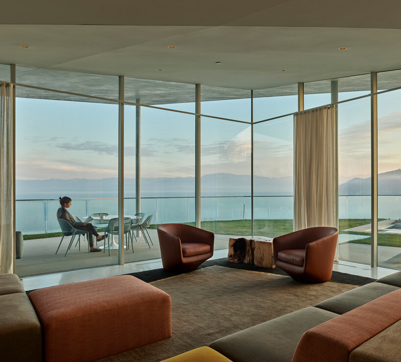
image by Timothy Hursley
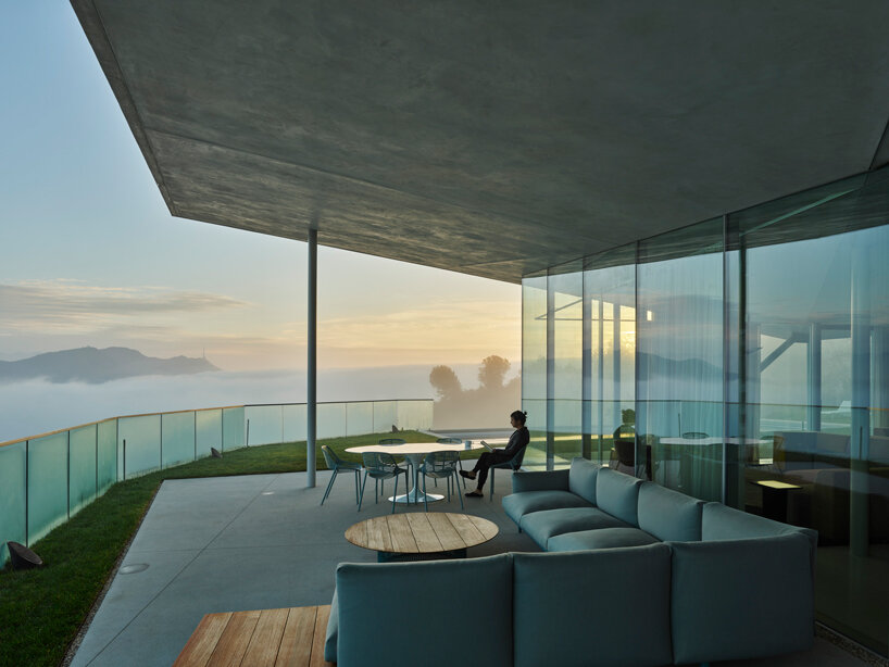
image by Timothy Hursley
Of course it’s not the first time Gluck has worked with his family. In 2013, GLUCK+ completed Tower House in upstate New York for his other son, Thomas, who is also an architect and Principal at GLUCK+. ‘He had a good portion of the design of his house. That was really his impulse,’ says Gluck. ‘It’s kind of iconic, which is what we strive for.’
‘The idea was that it’s basically a tree with the living room on the top floor and what elevates the top floor are the bedrooms. And so each floor has an ensuite bedroom, that becomes the stock that supports the house. And so the stairway becomes the vertical piece of the house. If you had a normal house, the stairway in this case would be equivalent to the hallway. It’s like a vertical hallway.’
Gluck continues, ‘The view is incredible but it’s less than an hour and a half from New York City. And the lake you see is actually one of the reservoirs that feeds New York City, 100 miles from the city. And the water goes to the city by gravity from a series of impounded rivers in the Catskill Mountains. It’s pretty amazing.’
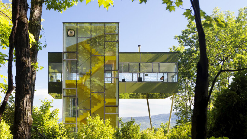
Tower House in upstate New York
image by Paul Warchol
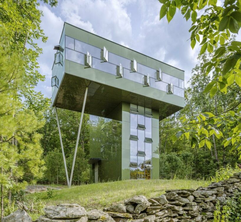
image by Paul Warchol
On the same property, Gluck designed Scholar Library for his wife and her ‘million books’. ‘The bottom floor is all storage for books. And the upper floor is her office and study space.’ For Gluck, this was one of his most interesting projects due to its simplicity. ‘The form and the function overlay perfectly. And the tectonics of the building and the cube divided simply like that, it just works on so many levels. Admittedly, you can do that when the program is very simple. It’s one of those rare examples where the program fits a three dimensional form perfectly. The more complicated the building gets, the more difficult it is to do that.’
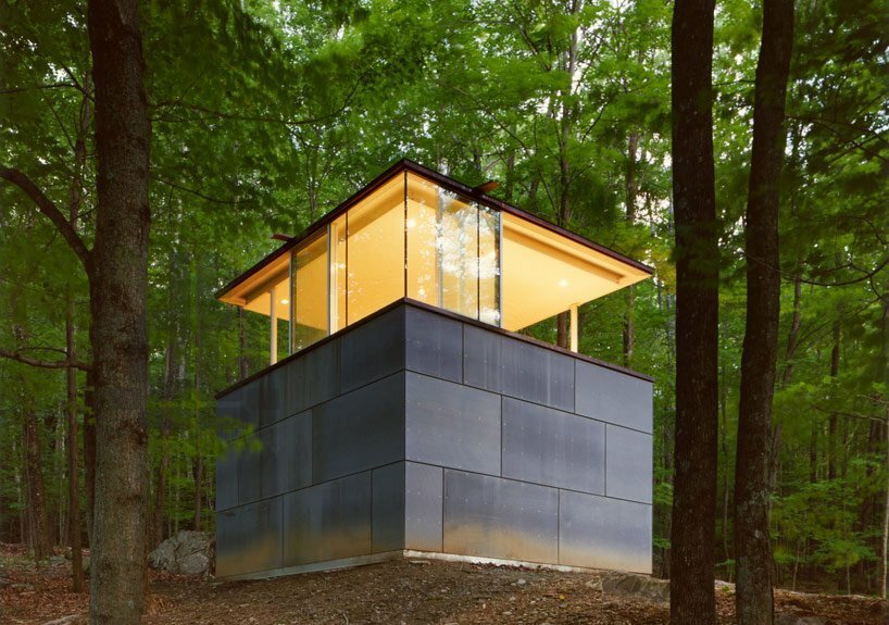
Scholar Library was designed for Gluck’s wife
image by Paul Warchol
California House, Tower House and Scholar Library are just three projects from a career that spans decades. Gluck first formed his eponymous architecture firm back in 1972, when it was formerly known as Peter Gluck and Partners. Now known as GLUCK+, one of the studio’s main tenets is Architect Led Design Build, in which the architect acts as both designer and contractor to give clients a single source of responsibility. Gluck shares some of his concerns about the division between design and construction with designboom:
‘In America the legal system drives everything. The avoidance of risk, and the avoidance of liability, is a major endeavour. So, the way you avoid risk is by doing less, but the way you do better work is by doing more. They’re in direct conflict with each other.’
‘It’s a terrible problem if there’s an issue or a detail in question. The most important thing is what’s the intent and how can you achieve the intent in a more efficient, more streamlined way. If the architect and the contractor can work together, or even better be the same person, or the same entity, it can be resolved infinitely easier than if they’re in conflict with each other. Each is trying to minimize risk rather than trying to solve the problem.’
‘Architects are supposed to be making directions for people to make the building. And yet they don’t know how to make the building. So how does that work?’
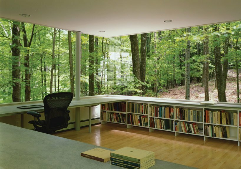
image by Paul Warchol
As a strong advocate for architects to be more involved on site, we couldn’t help but ask what Gluck thinks about studios designing buildings for the metaverse?
‘Unfortunately, I think that’s the way most academic firms practise, as if it were virtual. And that seems to me to be the standard,’ says Gluck. ‘There is the practical world and the world of imagery. Architecture is perhaps the art form where both matter.’
Discover more projects by GLUCK+ on designboom here, and see more imagery from California House below.
1/17
project info:
name: California House
location: Hollywood Hills, Los Angeles, CA, USA
architecture and construction: GLUCK+
project team: Austin Anderson, Ross Galloway, Peter Gluck, Matthew Harmon, Narin Hagopian, Gonzalo Moran
size: 697 sqm (7,500 sqft)
site area: 13,517 sqm (145,500 sqft)
year: November 2019
consultants:
civil and structural engineer: Peck
geotechnical engineer: Schick Geotechnical
mechanical engineer: IBC Engineering Services, Inc, CES Engineering
lighting design: Lux Populi
interior design: Insight Environmental Design
landscape design: Hoerr Schaudt
expeditor: Kimberlina Whettam and Associates
photography: Timothy Hursley, Here and Now Agency – Paul Vu
