perforated red aluminum skin envelops gisele borges’ pyramidal residential building in brazil
Gisele Borges designs dynamic residential building in Brazil
Within the city of Belo Horizonte, in Brazil, Gisele Borges Arquitetura has designed ‘Casamirador Savassi’, a striking residential building that stands out in the local landscape. Clad in a perforated red aluminum shell, the structure adopts a non-obvious pyramidal shape with an asymmetrical arrangement of windows. As a result, the project presents its very own stylistic identity, which still prioritizes lightness and transparency and ensures comfort for all occupants.
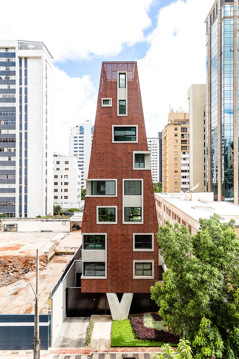
clad in a perforated red skin, the structure adopts a non-obvious pyramidal shape with an asymmetrical arrangement of windows
image courtesy of Juliana Berzoini
distinctive perforated skin ensures lightness and transparency
This residential project by Gisele Borges Arquitetura (find more here) features a second skin ‘worn’ by the building like a garment. This distinctive envelope is possibly the project’s most daring feature. Aluminum was used, and it was painted in an earthy reddish sepia tone that made reference to the region’s abundance of raw ore.
The exterior aluminum sheets were perforated in various diameters and in an asymmetrical yet harmonious pattern to ensure lightness and transparency. By doing so, city vistas are visible through the skin, allowing one to see through them from the inside out. The inhabitant, however, is guaranteed privacy because it is impossible to see inside from the outside. This component also allowed for the exploration of a wide variety of effects, such as hiding smaller, useful windows or splitting the skin to reveal the enormous spans. These windows, which were designed as large openings, enable the city to become a bright, airy addition to the home. Meanwhile, the openings’ concrete frames stand out against the rusted tint of the walls, adding to the visual interest of the exterior.
The skin covering the building also provides thermal comfort to the units. A mattress of fresh air is used to give optimum ventilation and shade for the fences away from the masonry. From that perspective, sustainability guided a large part of the project’s choices.
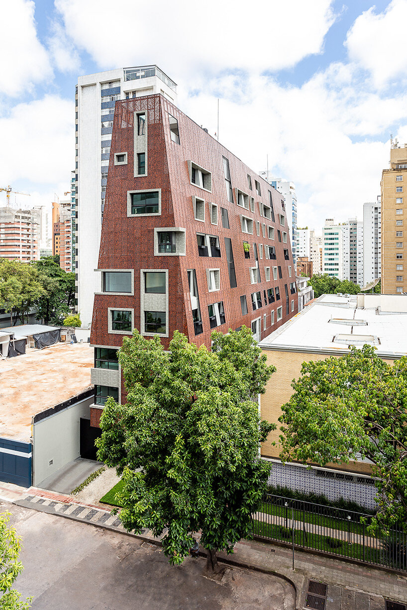
the striking design stands out in the local landscape of Belo Horizonte
image courtesy of Juliana Berzoini
pyramidal structure standing on a v-shaped pillar
The pyramidal shape of the building, which is the result of staggering, also allowed for the allocation of technical areas on both the internal and external faces of the skin, ensuring a clear and unadorned plastic.
Another key element in the project concerns the difficulty of laying the pyramid on the ground with only a single point of contact with the earth. Under the influence of Brazilian architect, Oscar Niemeyer, a ‘V’-shaped pillar was created, which is widely used in his works.
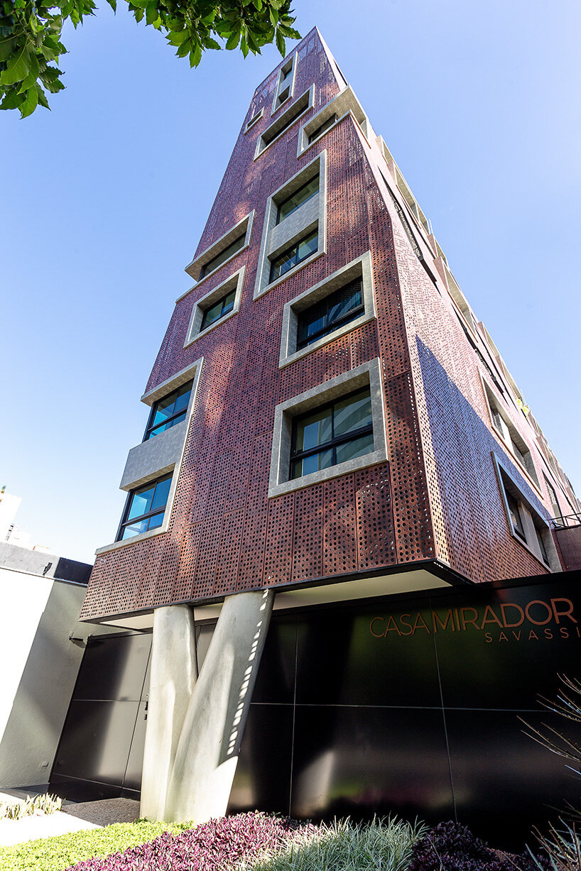
a ‘V’-shaped pillar ensures the stability of the pyramidal structure
image courtesy of Juliana Berzoini
irregular yet harmonic volumetry creates its own identity
To increase rigidity and ensure flatness on the facade, the aluminum sheets were bent on all four sides. Several experiments were conducted before the final fixing model created an alignment of the slabs and the midway of each floor, even if the sheets were randomly perforated, the joints were aligned, and the volume was harmonic. There are only three horizontal profiles per level, and the upper and lower profiles were also integrated to secure the plates of the adjacent floors, thus the study ensured optimization in the secondary structure for fastening the plate. The final plastic is the result of a marriage between covering sheets, frames, and structure. There are three elements that alternate on the facades with greater or lesser relevance of the skin, ensuring a clean and unadorned plastic.
The building has 14 lofts and 24 studios, spread over nine floors on a narrow lot, with a width of 12.7 meters. The challenge of its volumetric mathematics, to respect distances, was one of the factors that influenced non-obvious decisions resulting in architecture created with its own identity.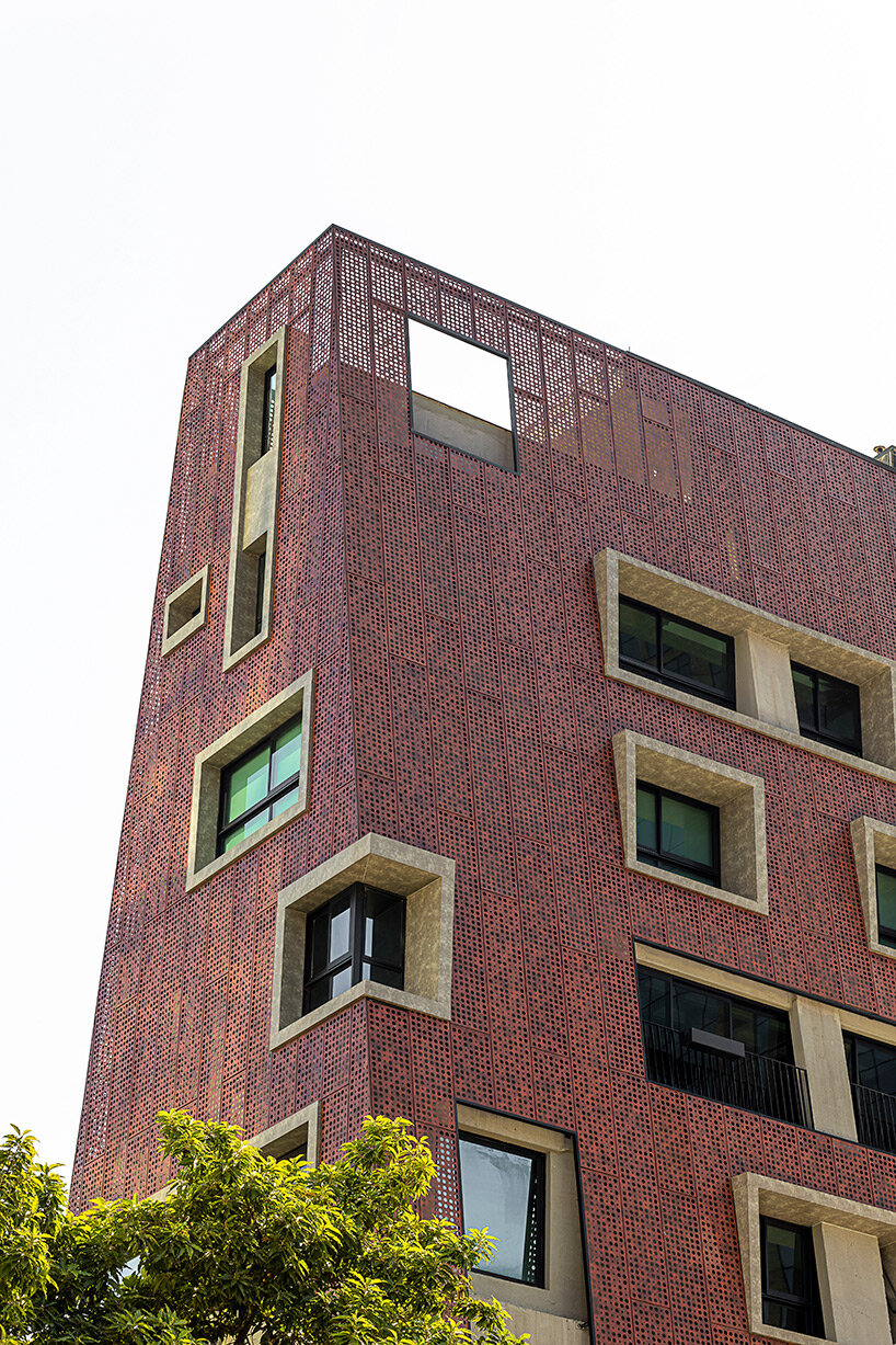
image courtesy of Pablo Gomide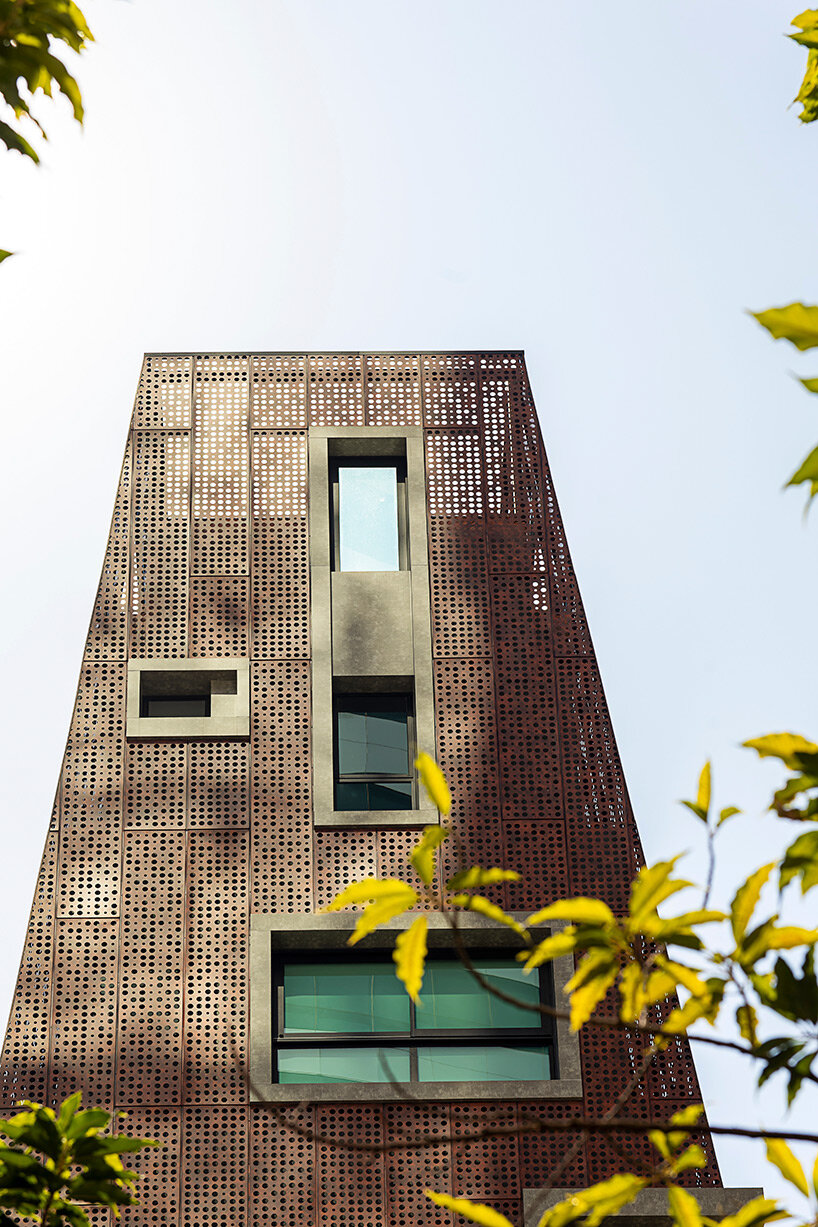
image courtesy of Pablo Gomide
