Parallel Rules showcases work by six architects that expands ideas of what a drawing can be
Parallel Rules
a83
83 Grand Street
New York, NY 10013
Open through January 20, 2023
In Signal. Image. Architecture., John May effectively proclaimed that “drawing”—the mechanically constructed medium of applying a physical material onto a physical substrate—is dead. We instead live within the regime of the “image,” in which everything is pixels. While May is mostly right, the current show at a83, an architecture gallery based in Soho, provides a counterpoint—or at least an interesting caveat—to this obituary. The gallery is housed in the former home of John Nichols Printmakers, a prominent woodblock, screenprinting, and lithograph shop in the 1980s that reproduced works by heavyweights like Michael Graves, Thom Mayne, and Peter Eisenman.
Today, a83 continues this legacy, operating both as print shop and public gallery space for emerging architects. (Owen Nichols, who operates a83 with Clara Syme, is John’s son.) Printmaking today is certainly no pure analog practice unenchanted by the efficiencies of software and digital production. The process of creating serigraph masters or screenprint screens is of course aided by computer images, but the process remains grounded in pre-digital traditions of craft. In other words, it is preeminently material and therefore materially different from conventional photocopiers. Standing against the “print” or “export” interface which immediately converts a .dwg or .jpg to a physical output, there is a translation process in which the medium itself pushes back on the image. It sounds a lot like architecture.
Parallel Rules, a83’s second exhibit in a series focused on architectural drawing, features a total of 29 pieces by six architects: Architensions, Bruna Canepa, Galo Canizares, Carole Lévesque, Gore/Hall (the duo of Aelitta Gore and Daniel Hall), and Young & Ayata. Instead of proffering an elaborate curatorial prompt, curators (Owen) Nichols and Syme let the drawings individually and collectively speak for themselves. They conceptualized the designers’ works in pairs: Works by Canizares and Young & Ayata both share a painterly quality of layered pixels; Gore/Hall’s animated section and Lévesque’s large Piranesian works utilize black-and-white, elevational layering to create immersive worlds; and Architensions and Canepa’s colorful, infrastructural compositions read more as self-contained objects.
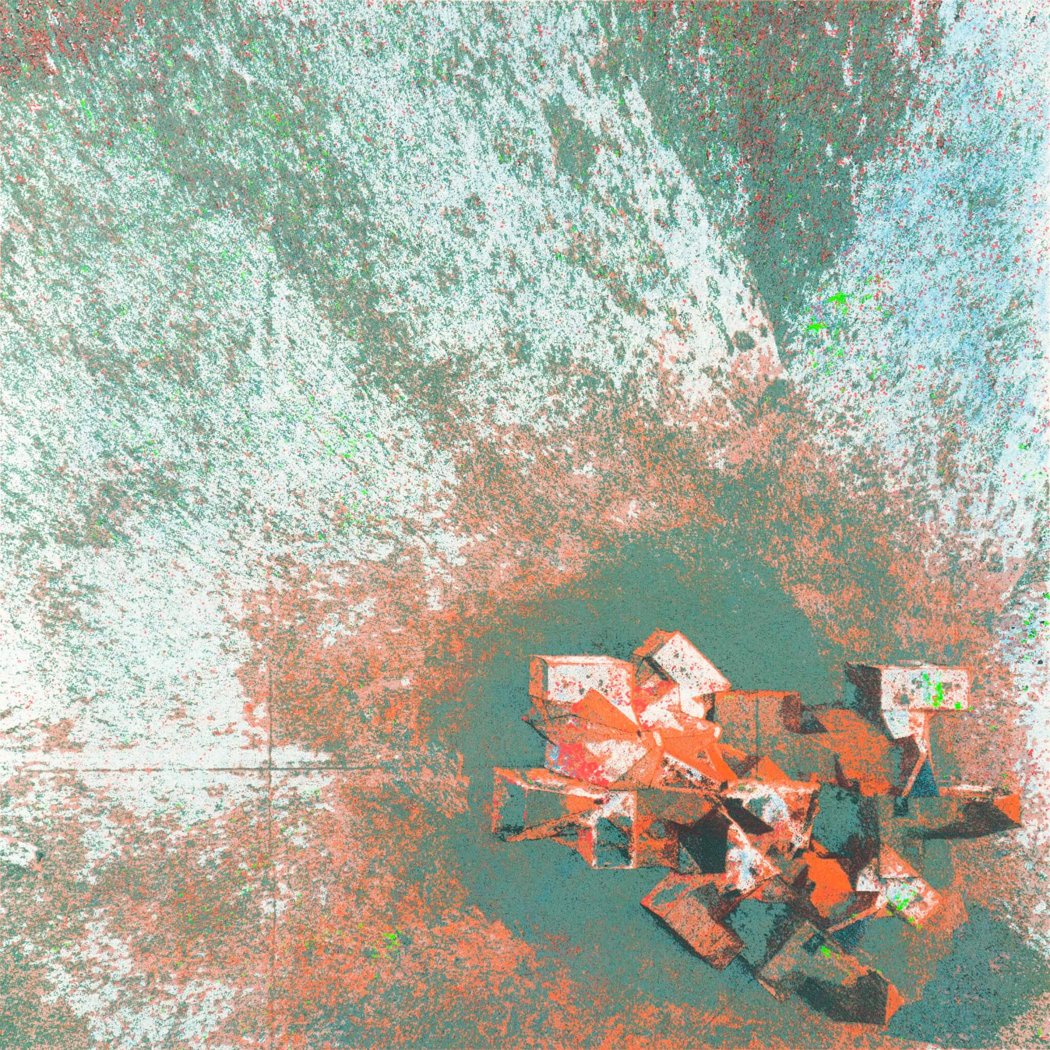
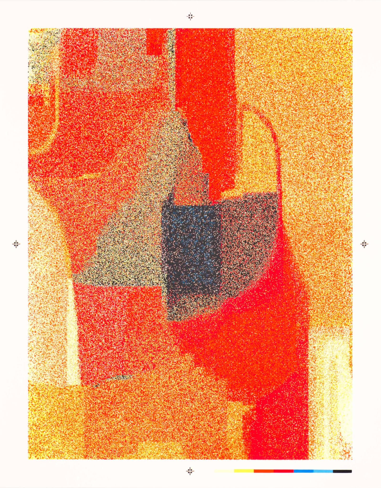
Aside from Canepa’s collage-like analog compositions, each piece mixes media and translates from various types of digital files to physical work of art. Canizares’ SCREENSPACE SILICA works are the most overtly software-based: Created using Processing and GLSL shaders, these custom prints are freeze frames of animated, real-time, on-screen, pixelated paintings. The pixel-to-print pipeline required rounds of color testing and layering to translate any given frozen still of the dynamic paintings as seen on screen. As such, the final piece carries a painterly effect that’s somewhat reminiscent of abstract expressionist paintings reinterpreted in a digital language, maybe an updated take on 1990s explorations like those of Jeff Elrod.
Young & Ayata’s Spectral Montage series creates a similar effect of pictorial staccato from the optical oscillation from individual layers of color to an overall whole. The works’ back-painted fluorescent edges cause the dense pieces—detailed “brushstrokes” of manipulated photogrammetric scans of physical models by artist James Casebere—to float off the wall. This mixing of media results in defiance of a categorical type—is a serigraph a “drawing”?—into something new altogether.
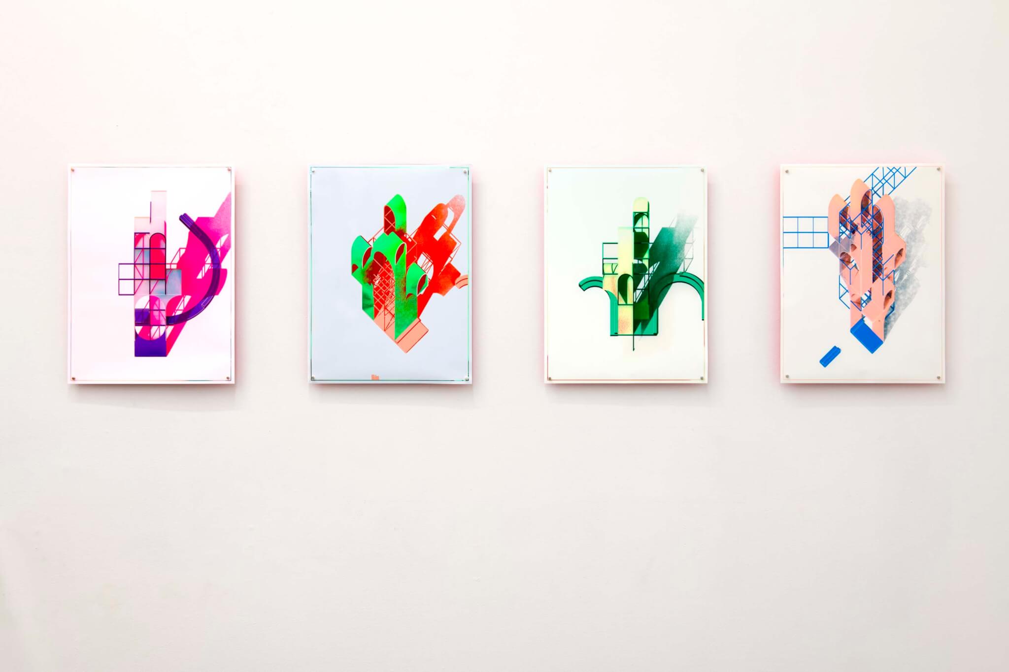
Relative to the intricately layered pieces described above, Architensions’ prints were much simpler and straightforward, but the visual effect is no less dynamic. A set of four serigraphs, each with unique color profiles and printed on dichroic film, represent individual chunks of their massive, colorful installation The Playground, realized for last summer’s Coachella Valley Music and Arts Festival. Playing with figure-ground relationships, the primary geometry of each assembly is revealed in the dichroic layer, while the background is printed with white ink; grids and shadows are also represented in a single color each. This layering, built from reserved geometries with #Rossi vibes, results in complex and ever-changing compositions (thanks to the dichroic’s iridescent qualities) that is experienced in the semicircular round, akin to sculpture more so than drawing.
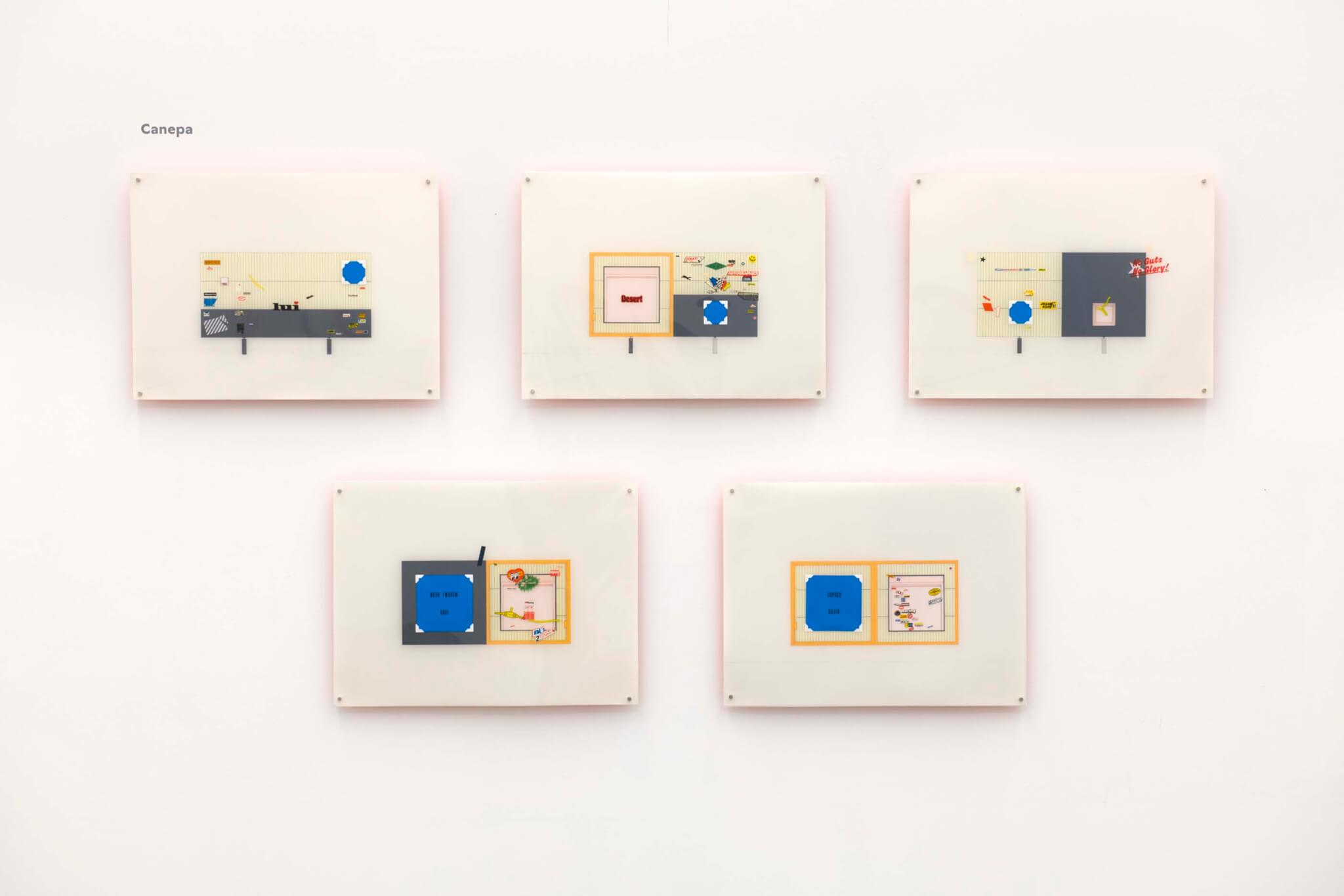
Canepa’s pieces, meanwhile, are more manual efforts. She utilizes a variety of media, including pencil, ink, acrylic paint, and various stickers and decals from transportation model kits, an extra-disciplinary detail which contributes to a pop art, bricolage-y aesthetic. Deadpan compositions and minimal linework allow for multiple readings: The immediate, one-point-perspective view is of a billboard that spans across a highway, but it could be understood as a facade, a section, a plan, or even, more abstractly, as a diptych of two squares.
Lévesque’s large-format drawings are both the largest and the most drawing-like of the show’s pieces, but they too have undergone a translation to their final, physical form. Through their sepia-toned ink prints and fantastical world-building, Lévesque’s compositions combine disparate elements in a layered, sectional/elevational manner. The implication is still one of detailed space and depth, but there’s more play: Scale is betrayed, as witnessed in the sizable building facades perched upon by even-larger birds. Entourage such as plants, flowers, and insects round out the drawings, making them more immersive rather than technical or conventional. A close inspection reveals concentrated individual pen strokes—an impressive investment of time and a steady hand for a 48 inch by 48 inch canvas—but a step back illuminates that these unreal drawings were created first as a digital collage of layered images over which the linework was traced to unify the environment from a collection of parts to an immersive whole.
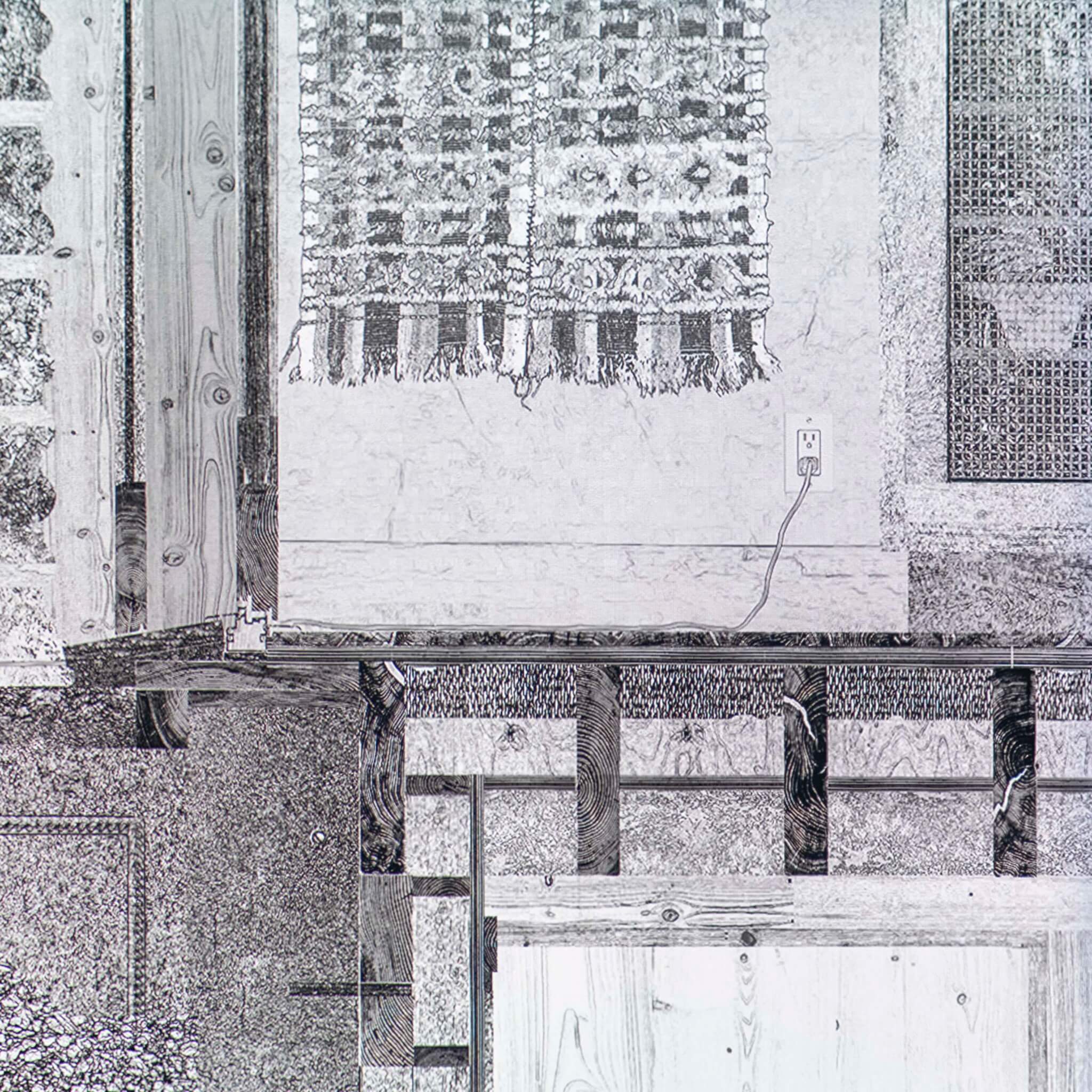
Gore/Hall’s animation Section Through a Path, meanwhile, is the only work without a printed representative on the gallery wall, but the physicality of its imagery remains vital to its world-making. A projected video playing on a loop could at first, in a crowded gallery, be confused for an animation of Lévesque’s drawings, as the hand-drawn, elevational layers are digitally composed and redrawn as a unifying element. Each layer moves at a slightly different speed such that foreground, midground, and background take turns becoming legible, and their movement constitutes an integral part to the drawing itself. Rather than a long section that is simply zoomed into and panned across, the architecture (or, really, the world) itself is moving. At certain points, viewers witness detailed landscape elements, including a section cut through the earth itself in the foreground. A few minutes later, a crawlspace below a rustic cabin’s bathroom, complete with a cut through the bathtub and floor joists rendered as end-grain with bridging between them, scrolls into view. It is only upon pausing to interrogate the animation for several minutes that the observer realizes this entire set-up is a hyper-detailed, zoomed-in section cut through a cabin Gore and Hall have designed. Here, equal care is given to the elements that create the life of the building and its surroundings (often left out of conventional architectural representations) as to the architectural details themselves. The effect is that instead of a representation of a building to be built, the drawing creates a self-contained world in and of itself.
Ironically, though it bears little resemblance to Spectral Montage, it does recall the point Young made in his recent book Reality Modeled After Images about the flattening of the divide between entourage versus “architecture” in such contemporary technologies as photogrammetric scans, a phenomenon he discovered through making the very images displayed in the next room.
Architecture flourishes when the conceptual collides with the material. Still, it’s more than the rote process of building buildings, so “flat” drawings hung on a gallery wall should not be understood as abstractions or representations of some potential, other built reality, but as realities themselves: They are works of architecture—items of value which, in this case, can be sold as “artworks,” as prior generations of architects did if business slowed. (With the exception of Lévesque’s pieces, everything is for sale at a83.) The pieces might land as “paper architecture” as conventionally understood, but there’s no escaping meatspace: After all, even paper itself is a material, as evidenced by the craft involved in each of the works displayed in this show.
The representations designers create—whether in the legalized domain of construction documentation or the free realm of digital paintings on view in a gallery—retain material and intellectual content within their linework, pixels, and collaged fragments. Though the pieces on view may be mostly “just” two-dimensional pieces of paper, Parallel Rules shows us what happens when ideas become something else—not mere works of art, but works of architecture.
Davis Richardson is an architect at REX and teaches at the New Jersey Institute of Technology’s School of Architecture.
