Pantone’s Color of 2026: Cloud Dancer as Fresh Start or “Landlord Special?”
Architects: Want to have your project featured? Showcase your work by uploading projects to Architizer and sign up for our inspirational newsletters.
The design world is spending the first chunk of 2026 arguing about the color white.
Pantone chose Cloud Dancer, a soft, warm white, as the Color of the Year. But instead of summoning the feelings of calm or peace that the shade was supposed to evoke, many people simply felt annoyed. The color, the internet decried, reminded them of the “Landlord Special.” Anyone who has ever rented an apartment is probably familiar with the experience of living in a freshly painted space where landlords have coated every surface in a quick coat of white, painting over light switches, door handles, dust — even bugs.
People around the world are cynical about this choice. After years of housing problems and economic stress, picking a simple white color feels lazy. The “Landlord Special” is not about design; it is about hiding dirt. It makes a home feel flat and empty, like a clinic.
Put differently, this decision basically sparked hate because it reminded them of this careless attitude. Using white in 2026 is just another way to do the bare minimum. However, upon closer look, the problem isn’t the color white itself. The problem is how landlords use it without thinking. Landlords use white to say nothing. But good architects use white to create a quiet space where we can think.
The Architecture of Silence and the Need to Reset
If we forget about bad rental apartments for a moment, we can see why Pantone chose this color. They said we need to “slow down and reset.” Life in the mid-2020s is full of loud screens and digital noise. In this chaotic world, white is a break. It is a pause button. The Landlord Special feels like “emptiness,” but maybe Cloud Dancer feels like “open space.”
Architecturally, this is important. We are moving away from the cold, bright whites of the past. Cloud Dancer is different. It is a billowy, quiet white. It has warmth. It doesn’t feel like a hospital. This is the “Fresh Start.” After years of noise, we need a blank canvas. This color challenges architects to focus on the basics: shape, light and size. You can’t hide bad design with white paint because white shows everything. Using this color is a brave choice. It means the design is strong enough to stand on its own, without decoration.
Material, Curves, Light, Contrast

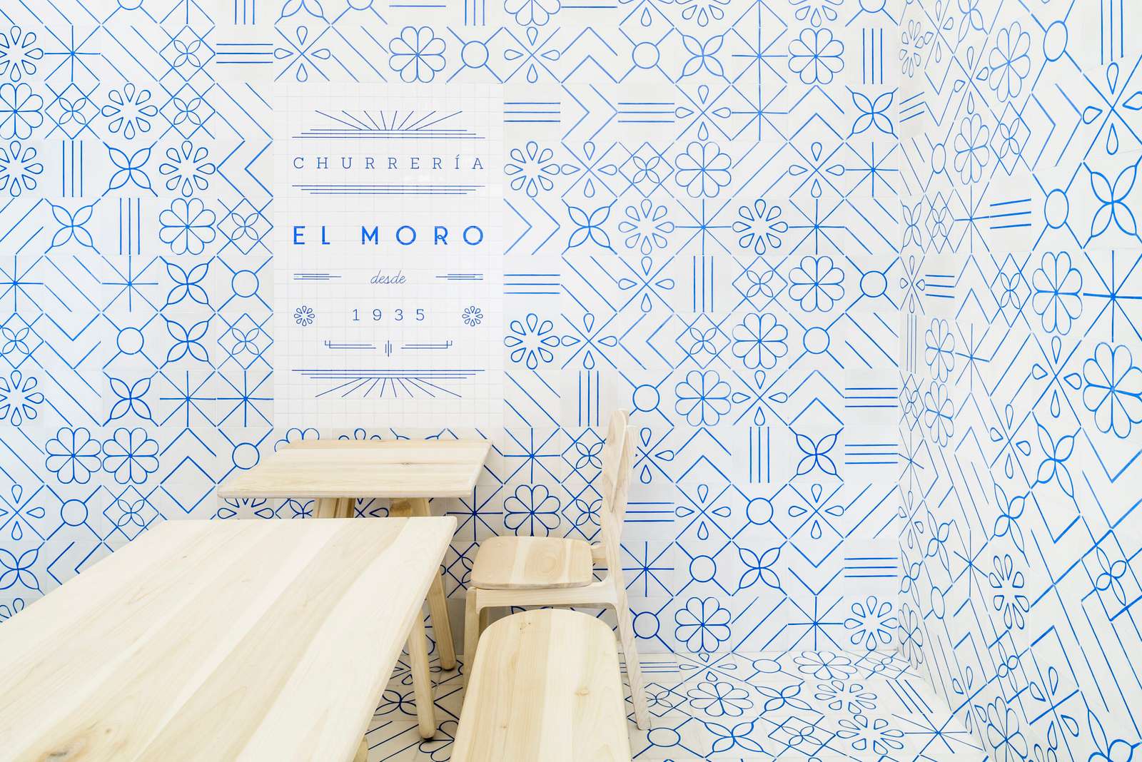
El Moro by Cadena + Asociados Concept Design, Ciudad de México, Mexico | Photo by Moritz Bernoully / Architecture Photography
How do we use this color without it looking like a cheap rental? The answer is texture and form. To make Cloud Dancer look intentional, we must stop painting flat walls and start building interesting surfaces.
So let’s look at a few examples from the archive.
First, we look at El Moro in Mexico City. The architects wanted the shop to look like sugar — white and sweet. They used thousands of small white ceramic tiles. This solves the biggest problem of white walls. When you use tiles, you create a grid. The lines between the tiles (the grout) break up the large white space. The glossy surface of the tiles catches reflections from the street and the people walking by. It makes the wall feel “active.” It proves that a monochrome room doesn’t have to be flat; it can sparkle.
Softie by OPA, Mill Valley, California
Another project is Softie in California. Most rental apartments are rigid boxes with sharp corners. This makes white paint feel stiff and industrial. In this house, the architects (OPA) used the color white to highlight softness.
They built the ceiling to ripple and curve, like a cloud floating over the room. Because the surface is curved, the light hits it differently at every inch. Some parts of the white ceiling look bright, while others are in soft shadow. This creates a gradient. It teaches us that if you want to use white in 2026, you should try to round the corners. It makes the “Cloud Dancer” color feel like a blanket wrapping around you, rather than a box trapping you.
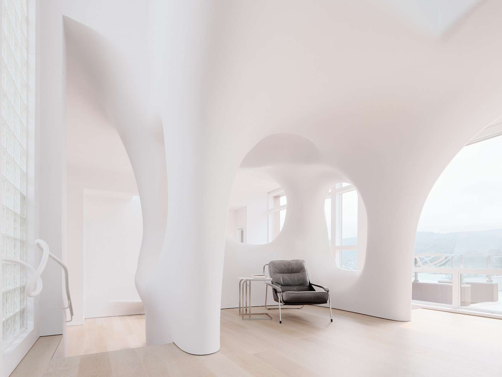
Then, there is the White Cave House in Japan. Here, the white color is used as a tool, not a decoration. The architect carved a large open space (a void) out of the house and painted it pure white. This acts like a giant reflector. It catches the sunlight from the sky and bounces it deep into the house. In a “Landlord Special,” white is used to make a dark room look artificially bright with cheap bulbs. In this house, white is used to harvest natural sunlight. The color of the wall changes with the weather. It shows us that white is a mirror for the sky.
Finally, we have The White Cave in India (pictured at top). This project teaches us about grounding. If a room is 100% white, it can feel like a laboratory or a sci-fi movie. It feels floaty. To fix this, the architects at D’WELL paired the white walls with rough textures. They used white pebbles on the floor and rough stone textures on the walls. The crunch of the pebbles and the roughness of the stone give your eyes something to rest on. It adds a “natural” feeling to the color. It proves that Cloud Dancer looks best when it is next to something raw and earthy.
By using these techniques — tiles, curves, sunlight and stone — we stop the color from looking cheap. We turn it into a rich, layered experience.
Architects: Want to have your project featured? Showcase your work by uploading projects to Architizer and sign up for our inspirational newsletters.