outdated japanese home half-buried in mortar mass emerges in renovation by naoshi kondo
‘yutorie atami’ dormitory renovation by naoshi kondo
naoshi kondo has completed an unexpected transformation of a ‘gasshukujo’ dormitory from the 50s in shizuoka, japan. embodying kondo’s creative identity which combines design with humor and edge, the renovation (named ‘yutorie atami’) adopts a brutalist character, presenting an old-style wooden house that’s half-buried in mortar mass. the architect’s idea was to realize an ‘irrational’ concept through spontaneous, intuitive decisions, something that could not be realized within structural creative logic or consideration of necessities, thus leading to a surprising accumulation of balance.
all images by yujiro ichioka
a house half-buried in a mortar block
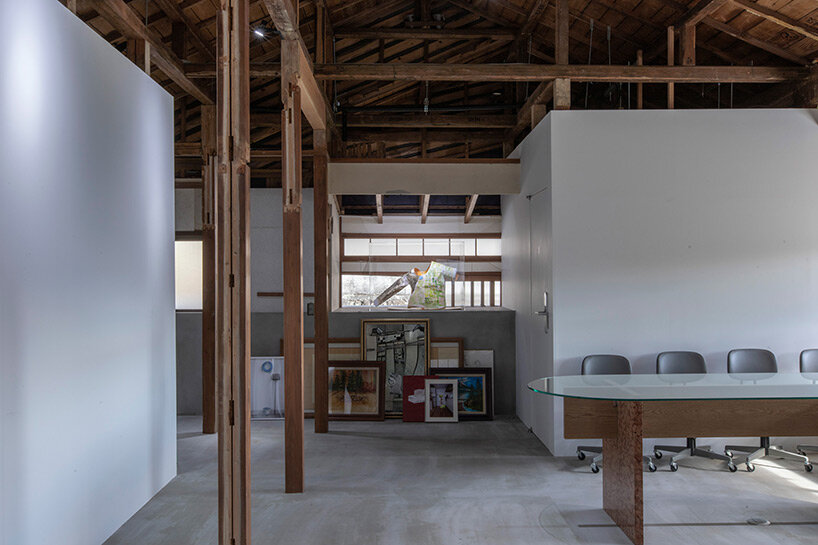
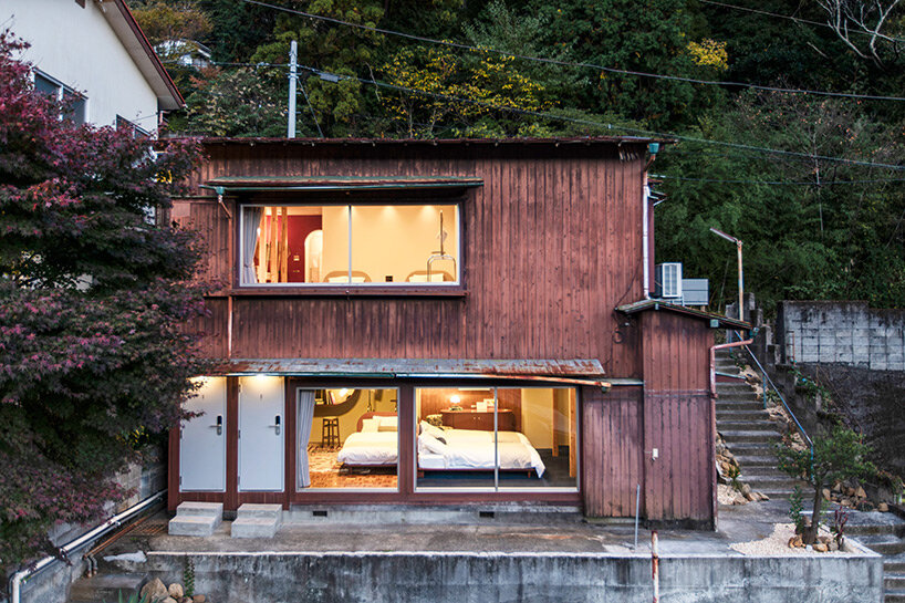
the main wooden residence was built in the 1950s as a second house for naoshi kondo’s grandfather-in-law, and it was abandoned for a decade until the project construction started at the beginning of 2021. besides the main building, there is also a two-story annex facing the steep slope. the former structure has been entirely transformed into a studio space with one guest room. the latter is now used as a lodge with three rooms, while also including a café space on its second floor.
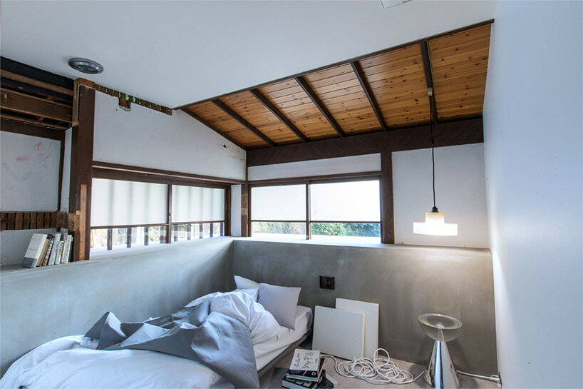
perhaps the most surprising element of the renovation is an old-style wooden house settling amid a stone-filled court opposite of the annex. the structure is half-buried with mortar mass in a brutalist manner. upon designing, the japanese architect came up with an illogical idea of ‘filling the house with mortar’ and eventually, all sides of the house were covered with a 100-cm-wide mortar block. from the inside, the mortar mass runs along the walls and leaves the guest to explore its function or how they could interact with it. recalling the process, kondo shares that he is still trying to find reasons to justify his decision. though the purpose or function was far from intention in the beginning or even until the present, the mortar mass plays a significant role as far as the identity of the space is concerned.

a contrast of old and new featuring graphic elements
unlike typical ‘gasshukujo’ dormitories, the rooms of yutorie atami (find more here) are semi-luxurious. the built-in shelves, bed headboards, openings, and furniture present themselves as round-shaped elements which are rarely seen in old japanese housings. the cross-structured handrails provide a visual rhythm to the environment while adding a touch of graphic design to the overall architecture.
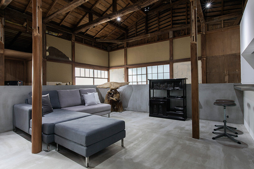
a similar approach was adopted in the studio space, where the mortal separates the space in half. the upper part is preserved as an old folk house with urethane insulation and exposed ceiling structures. on the contrary, the lower part is completely minimal and modern, employing a monochromatic color scheme. the visual flow is abruptly cut, while three wooden pillars are kept intact in order to achieve partial continuity from the ceiling to the floor. overall, the contrast of old and new, and the different materials are adapted to the space through a two-dimensional cut-and-paste, layering/zapping idea. as a result, visitors are left to enjoy a tricky, yet refined and inspirational stay at yutorie atami to trigger their senses.
