OPPO ColorOS 13 brings splash of nature-inspired design to smartphones
With over 500 million monthly active phone users spread across 60 different countries and regions, OPPO’s design team is devoted to constantly improving ColorOS – its Android-based mobile operating system – to provide a more customized, efficient, and intelligent service to its users. In 2022, OPPO launches ColorOS 13 by applying an array of innovative new features using an inclusive and intuitive design. Water-inspired visuals, customizable experiences, and smart interconnectivity are just a few updates that deliver more intelligent and convenient services to aid our everyday lives.
Xi Zeng, Director of Software Design at OPPO, delves into the new design and features of ColorOS 13 in an exclusive interview with designboom.
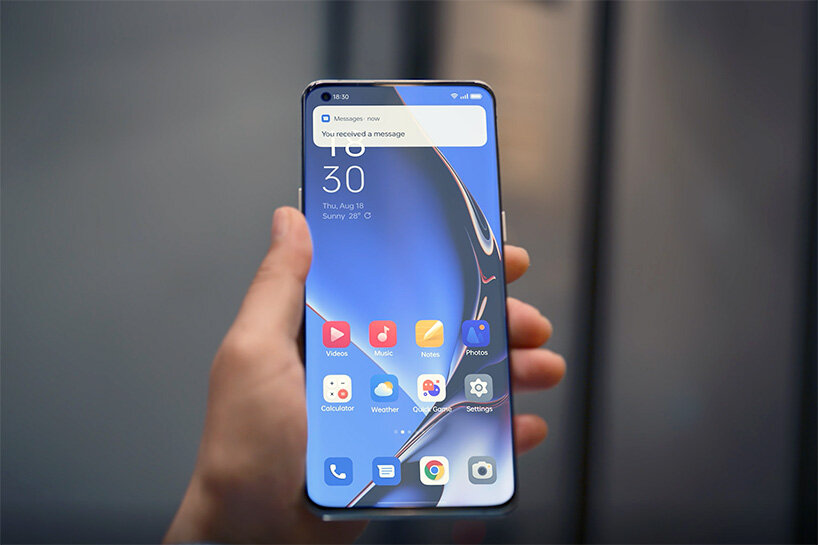
The fluidity of water shapes the organic forms of OPPO ColorOS 13
water inspires design of OPPO ColorOS 13
‘The ultimate goal of OPPO is to enhance technology to build smart devices that are vivid and less mechanical in feeling,’ begins Xi Zeng, Director of Software Design at OPPO. ‘If I were to use one word to describe ColorOS 13, it would be aquamorphic. This is a combination of water – aqua – and morphism. We wanted to leverage the power of water in the design concept to express the value OPPO wants to show to the user. Our software design also needed to be fluid, natural and inclusive. Water is the perfect symbol for the aesthetic and relationship we wish to create between tech and user.’
OPPO envisions its technology as peaceful, vibrant, all-pervading but silently benefiting our lives. Sourcing inspiration by the way water – a symbol of hope and vitality – acts in nature, OPPO ColorOS 13 introduces a fluid, vibrant, and inclusive user interface through a new concept called Aquamorphic Design. Organic shapes form the windows, cards, and input boxes on-screen to reflect a water-like fluidity. The features of water is further integrated into system animations using effects, such as interactions with the fingerprint when unlocking the phone or the water droplet animation on the screen during fast charging. A concise, comfortable visual experience plays out across all features and interactions with the device.
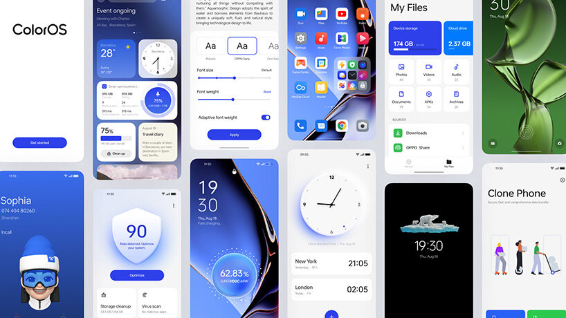
Human-centric design choices, such as Adaptive Layouts, deliver improved readability and ease of use
inclusive for more than 500 million monthly users
Inclusive design was a key update with ColorOS 12 in 2021. In 2022, ColorOS 13 continues to improve this core component with a more intuitive and inclusive design language. This introduces Empty State Illustrations, Adaptive Layouts for different screen sizes, and highly recognizable icons to enhance readability and overall ease of use. Empty State illustrations, for example, adds characters from diverse cultures and backgrounds in the system’s setting menus to help users in understanding different meanings.
‘Inclusivity is such an important challenge for us, as OPPO has hundreds of millions of users worldwide. To be a real global company, we have to overcome these difficulties and deliver the best experience for everyone. To do this, ColorOS 13 introduces a new font that improves readability in different languages, new icons to avoid misunderstandings in other cultures, and diversified Empty State Illustrations. We also developed Adaptive Layout to deliver a more concise and consistent layout across different languages, such as Arabic or Japanese,’ explains Xi.
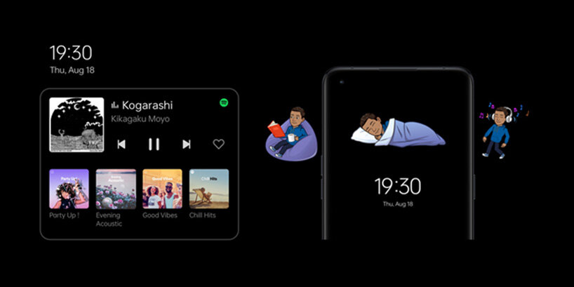
The highly expressive Smart Always-On Display now communicates key information ranging music playing to food delivery apps
more functionality for expressive Always-On Display
ColorOS 12 also brought the highly expressive and personal Always-On Display to smartphones. ColorOS 13 takes the display to new, positive levels of functionality. Called Homeland, a series of images depict powerful scenes of wild animals in nature. The animations – including a polar bear, penguin and clown fish living around coral – reveal changes in the environments of these creatures, based on daily temperature changes. It calls upon users to consider climate change, environmentally positive choices, and co-habitation. The Smart Always-On Display now communicates key information ranging music playing to food delivery apps. This gives quicker access to information and convenient control, all whilst minimizing power consumption too.
‘The Smart Always-On Display has a clear positioning as a window for users to glance at important information without needing to unlock the smartphone. OPPO does not want users to overuse their phones. This is why we developed this display. Lots of different information can be displayed depending on regions, from Spotify to Zomato, Swiggy and Snapchat.’ The Director of Software Design continues to add, ‘ColorOS 13 introduces Homeland to the Always-On Display. It showcases nature, like animals or plants, according to the temperature of the user’s location. This aims to give context to global warming, make users conscious of the issue, and promote ideas for positive change.’
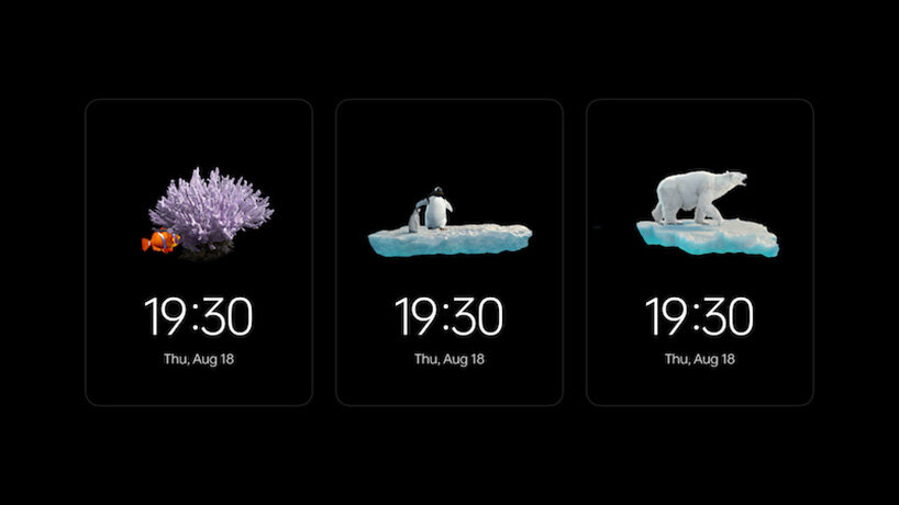
Homeland animations warn of climate change, based on daily temperature of the user’s location
an industry first: Meeting Assistant for smartphones
As a habit that has continued to grow since the pandemic, online meetings are now an integral function of smartphones. OPPO has developed the industry’s first Meeting Assistant for smartphones to help: automatically prioritizing wireless data for stable connection, simplified banner notifications to minimize distractions, and a Notes shortcut to take meeting minutes in a small pop-up window. Productivity and convenience is further boosted with the Multi-Screen Connect. Now feature that supports seamless connectivity between smartphone and OPPO Pad Air or PC. File transfers, with more file formats and without smartphone hardware limitations, are a simple click away.
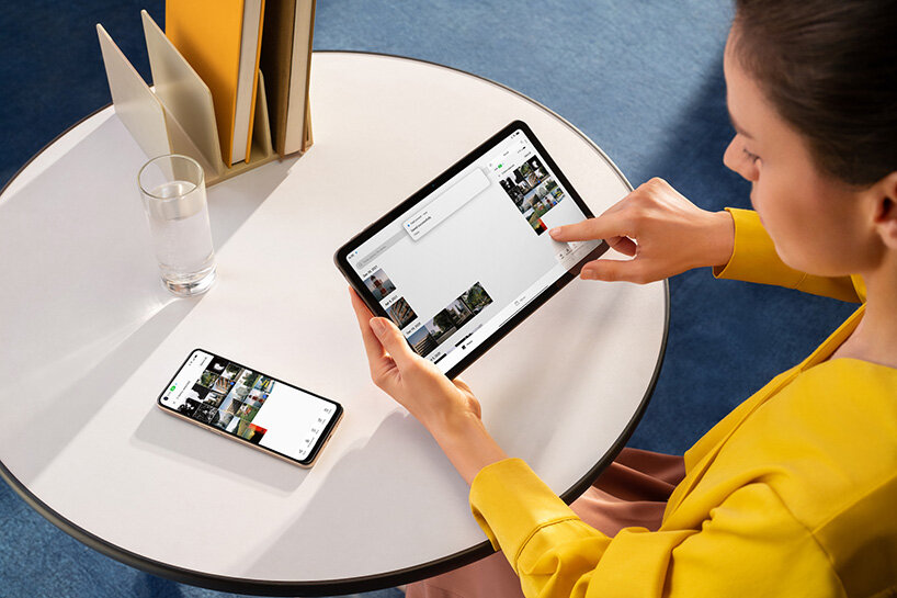
Multi-Screen Connect. Now feature that supports seamless connectivity between smartphone and OPPO Pad Air or PC
‘We have a model for design called PIV: the problem of society and user, innovation of your time, and value of the company. We believe good design is always a sum of these three points. Aquamorphic Design overlaps all the criteria,’ concludes Xi Zeng, Director of Software Design at OPPO.
Based on Google’s Android, OPPO’s operating system is fundamentally simple, but ColorOS 13 enhances this platform to become more customized, efficient, and intelligent for its worldwide users. Problems are identified and solved with new innovations and human-centric design choices. The result, as immediately noticeable by users, is the concise Aquamorphic Design language that inspires confidence and intuitiveness.


