Olson Kundig’s Bob Dylan Center Blends Beautiful Architecture With Sophisticated Exhibition Design
Architizer is thrilled to announce the winners of the 10th Annual A+Awards! Want to earn global recognition for your projects? Sign up to be notified when the 11th Annual A+Awards program launches.
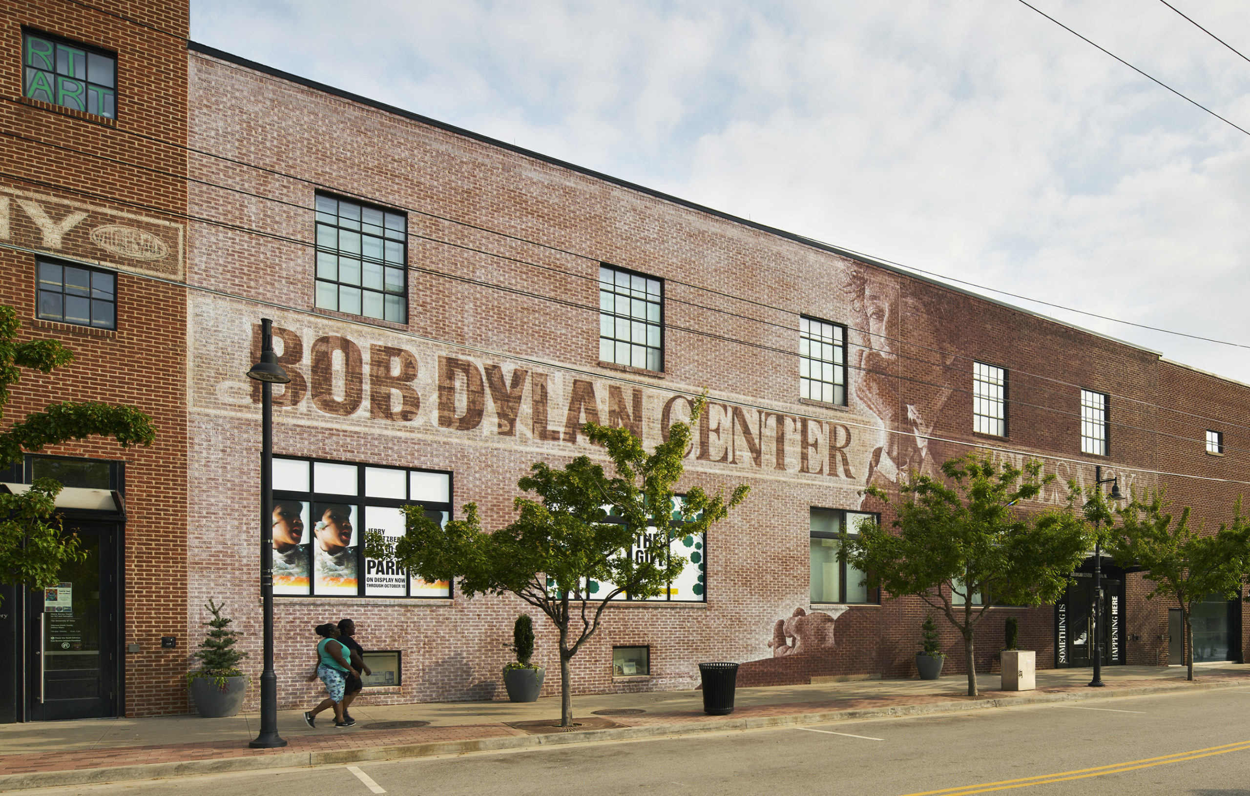
“Architecture is frozen music,” Johann Wolfgang von Goethe once said, and the links between songwriting and building design have been drawn continually throughout the past century. The latest coming-together of these creative disciplines arrived in the city of Tulsa, Oklahoma, where acclaimed architecture firm Olson Kundig completed their transformation of a former gallery building into the Bob Dylan Center, home to the complete archive of one of the most iconic rock stars in history.
I met with architect Alan Maskin, Principal and Owner of Olson Kundig, for a guided tour of the project. “This was originally an international design competition, and at first the client was looking for architects and exhibit designers,” explained Maskin. “Olson Kundig is one of the few firms that does both. I’m sure you’ve been in museums where the architect stopped and the exhibit designer took over, and they never met or talked to each other; we try to design visitor experiences where, spatially and narratively, everything is working together.”
Bob Dylan Center, Tulsa, OK; photo by Matthew Millman
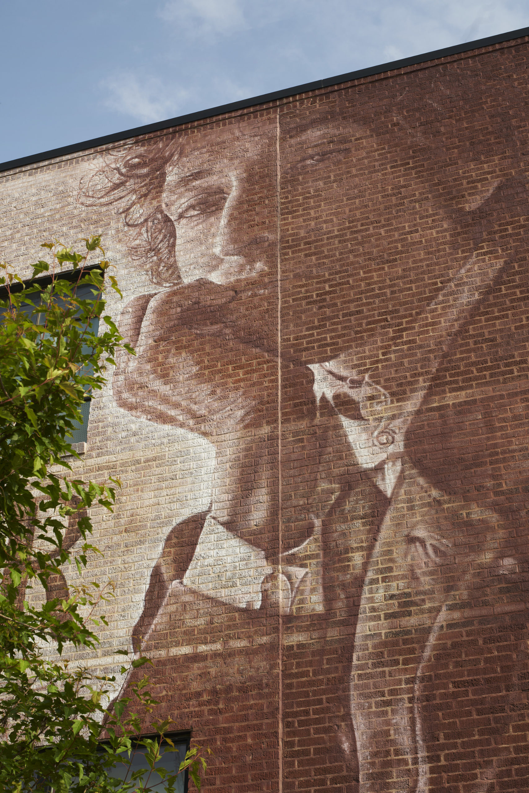
The firm’s versatility paid off when a new building was acquired for the Center that meant the architectural component of the brief was removed, and the scope shifted to exhibit design only. Olson Kundig were able to adapt to this new reality, and carried across many of their original design proposals to the new space. This included an incredible, evocative mural of Dylan, painted on the bare brick across an entire street-facing façade.
Bob Dylan Center, Tulsa, OK; photo by Matthew Millman
“Erik [Burke] is a graffiti artist whose work I found in an alley walking to work in Seattle,” Maskin recounted. “He ended up spray painting the mural of a famous portrait, a very rare photograph of Bob Dylan by Jerry Schatzberg.” The mural encapsulates the collaborative nature of both the project and the Center itself: Elements of architecture, art and music are woven together throughout the space, brought together by a rotating set of curators from diverse backgrounds including biographers, screenwriters, poets, filmmakers and more.
Bob Dylan Center, Tulsa, OK; photo by Matthew Millman
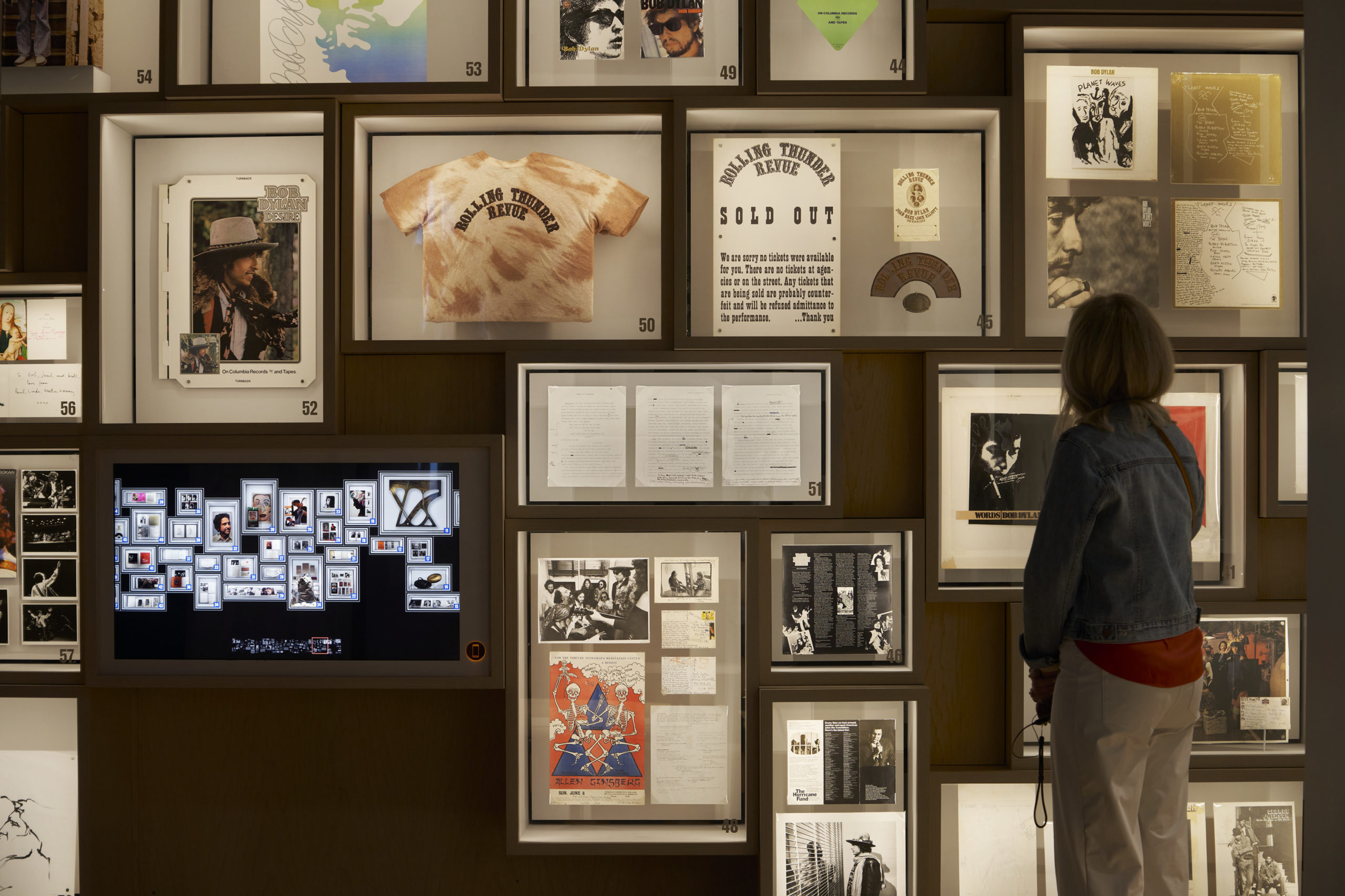
Walking me through the material details and programmatic order of the space, Maskin revealed the intricacies of designing an exhibition for a legendary musician defined as much by his secrecy as his success. Dylan was an enigma, and his archive is similarly shrouded in mystery, much of it hidden away with only select pieces being made accessible to the visiting public. Maskin turned this challenge into an opportunity, and, rather than trying to create a “monument to a rock star” like many conventional music museums, he opted to create a spatial experience that would “tell the true story of Bob’s creative trajectory”.
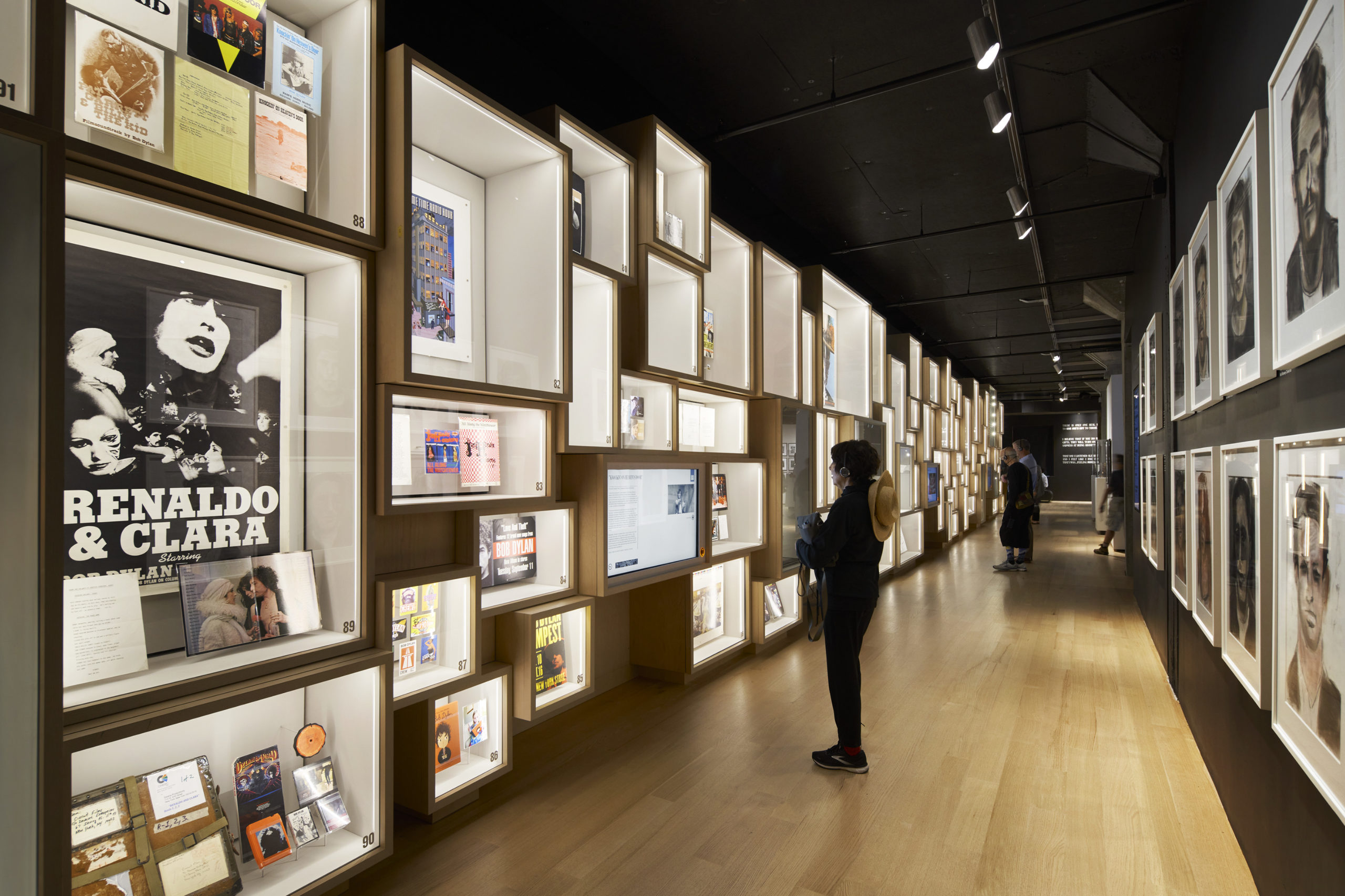
Bob Dylan Center, Tulsa, OK; photo by Matthew Millman
To this end, the selection of objects that are included within the exhibition are not intended to be viewed as relics, akin to a Hard Rock Café-style “shrine”. Instead, they are carefully curated to tell stories, revealing new narratives about Dylan’s creative process. Taken as a whole, the Center forms a platform to spark inspiration in the minds of visitors, hopefully leaving them with the desire to create something new in their own lives.
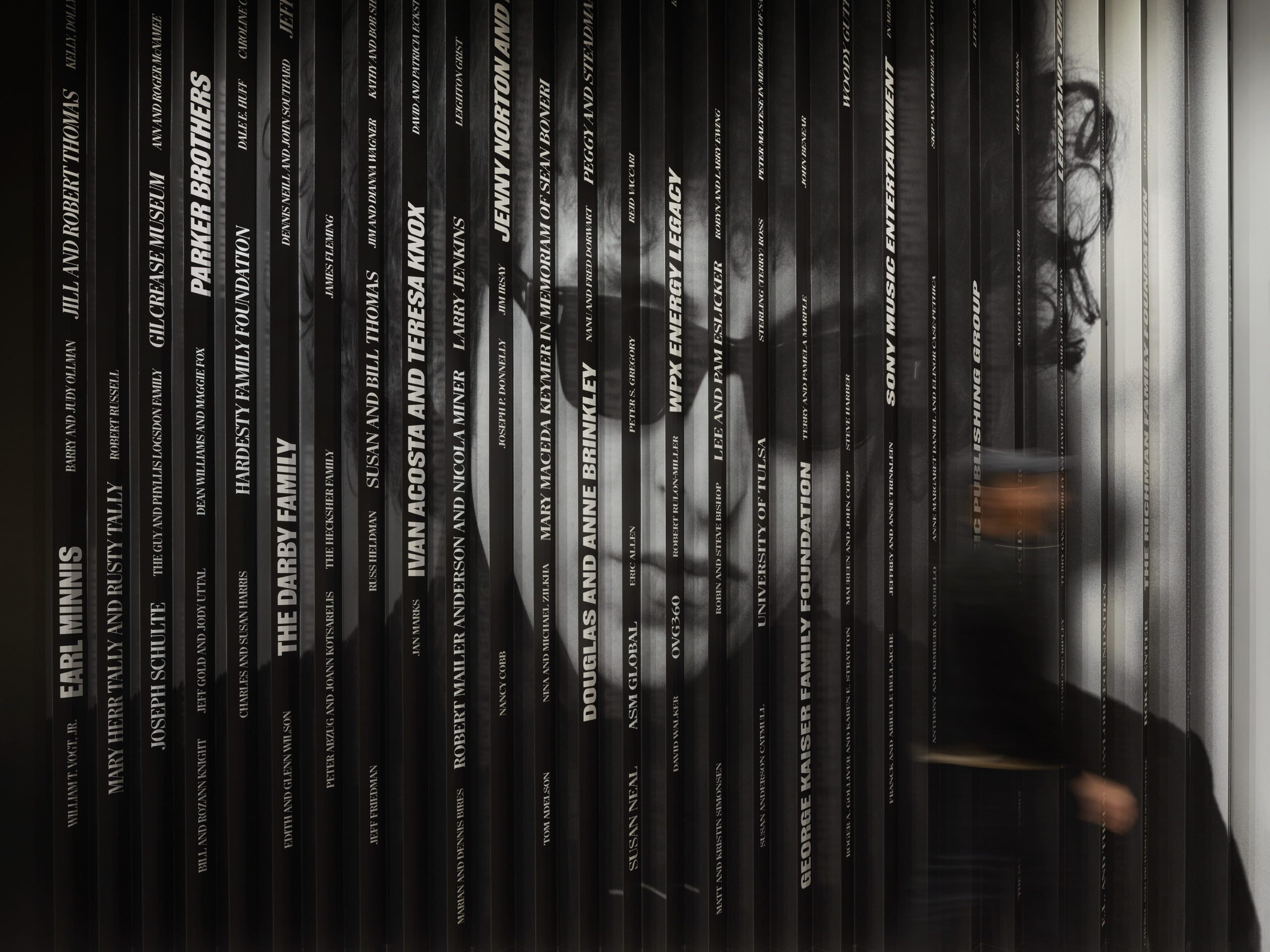
Bob Dylan Center, Tulsa, OK; photo by Matthew Millman
The exhibition is expertly designed to serve people with different levels of interest and knowledge on Dylan and his career. “There are three different types of visitor that we needed to design for,” said Maskin. “The ‘Skimmers’ are the ones that move through really quickly; they look at the big things, they read the headlines, they’re there for about 30 or 40 minutes. The ‘Swimmers’ will know Blowin’ in the Wind; they’ll recognize pictures from history, things that call them over. They’ll definitely go and touch things, and interact with them, but they’re only there for about an hour to an hour-and-a-half. The ‘Divers’ includes ‘Dylanologists’, people who have devoted their entire lives to the career and works of Bob Dylan. We knew we had to have something for these people, something that they had never seen before.”
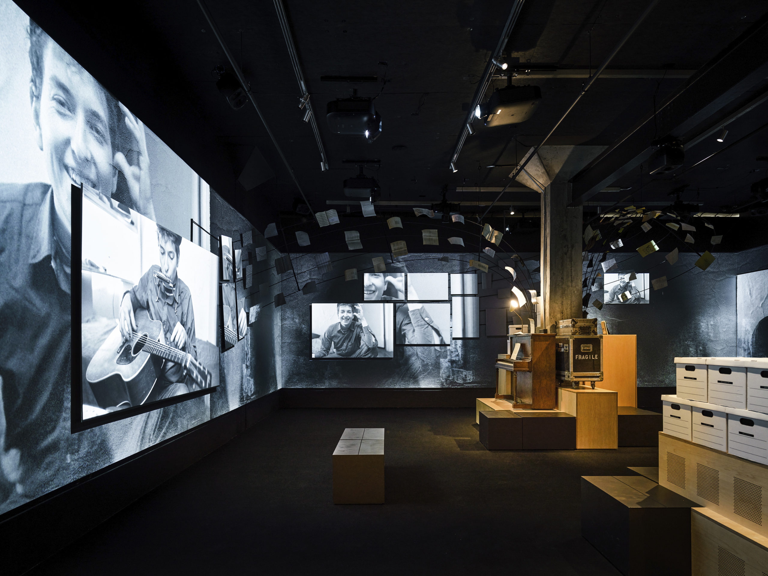
Bob Dylan Center, Tulsa, OK; photo by Matthew Millman
While this project was more about exhibition curation than architectural design, there is a significant piece of architecture embedded within the project — designed by none other than Dylan himself. “When we designed the original competition rendering, if you look carefully, we actually put a Bob Dylan gate on the outside of the building … we had no idea if we’d ever get one, but somehow, through connections and people doing us favors, he agreed to make one. The materiality of that, the fact that he’s a writer that also welds and works with metal, we just loved showing that side of him.”
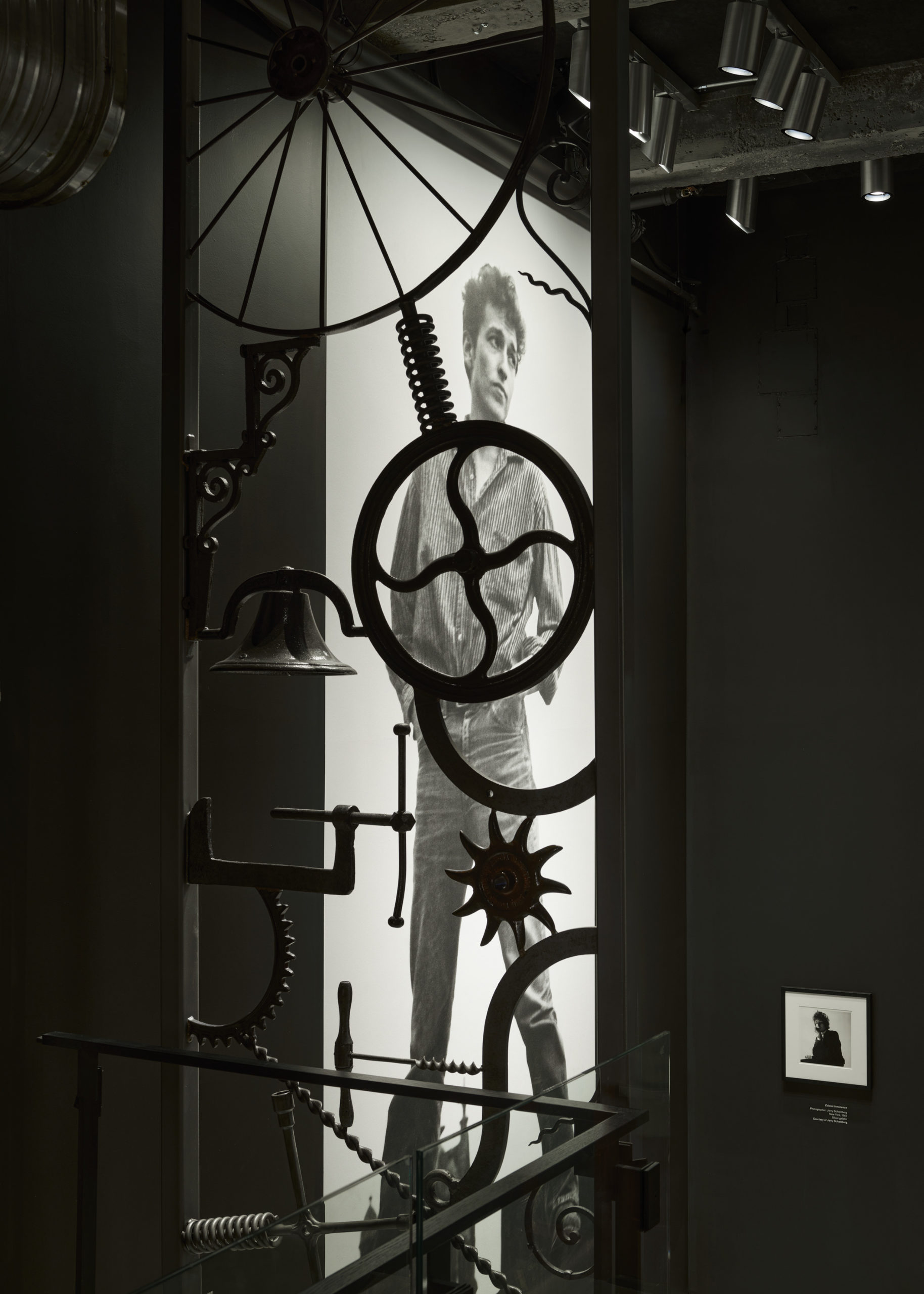
This 17-foot tall gate resides in the lobby of the Center, a machine-like screen of welded industrial components. The piece harks back to the idea underpinning Wolfgang von Goethe’s “Frozen Music” quote: That creativity can carry itself across mediums, and the arts can overlap in the most unexpected, yet wonderful, ways. The same can be said for Olson Kundig.
This extraordinary design firm, so famed for its tenacious, tactile works of architecture, has also demonstrated its expertise in exhibition design here, with a series of subtle yet sophisticated design moves and wealth of smart collaborations. As a result, Tulsa has a timely new cultural landmark, securing a home for Dylan’s legacy for decades to come.
Top image: Bob Dylan Center, Tulsa, OK; photo by Matthew Millman
Architizer is thrilled to announce the winners of the 10th Annual A+Awards! Want to earn global recognition for your projects? Sign up to be notified when the 11th Annual A+Awards program launches.


