Ogilvy Workplace Vilnius / TOOTA
Ogilvy Office Vilnius / TOOTA

- Area:
421 m²
Year:
2021
Photographs: Norbert Tukaj-
Lead Architect:
Justė Žibūdienė

Reality is not real.

Are objects visible to our eyes indeed real? Can we trust our senses and first impressions? Are we possibly being misled by the visuals created in our conscience? Topics of illusion, surprise, and first impression are the leading themes in the interior dedicated to an international marketing agency “Ogilvy”. The goal here is to create a misleading first impression, an illusion, and to distort reality if only for a moment.


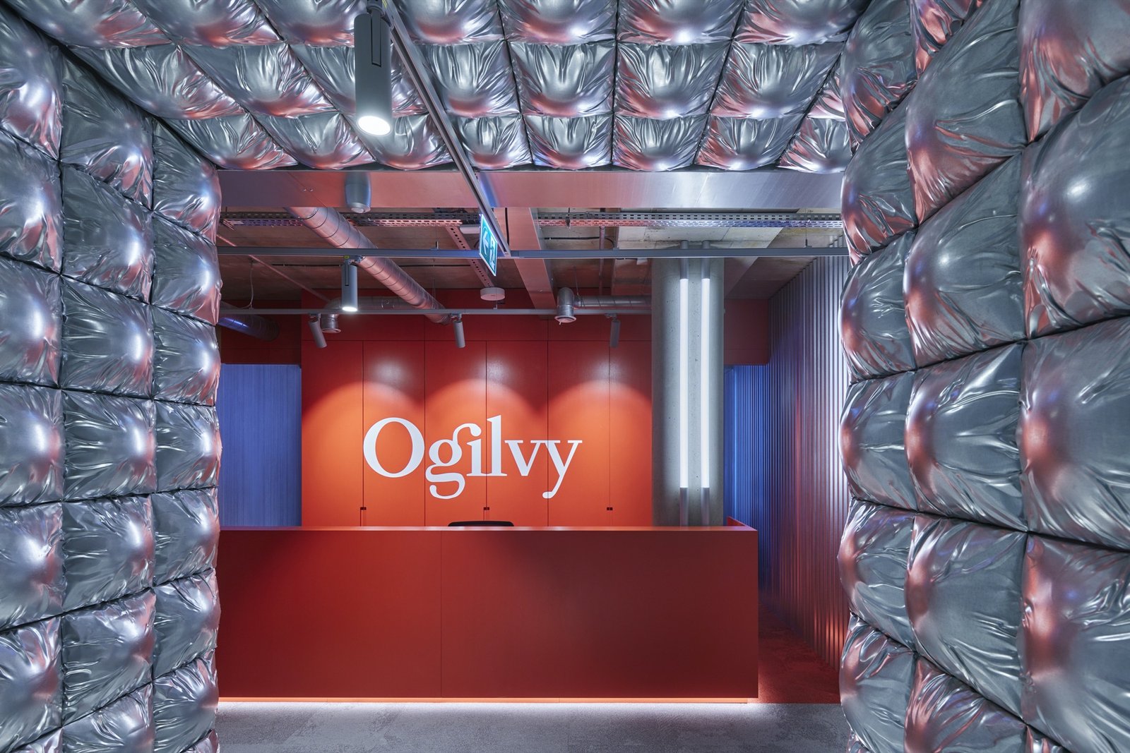
After opening an ordinary-looking office door, a visitor is greeted by an impressive entrance portal made up of puffed-out elements, which form the first impression must plastic or rubber. A person is led through into an entirely different space than expected after opening the ordinary-looking door. The puffed-out elements appear to be temporary and soft. But as you touch them, you realize that they are solid and cold, made of shiny metal.

This is just the beginning. More items of surprise and unexpected impressions follow. From outside, a cold-looking meeting room made of silvery-white metal is in fact soft and bright inside. The exterior of another meeting room is wooden, but it becomes burnt-down black from inside: the material used is the same, however, its structure and color change drastically. The lounge area, which typically we expect to be soft and comfy, seems to have stainless steel furniture. This is a great contrast to the very idea of lounge space. But once you touch and try out the furniture, you understand, stainless steel is an illusion.

This interior does not attempt to hinder the main purpose of the office which is to facilitate productive work in a most traditional sense. The spaces with dominating, bright elements are isolated, thus do not interfere with a productive work environment. Much attention was also given to work ergonomics.

The office plan is clearly structured and thought through. The whole office area facilitates fifty workplaces, five meeting rooms of varying sizes, and roomy lounge, kitchen areas. Convenient functional links interconnect these spaces.

Every functional area has its own fabric and colors, thus creating distinctive individual characters in each of them. Cold materials, such as concrete, stainless steel, galvanized tin are matched with soft and “warm” materials: felt, carpet or wood. Neutral colors of metal and concrete are contrasted with bright corporate colors of Ogilvy.


