NO ARCHITECTURE organizes flower house as six overlapping pavilions in the berkshires
flower house by NO ARCHITECTURE
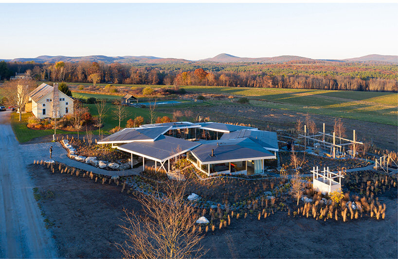
New York-based studio NO ARCHITECTURE has designed ‘Flower House’, a weekend getaway in Massachusetts to bring family members closer to each other and to nature. Perched on the picturesque scenery of the Berkshires, the final composition is organized as six interlocking pavilions around a central open hexagonal courtyard. From a bird’s-eye view, the dwelling resembles the contour of a flower, hence the name of the project.
Taking references from the modern glass houses and the native terrain, the project presents itself with clear geometries dominated by generous amounts of glazing. The resulting layout lets the interior flood with plenty of natural light, while optimizing passive heating and cooling, solar access, and natural ventilation, thus endowing comfortability for the rituals of daily life. ‘The project reinterprets and expands on the glass house typology through its dynamic relationship to the native landscape and a plan configuration that organizes the six interlocking pavilions into “petals” around a central open courtyard,’ shares the architects.  all images ©NO ARCHITECTURE, unless stated otherwise
blurring the boundaries between in and out
Founded by architect Andrew Heid, NO ARCHITECTURE (see more here) has completed the holiday house partially excavated into a hillside. The project is strategically orientated to optimize varying sun exposures and offer a clear division between public and private spaces.
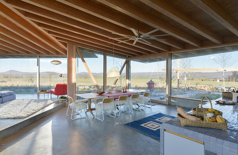
Taking into account the overall calm atmosphere evoked by the neighboring humble structures and the lush landscape of the property, the architects sought to make the most of the views. Thus, various openings from different directions fill the interior with natural light and views, and proper ventilation flows through the spaces. Uphill to the west, clerestory windows brighten the bedrooms and baths. Downhill to the east one encounters the public programs, including the kitchen, living- and dining room, while floor-to-ceiling windows blur the boundaries between the Flower House’s outside and inside.
The cantilevered roof canopies provide weather protection, passive shading for the interior, and a dramatic frame that expands the transition from interior to exterior. The central hexagonal courtyard catches summer breezes and winter sun, exuding a welcoming and vivid atmosphere for the interior. ‘Structurally, each pavilion operates like a Miesian umbrella diagram—a canopy open to all sides—with an exposed concrete slab-on-grade below.’
 the living room enjoys direct views in all directions
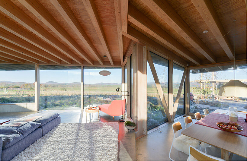
Throughout the interior, the team avoided the usage of columns in order to achieve free movement and clear lines of sight. The structure is vertically supported by load-bearing window frames and stabilized laterally by T- and L-shaped cores that conceal shear walls. ‘By consolidating the bathroom, storage, and mechanicals within these structural cores, the project maximizes usable space and minimizes poche.’
When it comes to materiality, the architects molded the interior with a homely palette of warm colors. Wooden accents in combination with concrete flooring and large amounts of glazing complete the interior. The team avoided excess decoration, letting the panoramic scenery spill over the spaces and do the talking.

the resulting design endows the spaces with honest comfort and gentle living

