nmdarq – nmd arquitecto Design Spacious and Bright LR Apartment
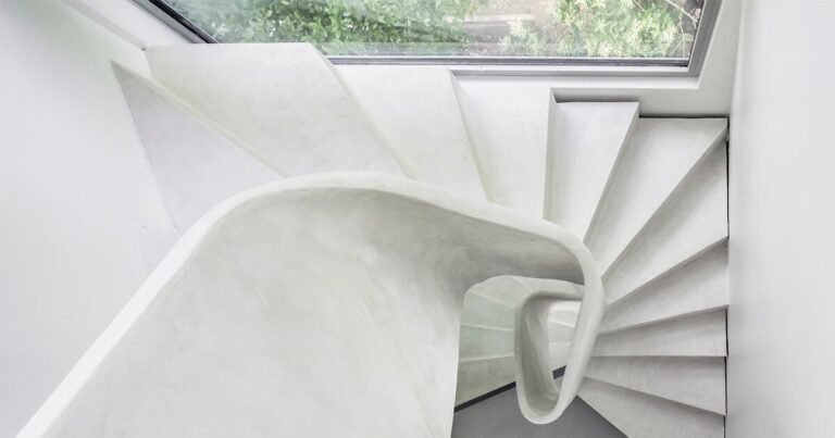
LR Apartment – The project focuses on an interior intervention of a flat located in the centre of Lisbon, whose first visit enunciated what was too evident for us – a fragmented space with a weak connection to its large exterior terrace. Such evidence was the trigger for the development of the project’s concept – spatial amplitude and direct connection with its exterior terrace. The project is developed under three premises: 1. To physically enlarge the space confined to the existing area; 2. Bring light and “lightness” to its interior; 3. A more direct connection with a new space for social interaction and outdoor leisure.
Architizer chatted with Nuno Miguel Dias, Architect at nmdarq – nuno miguel dias, arquitecto, to learn more about this project.
Architizer: What inspired the initial concept for your design?
Nuno Miguel Dias: The denial of what we identify as “tendencies or trendies” together with the transformation of space into the antithesis of what existed, making it spacious, bright and functional. Austerity is the starting point, with thoughts of predominantly light spaces contrasted with the materiality to be adopted in conjunction with the integration of natural light coming from the terrace and that which would be artificially created.

© nmdarq – nmd arquitecto lda
What do you believe is the most unique or ‘standout’ component of the project?
With some difficulty and without any presumption, I believe that the whole project interacts with itself, even though there is no aspect that could stand out more than another. Perhaps it is a little unfair to highlight something in a project that is thought of as a whole.

© nmdarq – nmd arquitecto lda
What was the greatest design challenge you faced during the project, and how did you navigate it?
When we work on existing buildings and during the development of the work it is natural that some surprises arise. In this case, being a building from the beginning of the XXI century and according to the information on file, it was expected that such surprises would be very few.
However, during demolition we found discrepancies between the original plans for the building, namely waste water drainage, and what was actually built. Unable to circumvent the problem, we had to take it on board and integrate it as best we could into the project.
Thus, what we currently see as a column “suspending” the kitchen island, is in reality a drainage pipe from the building that was properly soundproofed and integrated into the proposal.

© nmdarq – nmd arquitecto lda
How did the context of your project — environmental, social or cultural — influence your design?
Nowadays information pulsates at a speed almost identical to the beating of the human heart. This intoxication of information based on images is little filtered or questioned, giving rise to trends or fashions, which in the end do not resist time, becoming ephemeral.
It is in this resistance and in the time we spend developing our creative process that we frame our design, trying to sensitize our customers in that sense, we believe in a project that can stand out before what is now a trend, persist in time and be culturally accepted.

© nmdarq – nmd arquitecto lda
What drove the selection of materials used in the project?
The selection of materials was very natural, we wanted a wide and neutral space. We worked inside with the natural tones of marble stone, and neutral tones (white, black, gray), in opposition to the natural wood tone of the exterior and the proposed plant species. This gives a certain emphasis to the neutrality of the materials proposed for the interior. The concept of spatial amplitude in a space delimited by itself led us to opt for the introduction of materials with reflection, in the case of the option for mirrored areas and a polished marble floor.
The subtleness of the proposed materials gives relevance to some aspects of the project, such as the rhythm caused by the proposed vertical props, and the circular shape of the lighting in the ceilings that end up dialoguing with the circular glass form in the hall door of the flat.

© nmdarq – nmd arquitecto lda
What is your favorite detail in the project and why?
I would say the one that came as a surprise – the column that “suspends” the kitchen island – which could have conditioned the project a lot, ended up having a timid presence considering its importance.

© nmdarq – nmd arquitecto lda
In what ways did you collaborate with others, and how did that add value to the project?
All the people who collaborated and were involved in this project added value to it, as we have a perspective of working and learning together.

© nmdarq – nmd arquitecto lda
How have your clients responded to the finished project?
From the beginning and throughout the whole process they always maintained a relationship of trust in the work that was being done, and I believe that the result for the clients was very positive, otherwise they would not have recommended our services to another client.

© nmdarq – nmd arquitecto lda
How do you believe this project represents you or your firm as a whole?
I believe this project remains in line with the attitude and coherence we imprint in our projects, and obviously we will not fail to be grateful to all our clients, collaborators and builders who trust and believe in the project making it fulfill and guarantee the satisfaction of all parties.

© nmdarq – nmd arquitecto lda
How do you imagine this project influencing your work in the future?
I honestly don’t know, perhaps I could risk saying that it will force us to be more demanding and creative in future projects.

© nmdarq – nmd arquitecto lda
Team Members
João Domingos, Architect | Susana Costa, Bill of Quantities | Sérgio Gomes, Engineer | Oficina dos Sonhos, Builder
Consultants
BRUMA, bathroom taps | CIN, Paintings | EFAPEL, electric accessories | PLANIKAFIRE, Bioethanol Fireplace | Roca, Toilets | Sanindusa, Bathroom Sinks | U-DECK, exterior wood | KCBERRY, Microciment | FRANCOMETAL, windows and steel works
Products / Materials
Portuguese marble | Lacquered coverings | Natural wood | Microciment coverings
For more on LR Apartment, please visit the in-depth project page on Architizer.


