Milanese hospital breaks down city smog with titanium dioxide coated porcelain louvers
Mario Cucinella Architects’ San Raffaele Hospital breaks down Milan’s smog while optimizing daylighting for patient privacy and energy efficiency. Opened in January, the 40,000-square-meter (430,550-square-foot) building is home to research, teaching, and clinical activity, with facilities dedicated to specialized care and 284 inpatient beds. Rising ten stories, the hospital serves as a new home to a medical campus whose buildings date from the 1970s and 1980s.
The building’s plan is largely rectangular, its circulation is optimized to minimize the distances between critical care facilities. The architects also focused on maximizing site lines between staff and patient areas, allowing for hospital workers to monitor patient needs more effectively. This was not done at the expense of privacy, however; there are still dedicated spaces for patients and visitors varying by privacy needs. Rooms for visitors to meet with patients were designed to be more homely, with interiors that feel less clinical and locations near corners—providing for greater views of the exterior.
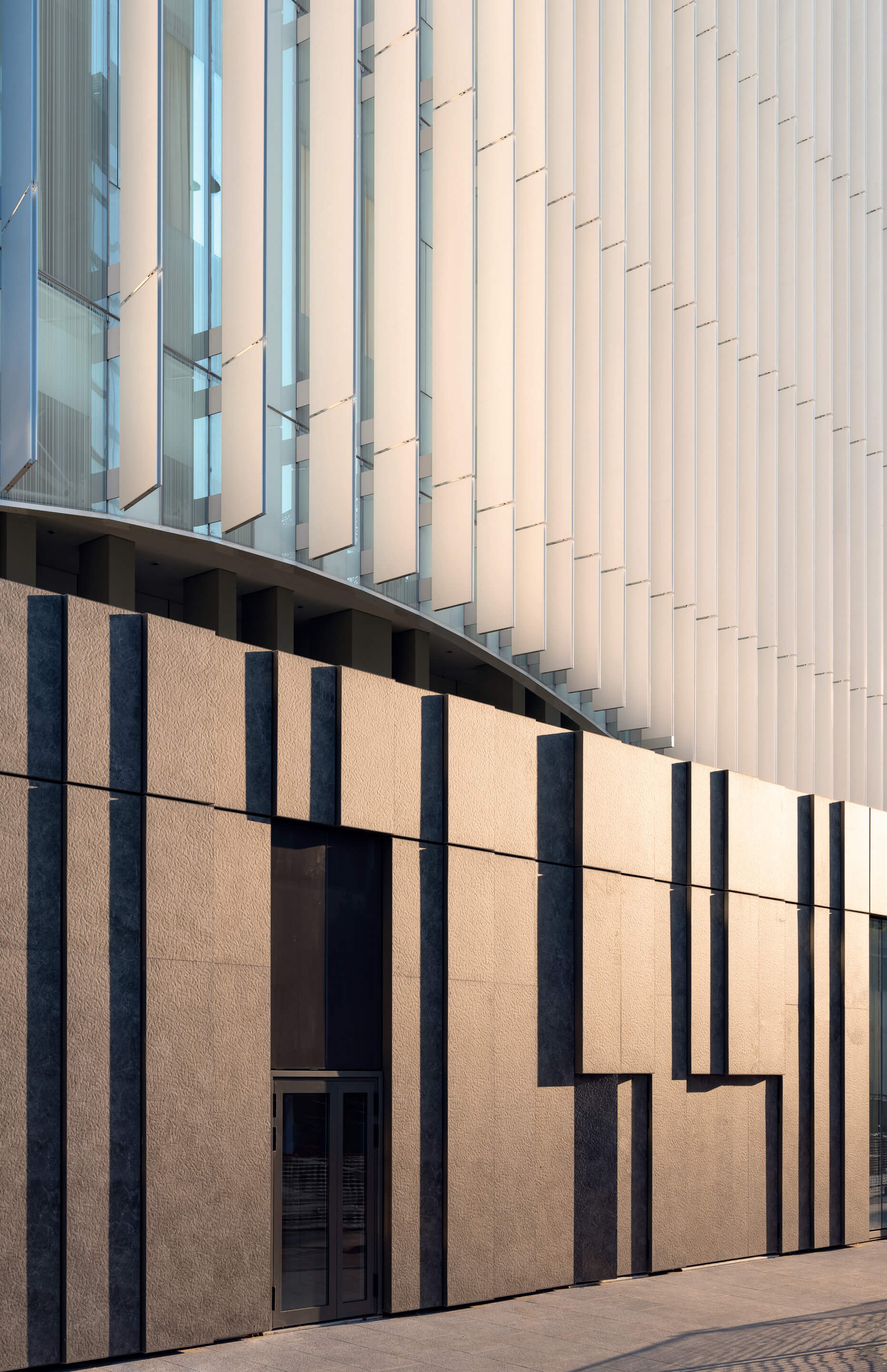
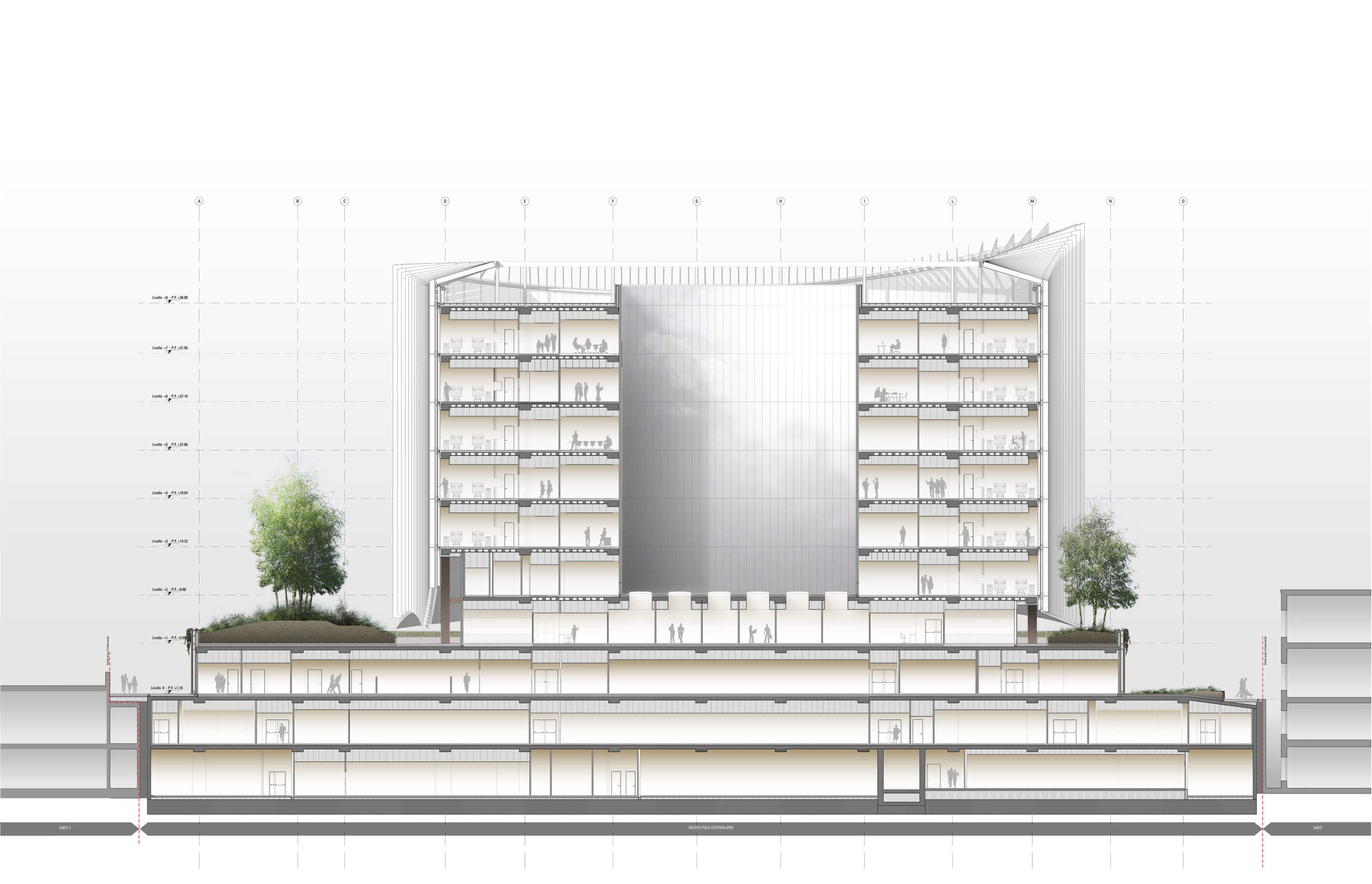
Daylighting was an important consideration throughout the building, in relation to both patient privacy and energy performance. Understanding the “draining” impacts of artificial light on patients and workers who spend extended periods of time in the hospital, the architects sought to bring in as much natural light as possible, and reserved the rooftop for a garden that is accessible to patients. The facade design was integral in achieving the balance of privacy needs while also maximizing daylight.
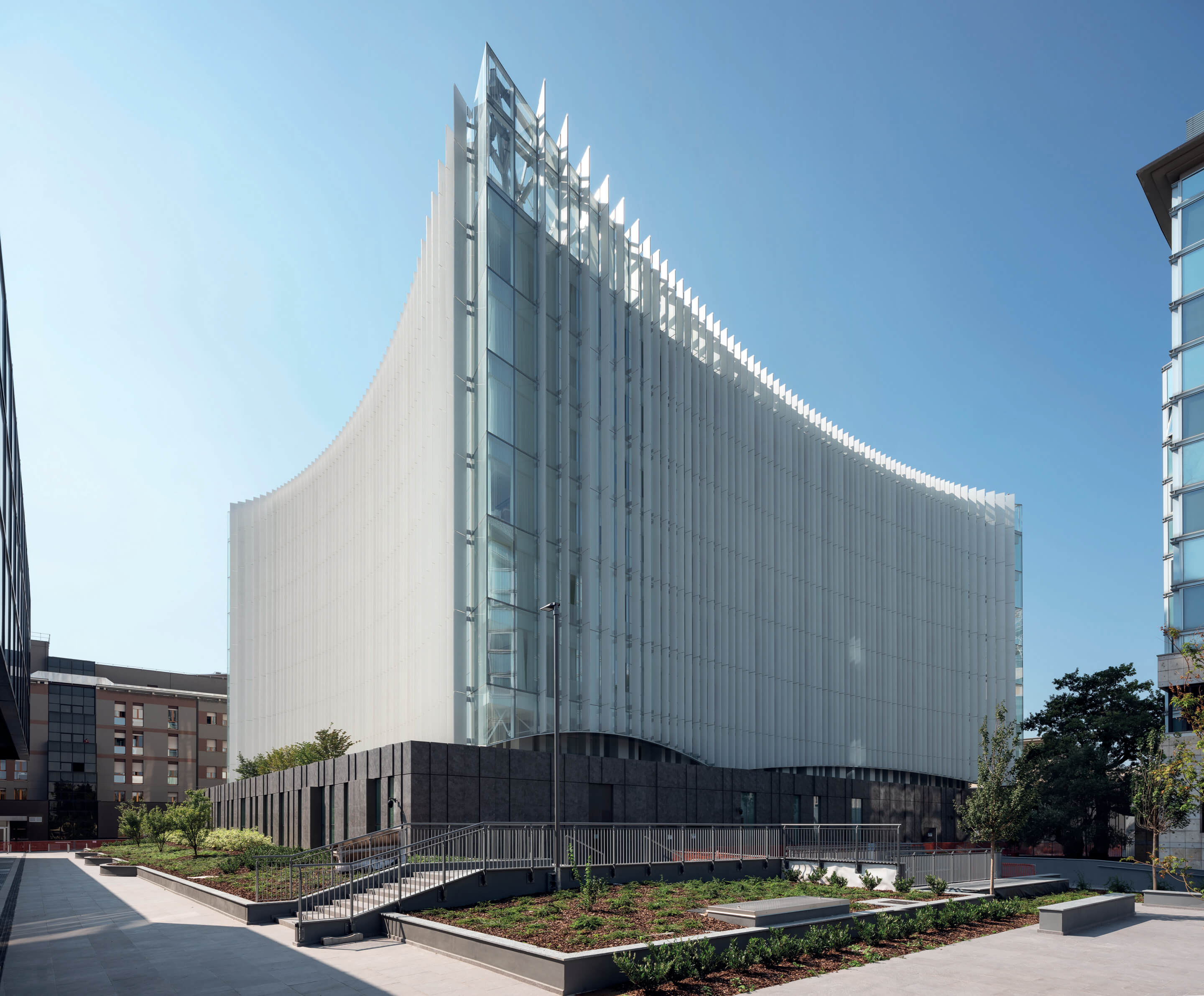
Despite its more straightforward floorplan, the faces of the building curve—similar to sails on a ship—coming to points on each corner. The sinuous form, combined with the materials’ white and blue hues, garner the building’s nickname of “iceberg.” The mass of the building appears cloud-like above the ground floor podium, whose shape was designed to resemble “a bridge raised above the base on metal stilts,” according to the architects. This plinth-like base was constructed with earth-colored tiles, creating a “chromatic contrast” with the white, low-thickness porcelain fins on the hospital’s upper floors.
As the architects explained, the material separation between the ground floor and upper levels, apart from an aesthetic contrast that emphasizes the fins’ iceberg effect, is reflective of the hospital’s operations. The ground floor is home to Italy’s largest emergency room, and a surgical block that extends into the basement. The upper floors are more focused on patient care and comfort rather than highly advanced medical needs, making them more suitable for the daylight filtered by the ceramic louvers.
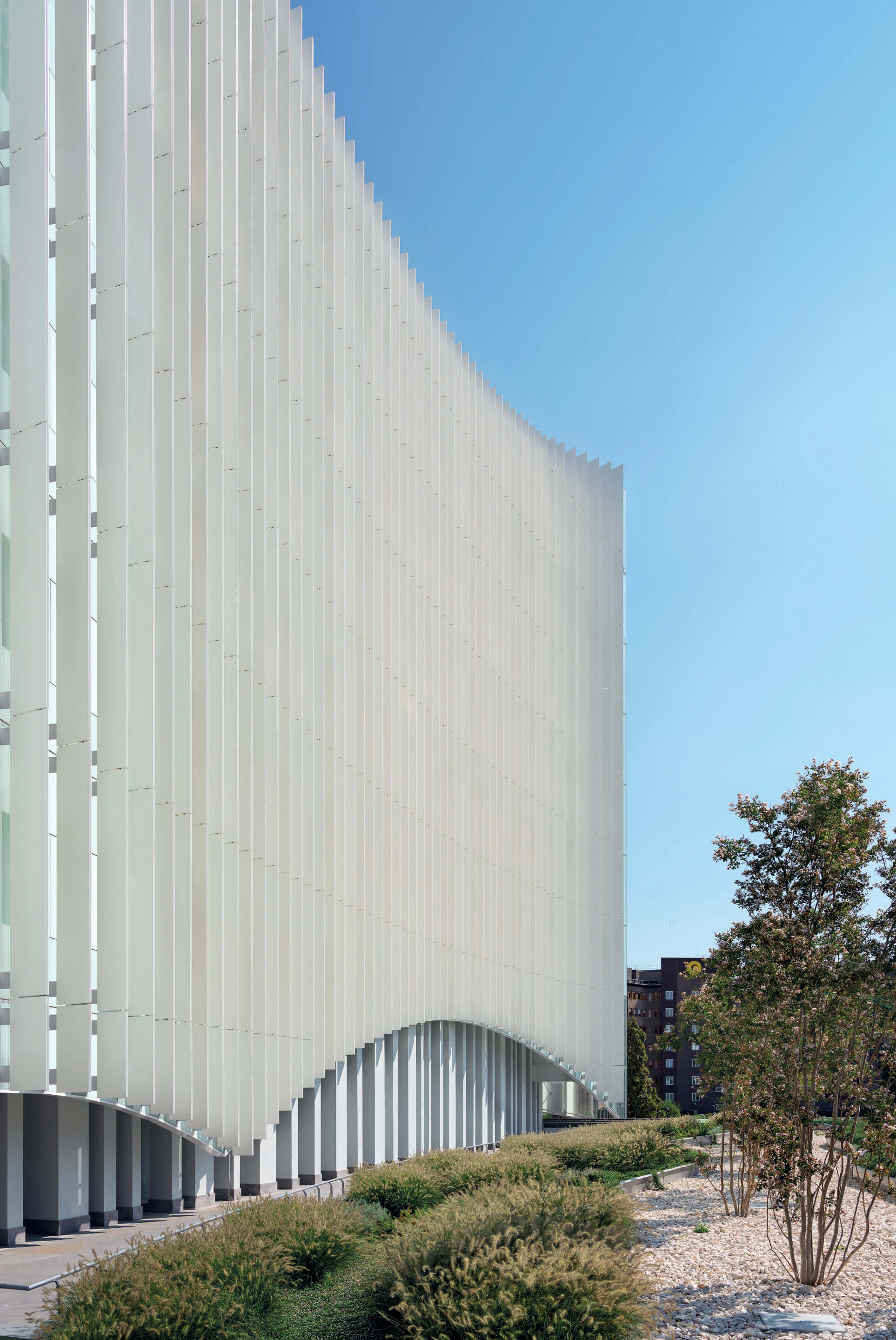
The choice of white for the fins was chosen as it “allows light to be modulated inwards, reducing glare from direct lighting,” as the architects explained. The team has originally considered using aluminum, but settled on porcelain as it is easier to maintain, more durable, and allowed for smog reduction technology. The ceramic louvers wrap the five uppermost floors, diffusing sunlight and reducing heat gain. The louvers vary in depth, and were designed to respond to the path of the sun. Mario Cucinella Architects’ research and development team simulated solar radiation, and staggered the vertical slats to minimize the sun’s effect and reduce glare, limiting the thermal energy on the glazed facade.
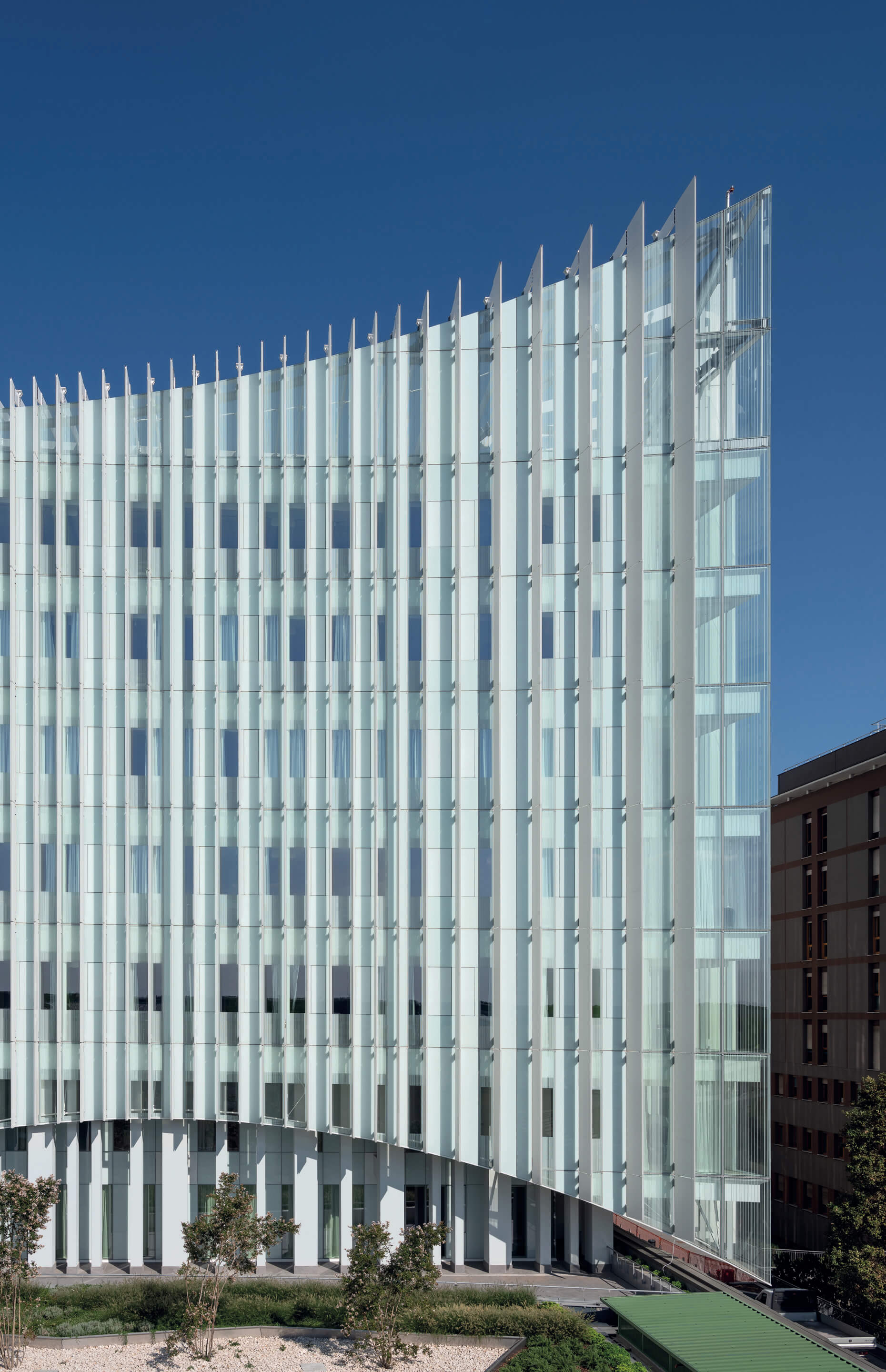
In addition to the healthcare provided inside of the building, the facade addresses exterior environmental health concerns. Titanium dioxide particles were inserted onto the surface of the porcelain louvers, which will break down smog particles with an antibacterial effect. The architects estimate that the titanium dioxide, which also conserves heat, will reduce the building’s energy consumption by 60 percent. The importance of the facade in defining the building’s relationship with its exterior environment—namely educing the building’s energy impact—was of particular importance to the architects.
While the focus of the facade is drawn to its fins, approximately 60 percent of the facade was finished with opaque insulation panels. The panels were fabricated with back-painted glass and an insulated back, and their transparent sections were shaded with a screen print. This contributed to the design intent that, as described by Mario Cucinella, sought “a building that needed very little energy for heating, retaining heat, and generating little thermal gain required very little cooling.”
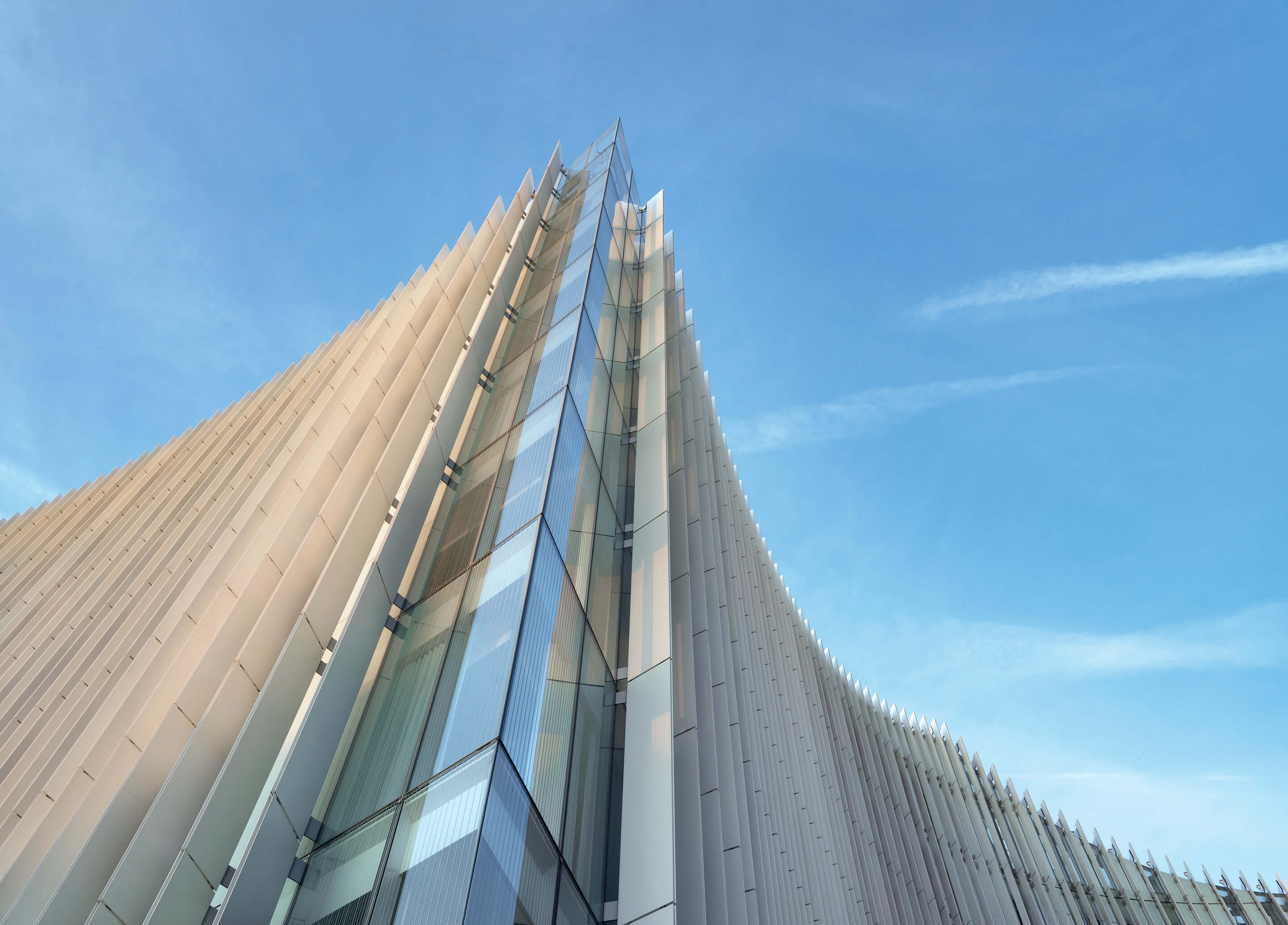
The architects credit the collaborative effort behind the design and construction of the hospital as key to achieving the intended impact of the facade. As the iceberg image of the building was something that the architects “had in mind from the beginning,” coordination on the facade began in the initial stages of its design. Working with facade consultants and suppliers, mainly AZA Aghito Zambonini, throughout the project’s design and construction helped to ensure “the best possible realization,” in the words of the architects.


