meng shui turns real human bodies into modern egyptian hieroglyphs font style
Project body type by Meng Shui
Some designers might invent new typography designs to unleash their creativity or make money out of them, but one of them strays of these paths as she zeroes in on her advocacy: celebrating the diversity of body forms. Creative Director Meng Shui honors the human form and its array of differences and beauties, and as her desire to acknowledge them in a way she knows best, her venture has led her to design a new typeface titled ‘Project Body Type’ that encourages viewers to scrutinize and appreciate diverse bodies whenever they read or write with it.
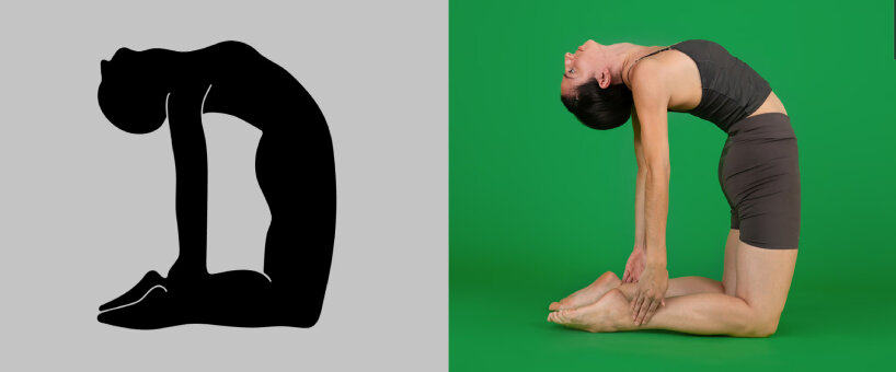
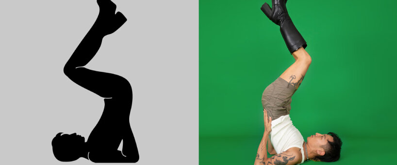
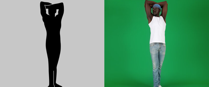
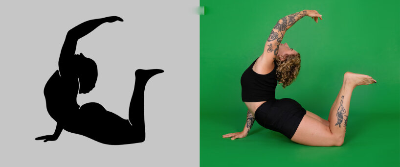
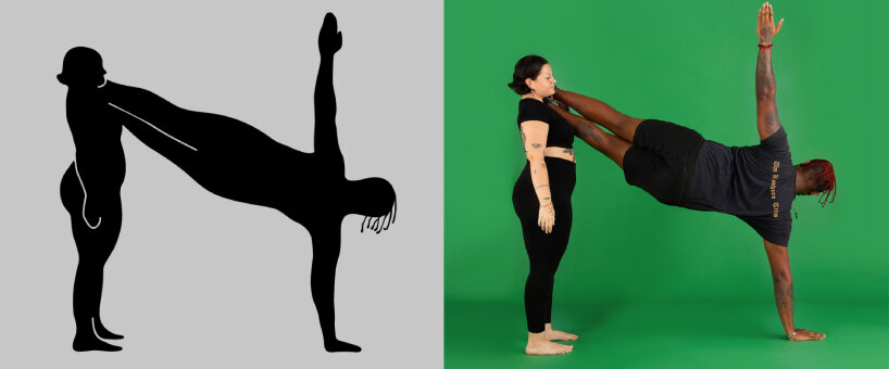
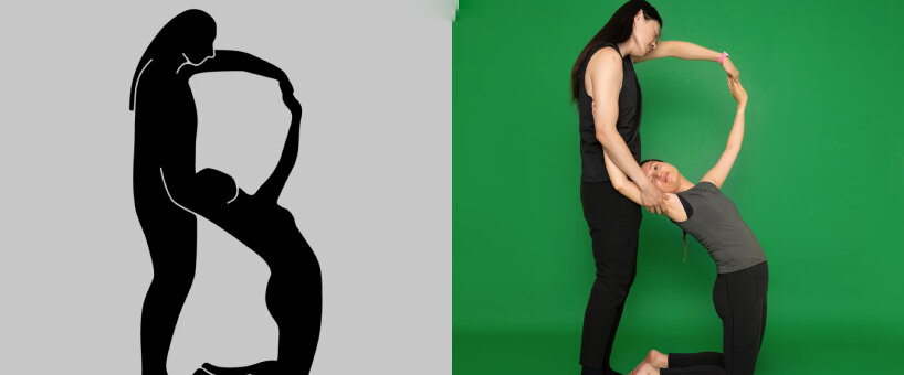
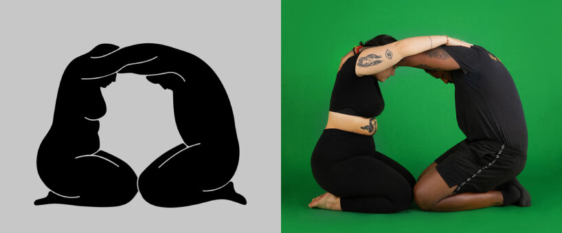
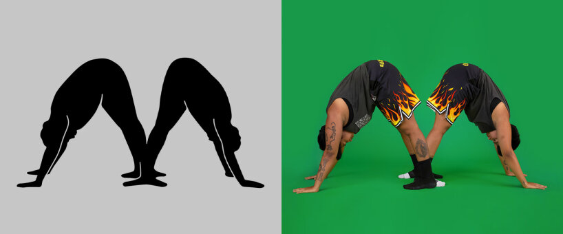
The shadowy font style moves beyond just being a typeface. It recalls the collective effort of over 50 people based in New York and other parts of the world. It turns over 40 human bodies that bend, stretch, bow, sit, and stand into letters viewers can use for their new campaign headlines, slogans, brochures, or any creative endeavors they are thinking of. More than just a new font style, Body Type by Meng Shui forms a series of told narratives by those who participated, sharing their bodily experiences with the world and through an accompanying short documentary.
images courtesy of Meng Shui and Project Body Type
Design activism using human bodies
Design activism is one of the many ways Body Type by Meng Shui can be identified. A whole team supports Shui in her advocacy to put forward their shared belief on bodily autonomy. As she likes to put it, every letter is a love letter to our humanity and diversity, and rightly so. Sometimes sensual, other times downright dancelike, the human bodies of the shadowy typeface might reminisce about the Egyptian hieroglyphs, but Body Type’s design team writes that the set’s drawing style is inspired by the black-figure pottery painting of ancient Greek vases.
‘This style was developed around the 5th century BC, at a time when the subject of artistic creation shifted from tales of the Gods to daily activity of humans. However, only a certain type of human were depicted in those arts. We find it meaningful to apply this timeless style to all kinds of people today, but with simpler shapes and softer lines and instead of idealized body types we use real bodies as the basis for our letterforms,’ the design team writes.
An unconventional creative force, Shui and her team intentionally broke type design rules, starting with no specific height and width for the strokes of the letter. Instead of capsizing them, the team makes sure that every letter follows every slope and curve of the human representing it. No shredding allowed, retaining the rawness of the letter’s beauty and upholding the collective advocacy on celebrating diversity in body figures.
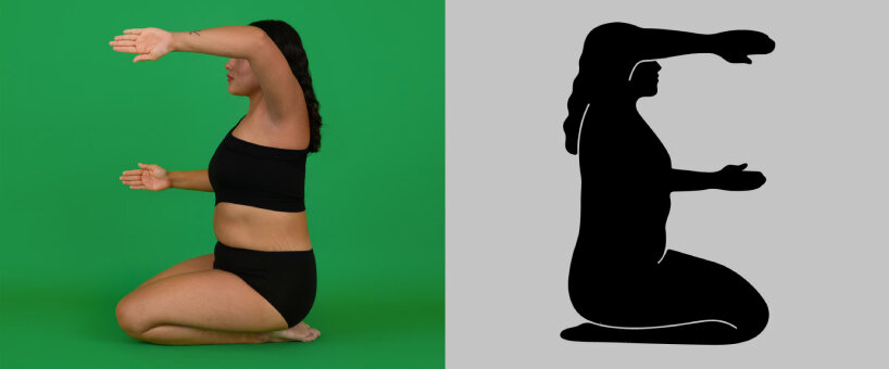
Designboom tries body type
designboom can’t resist the allure of Body Type and tests how it could carry the magazine’s name. Viewers can play around with the body-based font style on Project Body Type’s site, and the team announces that the complete version of Body Type, including numbers and punctuation, will be released early 2023.
What’s more, and probably the best part, is that proceeds from future font sales will be donated to support the project’s community partner Scope of Work. For those who want to use Body Type, the design team suggests that the body-based typeface is best used for campaign headlines, slogans, posters and short sentences to deliver great impact.
‘It is probably not the best font for small text or long paragraphs. It is not designed to give a clean, geometric look. It is designed to make you stop and think, to peruse the letterforms which in themselves say as much as the words they create. By choosing this font and creating visibility around it we hope that Body Type will increase our acceptance of body diversity, and allow what we say to be more human, both literally and metaphorically,’ the team writes.

project info:
name: Project Body Type
creative lead: Meng Shui
matthew burgos | designboom
dec 09, 2022
