MBS Magnificence Clinic / ASKA


Text description provided by the architects. Architecture firm ASKA’s latest refurbishment project – beauty clinic MBS by Malika, located in central Stock- holm, sets out to offer a new interpretation of an iconic Scandinavian design era. Inspired by the building’s architecture that dates back to the 30s, the architects have reawakened” The Scandinavian modern style”, ”Nordic functionalism” or simply ”Funkis” in the interior of a ground floor space of 70 m2.


The atmosphere inside could be described as something like ”modern nostalgia”, as some of the design elements feel recognizable giving the space a rigid and trustworthy flavor, while other fragments are unexpected, adding a sharp and slightly playful touch. Making the design feel effortless while at the same time managing to surprise.

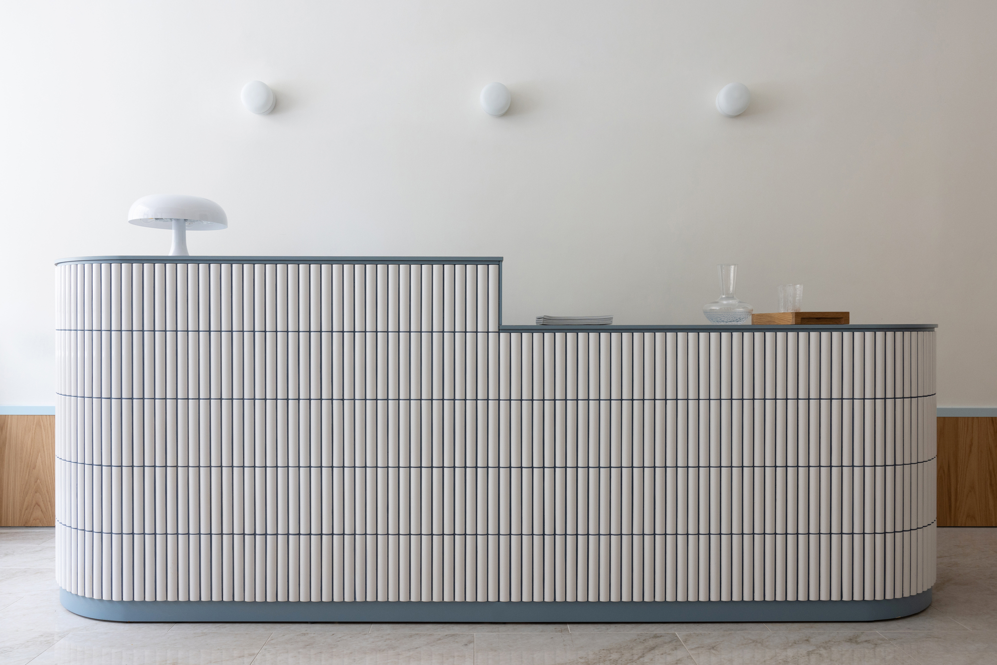
The interior of the salon is dominated by typical Funkis materials such as the white, slightly rounded Alvar Aalto-inspired tiles, oak veneer, compact laminate, and structured glass. By adding details like the nickel-plated brass handles, linen fabrics, and porcelain floor tiles inspired by the Swedish Ekeberg marble, the architects were looking to add elegance and exclusiveness to the experience. While on the other hand, the fresh light blue and dark blue color accents add a modern and bold feeling to the space.


”We saw potential in adding luxury, softness, and a young vibe to this simple, strict, and socialistic style. Believing that something new and unique could rise from the merge.” Says ASKA co-founder Polina Sandström.

In order to reach a conceptually strong and effective result, the duo works over different scales and disciplines, which also includes designing most of the furniture. The cream-colored lounge tables and nail manicure stations are some of the specially designed pieces by ASKA for MBS, aiming to blend into the environment in a smooth, seamless way. The reception desk, on the other hand, is something of a key piece, designed to capture the visitors’ focus thanks to its size and level of detailing.

It is clear that all separate objects are designed to complement the rest of the architecture. The shape of the pseudo three arches reappears in the form of the table-tops, the foot panel melts together with the product shelf, while the dark blue tone of the grout on the reception desk goes hand in hand with the MBS logo sign.

”By interpreting the same design elements (colors, shapes, materials) in different ways, we believe we can create visual interest while keeping a coherent and clear impression of the space. The goal is to create a specific and memorable experience.” Says ASKA co-founder Madeleine Klingspor.


