Martin Fenlon Architecture Create Complex and Experiential Continuity Between Differing Elements at Rodgers ADU
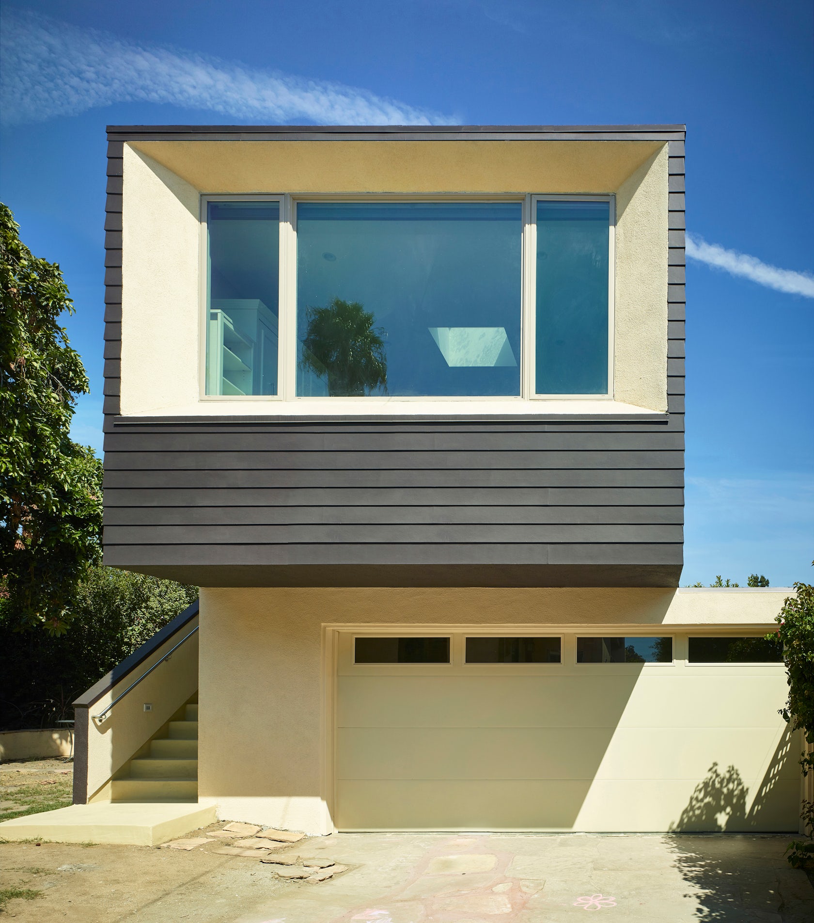
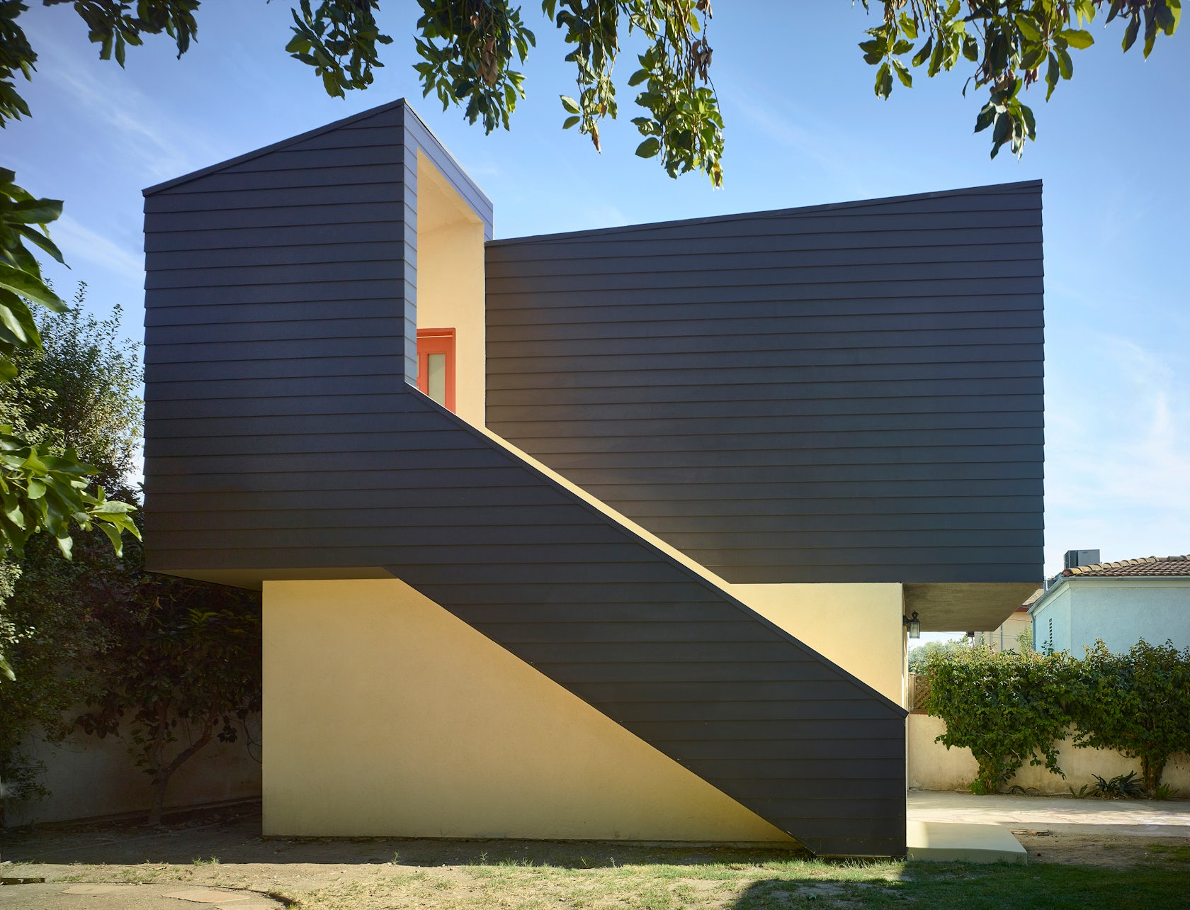
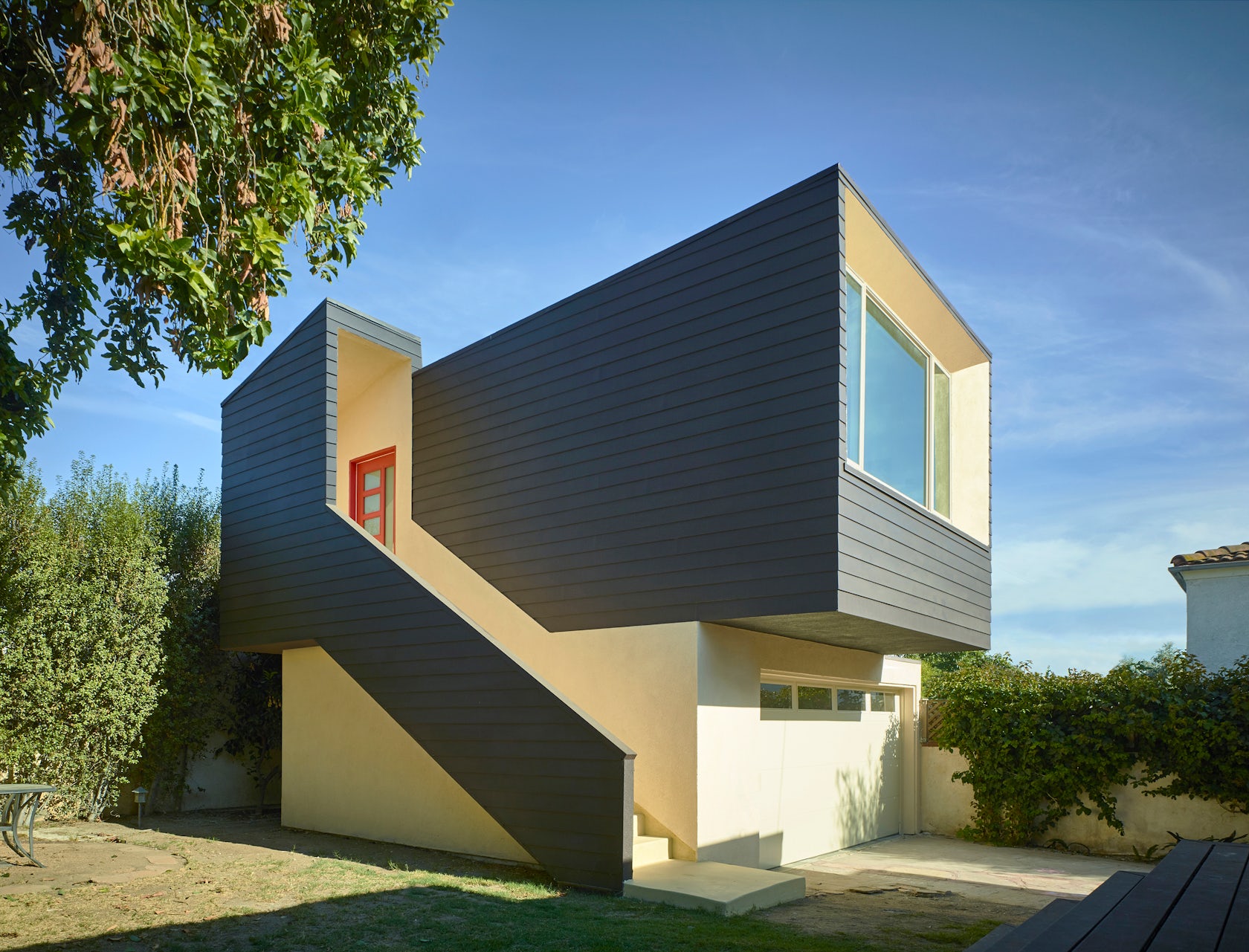
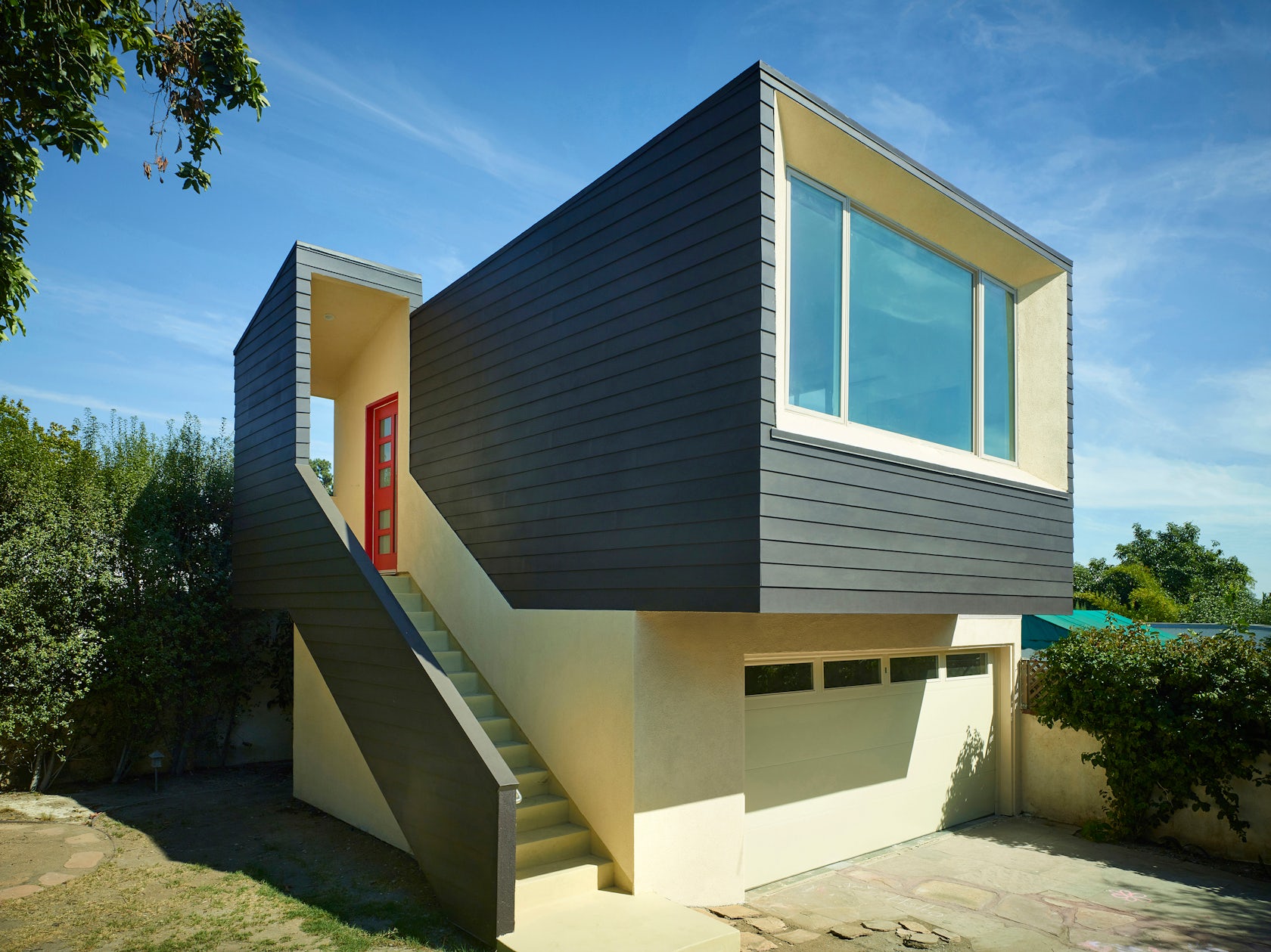
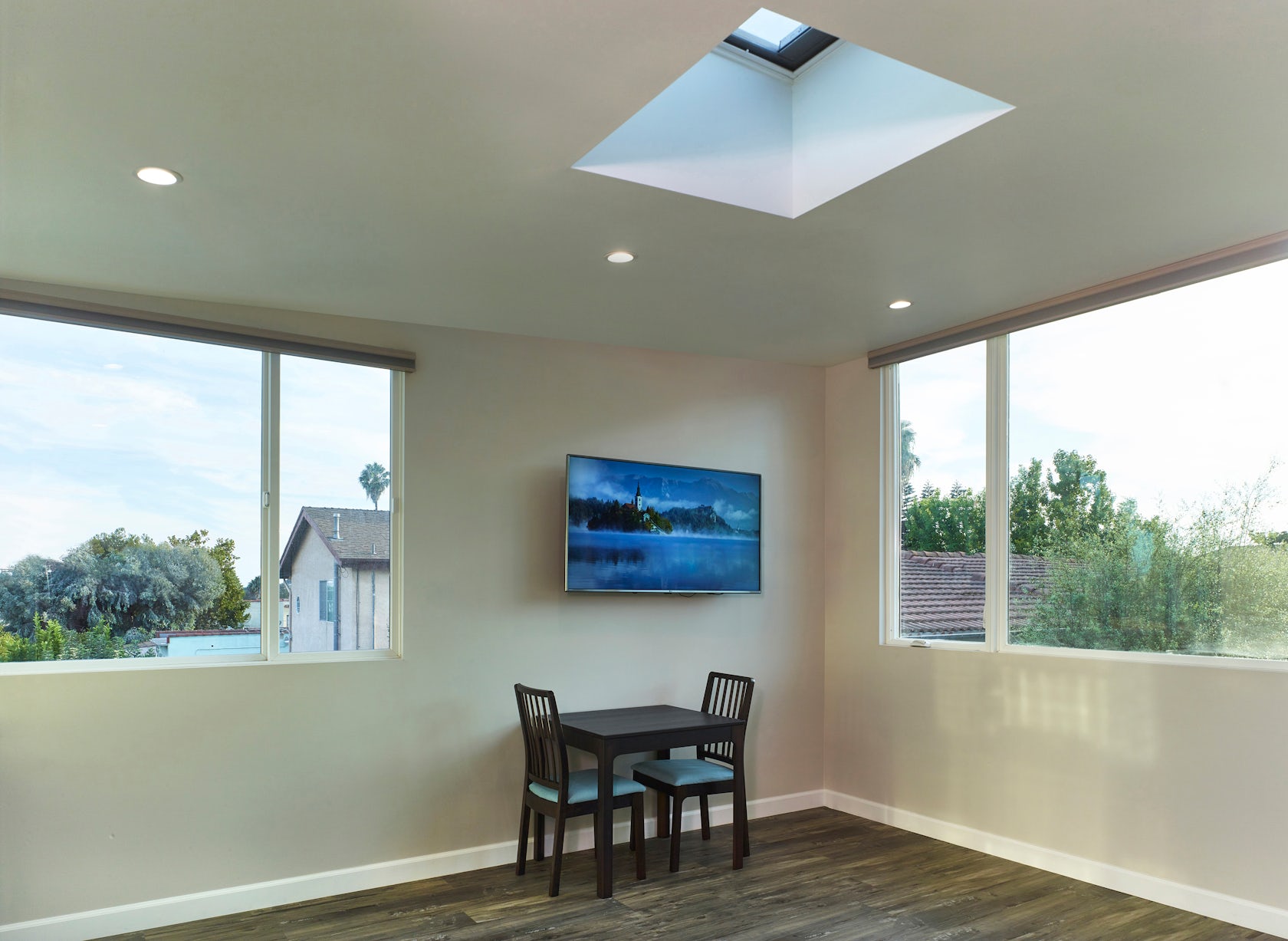
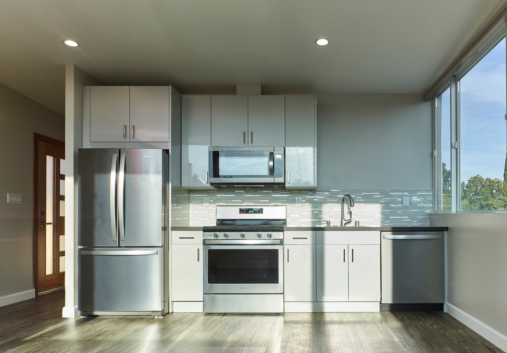
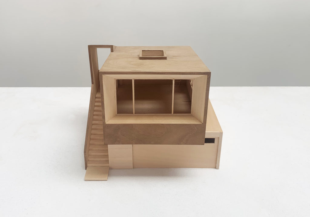
Rodgers ADU – The brief called for a new ADU to be built above an existing garage. The vision was to create both contrast and continuity between the old and the new. The new ADU entry sequence creates a strong continuity between the different levels. The lower-level base flows up into the entry porch while the upper level reaches down to the ground level. The distinct upper level is oriented towards the street with a large window. The Inside, the ceiling follows the shed roof which gently rises towards the front, where an operable skylight is centered above the flexible living space.
Architizer chatted with Martin Fenlon from Martin Fenlon Architecture to learn more about this project.
Architizer: What inspired the initial concept for your design?
Martin Fenlon: The “promenade architecturale” of Le Corbusier and the sculpture of Vincent Fecteau served as the initial inspiration. Vincent Fecteau’s sculptures are compact constructs that contain a remarkable range of complexity and contradiction. Within them, you see different forms and spaces that are shapeshifting and toggling between opposites; inside becomes outside, dark becomes light, smooth becomes rough. They’re typically resolved with a balance and continuity between the different elements. Seeking this quality, combined with an architectural promenade reminiscent of Le Corbusier’s work, was the way to creating a complex, experiential continuity between the differing elements of the upper and lower levels and the inside and outside of the project.
© Martin Fenlon Architecture
What do you believe is the most unique or ‘standout’ component of the project?
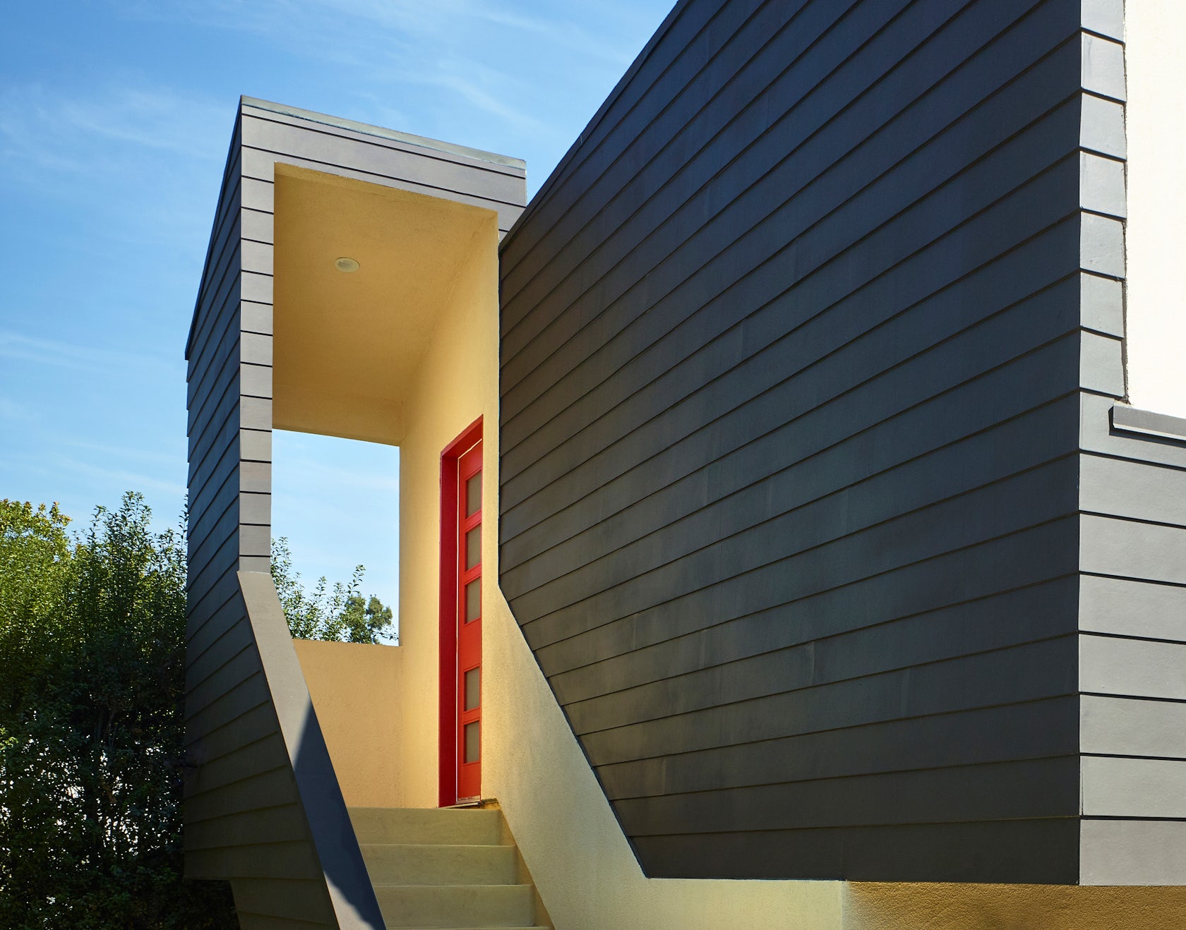
The most unique feature of the project is the entry sequence. It is here where the architectural promenade culminates in a transitional indoor/outdoor porch that frames the neighborhood. Despite how compact it is, it creates continuity between a series of binary opposites – old/new, above/below, inside/outside – into a singular spatial articulation. The transitional nature of this entry space is part of the Southern California tradition of blurring the threshold between outside and inside. The boundary of this sequence is intentionally ambiguous, pulling in the space of its surroundings.
© Martin Fenlon Architecture
What was the greatest design challenge you faced during the project, and how did you navigate it?
The greatest challenge was trying to create something that is unique and inspiring with a limited budget. A flexible new ADU was called for in the brief; any qualities beyond that would need to be accomplished within a builder’s budget of less than $300 per square foot. The work of Rudolph Schindler served as an important example for navigating through this challenge. He was a master of elevating common, inexpensive materials into inspired, complex spatial articulations. In this case, common, inexpensive materials were applied and juxtaposed in unexpected ways.
© Martin Fenlon Architecture
What drove the selection of materials used in the project?
There were three main factors that drove the selection of the materials: economy, durability, and tradition. Exterior cement plaster (stucco) and fiber cement siding were selected because they met all the criteria. The materials are affordable and fitted within the limited budget. They have a proven track record of being durable while requiring little maintenance. They also have a connection to the architectural history of the region. The lap siding is reminiscent of the craftsmen bungalows in the area. Stucco has a long tradition in the area, and specifically recalls Rudolph Schindler’s ‘plaster skin’ work from the nineteen thirties.
© Martin Fenlon Architecture
How important was sustainability as a design criteria as you worked on this project?
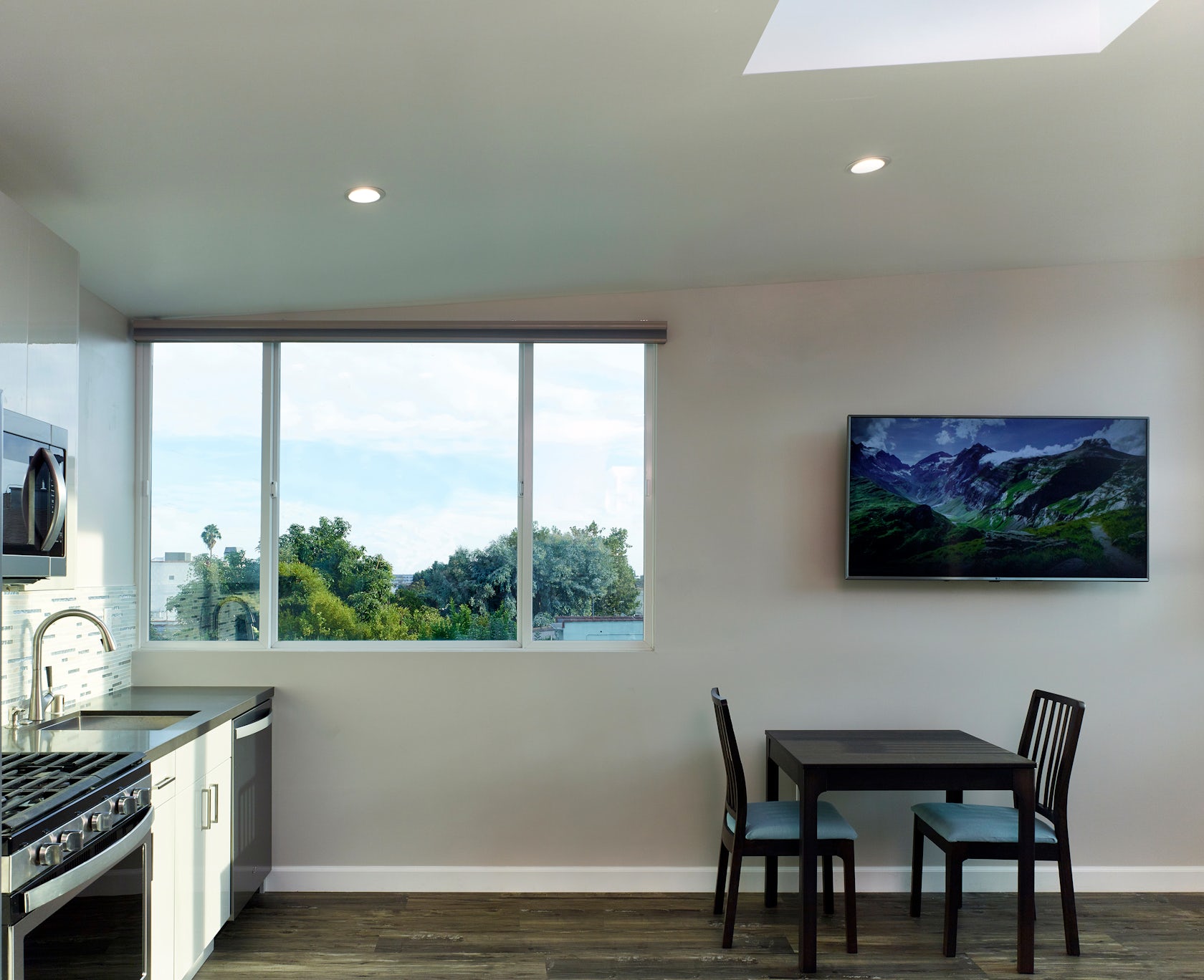
Sustainability was a central tenet of the project with various measures being integrated. The existing garage was reused and incorporated into the design, even though it would require significant underpinning. An efficient shed roof directs all the rainwater into a rain tank for reuse. Engineered lumber was used throughout to achieve thinner profiles with less material. Large operable windows facilitate cross ventilation and maximize natural light inside. A central operable skylight augments passive cooling with a stack effect. A new cool roof was added to both levels.
© Martin Fenlon Architecture
Were any parts of the project dramatically altered from conception to construction, and if so, why?
The only part of the project that was significantly altered was the main window that faces the street. The window was originally conceived as being flush with its surrounding frame, which would have made it significantly larger. A more economical window line was chosen because of the budget constraints. The chosen window line had a height limitation that wasn’t feasible at the desired size. The design was therefore adjusted to accommodate a smaller window size that is recessed within the larger frame. This compromise offered an opportunity to create another transitional indoor/outdoor space that echoed the space of the entry porch.
© Martin Fenlon Architecture
What key lesson did you learn in the process of conceiving the project?
There are no small projects in terms of significance and effort! Any project, regardless of size, offers the same opportunity for design exploration and experimentation. Generally, projects can take years from start to finish. A project that is smaller in scale has the benefit of a having a tighter focus with a quicker turnaround.
How do you imagine this project influencing your work in the future?
The solution to this size and scope of a project has helped hone in on a broader design strategy that will be incorporated into future work. Recognizing or identifying difference and diversity within a project, while creating a unique continuity between that difference and diversity, has become a focus. The potential of a more inclusive, responsive architecture, done with less means in a more affordable manner, is very exciting.
© Martin Fenlon Architecture
Is there anything else important you’d like to share about this project?
I acted as structural engineer of the project. A closer relationship between the structure and design was maintained while the process was streamlined.
Team Members
Kaiyun Cheng
Consultants
Contractor: Preferred Home Builders
Products / Materials
Skylight: Velux, Fiber Cement Siding: James Hardie, Metal Shear Panels: Hardy, Engineered Wood Beams: Weyerhaeuser
For more on Rodgers ADU, please visit the in-depth project page on Architizer.
