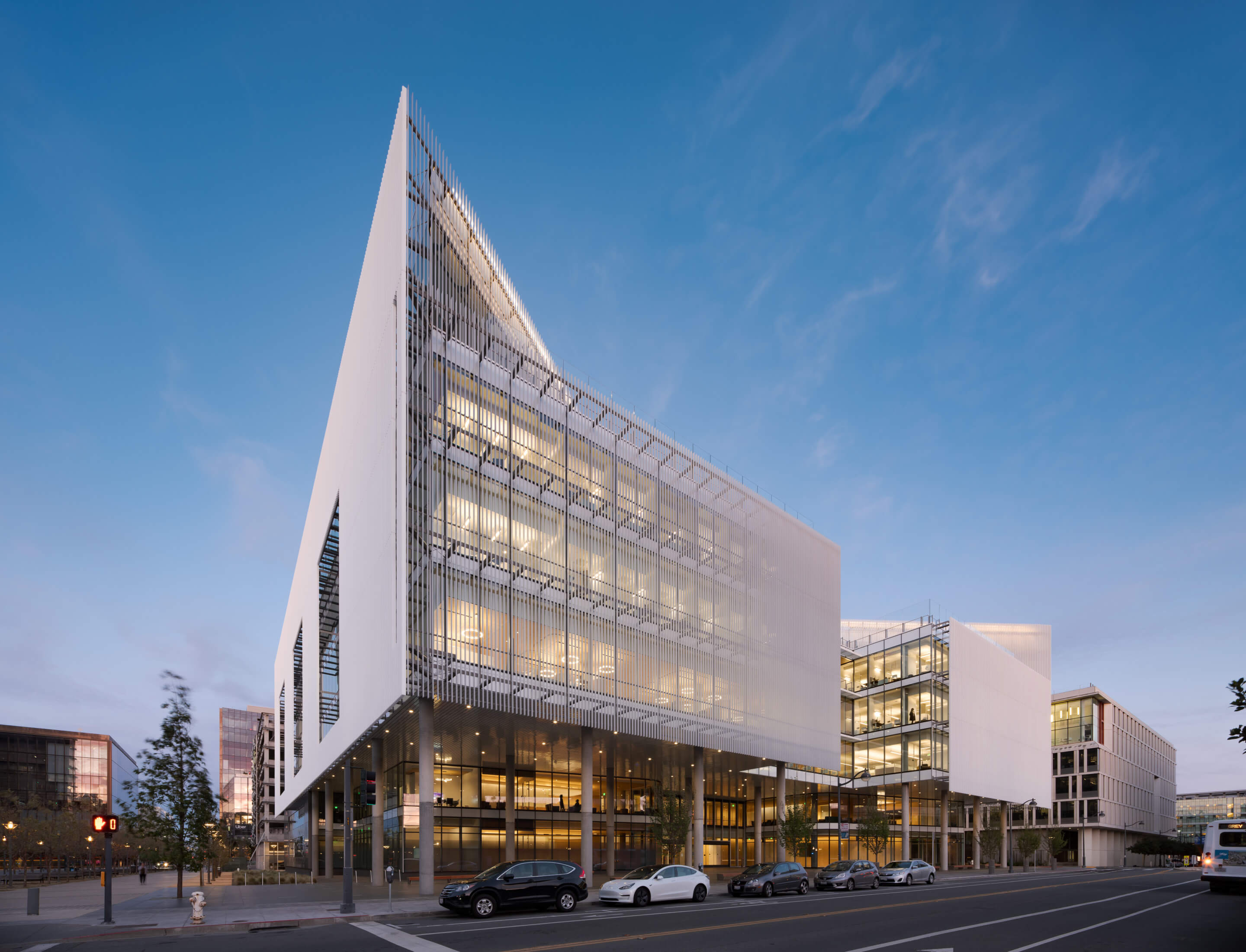
Mark Cavagnero Associates shades the UCSF Joan and Sanford I. Weill Neurosciences Constructing with symmetrical gentle display
Centering patient needs while meeting high performance standards, the facade of the new Joan and Sanford I. Weill Neurosciences Building at the University of California, San Francisco (UCSF) wraps one of the largest neuroscience research centers in the world. Designed by the San Francisco-based Mark Cavagnero Associates, the building combines UCSF’s neurology, neurological surgery, psychiatry, and behavioral study, neurodegenerative diseases programs, and the Neuroscience Graduate Program, all under one roof.
Rising six stories and spanning 282,900 square feet, the building is divided into two sections—inspired by the two hemispheres of the brain—with a central atrium. The first two floors contain clinical spaces, allowing for cross-disciplinary diagnosis and research, with the research center spanning the upper four floors. The atrium serves as the building’s central connection point, featuring a skylight and natural materials, challenging the typical design of a clinical and research building.
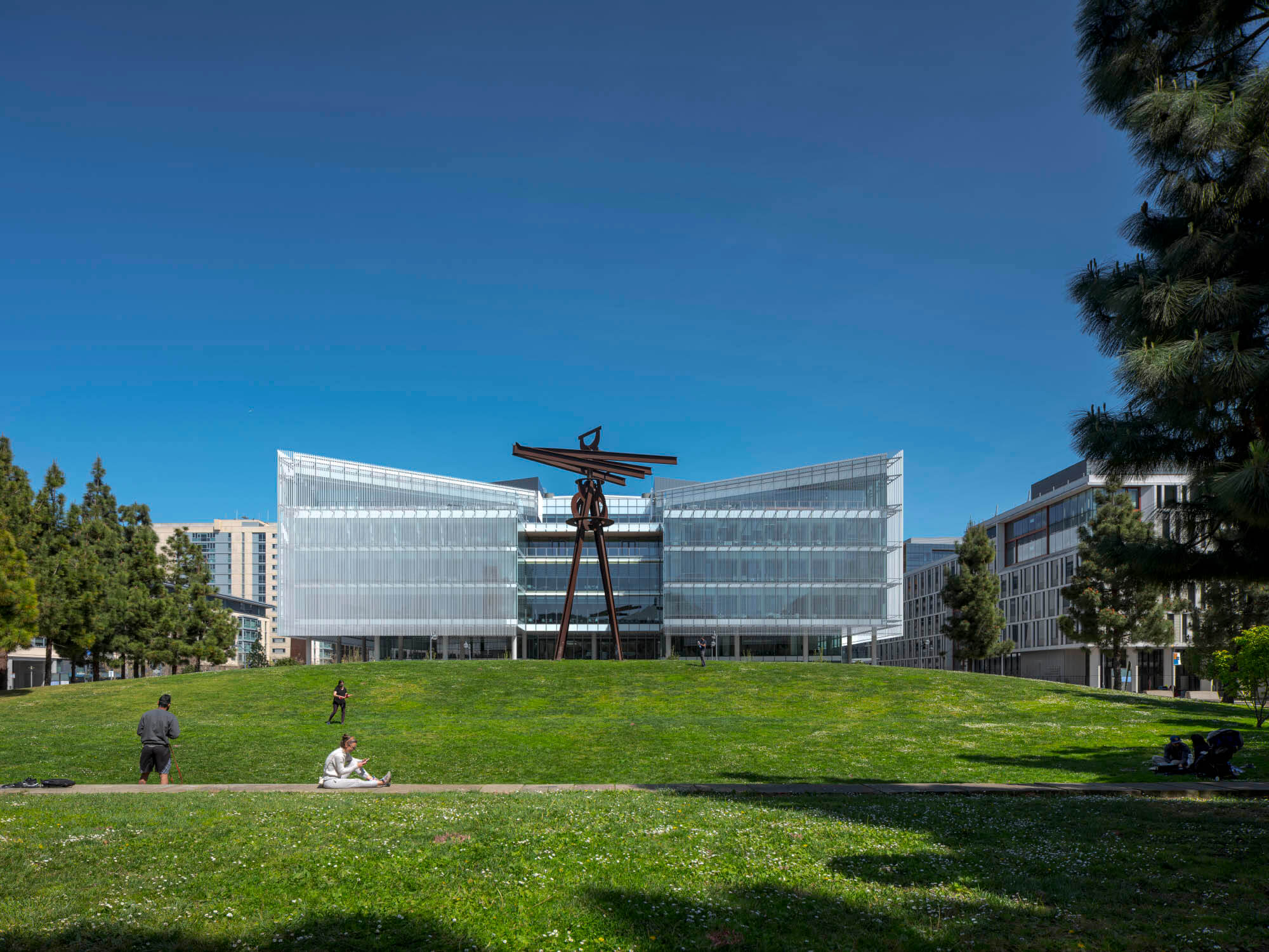
The design team optimized their design for the building’s site, with a focus on bringing in extensive daylight and allowing occupants to view UCSF’s Koret Quad across Fourth Street. Given the programmatic demands of clinical and research spaces, bringing daylight into the atrium and perimeter spaces was considered a necessity in the early stages of the design process.
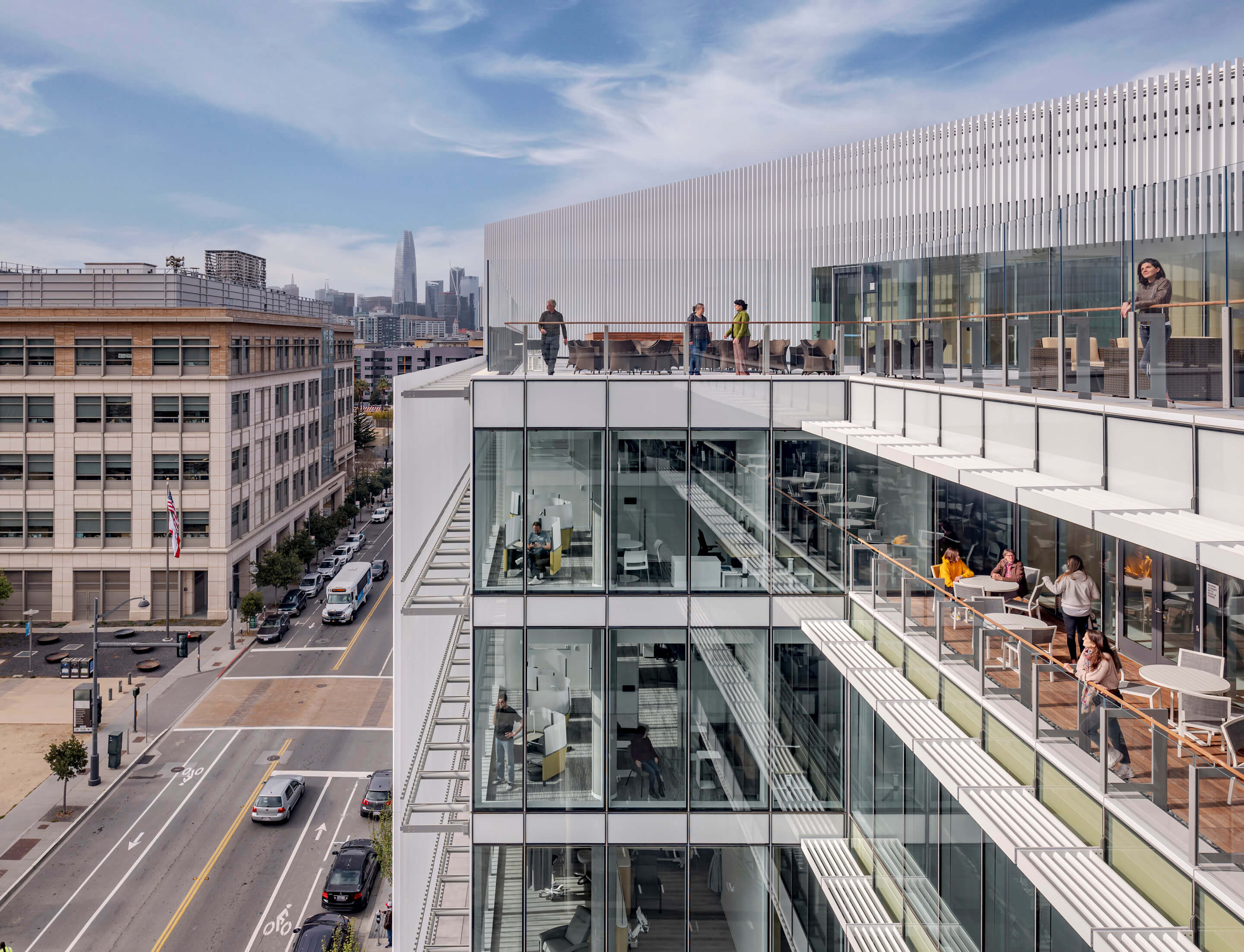
The facade includes both screened and unscreened areas, reflecting the privacy needs of the interior program and the desire to open up other sections of the building to the outside, primarily in larger areas containing social spaces. The design team wanted the facade to remain legible as a scientific building, working to clearly delineate between sections. Working through a range of screen designs—a collaborative process with Atelier Ten—designers had to negotiate daylighting and viewpoints with the need to filter heat gain and glare, and client desires for a durable facade. Ultimately, factory-finished aluminum blades were chosen as a solution to shade the glass curtain wall. Spaced 7 inches apart, with each blade measuring 6 inches in depth and 1 inch in thickness, a 45-degree cut-off angle was created to incorporate multiple solar exposures while retaining a continuous design across the facade. The final size and angle of the aluminum system were selected to optimize performance on a fixed screen, leading to reductions in sunlight entering the building under most meteorological conditions while still allowing occupants views of the exterior.
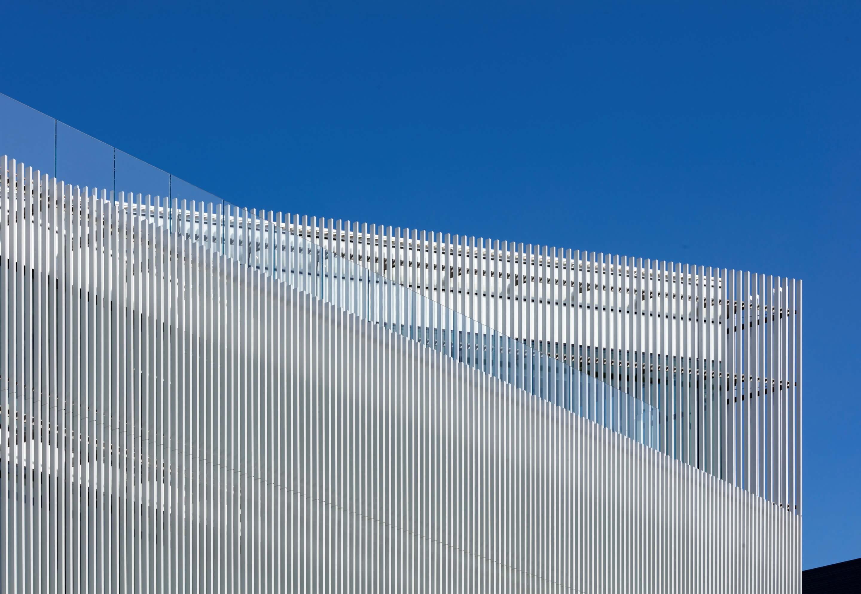
From the idea of “bringing ‘nature’ into a science building” through extensive daylighting, the design team looked for a “precise and considered way” to do so, “such that it might reflect and celebrate the exact rational thought the building was designed to accommodate,” explained principal Mark Cavagnero and senior associate Paul Davidson. Given the need to meet ambitious deadlines, the team worked closely with the architect of record, SmithGroup, the design-build fabricator, Walters & Wolf, and the general contractor, DPR to collaboratively explore skin designs. Following integrated design principles was crucial to meet the project’s target dates while maintaining high performance standards, including client requests for a high level of seismic resiliency.
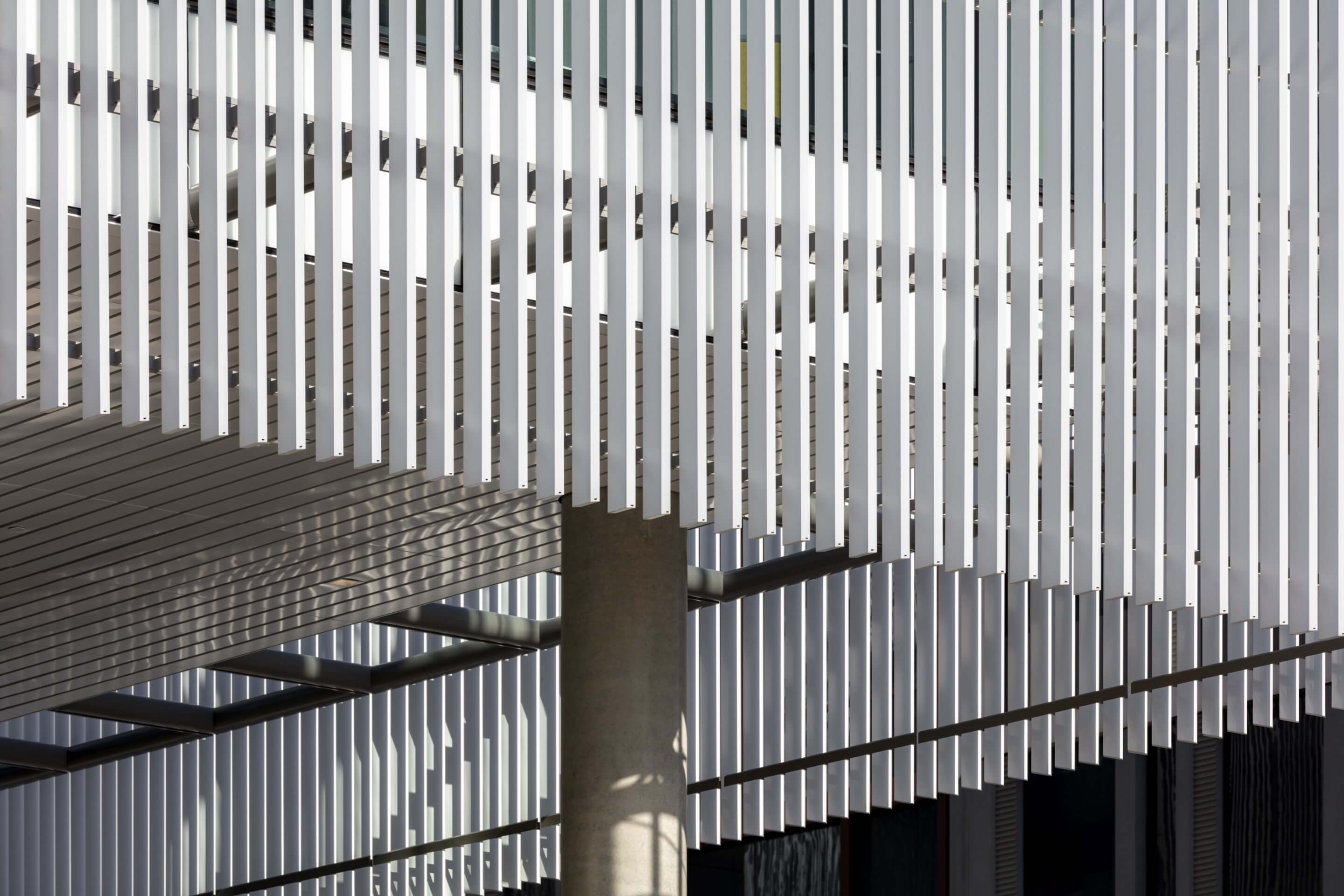
Work with Walters & Wolf began at conceptual stages of the design process, allowed for design aspirations to be integrated with technical requirements early on, and helped with maintaining cost and schedule requirements. Working with mock-ups became a “vital part” of the process, with tie rods being added to corners and modifications to the connection of screen details between panels worked out prior to installation. This meant that technical aspects were ready to be “fully integrated into the expression of the facade,” resulting in a fluid design ready for installation. The constructed facade reflects the desire for continuity across the building, and the screen allows for enough visibility from the exterior to reveal the building’s illuminated interior. During the day, the aluminum’s white coloration—combined with the glass sections outside of the screen—maintains the expectations of a scientific building.
