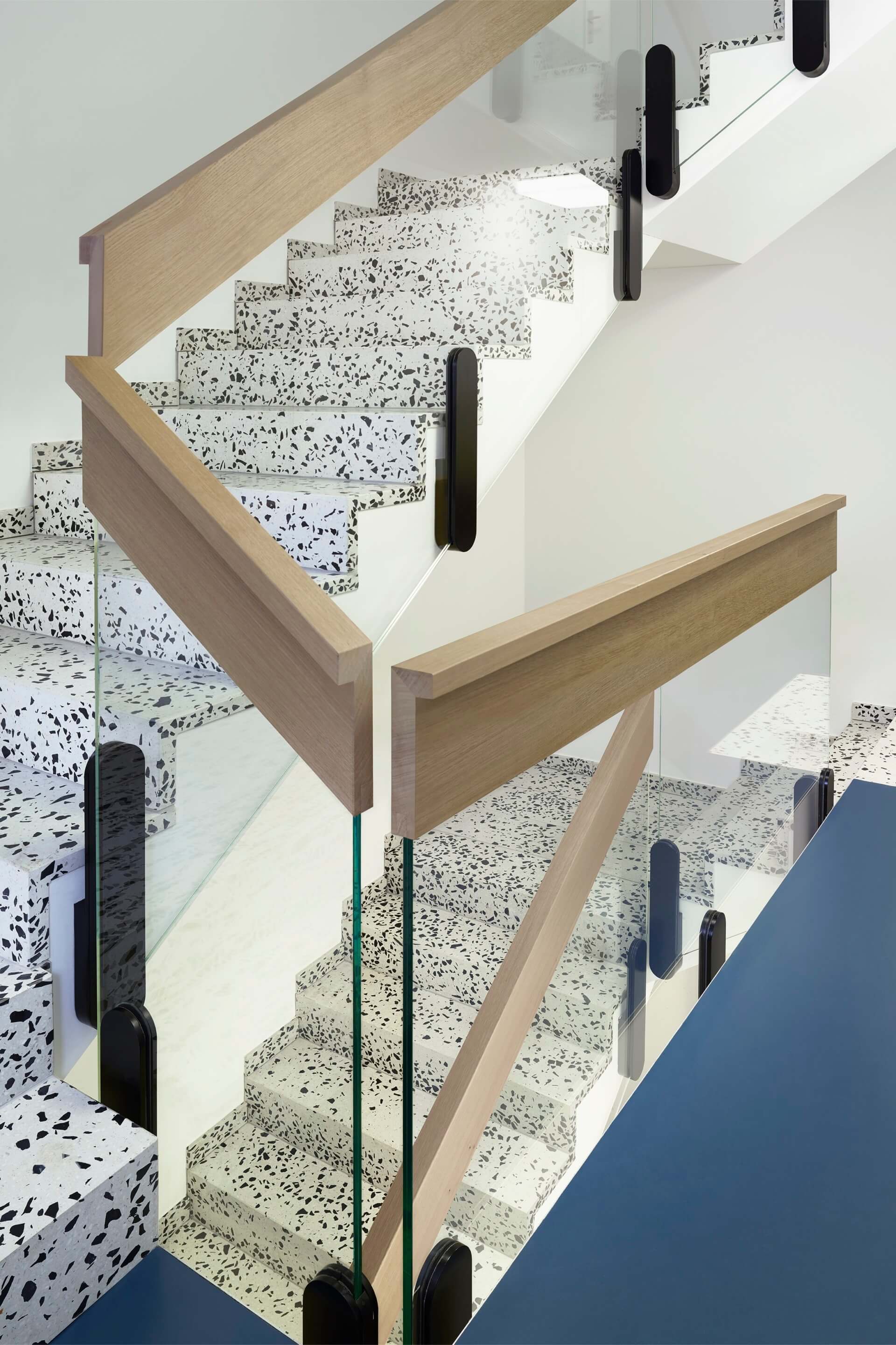
Lütjens Padmanabhan mines architectural history to produce buildings with distinctive qualities attuned to contemporary construction
When one thinks of Swiss-German architecture, the images that come to mind might include comprehensive concrete structures or singular material assemblies. Instead, the work of the Zurich-based office Lütjens Padmanabhan, founded by Oliver Lütjens and Thomas Padmanabhan in 2007, explores thin, sheeted surfaces and buildings that draw attention to their composite makeup. The generation of architects that preceded them—Herzog & de Meuron and Diener & Diener especially—were “famous for the solidity and monolithic appearance of their buildings, where craft and construction formed one unity,” Padmanabhan said. He explained that the duo “entered our profession when the cost pressure of the market and the thickness of insulation was constantly increasing, so that solidity was almost impossible to reach.” Instead, they contend with global market forces that push designers to build ever more cheaply with fewer generative constraints. In exploring fiber cement shingles with exposed edges and folded metal sheets, their work articulates a language of ordinary lightness. The approach has earned them international attention: Both were John C. Portman Visiting Design Critics in Architecture at Harvard GSD during the spring 2022 semester and previously taught a studio there in 2020.
A youthful mixing of high and low underscores Lütjens Padmanabhan’s repertoire, which spans multifamily affordable housing projects, private residences, installations, furniture, and a Swiss embassy in Algiers. “We love that architecture can be both kind of highbrow and use ideas and expressions from the deep space of history and reconnect to the presence and everyday life through the choice of materials, thickness, vulnerability, awkward form, fragmentation, and so on,” explained Padmanabhan. In referencing a wide-ranging set of cultural touchstones, their work feels urgent and closely linked to conditions of contemporary construction. Pragmatism and plurality undergird their buildings’ resolutions. Asked about changes in Swiss building conventions, Padmanabhan remarked: “Over the years, we have become more confident. Now we have more trust in human ability to see unity in diversity. That’s why we like to emphasize a kind of value of each element.”
Binningen II, 2014

Situated in a suburban neighborhood of single-family homes on a sloping site in Zurich, Binningen II maintains a playful lightness while referencing one of the 16th century’s architectural heavyweights. Stucco and metal in gray and white—“just one millimeter thick!”—clad the five-unit apartment building, producing subtly protruding lintels and recessed fasciae united by a monochrome consistency. Small windows that “hang from the belly of a big window” are reminiscent of Michelangelo’s Laurentian Library in Florence. On the interior, a careful composition of ordinary stone tiles, a grainless matte countertop, and black marble finishes continue this balancing act. Padmanabhan commented, “We’ve discovered that if you say something with light materials, you can allow yourself to say something that seems quite emphatic and formal without being overbearing.”
Waldmeisterweg, 2018

If Binningen II was a project of testing contemporary expressions of classical order and being inventive with cost-effective construction assemblies, Waldmeisterweg, a four-story affordable housing complex, is the product of its continued development. Wood posts and lapped Eternit panels cut to reveal thin profiles form a rhythmic tectonic language, inspired by Venturi, Scott Brown’s Lieb House. “The narrative was that because this is affordable housing, the beach house [concept] is perfect, not only as a tectonic idea but also as a social idea. Because at the beach, everybody is the same; there’s no hierarchy,” Lütjens said. On the interior, each unit entry opens to a deep kitchen-hallway that terminates at a winter garden, provides generous communal space, and eliminates the inefficiency of internal corridors.
Algier, 2017–

Now under construction, this one-story, 7,500-square-foot Swiss embassy in Algiers overlooks the ocean and a palm tree garden. Openness and exchange were central terms during the design process. “It’s not about representation of a king or monumentality or power,” explained Padmanabhan. “It’s a representation of democracy, of openness, of negotiation, of different things, different ideas, and different values coming together in discussion and dialogue.” Reinforced concrete panels form a fragmented band at the building’s periphery. At some moments, the panels create perimeter walls; at others, they tilt up “almost like a garage door”; at still others, they are poised in a raised position, as though extending a welcome invitation.
Zwhatt, 2019–

The eight-story apartment building for one- and two-person households is based on the theme of “sufficiency.” Located in a former industrial area on the outskirts of Zurich, each “maisonette-loft” occupies two levels, arranged in a stepped terrace form that responds to the adjacent luxury apartment tower. “There’s this David-and-Goliath pairing between the two buildings,” commented Lütjens. The double-height windows on the flat facade lean into this disparate comparison, making the eight levels appear to be an unusually capacious four. Large fiber cement panels with exaggerated lapping are used, tilted outward to form awnings. In line with the theme, the units are as spare as possible, and the designers took a ready-made approach to maximize the use of prefabricated components like the steel spiral staircase. Construction begins this summer.
Tiffany Xu is a writer and designer based in the San Francisco Bay Area.


