LoDer Eyewear // Atelier Boter
Text description provided by the architects.
Right at the center of the Pingtung City where growth and recession are parallel, the second generation takes over LoDer Eyewear as it shifts its store location into an old building built in the 1950s, anticipating a new direction in the concrete jungle.
We were reminded of Edward Hopper’s nighthawks that delicately expresses the loneliness of a woman as she returns to the city when we first saw the old building.
© Atelier Boter
© Atelier Boter
Standing in the rapidly developing city constantly fueled by commercial activities, we wanted to retain the reserved sense of loneliness of the building.The façade is the first impression of the building. Big signages are widely used in the city, fighting for attention. Apart from giving direction to the pedestrians, the role of signages is also to catch the interest of the passers-by.
© Atelier Boter
© Atelier Boter
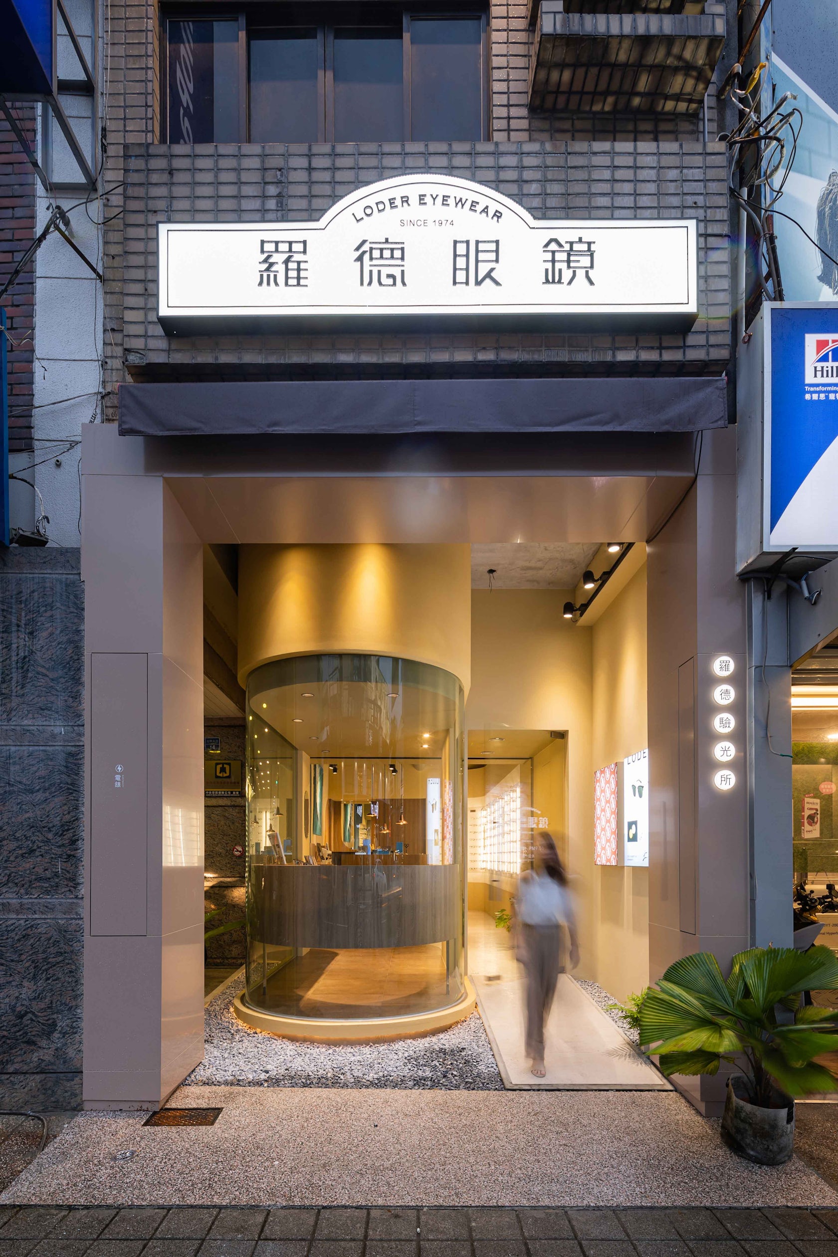
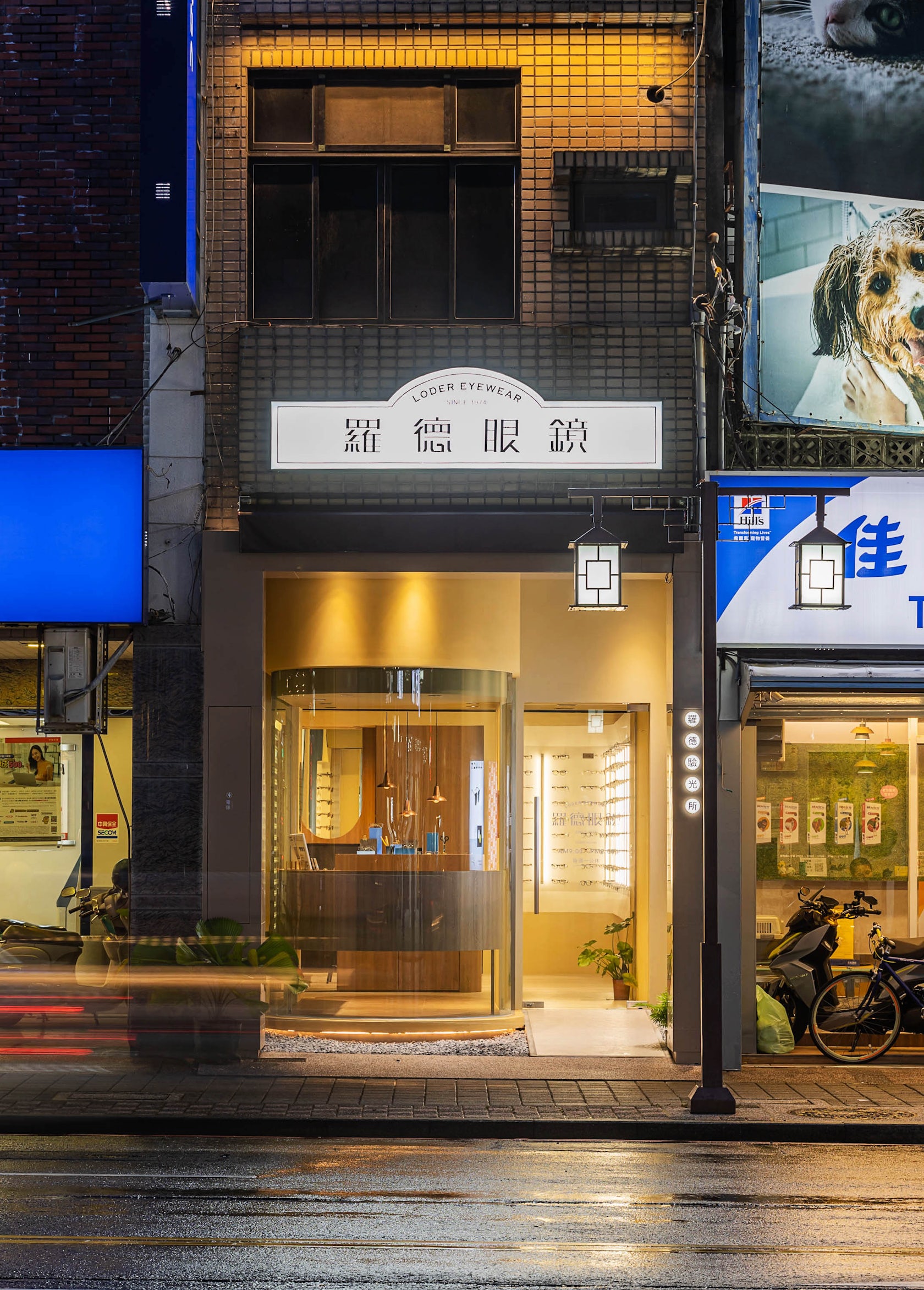
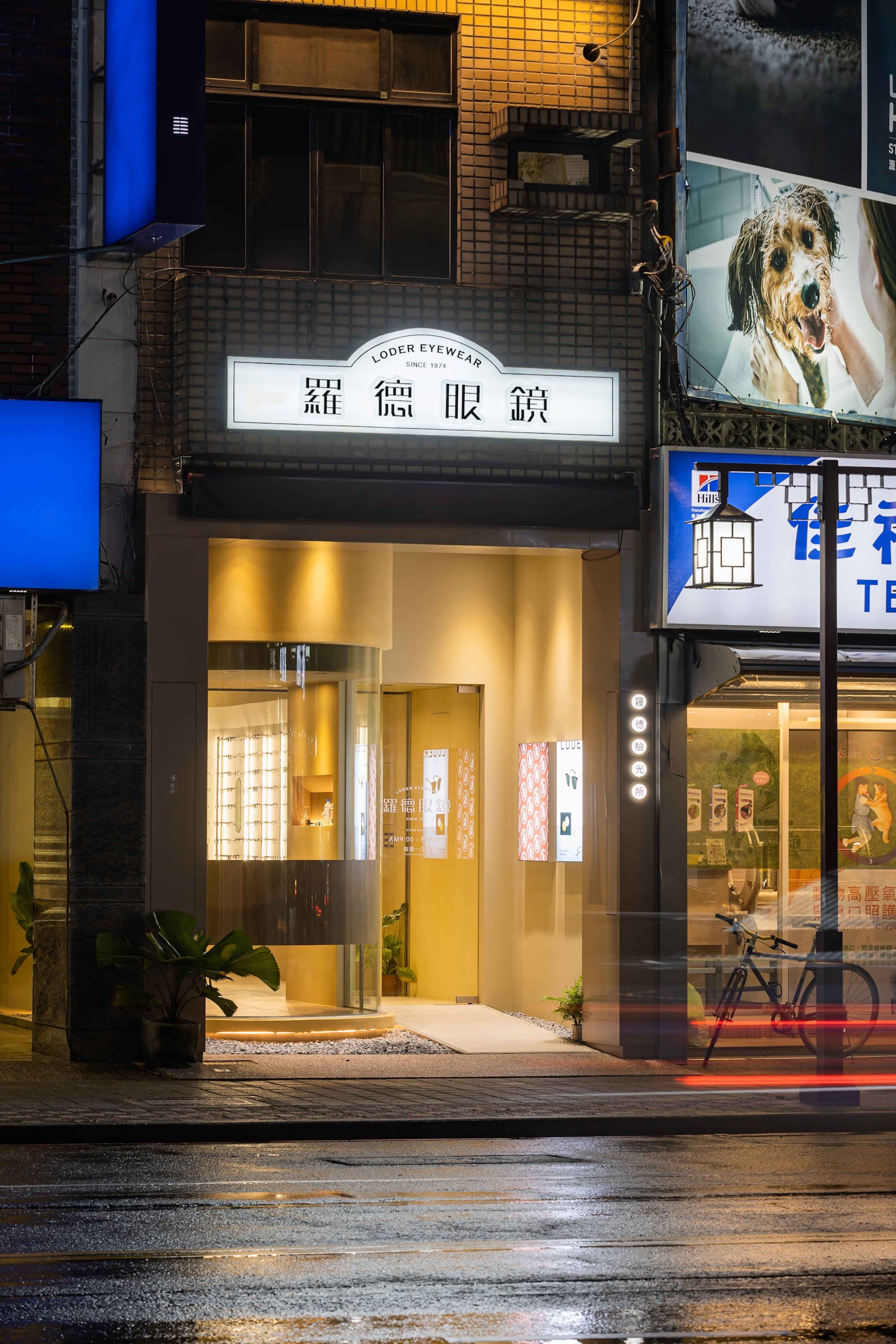
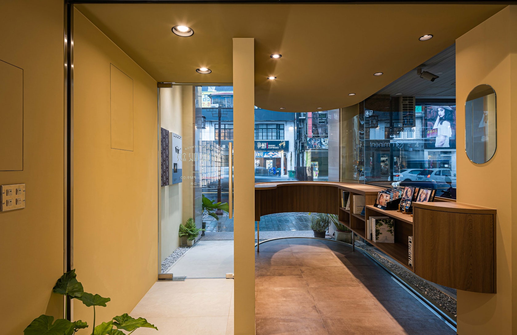
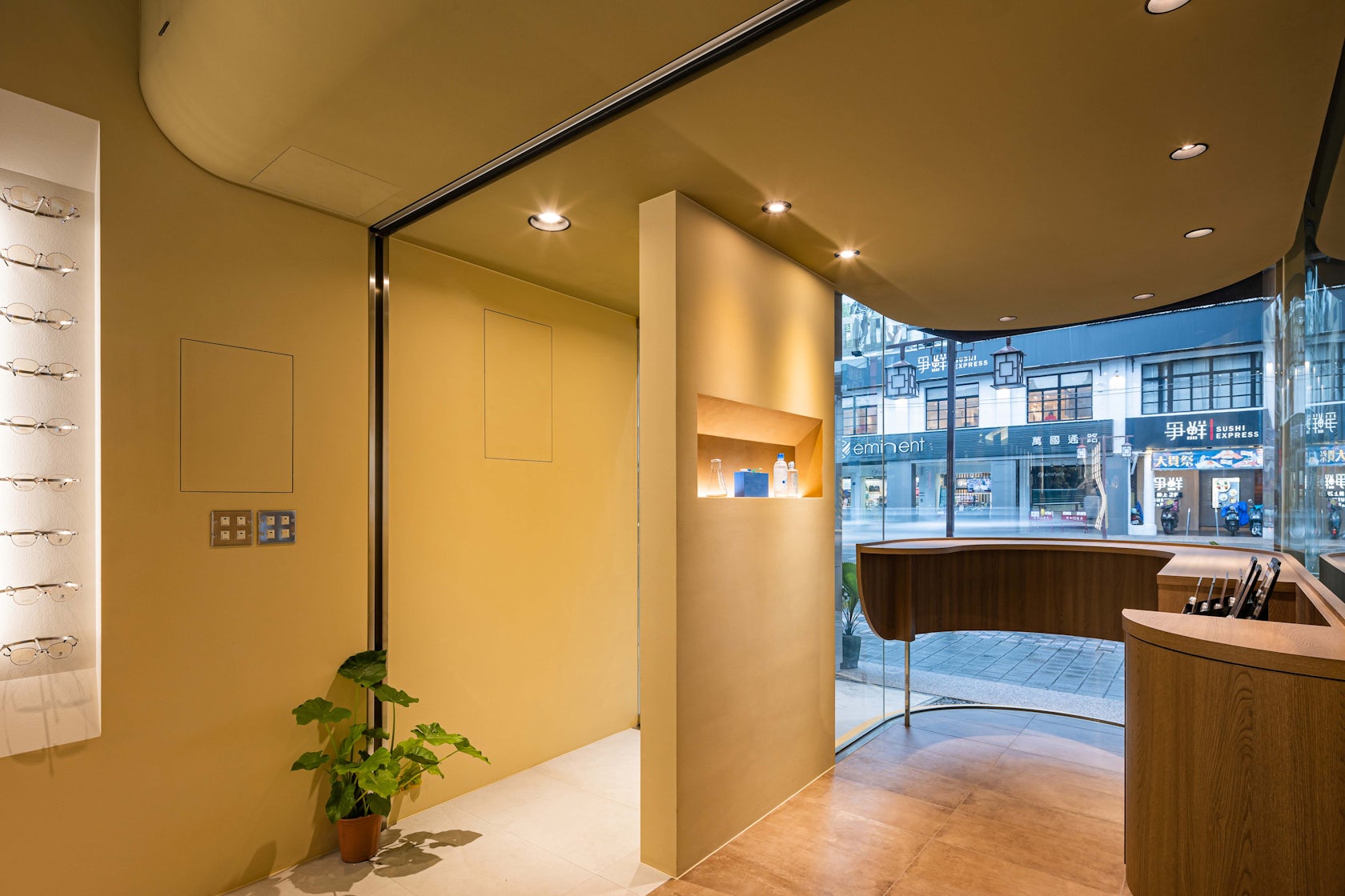
Instead of installing a huge signage, we went for a reversed strategy of emphasizing the contoured expression of the original façade to represent the new store, repositioning the main visual to the architecture. The protruding curved volume and the retracted entrance door on the ground floor utilize the southwest’s natural light to emphasize the contour of the shopfront.
© Atelier Boter
© Atelier Boter
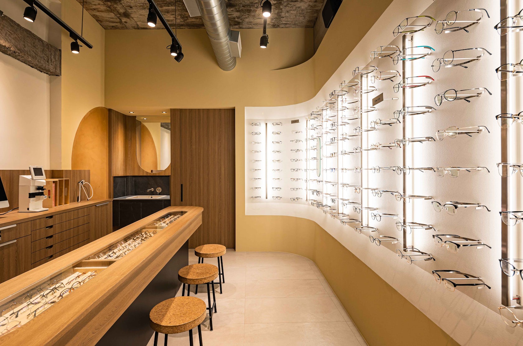
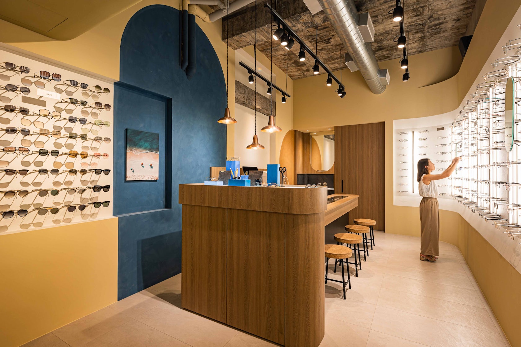
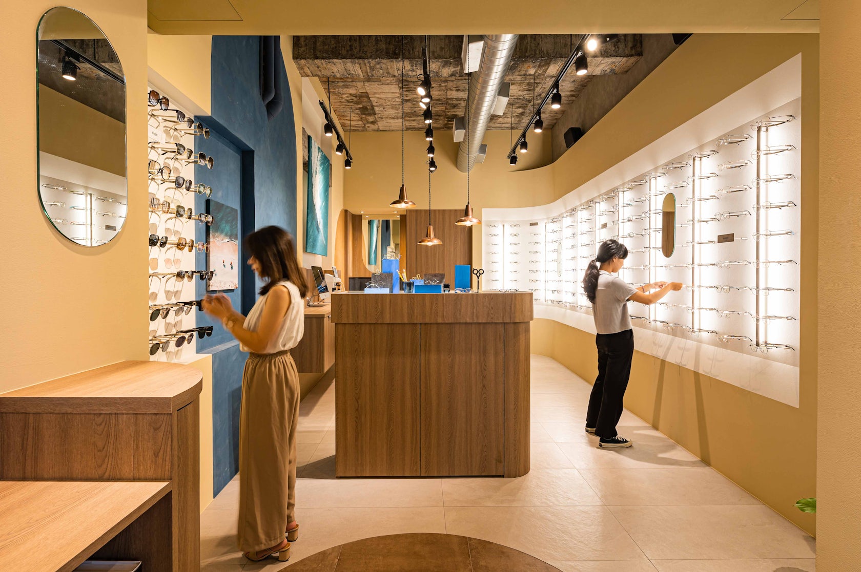
This is a new proposal of signage within the city of canvas and plastic signages.In the deep and narrow space of less than 35m2, the store’s interior is divided into three main areas. The contact lens area is at the front and the glasses display area in the middle, divided by a special seasonal theme display that is the closest to the entrance door; the seasonal theme display is a small exhibition platform where the store owner can invite different artists to collaborate on.
© Atelier Boter
© Atelier Boter
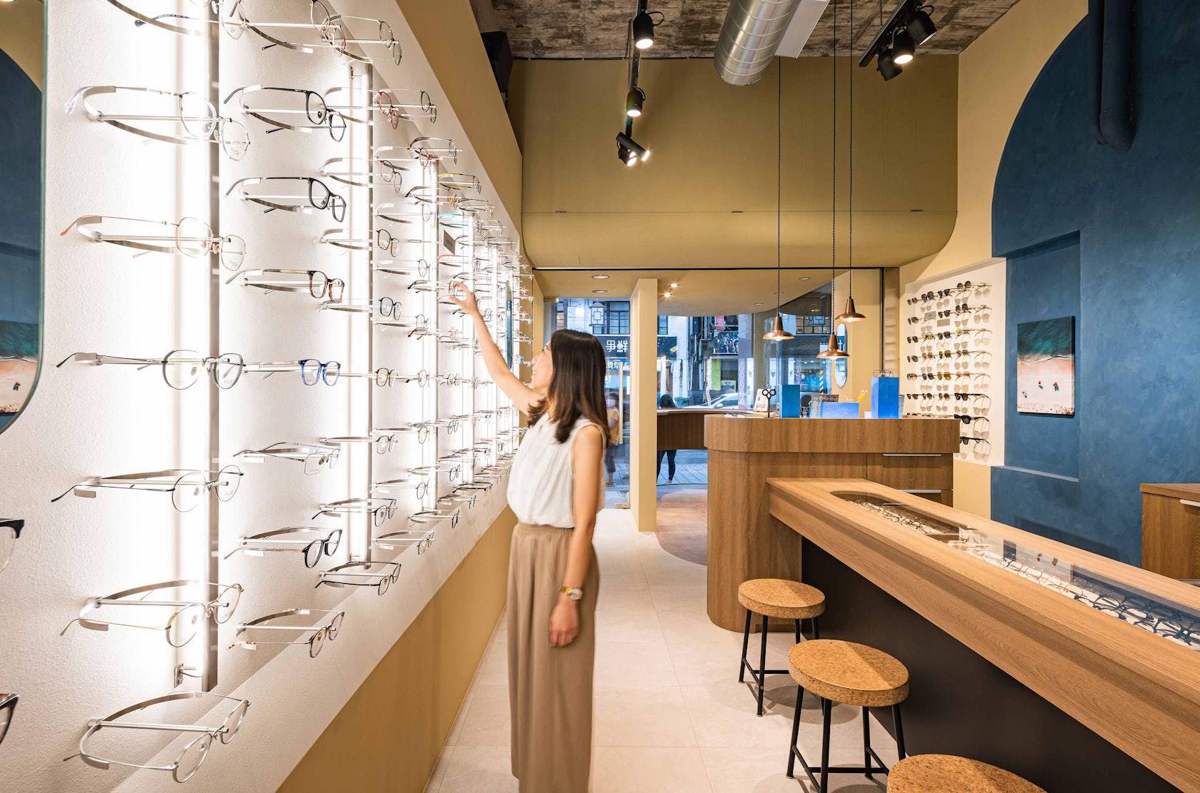
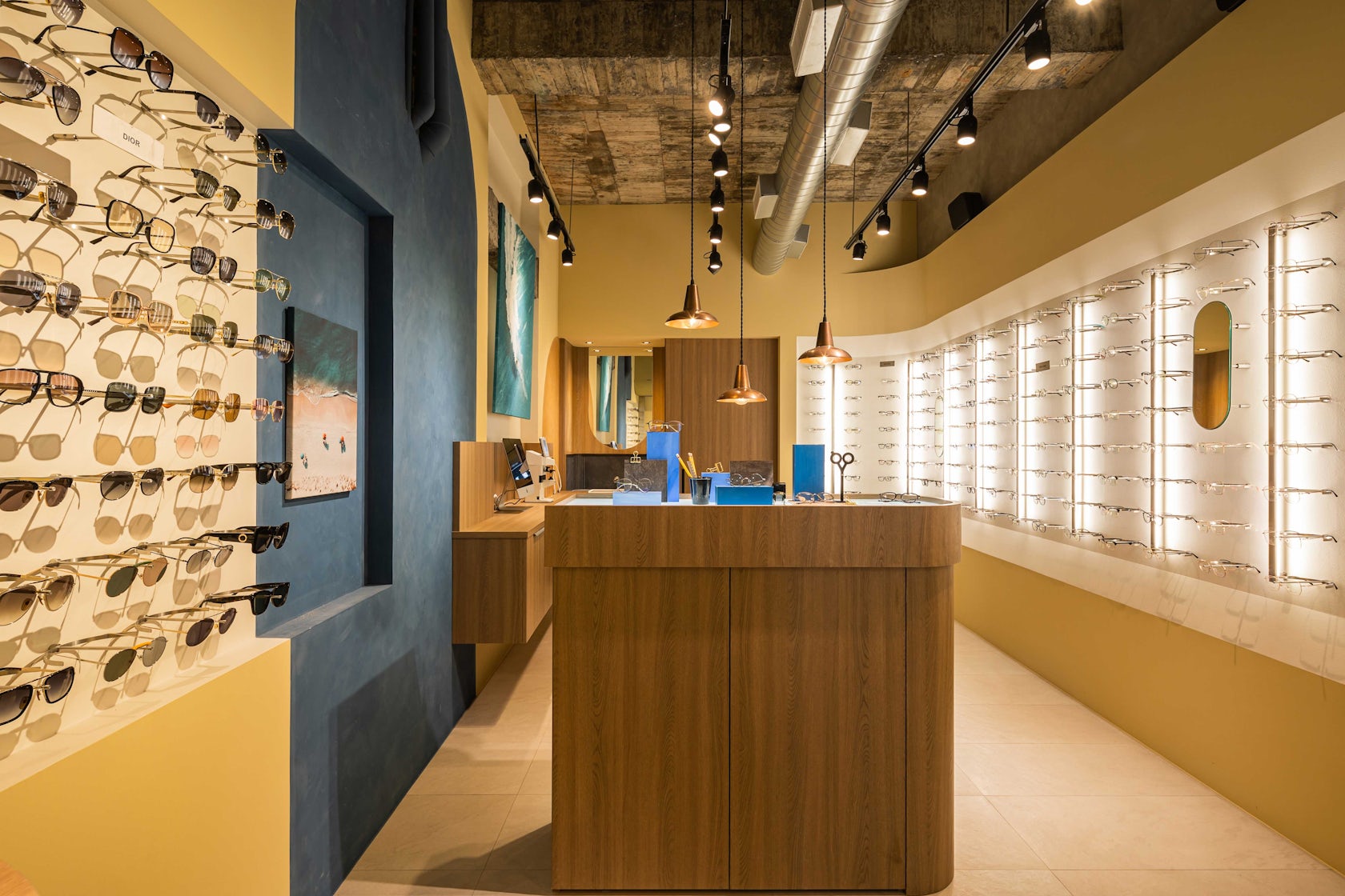
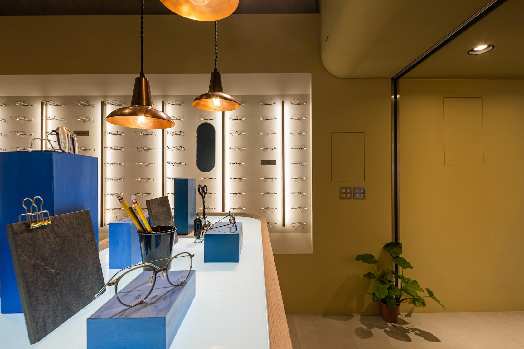
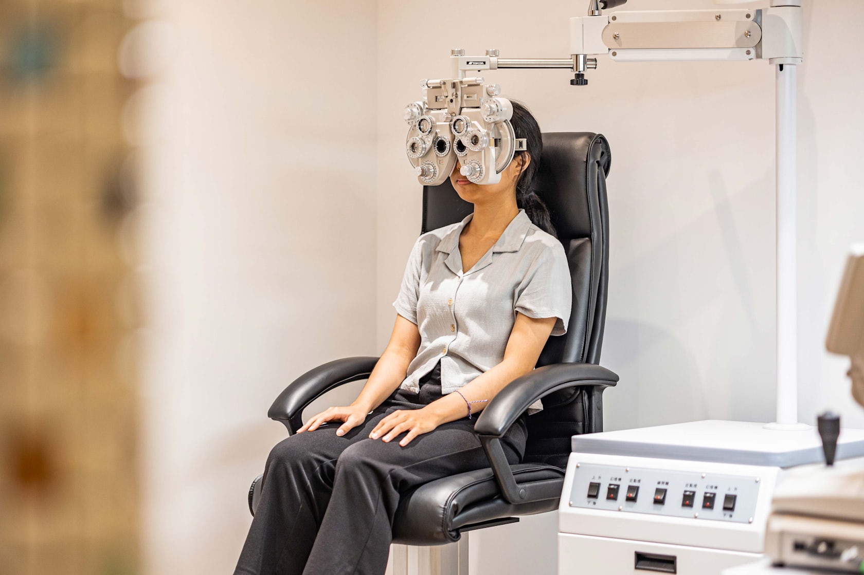
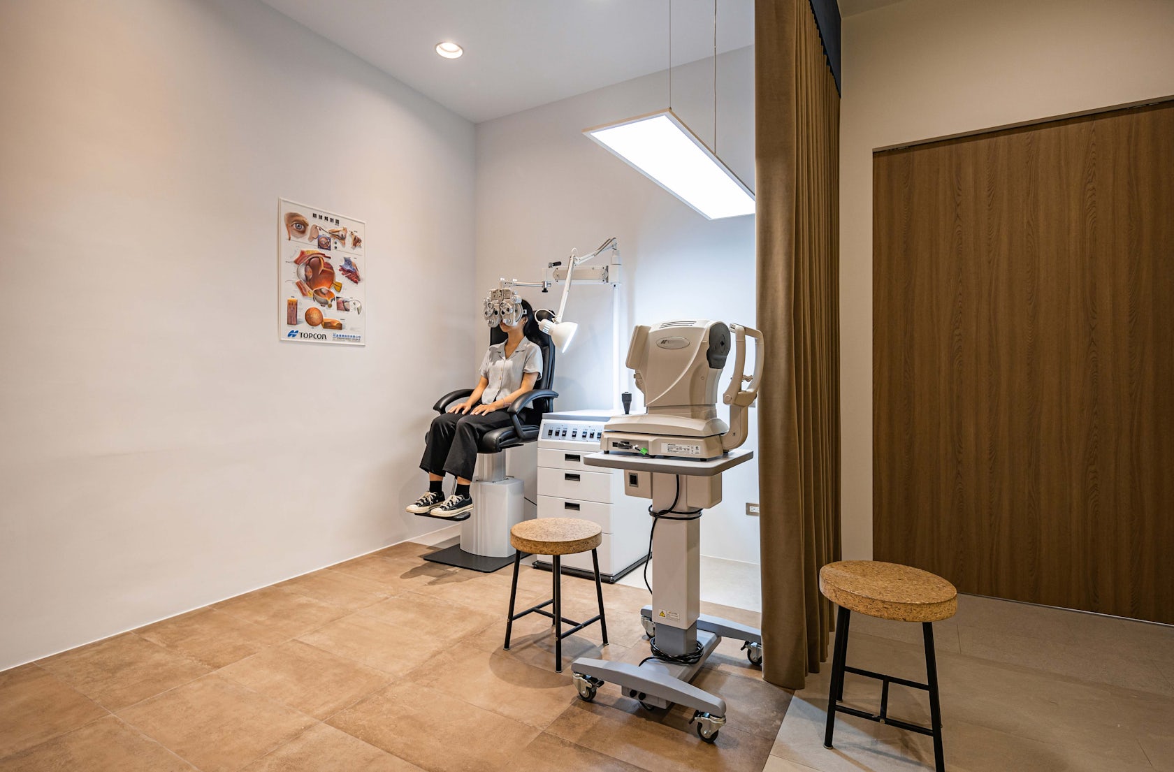
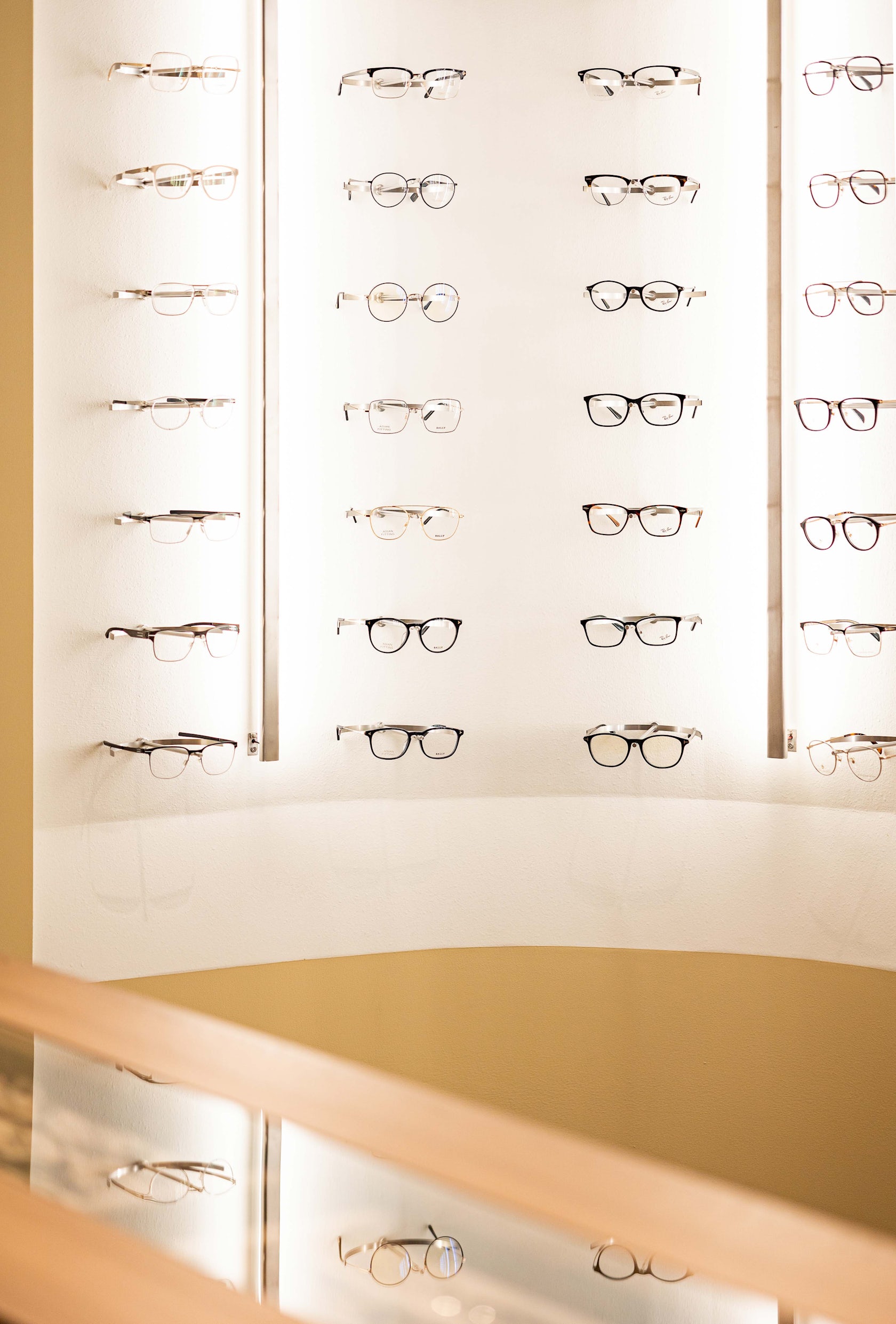
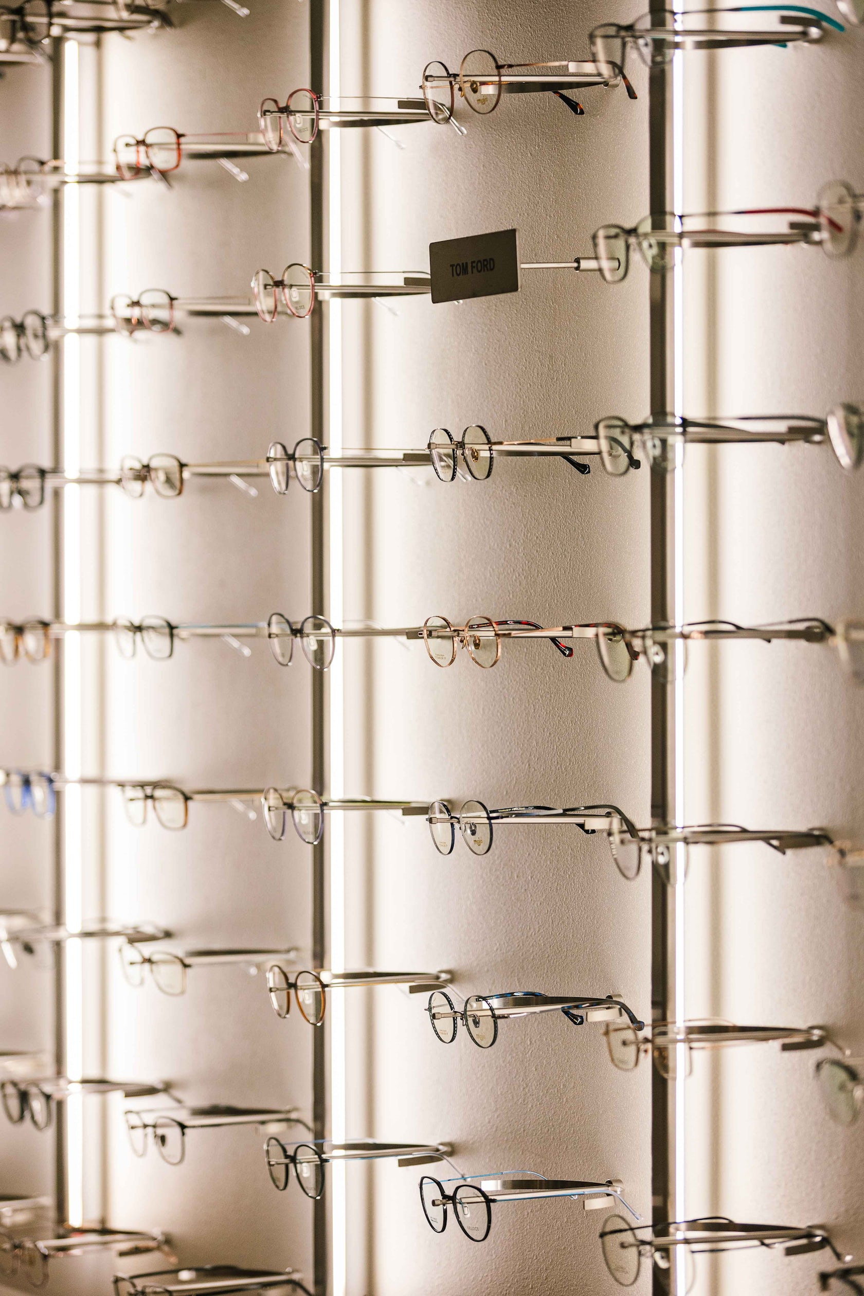
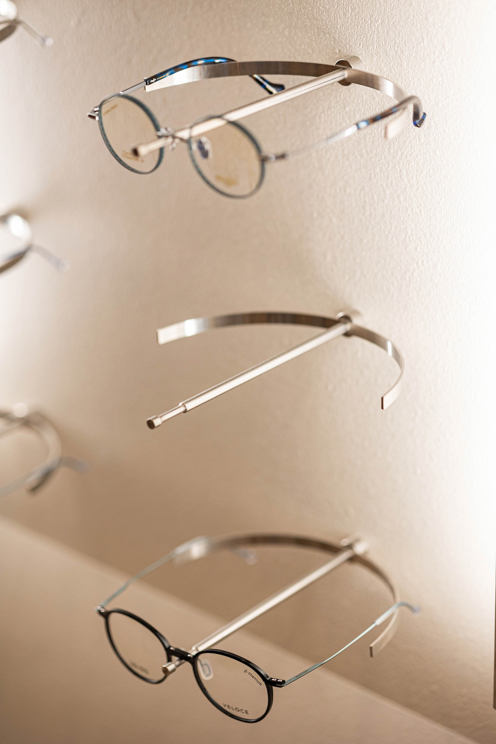
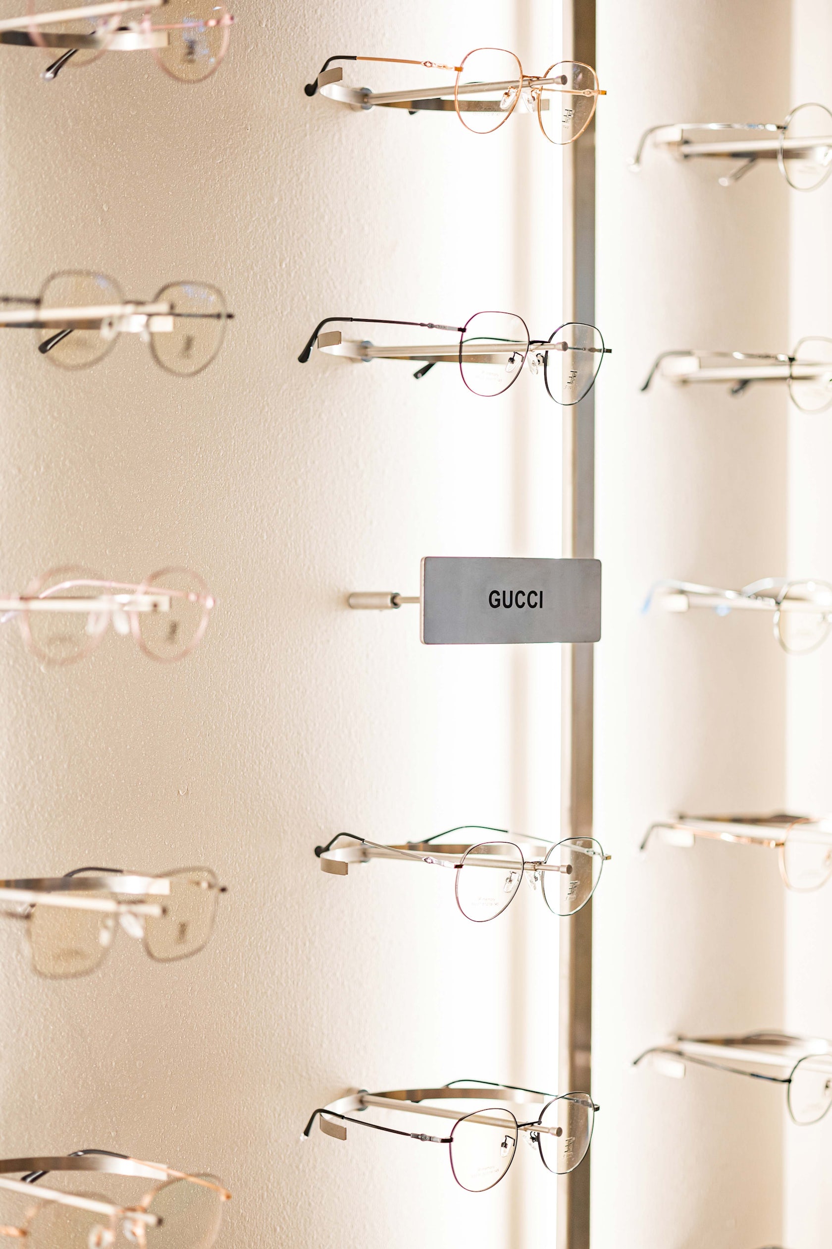
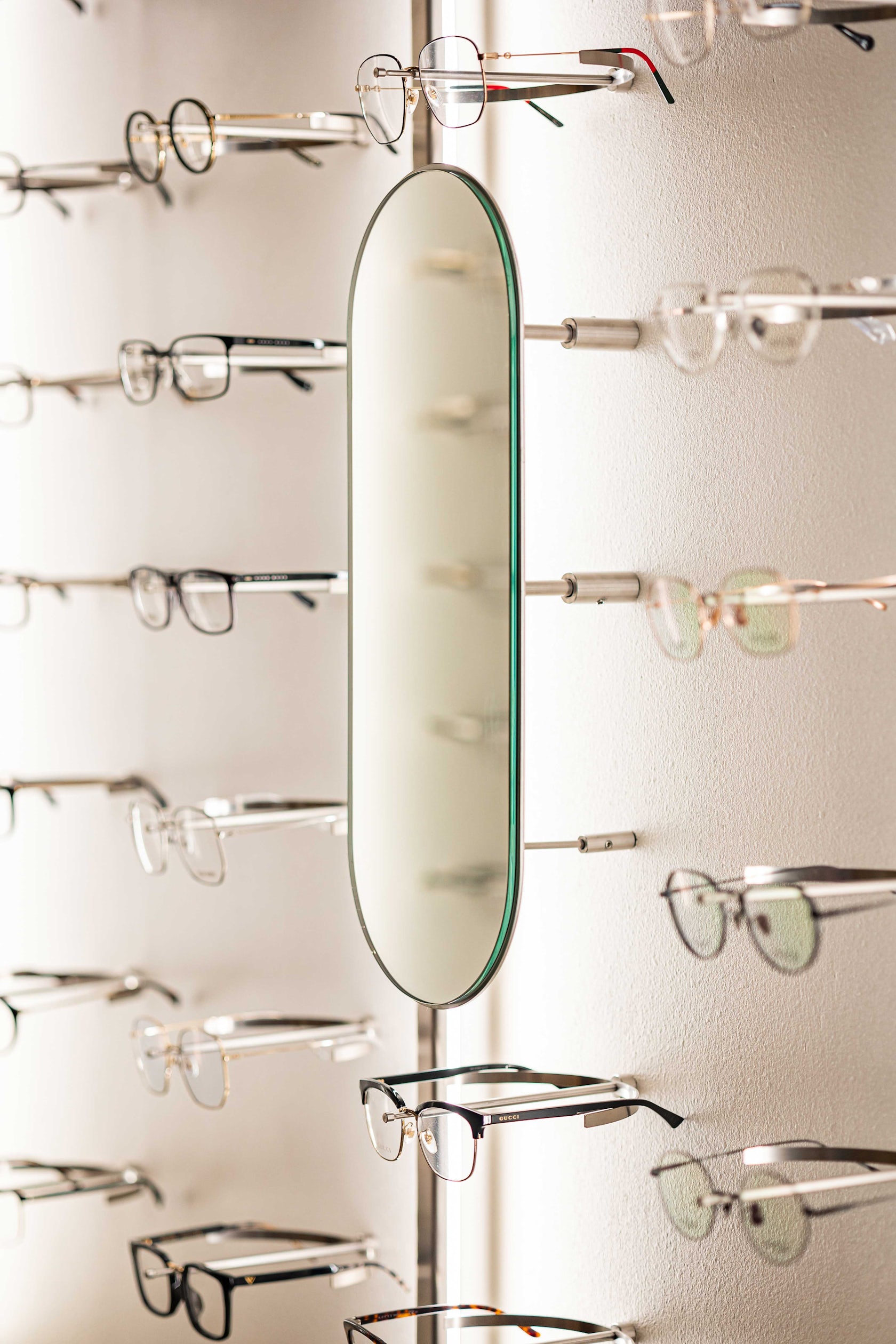
The optometry room is located at the back with more privacy.The main display wall is where the circulation from the main entrance leads to, ending with a curve. The custom made stainless steel racks on the display wall are minimal structures that can be easily changed to a tag display, or a mirror.
© Atelier Boter
© Atelier Boter
Unlike how the glasses are often displayed on shelves, the slender rack structure allows a clean background that draws all the attention of the viewer solely on the glasses; as a bonus, it is also very convenient to clean which is done daily by the owner.
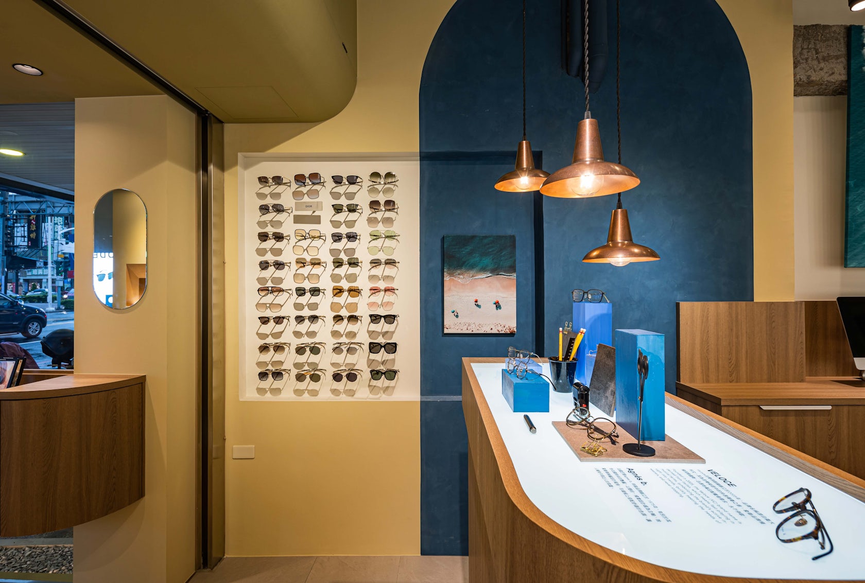
In order to avoid stock piling up in the store area, the lens solution display that is in the contact lens area adopts an exhibition mode, with the stock kept in the storage room instead.
© Atelier Boter
© Atelier Boter
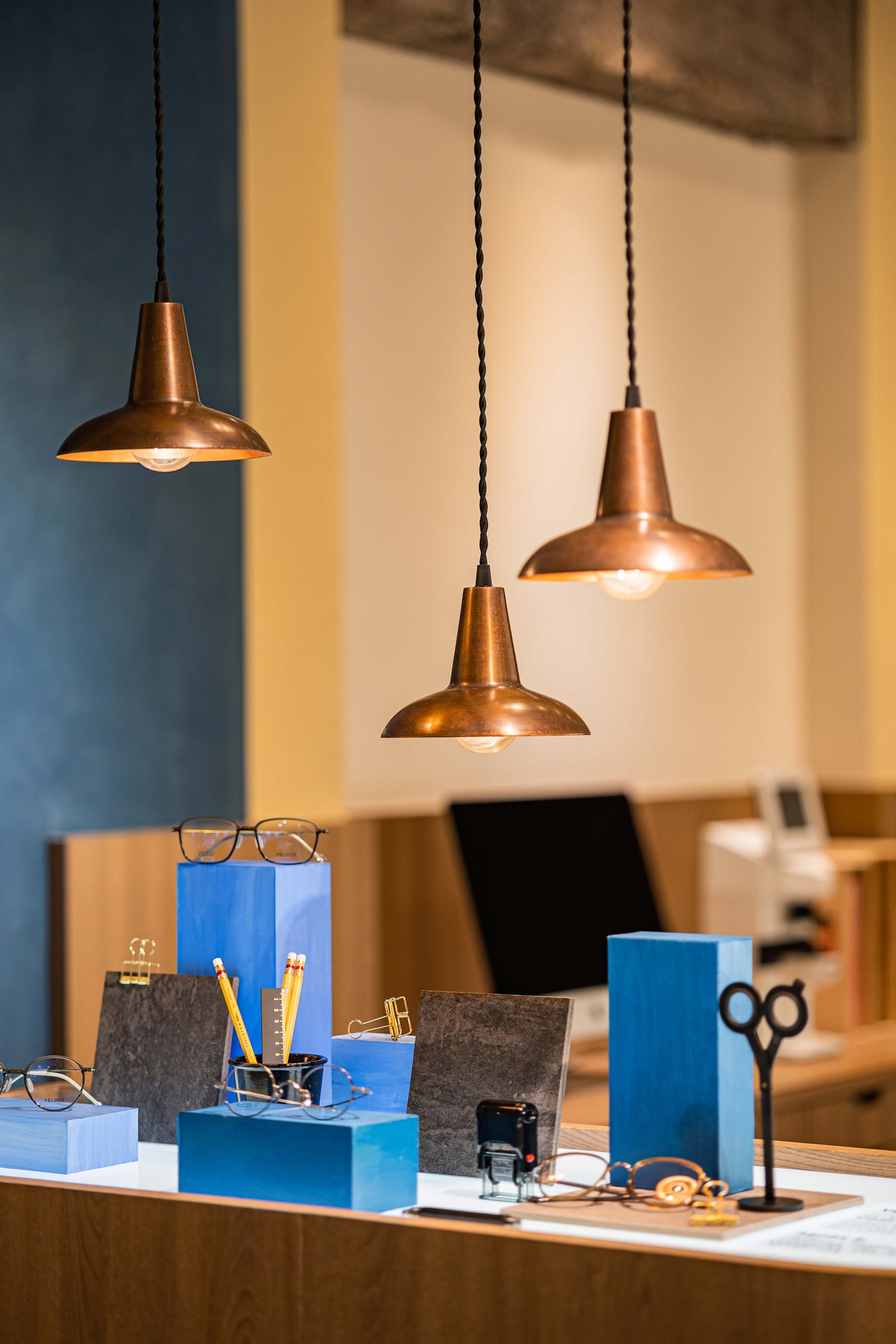
Customers are required to request their preferred option to the store owner in order to purchase their lens solution. A curved display counter is installed in the contact lens area. Other than providing a countertop for the customers to slowly browse through various contact lens samples, it also serves as a waiting area where the customers’ companions can comfortably stay in.
© Atelier Boter
© Atelier Boter
The counter appears floated when seen from the outside, giving a light impression in the fast-paced city.We proposed a collocation of earthy tones as the color scheme of the store. The goose yellow of the curved exterior wall expresses the vitality of the city, whereas the sand color of the interior brings calmness; the dark blue and Akatama orange bring characteristics to the store.
© Atelier Boter
© Atelier Boter
The door next to the sink leads to a 7m walkway to the optometry room. From the coarse sand-colored wall to the smooth hand painted blue wall, from the hard wall to the soft velvet curtain, we intend to create a tranquil optometry room environment through tactility.
Living in a low profile is the unchanging law of nature to be continuous in life.
© Atelier Boter
© Atelier Boter
We contemplate the urban texture as we design the eyewear store to ensure that it does not threaten the laws of the environment, and blends in. Under the attitude, the sensation is turned from the speediness of the street to the slowness of the pedestrians, and finally to the tranquility in the store.
At this point, it is not only the building that we can see, but also the landscape..
© Atelier Boter
© Atelier Boter
