Level Up Your Design: 5 Lessons for Architects from Video Game Architecture
The One Rendering Challenge is now part of the Architizer Vision Awards, honoring the best architectural photography, film, visualizations, drawings, models and the talented creators behind them. Winners are published in print! Start your entry >
Video games are the ultimate escape, offering immersive worlds that keep players hooked for hours. And the unsung hero behind these virtual universes? Architecture, of course.
With no construction budget or material limitations, game designers can let their imaginations run wild. From towering castles to futuristic cities, video game architecture is guaranteed to offer stunning visuals. But beyond the eye candy, there are valuable lessons to be learned from how game designers create mood, tell stories and guide players through their environments.
This article will explore five lessons from critically acclaimed video games to see how they utilize architecture as a storytelling tool. Whether you’re a game designer, an architect, or just a curious reader, these lessons will inspire you to create unforgettable designs in your own work. So, grab your controller (or your sketchbook) and dive into the exciting world of video game architecture.
1. Use Spatial Design to Craft a Narrative and Set the Mood
As experts in the power of storytelling through space, it’s no wonder architects particularly love game series like Dark Souls and BioShock. Dark Souls, a popular action role-playing game, is known for its atmospheric and challenging gameplay. Every architectural element plays a critical role in setting the game’s somber and desolate mood. Narrow hallways, flickering lights, and crumbling structures all contribute to a sense of isolation, danger and despair. Meanwhile, grandiose cathedrals and ancient ruins add to the game’s overall mystery and grandeur.

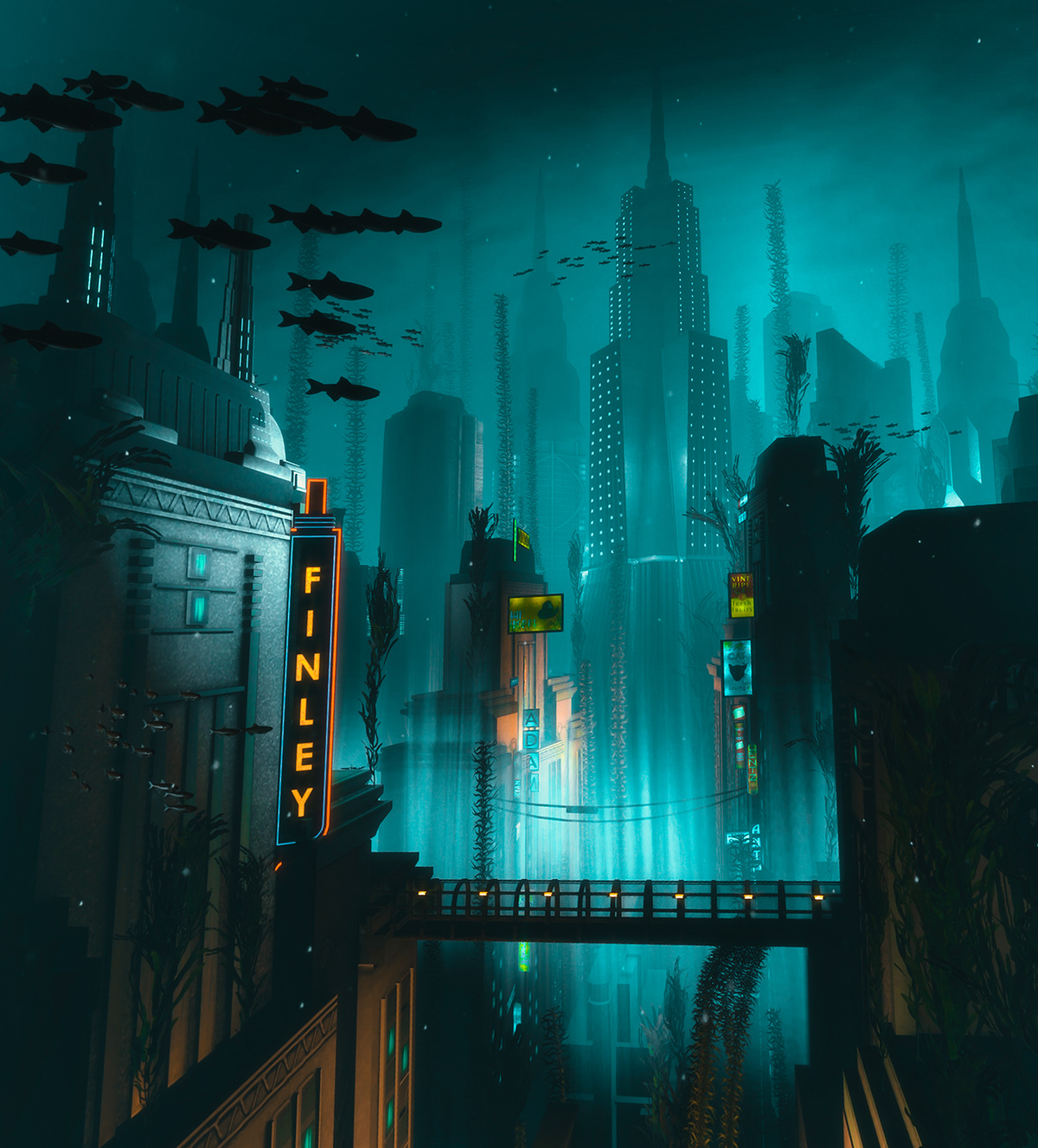
“Bioshock Remastered” by Kevin H

“Bioshock Remastered” by Kevin H
Similarly, in Bioshock, the action takes place in a dystopian world where players navigate through an underwater city called Rapture. Rundown buildings and rusted machinery create a sense of decay and abandonment. Meanwhile, Art Deco elements, now twisted and corrupted, evoke a sense of glamor and excess. The use of shadow and light also contributes to the feeling of unease, with dimly lit areas and flickering lights creating an unsettling sense of danger.
While video games may have more freedom to create fantastical and exaggerated spaces, real-life architecture can still utilize the power of spatial storytelling to enhance the human experience.
Lighting, color, texture, and materiality can be used to create a particular ambiance.
For example, open spaces with natural light can create a sense of tranquility, while low lighting and narrow corridors could evoke a sense of tension or mystery. Architects can also add artwork, murals, or sculptures to further enhance the mood-setting aspects of the space.
2. Establish Identity by Creating a Strong Sense of Place
A “sense of place” refers to the feeling of connection or attachment that a person experiences with a particular location or environment. The Elder Scrolls V: Skyrim is one game that does this particularly well. Skyrim places its open world in a Nordic-inspired setting, complete with snow-capped mountains, deep forests and ancient ruins. Each environment in the game has a unique identity, history and culture that adds to the overall sense of immersion. As players explore the world, they can visit landmarks, villages and cities that feel like they belong in the same universe. This strong sense of place enhances the game’s overall experience and makes players feel like they’re exploring a living, breathing world.
For architects, creating a strong sense of place means designing contextually appropriate and visually striking buildings. This can be achieved by using materials and design elements that reflect the local culture and environment. A building that fits in well with its surroundings can help to create a feeling of harmony and belonging, making it more likely to be embraced and appreciated by the community.
3. Simplify Navigation with Effective Wayfinding Techniques
In complex buildings, effective wayfinding is critical for user comfort and navigation. This principle is no different in video games, where it’s considered crucial for a successful player experience.
Portal 2 is an excellent example that utilizes effective wayfinding techniques. The game’s consistent color scheme and lighting provide players with clear visual cues to identify important elements and areas. The use of signage and distinct design elements helps players orient themselves and understand the environment’s layout. This makes it easier for them to solve the puzzles presented by the game.
In real life, architects have yet to design working portal guns (what a shame!). Luckily, we can still use architectural elements as wayfinding cues.
For example, creating distinctive focal points such as sculptures or fountains can serve as landmarks to guide users through the space. Using different materials, textures and colors on floors or walls can also help users differentiate between areas and navigate more easily. And lastly, light can be cleverly employed to create visual paths and highlight important areas.
4. Encourage Exploration by Designing for Movement
When designing spaces for movement, the goal is to create a seamless flow that ignites a sense of wonder and intrigue. In video games, movement-driven design prompts players to uncover hidden gems and treasures in imaginative worlds. Just like in Journey, where the sprawling desert landscape beckons players to traverse sand dunes and climb towering ruins. The game’s subtle visual cues, such as the wind direction or distant landmarks, serve as a siren’s call to explore new horizons.
In real-life architecture, creating movement-oriented spaces means crafting experiences that tantalize the senses and invite discovery. This can be accomplished by using inviting textures, patterns, and colors that captivate the eye and inspire adventure. And let’s not forget about incorporating fun features like stairs, ramps, and bridges that encourage users to move around and discover new nooks and crannies.
5. Embrace Flexibility with Modular Design
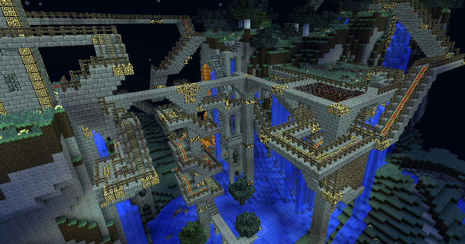
Modularity is the name of the game, allowing for easy modification, replacement, or addition of components. In video games, sandbox games like Minecraft have already embraced these principles, letting players build epic structures with modular building blocks, trying out different layouts, shapes and sizes to create wildly imaginative virtual worlds.
In the real world, architects can take a page from Minecraft’s book and incorporate modular design into their projects. By using standardized components and modular building systems, designers can create spaces that are highly adaptable and responsive to the evolving needs of their users. This iterative design process fosters innovation and collaboration among designers and users alike, leading to spaces that are truly out of this blocky world.
The One Rendering Challenge is now part of the Architizer Vision Awards, honoring the best architectural photography, film, visualizations, drawings, models and the talented creators behind them. Winners are published in print! Start your entry >


