karim rashid’s chelsea chair for boconcept blends in like nature’s extension
chelsea chair’s minimalist design blends indoors
The latest project from BoConcept and designer Karim Rashid results in an organic, minimalist design that blends smoothly into the nature of interior landscapes.

’The Chelsea collection is something you could argue is very simple, very reductive, very minimal,’ says designer Karim Rashid
BoConcept‘s Chelsea chair is designed by Karim Rashid, an industrial designer well known for his organically shaped products. With its rounded corners and simple format, it seems utterly natural and basic, almost like a non-design. Yet, obviously, a lot of thought and experimentation has gone into the process of ending up with such an unambiguous object.

The softness of the Chelsea chair invites casual use, creating comfort and cosiness
‘objects need to elevate a certain experience,’ explains rashid
‘I’ve always been interested in softening our physical landscape. I’ve created many blob-like forms over the years. I created the term “BLOBJECTS” in 1991 as a way to communicate sensual minimalism. This means there are no straight lines, yet the object is minimal, without any superfluous adornment. I believe that it is important to not necessarily over-embellish – to keep a certain truth to a product or space, but I also believe that objects and spaces need to touch our sensual side, touch our emotions, they need to elevate a certain experience, and they need to be human,’ explains Rashid.
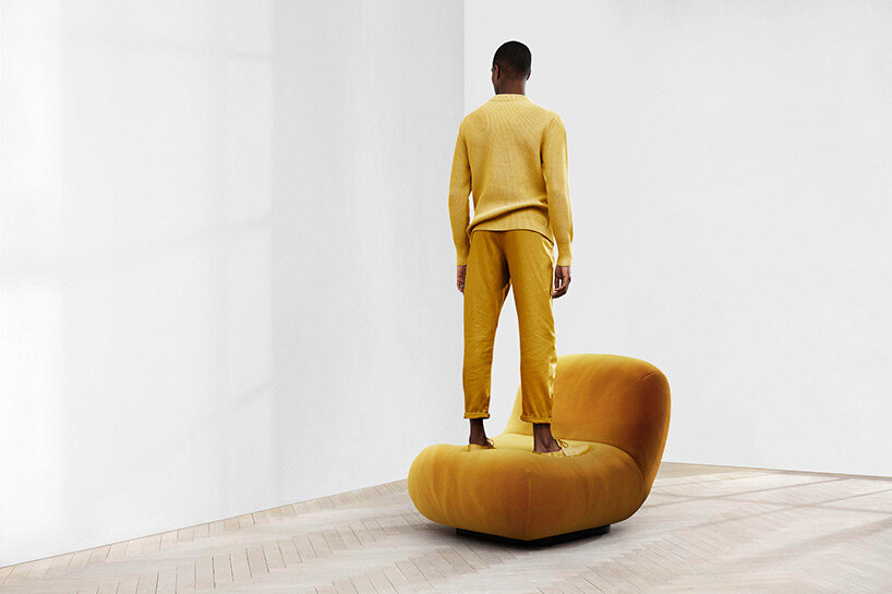
Like with most of BoConcept’s products, the materials can be chosen according to personal taste. Here, Chelsea is shown in a mustard coloured Italian fabric, Tomelilla, soft and with an elegant sheen
BoConcept delivers the requisite craftsmanship level for chelsea
Having been in the business of producing high-quality furniture since 1952, BoConcept is able to deliver the requisite level of craftsmanship necessary for creating Chelsea, which features an exceptional level of comfort, due to its excellent springs and zero foam sagging. ‘The Chelsea collection epitomizes my design language of fluid organic forms. I worked closely with BoConcept to make sure the details were perfect – otherwise, such a simple form can seem shapeless. When you create something rounded and soft like this, what’s nice about it is that no matter where you touch it, you never feel like you’re hurting yourself or going against nature. It’s an extension of nature, really, that is very minimal.’
Guest feature by Sisse Bro / Architonic
simon keane-cowell I architonic
jun 17, 2022

