Jacobs Creates Dramatic Intrigue through Spatial Overlapping and Use of Light at Kirkwood Performing Arts Center
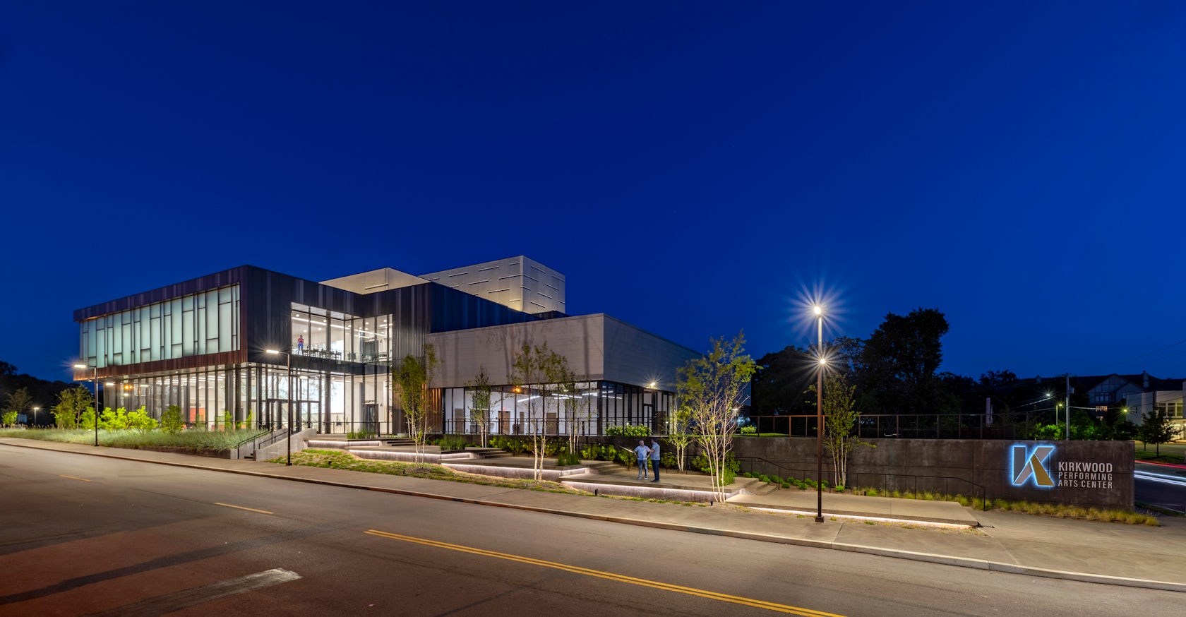
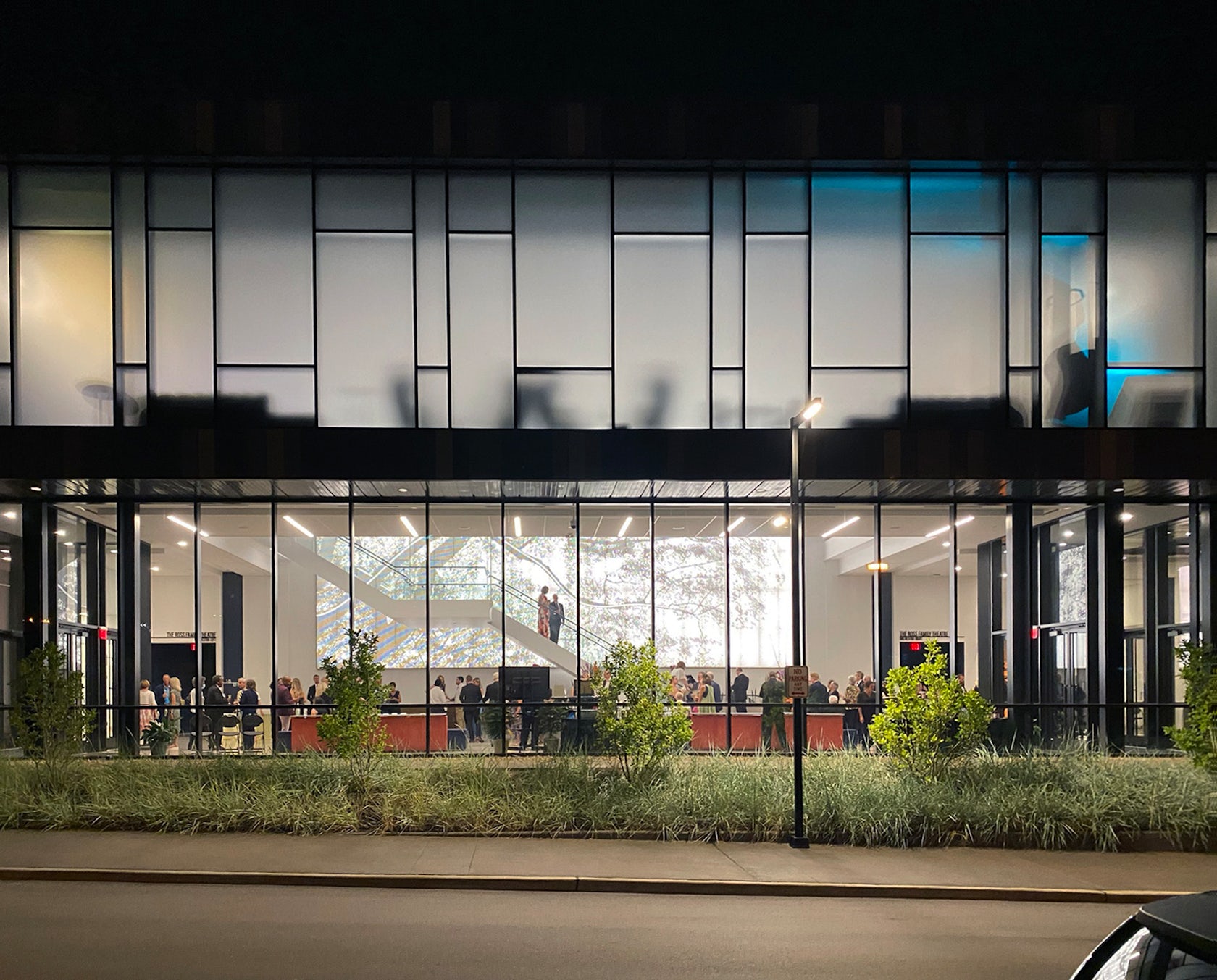
Kirkwood Performing Arts Center – The experience starts at the street and was conceptualized through a series of sequential vignettes considering how the promenade engages the public in the act of performance by providing formal and informal opportunities for interaction in the public realm: events, musicians, discussions, play, or simply to ‘See and Be Seen’. The lobby is the organizing element and serves as both frame and veil, creating connections and dramatic intrigue through spatial overlapping, blending of exterior to interior, variation of opacity, and use of light. The design solution amalgamates historical context, anticipation of future context, and the client’s desire to create an icon for the community.
Architizer chatted with Anselmo Testa, AIA, NCARB, LEED AP, National Design Principal | Division Vice-President at Jacobs, to learn more about this project.
Architizer: What inspired the initial concept for your design?
Anselmo Testa: The concept was built around the idea that the ‘Show starts on the Sidewalk’ and the importance of exterior space and approach – tying the venue into the city fabric. The parti diagrams revolved around the duality of the experience: light lobby/dark performance space, See/Be Seen, reality/fantasy, tension/release – translated as clear/opaque, heavy/light, smooth/textured… a balance of opposites. As this facility is part of the public park system, it was important to make the lobby welcoming to the public. Therefore, we were inspired to make the lobby at the ground level as transparent as reasonably possibly. The concept worked around a two-sided (east & west) entry sequence. A practical function of circulation, however this solution balances the need for onsite accessible parking with the aspirations of a more walkable and connected community that drives economic and social wellness.
© Jacobs
What do you believe is the most unique or ‘standout’ component of the project?
Its presence.
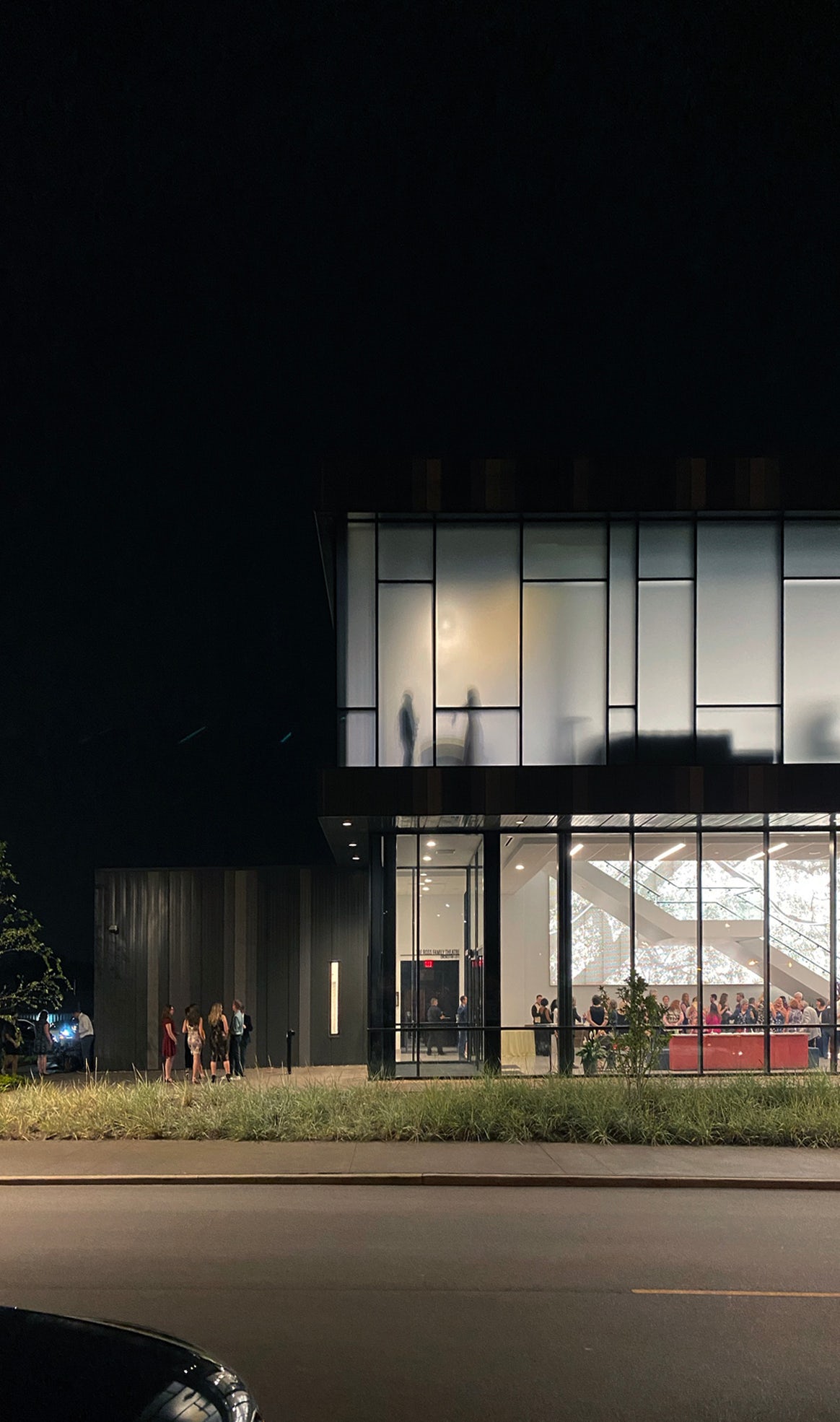
The client wanted an Icon to anchor a developing arts and entertainment district as well as the community. We believe the project is very successful in doing that in the way the building is sited, its visibility, its unabashedly contemporary attitude, and most importantly, through the impact of the lobby. Sited near an important intersection with a large expanse of transparent glass, it serves as a hybrid public space that allows the venue to spill onto the exterior plazas. The building is visible from a distance with the glowing lantern effect provided by the translucent glazing at the balcony level.

© Jacobs
What was the greatest design challenge you faced during the project, and how did you navigate it?
Precast concrete, as suggested by the contractor, offered fast installation and provides great acoustic isolation necessary for a performance space, However, it faced challenges of scale, aesthetics, and transportation, which were addressed as follows:
Scale & Aesthetics: Inspired by use of limestone in many of the community’s civic and religious facilities, the precast utilized integral color, abrasive blast surface texture, and wide reveals to reference the appearance of limestone, but with a contemporary attitude.
Transportation: The fly loft required very tall panels, testing the limits of the state Department of Transportation’s regulations governing maximum weight. This led the team to work a delicate balance of length, height, and width of the precast panels to maximize the allowable weight. At 77’ tall the precast panels are among the tallest erected in North America.
© Jacobs
How did the context of your project — environmental, social or cultural — influence your design?
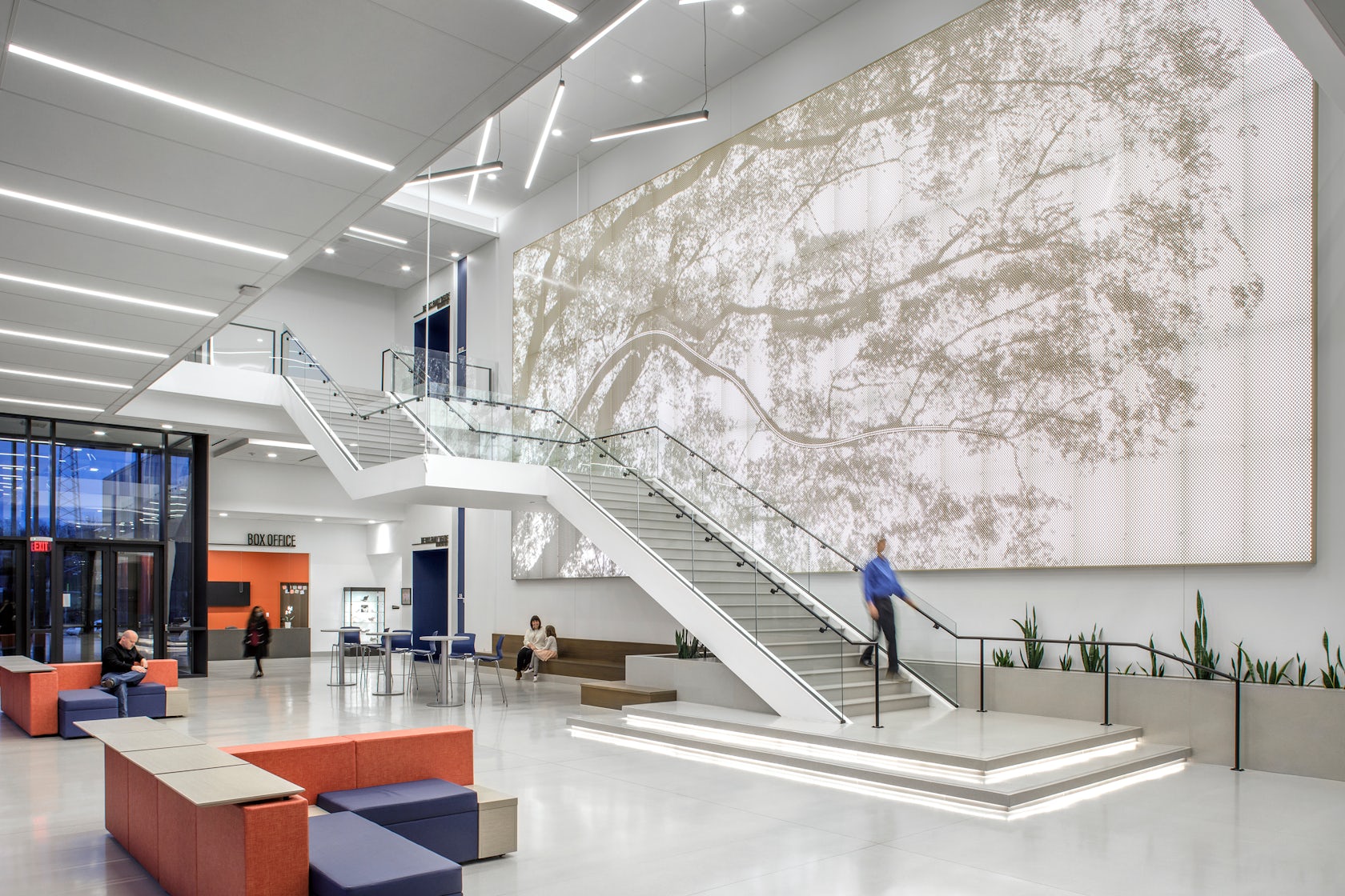
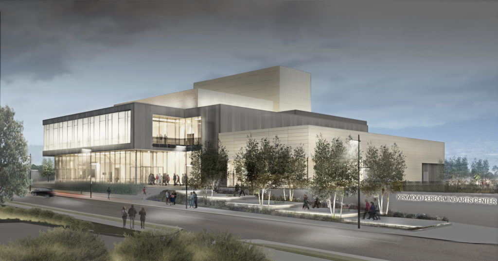
The opportunity to develop a Parks & Recreation Department project allowed the team to study different aspects of how a building can affect the community context and communicate the goals of a community that values its green space. In this case, a purposeful attitude towards encouraging and enhancing a walkable community. The team studied walking distances from parking, dining and retail venues, as well as relationships to future development to confirm the site and work to lace the theatre into a system of public, green spaces. To that end, the team placed great emphasis on the creation of various exterior spaces, including a tiered Entry Plaza offering many opportunities for the community to inhabit. The team also worked to develop a contemporary expression rooted on the materiality of local, historic buildings – studies of color, texture, joinery, and scale informed the final design.
© Jacobs
What drove the selection of materials used in the project?
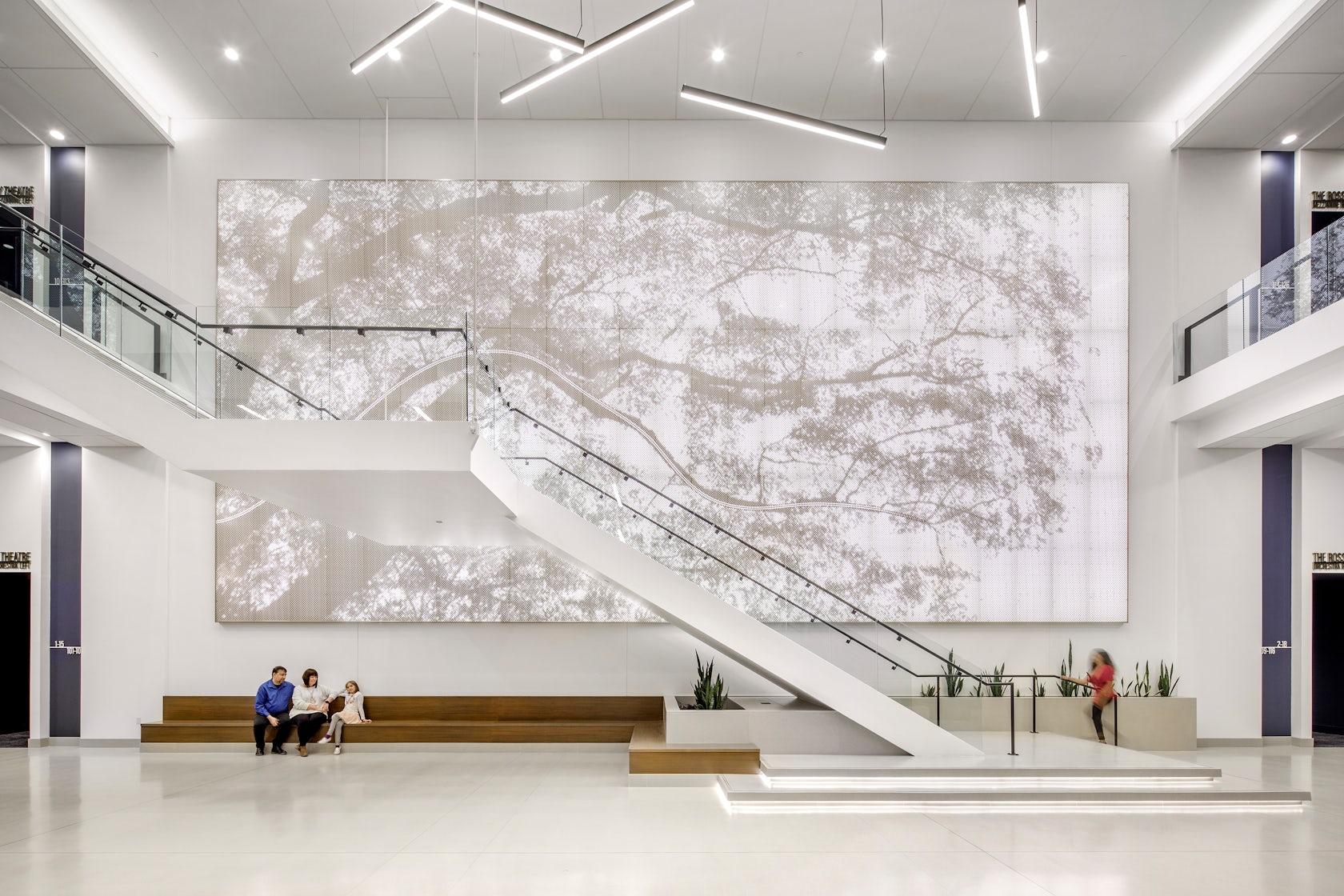
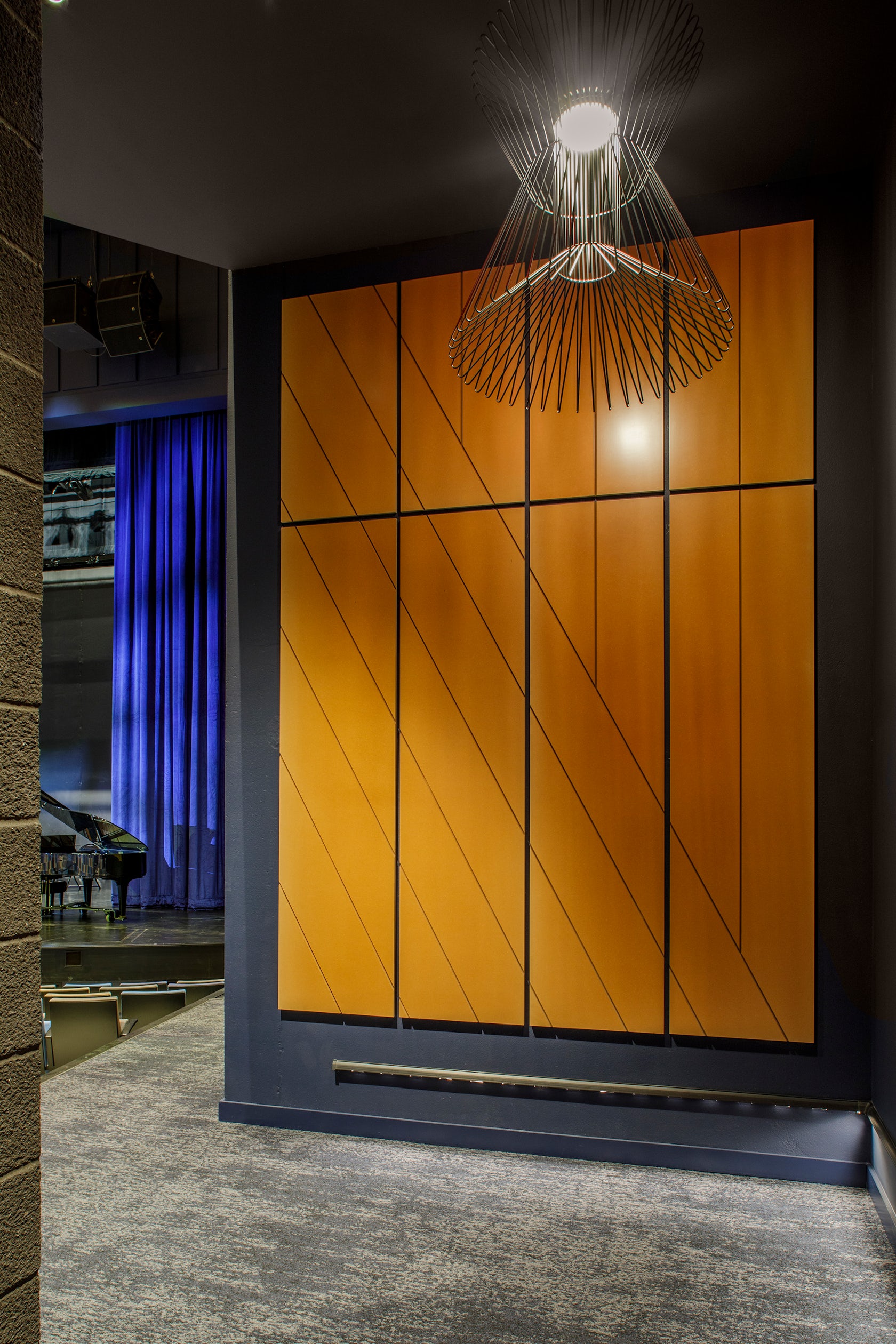
The team evolved the design to clad the House in structural precast concrete panels to simultaneously manage the structure, acoustics, costs, and an accelerated schedule. As we better understood the value of working in precast, it became the obvious solution. The translucent glazing at the balcony level plays against the clear glazing of the Lobby allowing the ground level to open up to the exterior for a fully transparent entry experience. Conceptually linked to tree bark and theatre curtains, the metal panel façade was developed to create a patterned, playful element against the solidity of the precast concrete

© Jacobs
What is your favorite detail in the project and why?
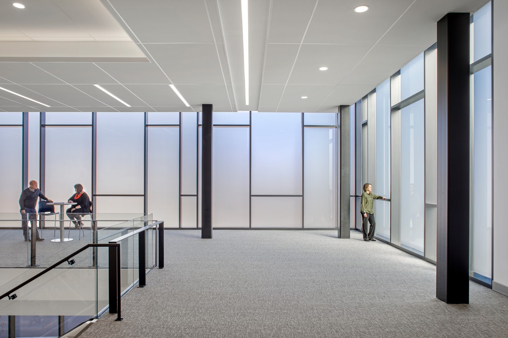
Personally, I think the translucent glass at the balcony level is marvelous and a simple move… It limits undesirable views, while focusing the guests into the spectacle of the theatre-goers arrival – truly a ‘see and be seen’ public moment. But perhaps most importantly, it serves as beacon for the downtown when the Lobby lights are on, or it captures the setting sun.
© Jacobs
How important was sustainability as a design criteria as you worked on this project?
Sustainability is integral to everything we design – in fact it’s a core value. Our philosophy on sustainability for this project was really about balancing resources for the long-term success. The design weighs the values / resources of first cost, life cycle cost, and everyday functional performance. All of those factors must come together for project to be successful and sustainable.
One key decision: The concept minimizes the amount of built structures and impervious surface by leveraging nearby parking structures and surface lots to reduce cost, consumption, carbon footprint, and storm water runoff. As such, the venue only accommodates 100 cars onsite.
© Jacobs
In what ways did you collaborate with others, and how did that add value to the project?
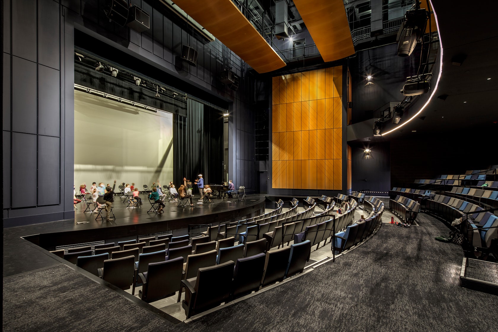
In the design of highly technical space such as this it quickly became clear that architects must depend on the expertise of others. To that end, we assembled the best consultants, notable not only for their subject-matter expertise but also for their collaborative spirit. Operating as facilitators in a series of client-inclusive charrettes to develop the program, technical requirements, and ultimately, the translation into a robust concept and vision for the project, we validated the importance of respecting expertise while challenging opinions of all team members (designers, consultants, engineers, contractors, product / materials reps., client, community, etc….) towards the best solution. The alignment of the collective was instrumental in ensuring that the project would be realized as conceived.
© Jacobs
Were any parts of the project dramatically altered from conception to construction, and if so, why?
We constantly evaluate options and value to make the best decisions. Some examples:
- The initial effort was devoted to making sure we got the House right in terms of all the technical elements: sightlines, acoustics, lighting, fly loft rigging… As budget and schedule started to become more pressurized, the team evolved the design to clad the House in precast concrete panels – requiring a rethinking of the structure, detailing, and exterior treatment.
- Similarly, translucent glazing at the second story of the Lobby – initially visualized as channel glass – evolved to a curtainwall system with acid-etched glass, to better respond to project costs. The curtainwall mullions were laid out in a staggered pattern for visual interest.
- The metal panel façade was initially visualized as zinc and evolved into a pre-finished metal panel due to the same budget constraints.
How have your clients responded to the finished project?
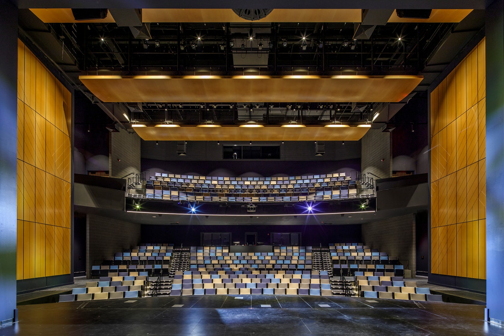
The undeniable success of the venue has become for the City and Community a great source of pride. It’s ability to perform in myriad ways for varied events, coupled with the success of the two theatre groups has driven a strong revenue stream. As I intimated earlier, they were heavily invested as part of the collective and leaned in from the start. Creative programming during the height of the pandemic created an initial buzz and the initial theatre season has seen great success and demand for the facility. As the size and capability of the venue was specifically designed to attract ‘pre-Broadway’ runs, there is now a steady stream of interest in ‘workshopping’ shows here.
© Jacobs
What key lesson did you learn in the process of conceiving the project?
The project went through a long process of discovery and development. Different sites and programs allowed us to go on a journey with the City and Users, developing great trust and a great relationship along the way. The importance of letting the architecture evolve in response to charrettes with the City leaders, users, and the Community became obvious as the concept became stronger through constant reiterative examination. Another reminder came in the form of a required value engineering process, which forced the design team to be more creative and develop a more interesting response / solution.
How do you believe this project represents you or your firm as a whole?
This project represents the importance of designing local projects within a global firm structure. Although, it represents a tiny fraction of the projects and revenue generated by a global A/E firm the connection to our local communities will always be of primary importance and afford us a fertile testing ground for ideas and processes.
© Jacobs
How do you imagine this project influencing your work in the future?
Our experience indicates that many of the ideas, elements, strategies, and processes will show up in our future work. We subscribe and aspire to an iterative process within the design of a project – and are committed to test and redefine it project to project. A process in which we build upon previous success and failure.
Is there anything else important you’d like to share about this project?
It was an excellent experience for our team to work in our community on a truly singular project. We look forward for future opportunities to continue exploration of this project type, and to connect with vibrant communities.
Team Members
Design Principal Anselmo Testa, Project Architect Jason Pierce, Design Architect Kyle Nottmeier, Architect Tom Bernhard, Lead Interior Designer Heather Lents, Interior Designer Kim Fredrich, Specifications Rick Yaw, Project Manager Bryan Mason, Structural Engineer Phillip Shinn, Structural Engineer Jonah Sprehe
Consultants
Landscape Architect: Planning Design Studio, Acoustic Consultant: Threshold Acoustics, Theater and Lighting: Schuler Shook
Products / Materials
Precast Concrete Structural Insulated Precast Concrete, Pac-Clad Flush & Reveal Wall Panels: Wall Panels – Reveal, Arktura Vapor Graphic Perf
For more on Kirkwood Performing Arts Center, please visit the in-depth project page on Architizer.
