interview: NO ARCHITECTURE embeds five interlocking pavilions into aspen’s panorama
NO ARCHITECTURE reveals design for ‘Risingmountain’ in Aspen
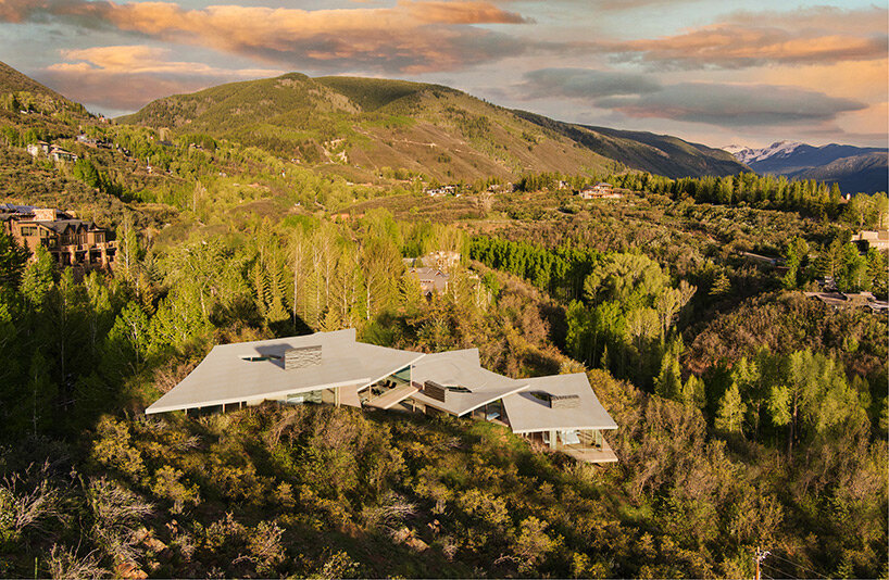
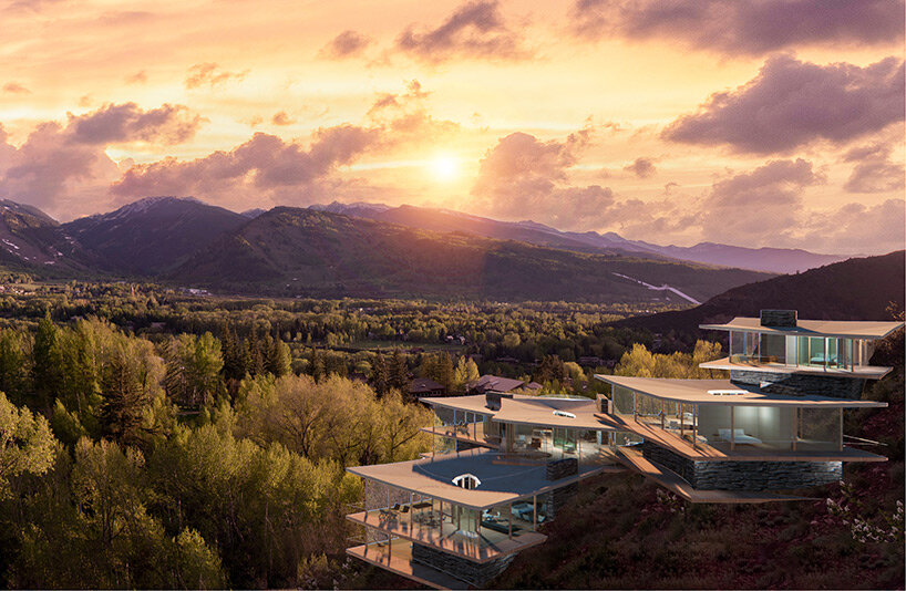
Principal architect Andrew Heid of NO ARCHITECTURE has revealed plans for ‘Risingmountain’, the firm’s largest residential design to date. The experimental project, designed in cooperation with Steven Shane of Compass Colorado, replaces an existing home with a new one that ascends a sharply sloped site on Red Mountain in Aspen, Colorado. The result sees a site-specific 8,250 sqft (766 sqm) home that caters to the needs and preferences of Aspen’s new guard.
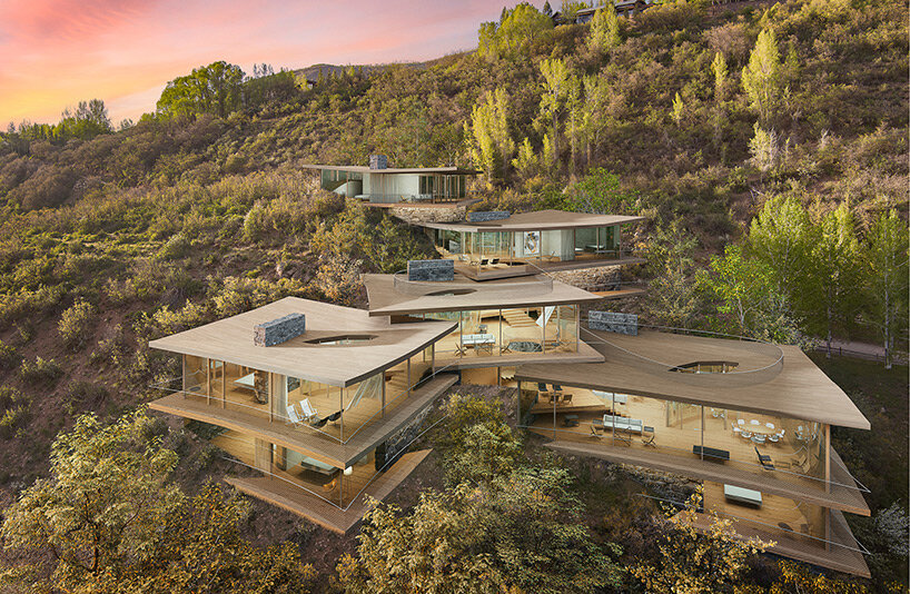
Designed to capture panoramic vistas, the dwelling incorporates a sequence of five terraced pavilions made of glass, stone, and timber, that interlock with each other, climbing along the mountain ridge. The architecture draws from the architect’s core ‘Matrix’ approach, which is based on adapting dwellings to flexible lifestyles and the natural environment. The name ‘Risingmountain’ was partially created using artificial intelligence with top word searches of potential buyers in technology, wellness, art, and fin-tech.
designboom spoke with principal architect Andre Heid in order to find out more about the ‘Risingmountain’ project, its AI-generated name, design concept, and appeal to buyers of younger generations. Read the interview in full below.
all images courtesy of NO ARCHITECTURE
Interview with Andre Heid
designboom (DB): What is the design concept behind Risingmountain?
Andre Heid (AH): Designed specifically for the site’s panoramic views of Aspen Mountain, our concept for Risingmountain is a cascading series of five terraced glass, stone, and timber pavilions that ascend along the steep ridge elevation of Red Mountain.
DB: How does the building relate to its natural surroundings?
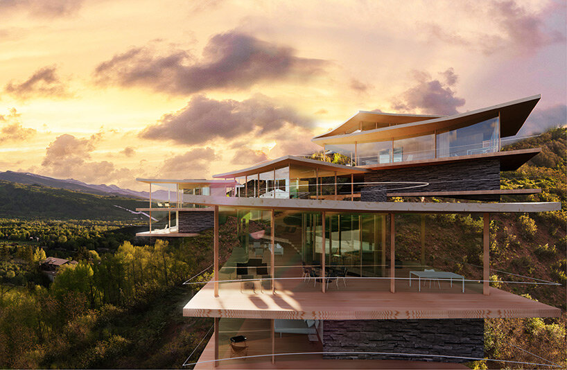
AH: Each of the five pavilions is oriented independently to capture different surrounding views as they extend over the ridge’s dramatic height elevation and 180-degree views. Intimacy and warmth are introduced through interior wood floors and ceilings, locally sourced stone fireplaces, and walls that wrap the perimeter where the pavilions carve into the mountain. Floor-to-ceiling glass wraps the cantilevered terraces and roof decks, allowing the landscape and interiors to become one. Roof overhangs sweep upwards toward views in every direction with a glass courtyard inside each pavilion in which to experience the sky, wind, rain, and snow.
DB: What is the foundational ‘Matrix’ approach to designing homes, and how have you used it to design Risingmountain?
AH: A conceptual thread running throughout NO ARCHITECTURE’s projects, the ‘Matrix plan’ prevents spatial inefficiency and social isolation by ensuring all adjacent spaces remain interconnected. By consolidating the bathroom, storage, and mechanicals within structural cores, the project maximizes usable space and minimizes poché. the solution was a space that departed from a compartmentalized ‘room-and-corridor’ plan, flowing in a continuous loop around decagonal courtyards and L-shaped storage cores.
interview: NO ARCHITECTURE embeds five interlocking pavilions into aspen’s panorama
DB: The project’s name was partially created using artificial intelligence with top word searches of potential buyers in technology, wellness, art, and fin-tech. What are some of the most popular words people searched for?
AH: Spiritual, ascendency, enlightenment, empowering, transparently, transformative.
DB: Have you used AI in any other way for this project? Do you consider implementing it in more ways in the design process in the future?
AH: We believe in thinking less and feeling more, so the creative act is like an algorithm of intuition and pragmatic feedback.
interview: NO ARCHITECTURE embeds five interlocking pavilions into aspen’s panorama
DB: How does Risingmountain showcase ways in which younger generations buying in Aspen want to live?
AH: Risingmountain showcases how we see younger generations buying in Aspen want to live, akin to the 20th-century hillside modern residential building boom in Los Angeles while giving it a contemporary twist for the 21st century in Aspen. The twist includes utilizing carbon sequestering mass-timber construction for the structure, and a flexible plan that allows different degrees of living together or separate without wasted bedrooms. The results allow every space to function in more than one way, from entertaining, to working, to sleeping. The flexible plan is created by perimeter circulation, and by the consolidated bathroom, storage, and mechanical spaces within the structural core walls. The perimeter circulation along with floor-to-ceiling glass windows allows the inside to connect seamlessly to mountain views and nature.
