interview: MINI Concept Aceman crossover EV debuts new design language
the mini family is growing
The MINI Concept Aceman debuts a fully electric, five-seater city crossover that will soon be in production. The car not only signals a novel model for the British-born automotive brand, but also the start of an entirely new generation of models for the family. It showcases a new design language that is focused on reduction, modernity, environmentally-conscious choices, and the harmonious yet vibrant mix of digital and physical.
‘We are creating an entirely new MINI family. The two bookends will be the original icon, the Hatch, and the MINI Countryman, which will grow slightly in size within the next generation. We identified a gap in between those two products. This is the Concept Aceman. As the youngest family member, we saw the design as a chance to stretch the brand in terms of form language, modernity and so forth,’ begins Oliver Heilmer, Head of MINI Design, in an interview with designboom ahead of the MINI Concept Aceman launch.
All images courtesy of the BMW Group
a reFINEMENT OF exterior design
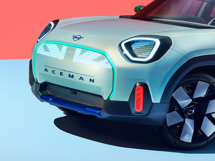
‘The vehicle is a city crossover so is slightly higher and a little longer than our other models. However, it still has classic MINI proportions: the wheels in the corners, really short overhangs, and the contrast between the roof, greenhouse and body.’ Oliver Heilmer continues, ‘the front showcases a very purpose-only approach. The arrangement of the headlights in relation to the grille is typical MINI, but the outline of the lights are then completely different. The grille has a super clean appearance with only a thin frame and the rest is the same as the body color. It is the most iconic MINI attribute that has been reinterpreted for the Concept Aceman. Its design still means people will be able to recognize it as a MINI from far away.’
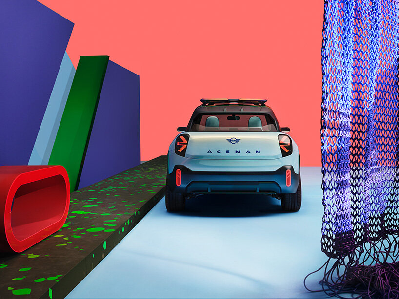
Progressive crossover proportions lend the four-door, five-seater MINI more practicality with a length of 4.05m, 1.99m width and 1.59m height. Its two-box design is split by the British Racing green roof and rack contrasting with the wraparound window and minimal body beneath, which shimmers in color from a light turquoise through to gold. A deliberate use of defined contours and clear edges reduces the design to a minimum. The geometrically sculpted bonnet and wheel arches, together with the tapered lines, then add dynamism to the familiar MINI form.
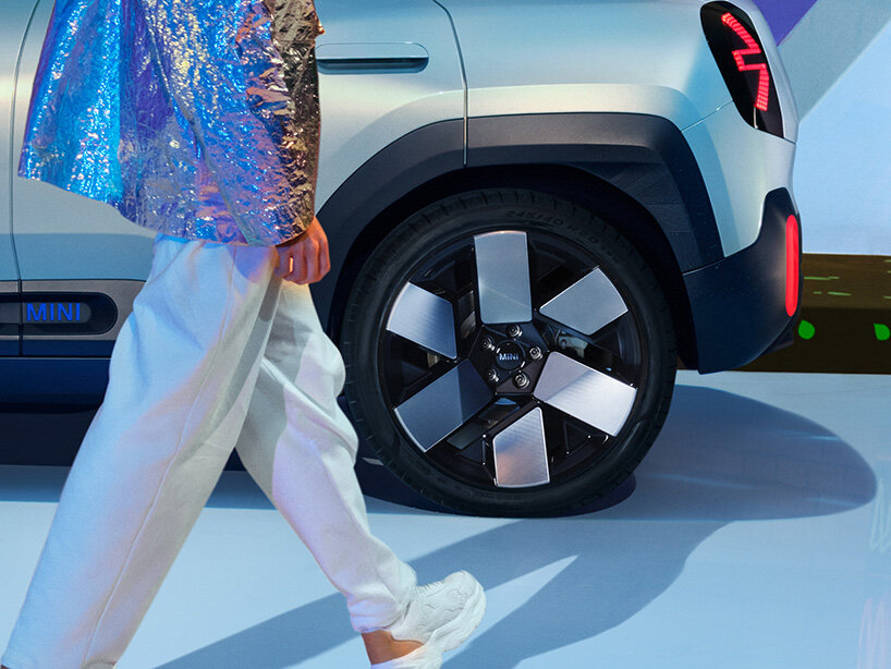
The much-love British character of the MINI remains, as the union jack is reinterpreted in the design of the lights and roof rack. A myriad of expressive details reveals the car’s dual personality of urban and adventure as well. Horizontal underride protection and dark green cladding on the door and rear, muscular spats, and the roof rack add to its character. A sense of modernity is illustrated through refinement with flush-fitted door handles, glass surfaces, and navy blue, 20-inch wheel rims dressed in a graphical six-spoke design.
‘It all begins as soon as we have defined the character of the car. Initially, we jumped really far into the future with the form language, proportion and details, and then we refined it back to the point where the car became instantly recognizable as a MINI. The design represents a big step towards modernity,’ confirms the designer.
A REDUCTION IN INTERIOR DESIGN
‘Our designers had so much fun with the interior. The concept was a chance to use different materials. We wanted to create a friendly, welcoming interior so tactile experiences were key. Differently textured materials and technology combine in unusual, unique ways that only MINI can do. The seats, for instance, merge printing and stitching. The result looks like art,’ explains Oliver.
The concept of ‘only MINI can do’ materials is apparent inside the Concept Aceman. The cabin itself is flooded with light from the wraparound window and panoramic roof, made even more spacious with the ingenious transparent, floating center console and large, open surfaces in the doors and behind the clean dashboard. Adorning it, a discrete light grey- and slight blue-tinged textile covers the door pulls and expands across the entire dashboard. The front seats and rear bench pair different fabrics on the body and head restraint. Flat-knitted, velvet velour and waffle weave give the seats a three-dimensional impression whilst the tops add color with its printing.
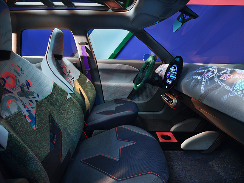
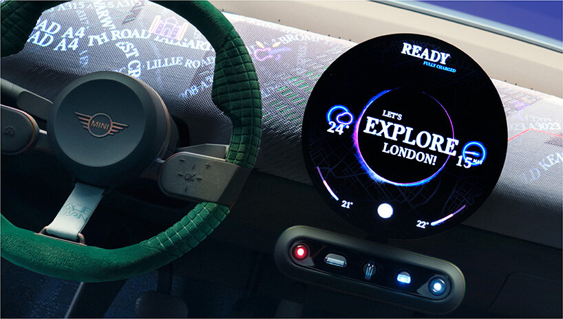
The dashboard, upholstered in discretely colored, recycled polyester textile, highlights the rigorously applied reduction to the interior design. Everything is pared back to the essentials, much like the original MINI by Alec Issigonis. A dark-green velvet velour-covered steering wheel and large, circular OLED display are the only features on the dashboard. The circular screen serves as a new experience hub, grouping all functions of an instrument cluster. A newly integrated toggle bar sits below, featuring a rotary control or rocker switch for the parking brake, gear selector, ignition, experience mode selector, and volume control. The balance of analogue and digital continues as the display can be expanded beyond the limits of the screen through projections on the dashboard.
‘Our design provides a visual relief in comparison to other interiors where the physical screen stretches from pillar-to-pillar and is surrounded by lots of switches. We just focused on three elements: the circular display, toggle bar and clean dashboard. We arrived naturally at the same amount of elements – five – in the toggle bar as in the 1950s design. The ignition key returns and is placed at the center of the bar. It helps build the relationship between the driver and car. We all need these tactile experiences,’ notes the designer.
DIGITAL EXTENSION OF USER EXPERIENCES
‘We wanted the interior to be super clean – and technical innovation was the enabler for this. It was important to showcase the emotional layer of digitalization beyond just the OLED display. The screen is a canvas and so is the dashboard. The customer is able to then change the appearance of the dashboard depending on mood. It is similar to a mobile device and how a change of background creates an entirely different phone. This is what we want to achieve with the Concept Aceman. We believe in the digital possibilities of personalization in the future. This will keep your MINI fresh,’ concludes Oliver Heilmer, Head of MINI Design, to launch the Concept Aceman.
The shy-tech of the dashboard enables an all-encompassing, cohesive user experience in the concept. Three vibrant and fun ‘experience modes’ can be selected by the driver and passengers: the customizable Personal mode, the navigational Pop-up mode, and the Vivid mode for stationery interactions with the OLED display. The trio of modes immerses users into different interiors of expressive color, light, sound, and moving-image projections. The interaction between car and users extends from outside in, welcoming the users with a lighting display on the front grille as well as a wink from the headlights, and from a light carpet as the doors open to a greeting message on the circular display. These heighten the personal relationship between people and MINIs in the future.
