Interstitial Space: Atriums Drawn in Plan and Section
Judging for the Fourth Annual One Drawing Challenge is officially underway. Check out the Top 100 Finalists and stay tuned — we’ll reveal the two competition winners in the coming weeks.
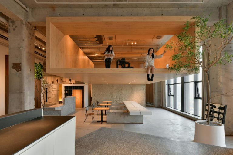
Great design invites people to use architecture on their own terms. This is one of the best parts about atriums. These large, open-air (and often skylight-covered) spaces are found within a building, and other than acting as spaces that provide light and ventilation to the interior, they are usually made without a heavily prescribed use. While atria are found worldwide and have existed throughout history, they continue to be reimagined in contemporary architecture and design.
From the world’s tallest atrium, Leeza SOHO, to small residential projects, atriums are made to uplift and draw our view to the sky. They also invite natural light and provide an open space to lounge, work or meet. The following atrium examples showcase their design through plan and section drawings drawn from around the world. Together, they reveal how an atrium is made within a larger building while also painting a picture of how these spaces are experienced today.
Melbourne School of Design, University of Melbourne
By John Wardle Architects and NADAAA, Melbourne, Australia
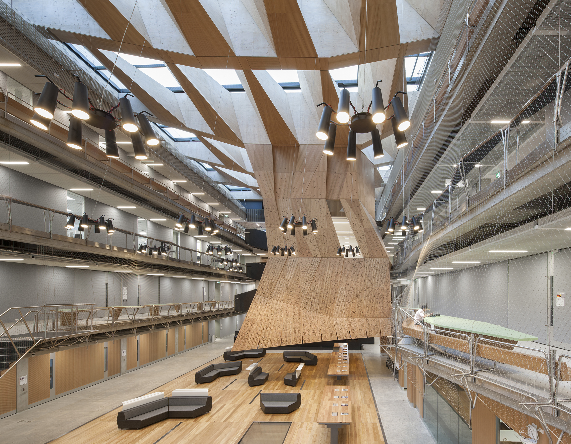
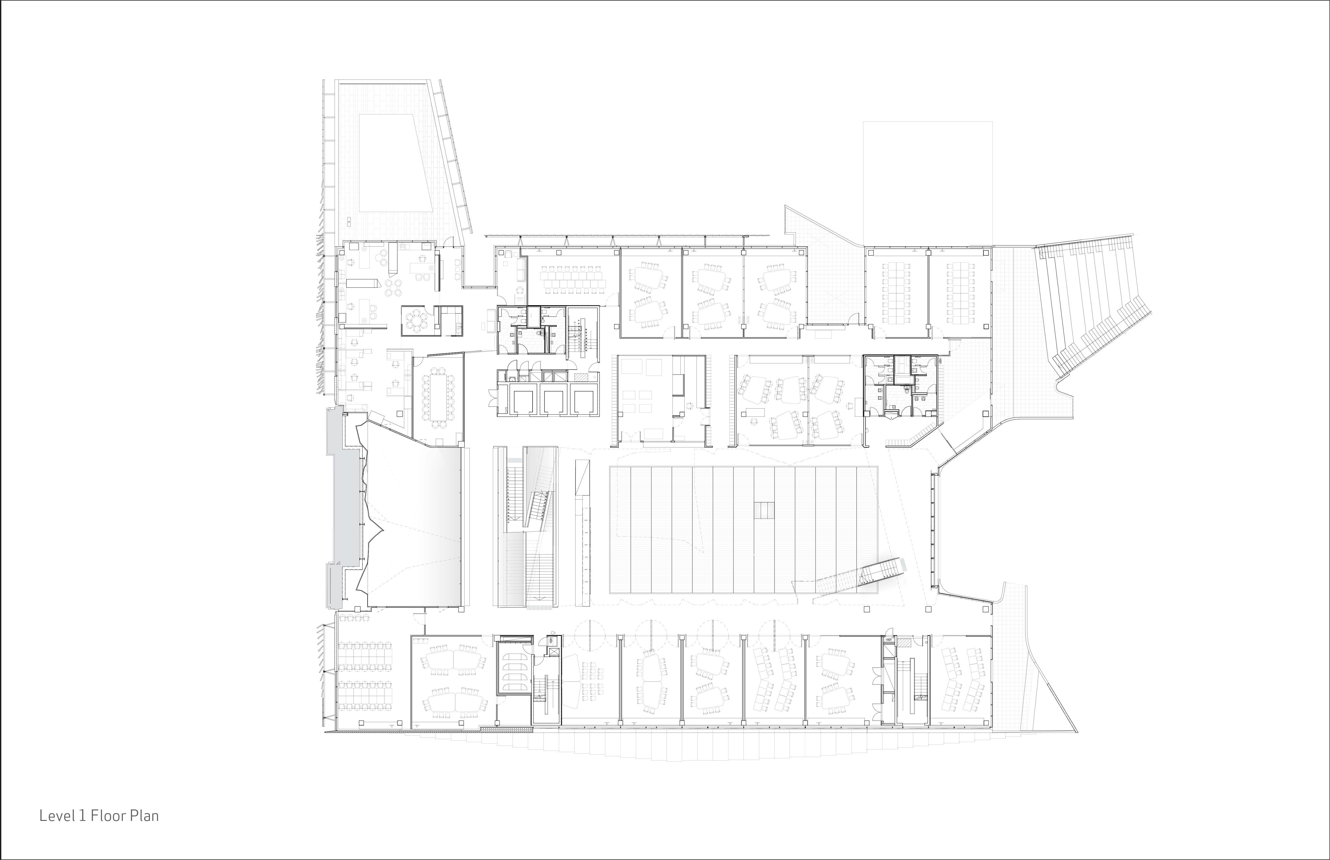 JWA and NADAAA designed the new Faculty of Architecture, Building and Planning building for the University of Melbourne. The building design responds to the planning principles set out in the 2008 University of Melbourne Parkville Campus Master Plan. Its design meets its briefed area and budget targets, comprising of 6 levels. Central to the design is the Studio Hall, a large flexible space that provides for informal occupation over all times of the day.
Beatrix College
By architecten|en|en, Tilburg, Netherlands
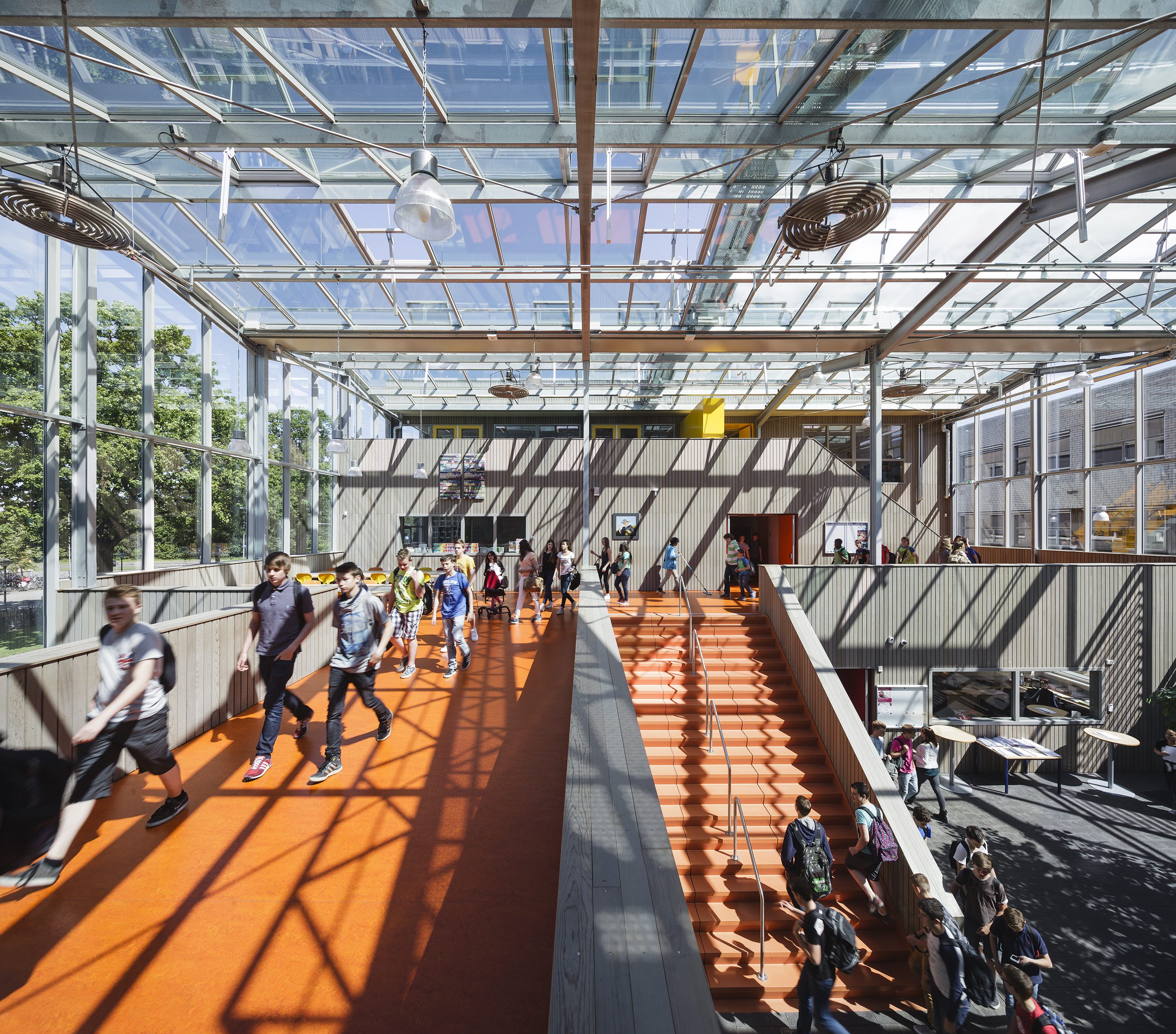
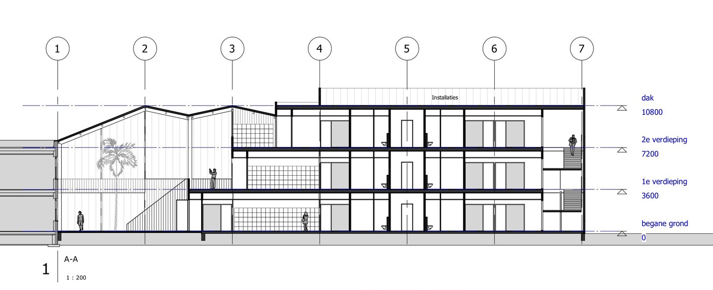
This new building for the VMBO is sited in Tilburg. The combined design and building time was limited to one year and the existing buildings at Beatrix College had to be able to function during construction. The new building is connected to the oldest building of the assembly by a remarkable, light, roomy and tall space; the atrium. This atrium services as an auditory with entrance, work spaces and as circulation area and it fits in the Beatrix-tradition of auditoria.
PULSE
By BFV ARCHITECTES, Saint-Denis, France
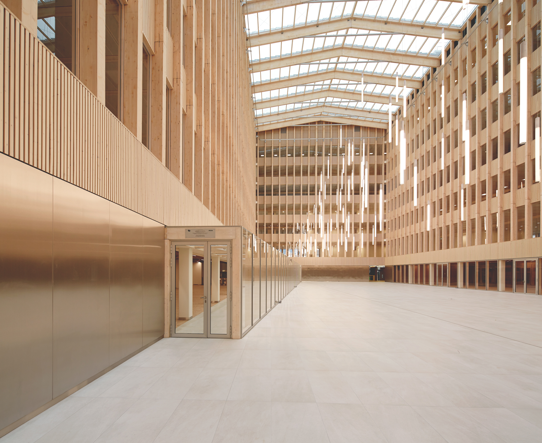
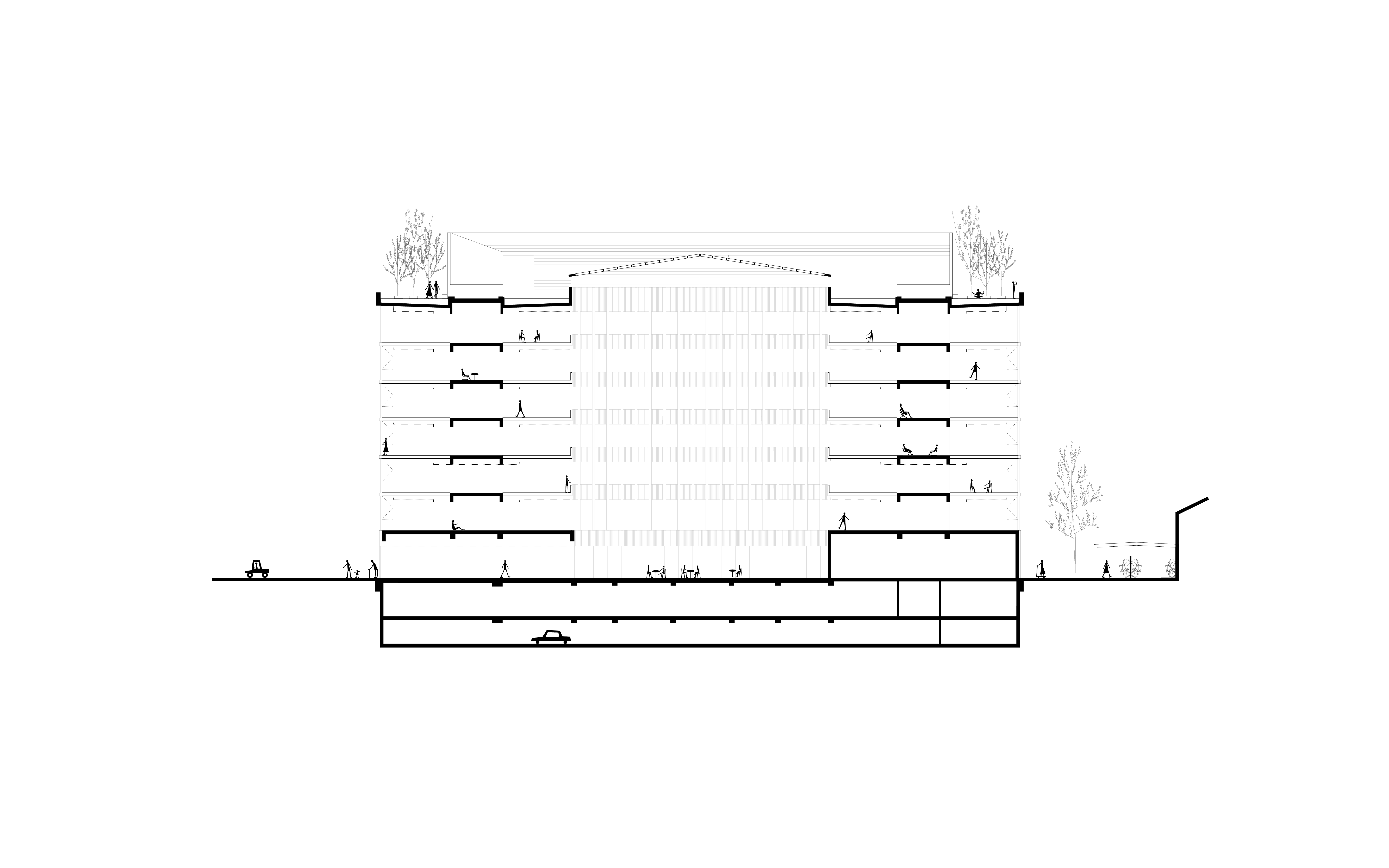 Pulse is a seven-storey office building. The building’s core — a vast atrium — is covered with a glass roof letting the natural coming into the wooden nave. The rigor of the construction system contrasts with the warm atmosphere and colors of the workplace. Wood can be found in all parts of the building, from the entrance hall to the many floors, creating a warm, quiet and peaceful work environment.
The building structure is dual, mixing core elements in concrete with wooden columns, beams and floors. Services and facilities for employees, including three catering areas, are located around the atrium on the ground floor. An urban garden and terraces can be found on the last floor. The food grown in the garden is cooked at the cafeteria. The geometric composition of the large windows generates a mosaic pattern on the façade. This pattern stops above the entrance hall, giving way to a vast green terrace. Like a treasure in a jewel case, the wooden building is protected by aluminum slats of three different colors.
Bill and Melinda Gates Computer Science Complex Center
By Pelli Clarke & Partners, Austin, TX, United States
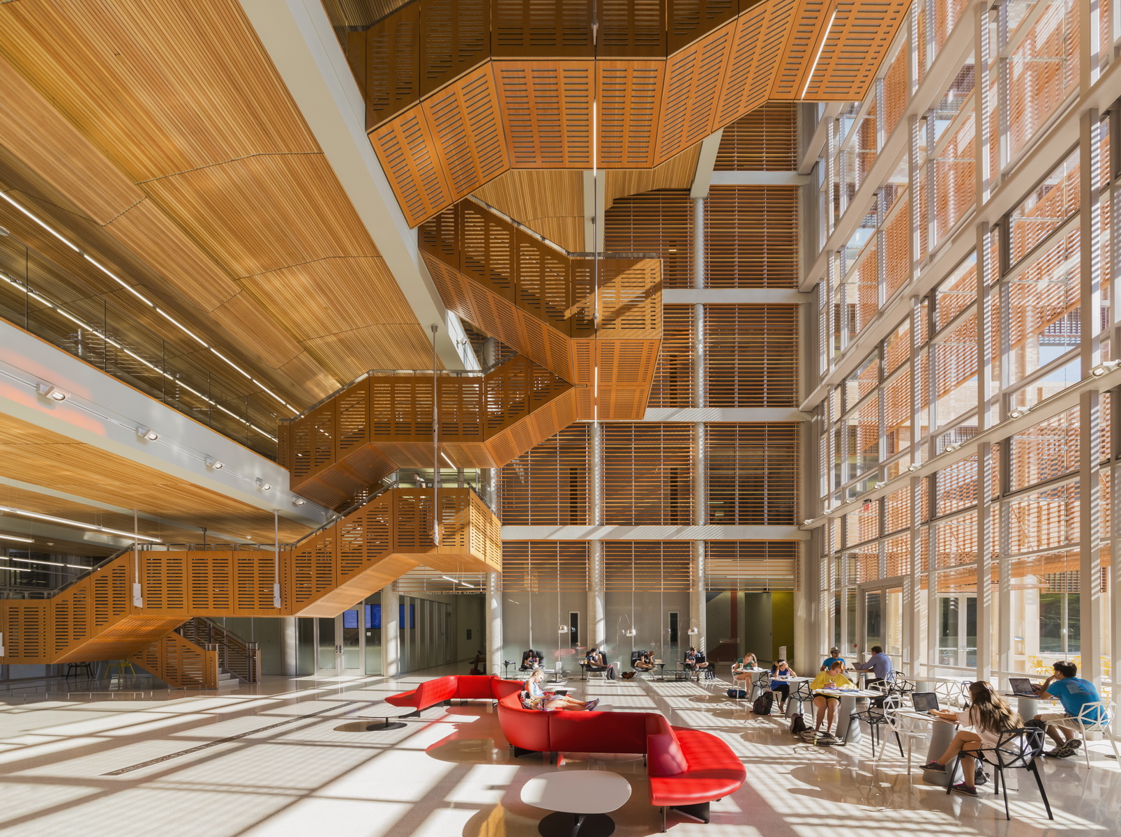
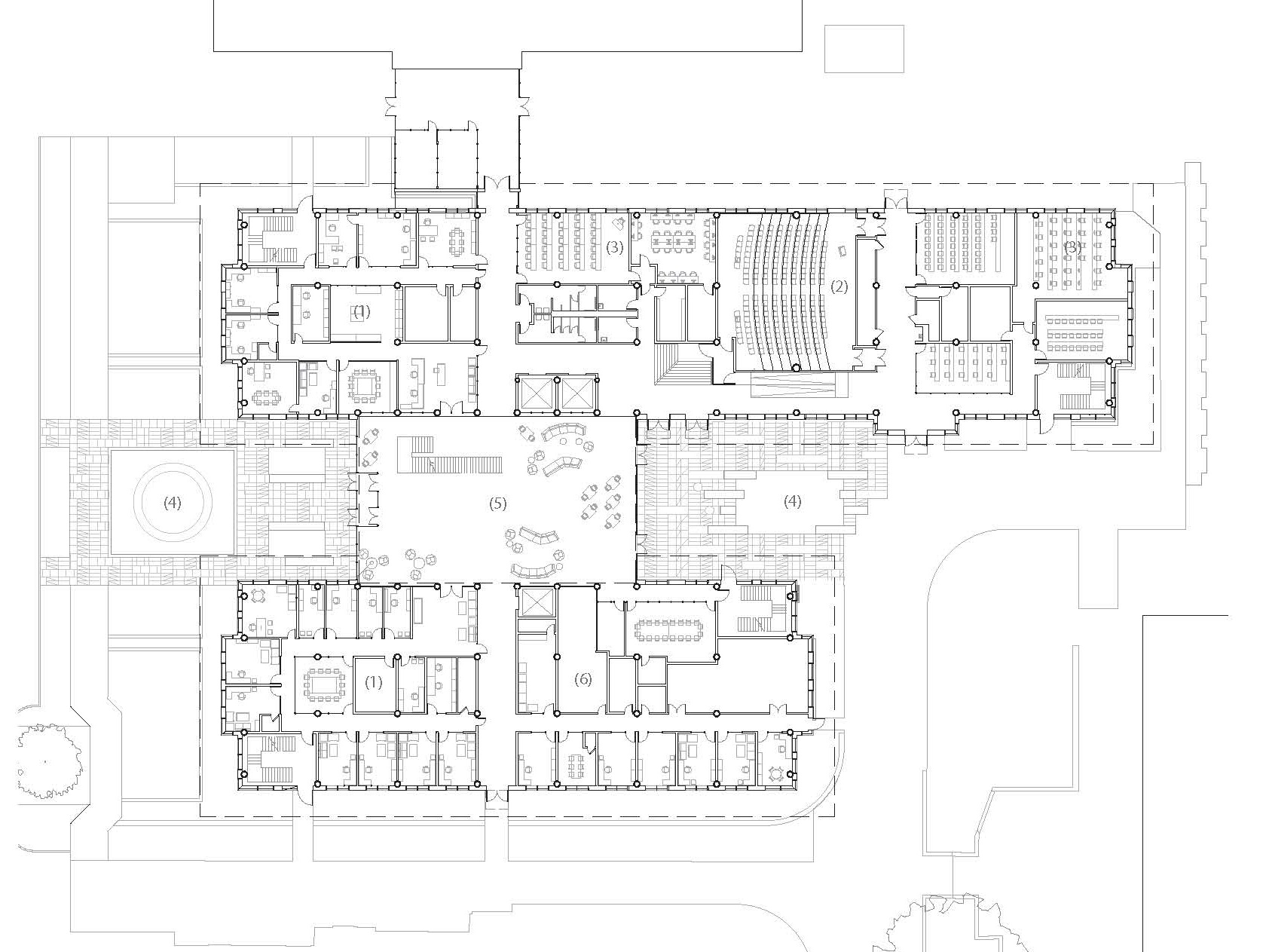
The Bill & Melinda Gates Computer Science Complex brings together all programs, faculty and students of the Computer Science Department for the first time in the department’s history. Located in the center of campus, the complex consists of two buildings — Dell Computer Science Hall and a wing to the south — connected by an atrium. The atrium is the complex’s primary gathering place. With wood finishes and lounge seating, the atrium is a warm, welcoming environment.
Zeitz MOCAA
By Heatherwick Studio, Cape Town, South Africa
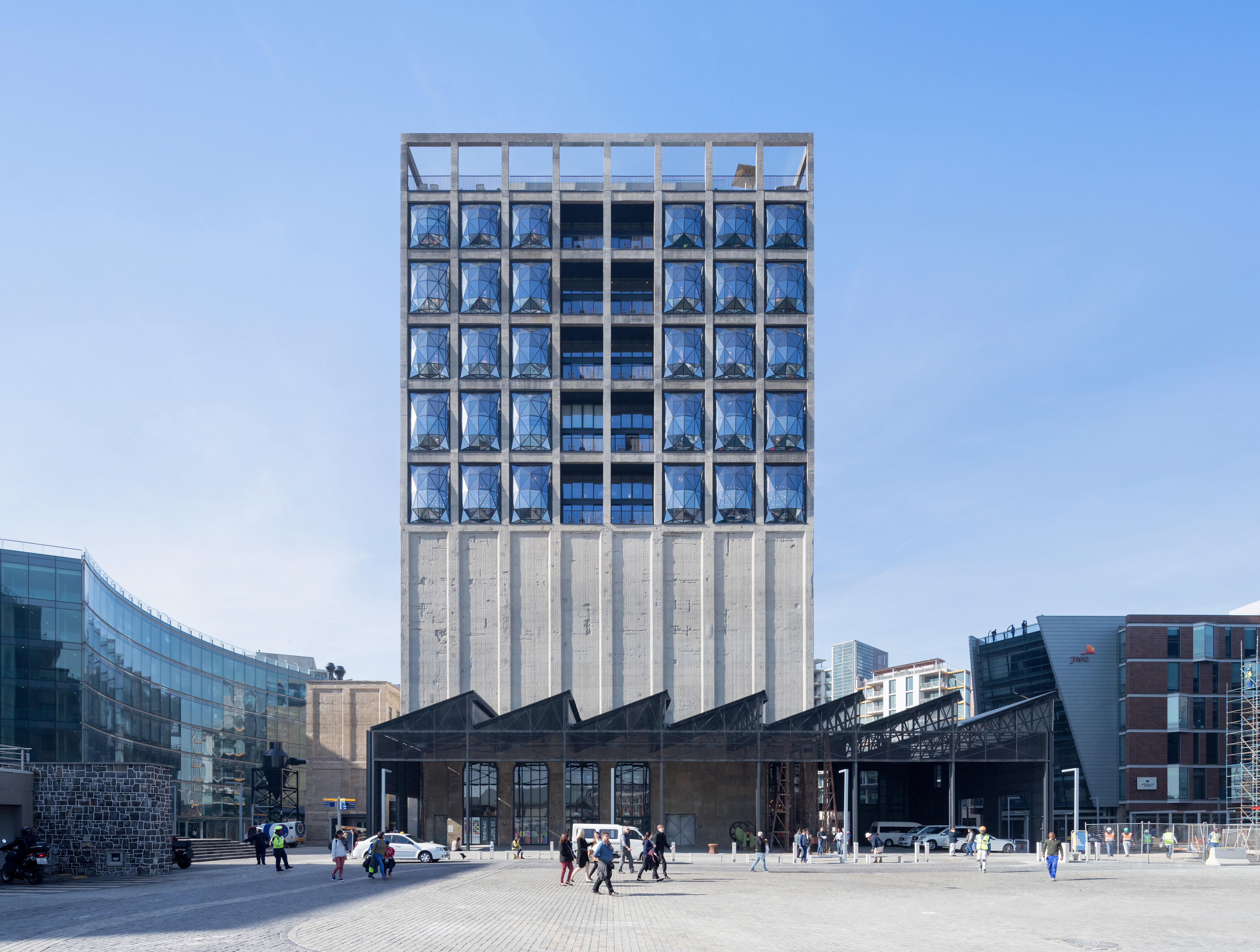
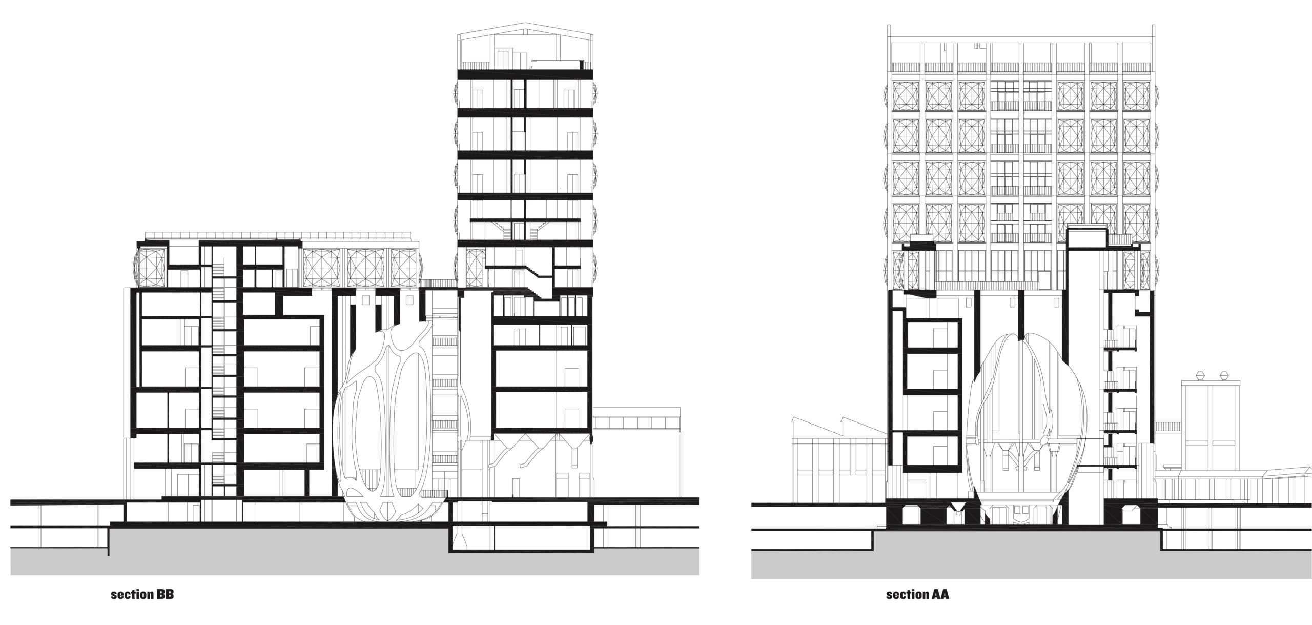 The Zeitz Foundation was seeking a new permanent home for their collection of contemporary art from Africa and it’s diaspora. This grain silo was transformed into a new museum to house the collection. The main challenge was to convert the building’s tightly packed concrete tubes into spaces suitable for displaying art while retaining the building’s industrial heritage. The team developed a concept to carve out an atrium, like a vaulted cathedral, to form the museum’s heart.
Polak Building / Erasmus University Rotterdam
By Paul de Ruiter Architects, Rotterdam, Netherlands
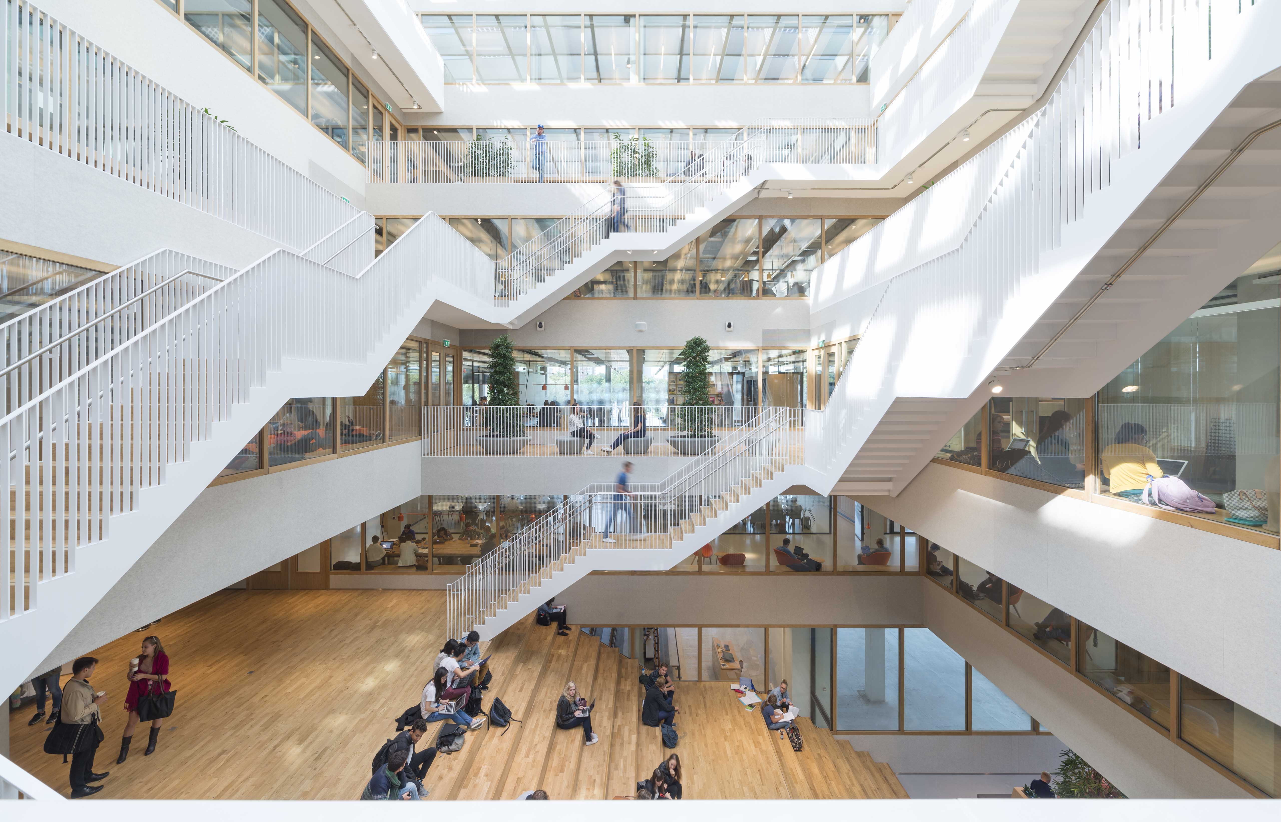
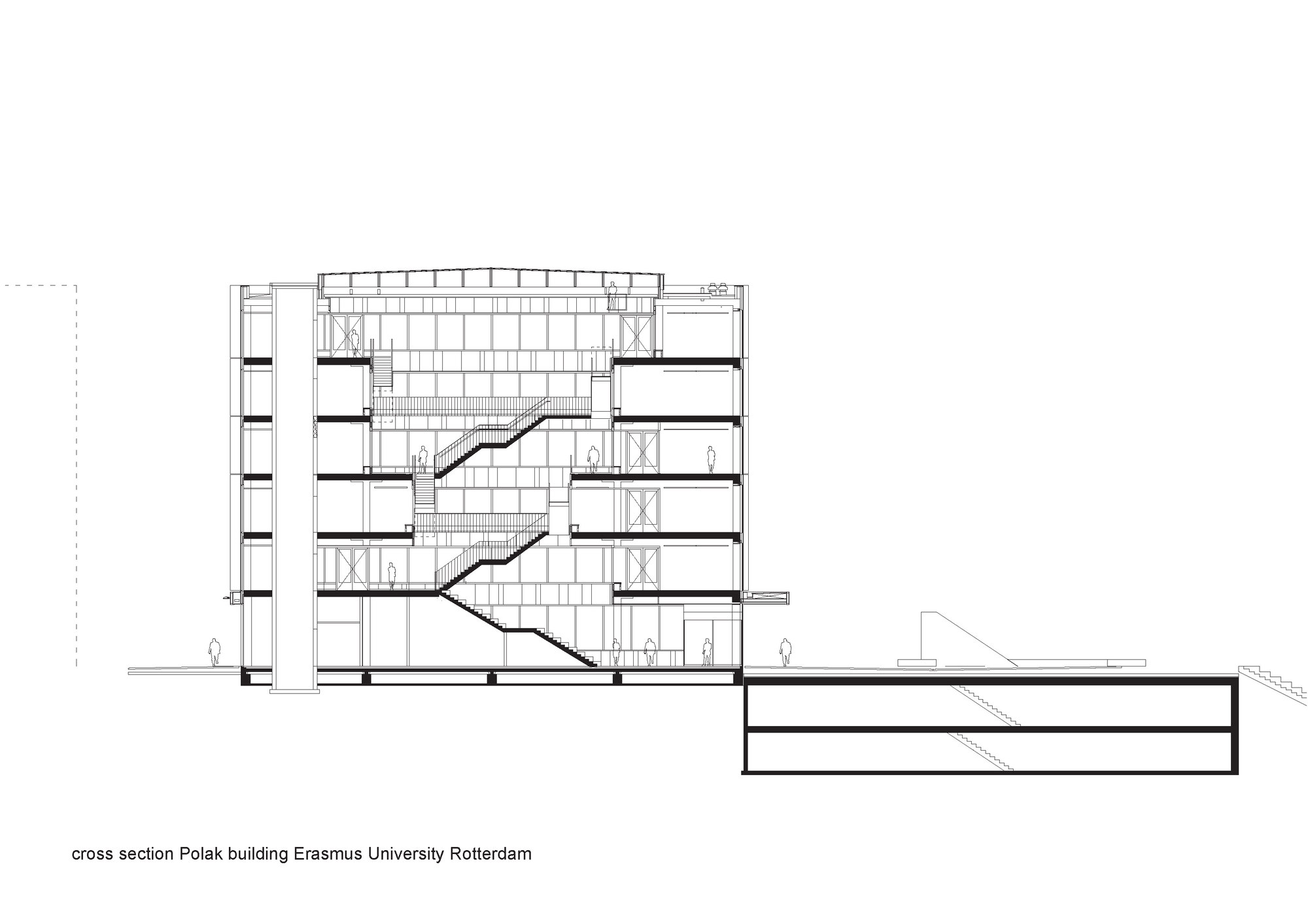 For the newest addition to Erasmus University Rotterdam, the design team created the multifunctional educational building called Polak. The university’s ambition is to be among the most sustainable campuses in the Netherlands. The energy-efficient building, of which both the interior and the exterior are designed by Paul de Ruiter architects, fits into the new educational strategy of the Erasmus University, aimed at activating, small-scale education. At its heart is an atrium that connects people across the building and university.
Sberbank Headquarters
By Evolution Design, Moscow, Russia
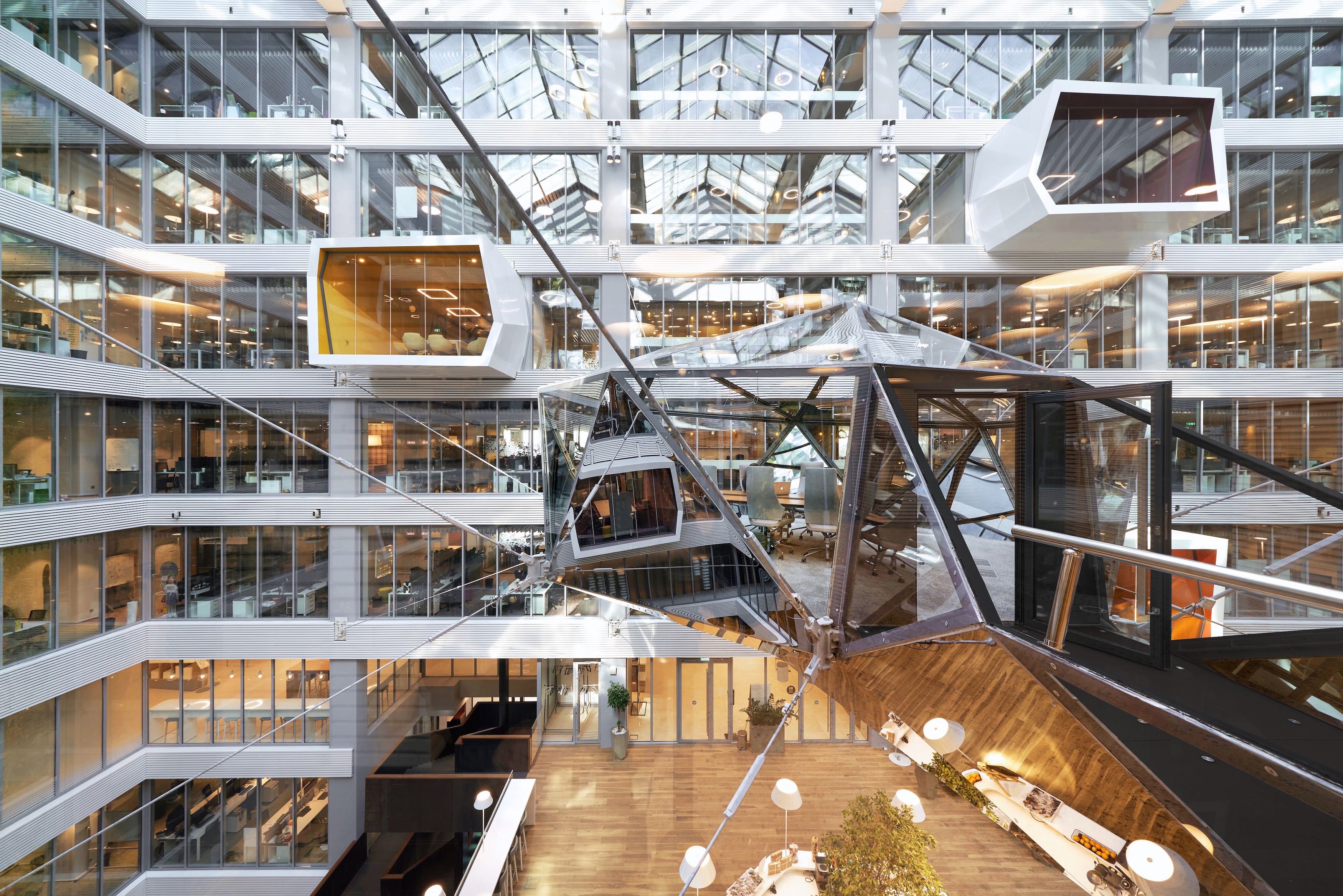
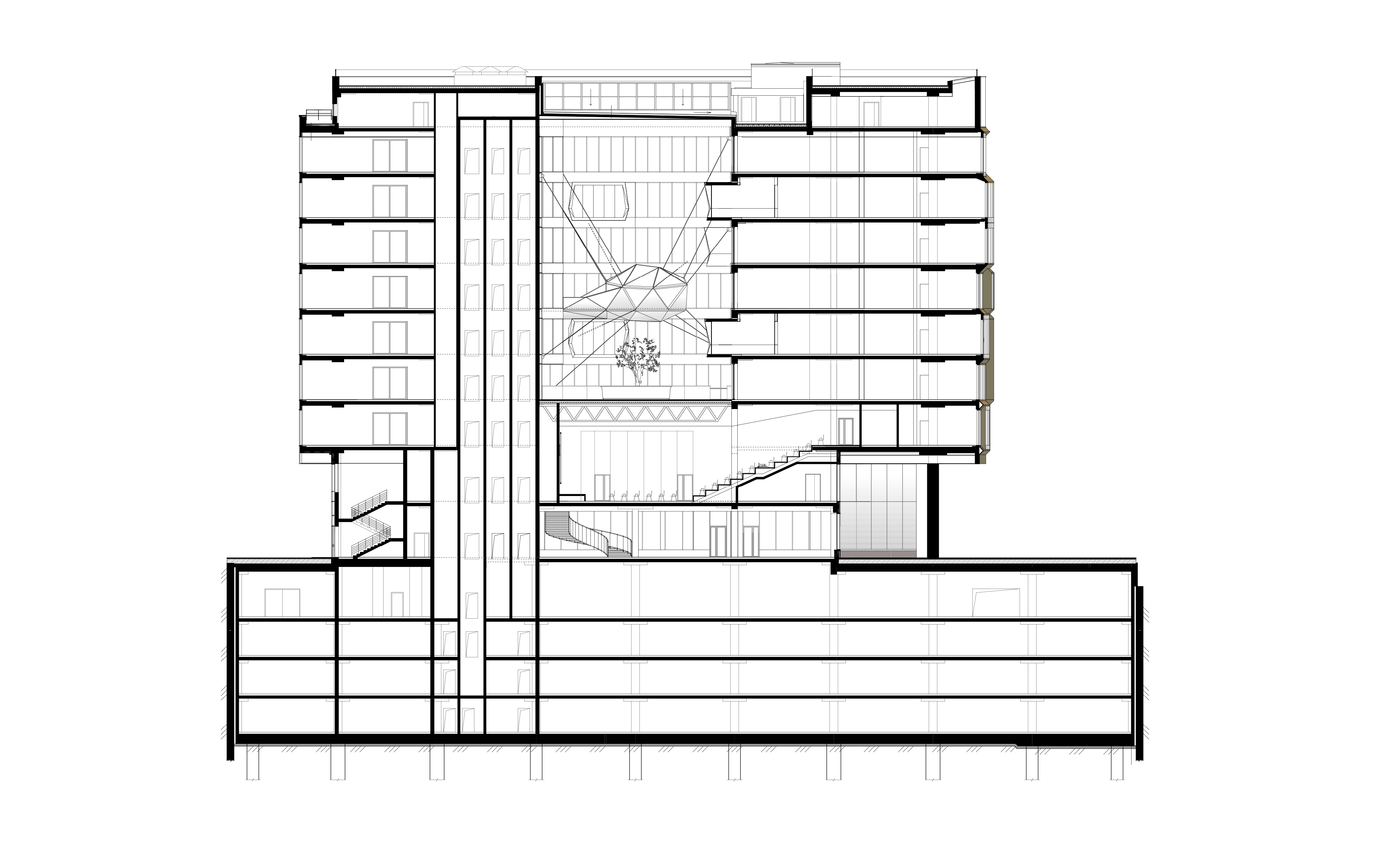
This new headquarters for Russian bank Sberbank was made as part of a new corporate district in Moscow. Sberbank commissioned Evolution Design to completely reconstruct a hulking shell and core building into a new multifunctional head office. The internal atrium forms the basis of the architectural concept. The focal point of the atrium is the diamond-shaped, mirror-clad meeting space, strung across its center.
Judging for the Fourth Annual One Drawing Challenge is officially underway. Check out the Top 100 Finalists and stay tuned — we’ll reveal the two competition winners in the coming weeks.
