Inspired by a Spider’s Web, Orange Architects Design The Line
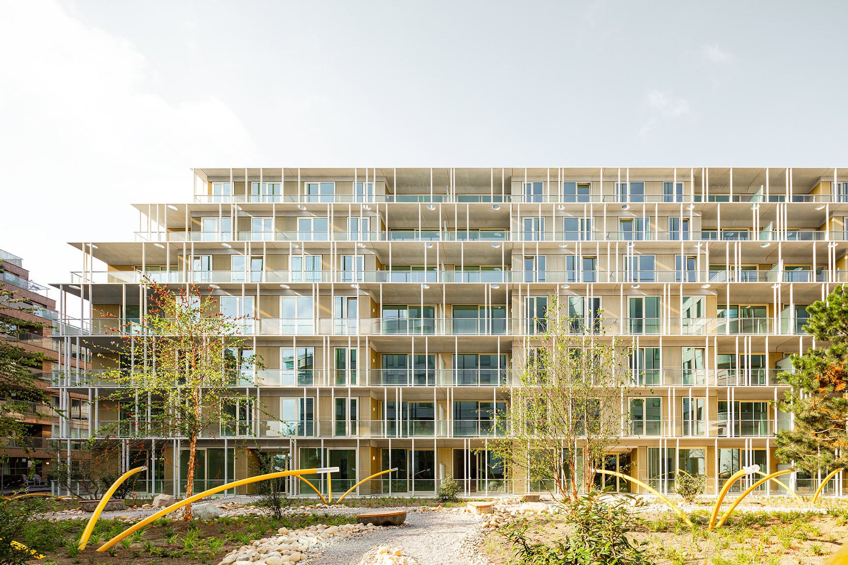
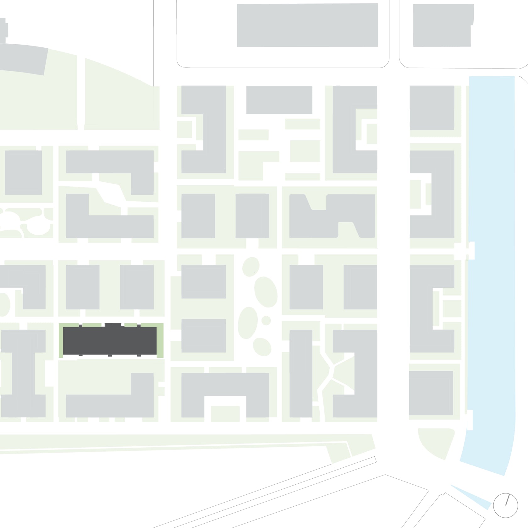
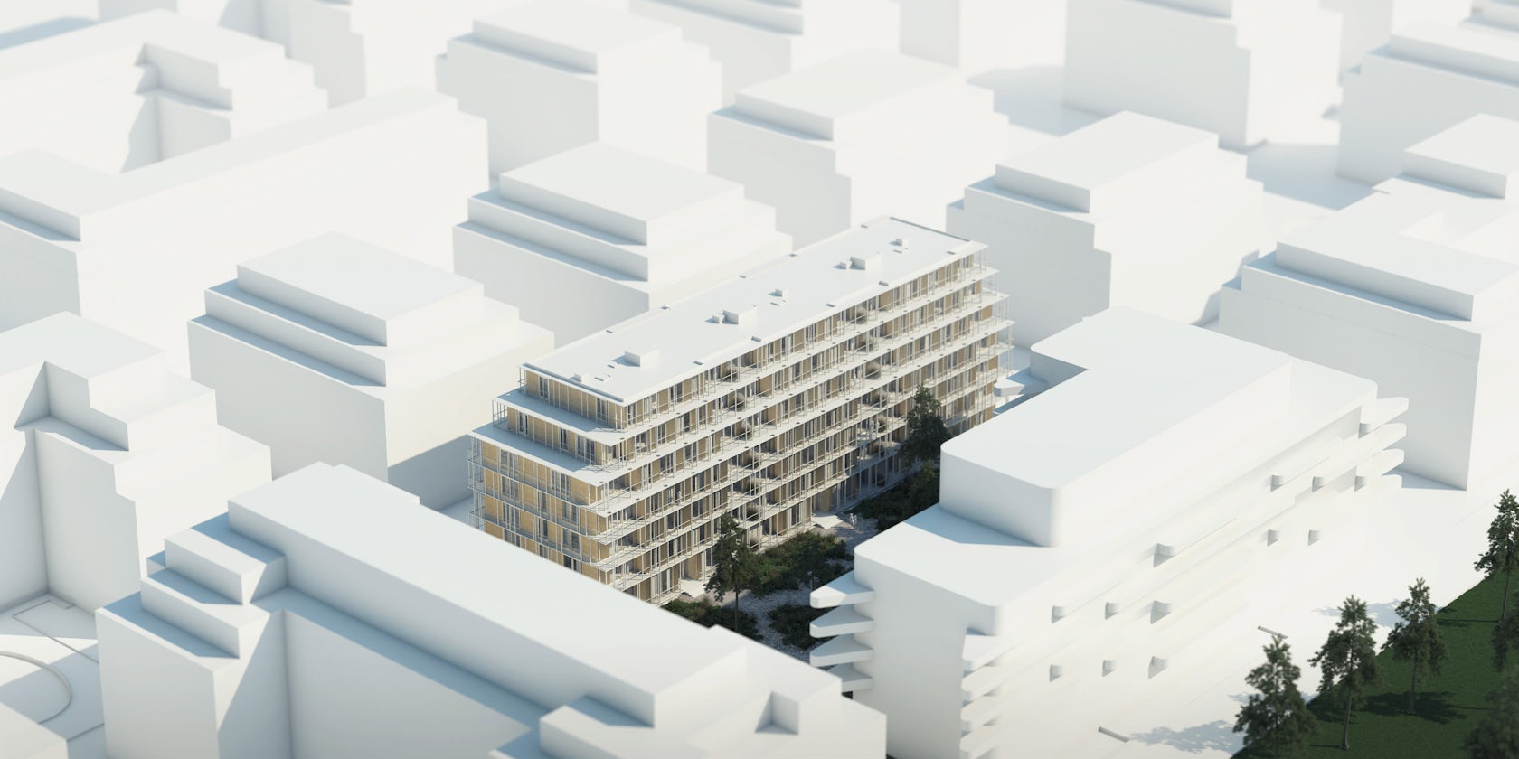
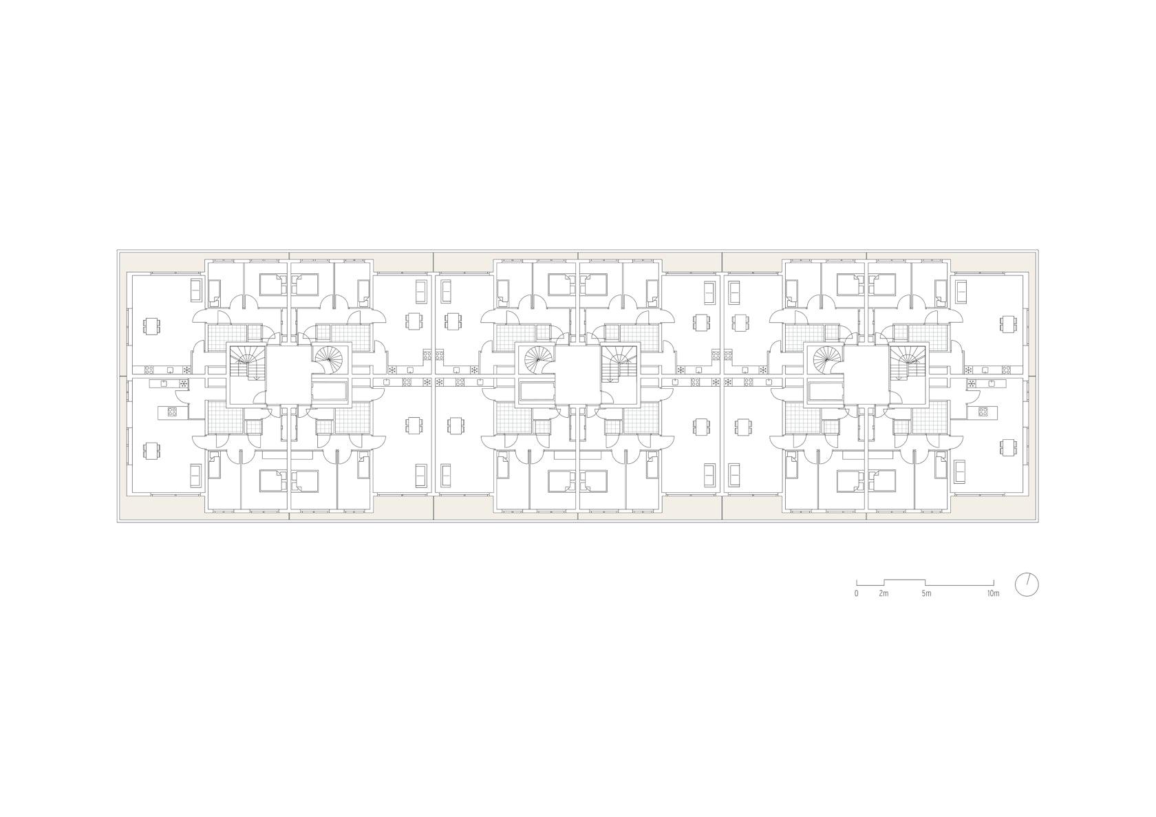
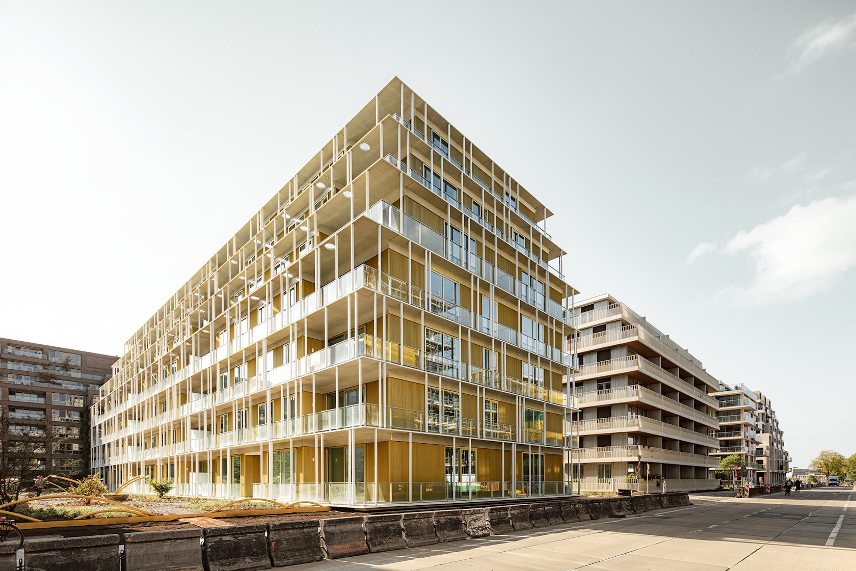
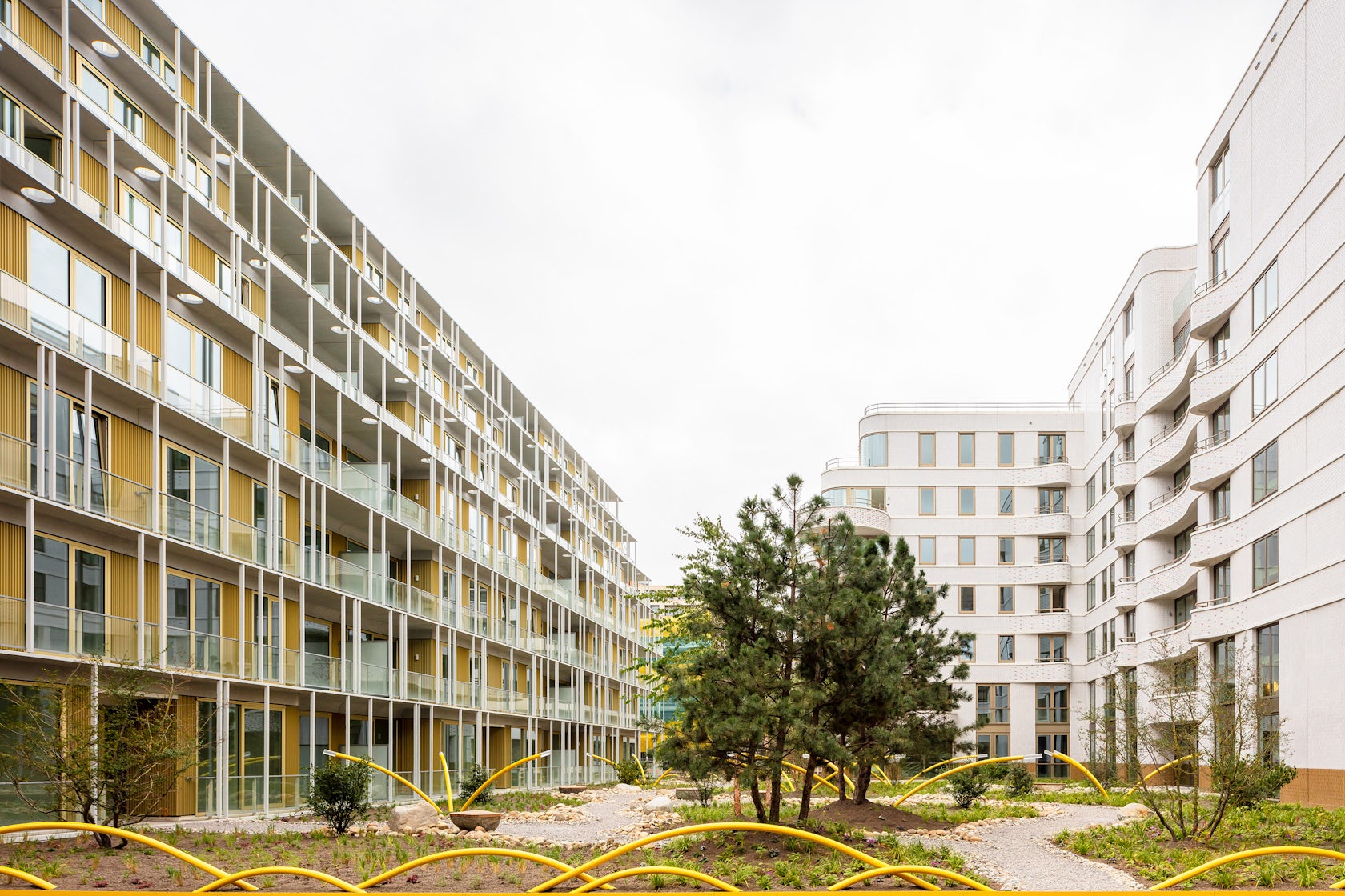
The Line – Because of the high density of the area, opposite Amsterdam Central Station, we decided to design a building with a light identity. The Line is fragile like a Japanese tea house and yet its identity is determined by a concrete grid. A screen of 6-cm-thin balcony slabs and 880 slender concrete columns wrap the main volume like a veil. Behind this ‘orthogonal spider’s web’ residents enjoy views of the IJ waterway just in front of them. Like a cruise ship the building contains outdoor spaces all around.
Architizer chatted with Bas Kegge, project architect at Orange Architects, to learn more about this project.
Architizer: What inspired the initial concept for your design?
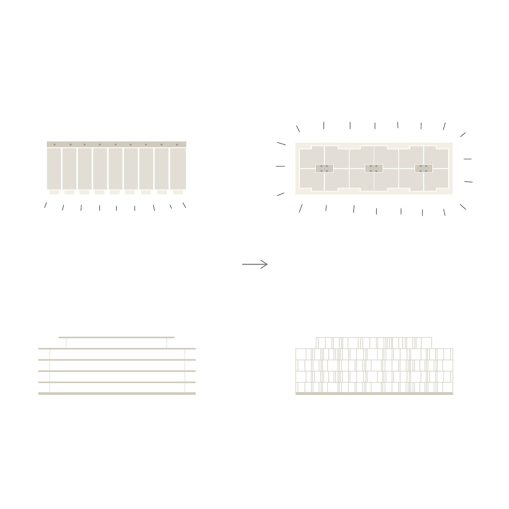
Bas Kegge: To achieve lightness in the appearance of the building, we envisioned a spider’s web – and ultimately translated that into a very thin concrete facade structure.
© Orange Architects
© Orange Architects
What do you believe is the most unique or ‘standout’ component of the project?
A significant part of the building consists of high-strength ultra-thin concrete elements. This innovative product was tailor-made, especially for the project.
© Orange Architects
© Orange Architects
What was the greatest design challenge you faced during the project, and how did you navigate it?
Since the concrete elements were so thin, high-quality execution was expected from the contractor. It took several engineering meetings to develop the right way of mounting the elements. In close collaboration with the contractor and concrete manufacturer we were able to achieve the nearly seamless end result.
© Orange Architects
© Orange Architects
© Orange Architects

© Orange Architects
Team Members
Jeroen Schipper, Bas Kegge, Angeliki Chantzopoulou, Paul Kierkels, Julija Osipenko, Elena Staskute, Mario Acosta, Rutger Schoenmaker, Fung Chow
Consultants
Goudstikker De Vries, Mabutec, DGMR, VGG, Bureau Sant en Co, Buro BIM, JMJ Bouwmanagement
Products / Materials
Hi-Con Nederland – High-Strength concrete (USHB)
For more on The Line, please visit the in-depth project page on Architizer.
