Inside a Rome Apartment With Renaissance Roots That Was Totally Revitalized
In the Rione di Ponte district, a top-floor Rome apartment in the former Renaissance headquarters of the Papal Mint has been meticulously restored. The building is associated with a number of bold-faced names of 16th-century Rome: Pope Julius II commissioned the original structure, Bramante designed it, and the façade (commissioned by Pope Clement VII and added later) was the work of Antonio da Sangallo the Younger. The facade, with its slightly concave form, hints at the Baroque style that would soon transform much of the city.
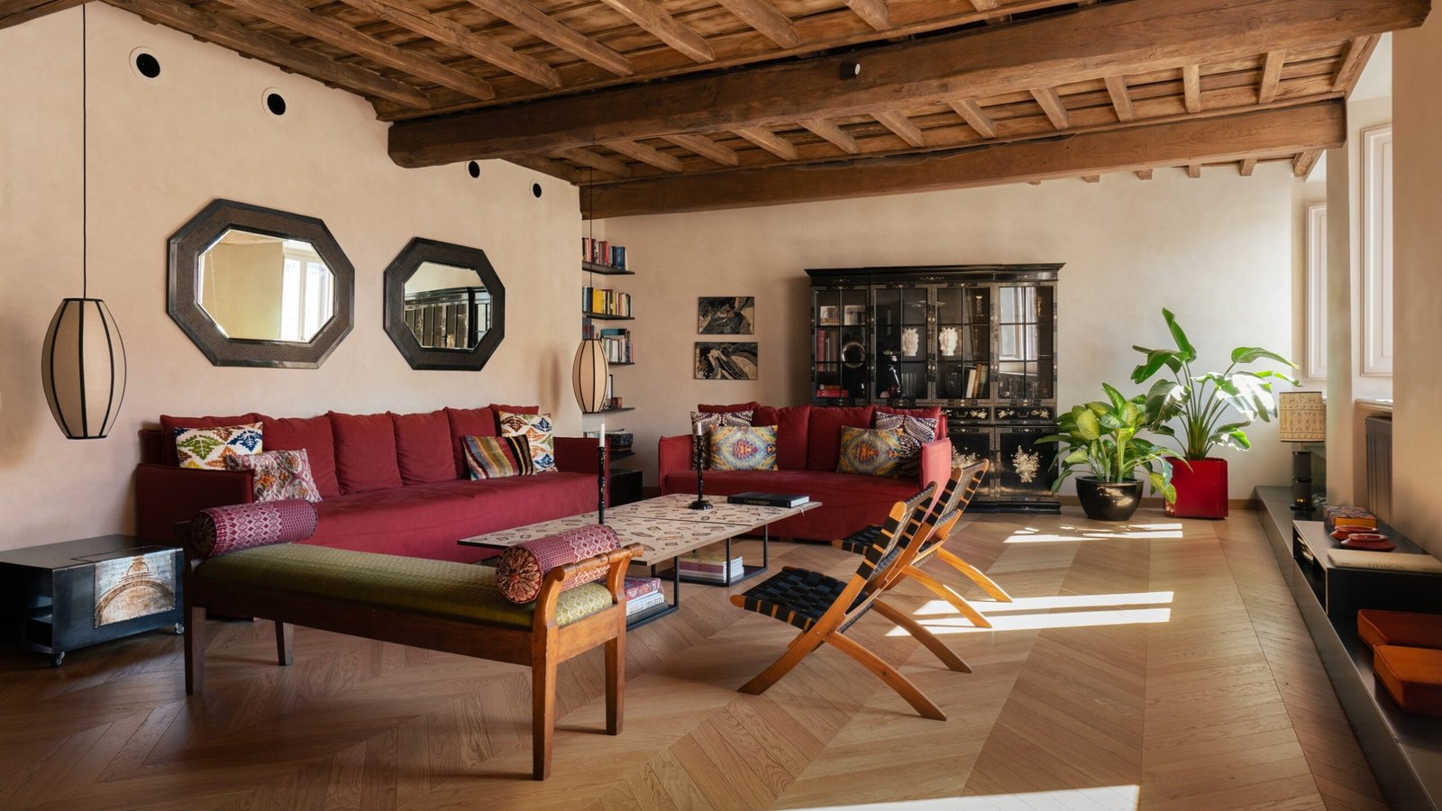
The apartment reflects its long history with original wooden beams and cotto romano (terracotta tile) floors. The renovation by Paris-based Studio Malià created a stately residence with vintage elements and colorful, lively accents. The color that is a common theme throughout the apartment is a deep red, found in many old Roman homes, which is used in exactly the right doses, like punctuation marks.
That is perhaps an especially fitting metaphor, as Studio Malià structured their redesign of the two-level apartment as if it were a tale of different sensations, scents, and images. The home is a collection of heirlooms, works of art, and handcrafted objects. The furnishings are mostly vintage, in wood and iron, while the fabrics are iridescent and give the living area a colorful spirit, embellishing surfaces and giving them light and character.
New design elements added by the studio were designed to interact with existing ones that reflected the building’s history as a mint. The additions highlight the magnificence of the period materials and the organic lines of the building. Steel and iron were the principal materials used by the studio. The staircase leading upstairs is made of black perforated metal, airy and light, and is suspended from the wooden ceiling; the kitchen was conceived as a single block, with worktops and doors made of steel, which reflects light and creates a perception of spaciousness. Industrial style is also a common theme to elements of the decor, especially the mirrors; their reflective surfaces create evocative portholes that, placed in the center of the walls, make the room feel more expansive. The twin mirrors above the red sofas in the living room contrast with the vintage 1950s wood furnishings. The prominent mirror in the dining room, designed by Philippe Starck, plays a key role in the room’s composition. It reflects Kundalini’s Dew glass pendant lamps, which, like drops of rain, seem to be falling gently to the gray onyx top of the dining table.
While a dialogue between handcrafted and industrial aesthetics is a cornerstone of the design of the living area, with its vintage furniture and objects, the sleeping area has its own unique elements. In the primary bedroom, the wall behind the bed is papered in a floral patterned House of Hackney covering that provides a dynamic presence. The red is complemented by bedside tables in teal and iridescent purple, found in the pillows on the bed and the ottomans. Even in this corner of the house, no detail is left to chance as the designers intentionally created balanced compositions. Just as colors and details were all deliberately chosen, the same applies to the materials. The designers selected local materials suited to the historic building, like Roman travertine for the tiles and countertops in the bathroom and the natural lime used on the walls.
Studio Malià’s design highlights a number of the Rome apartment’s most dynamic aspects—its location in the heart of Renaissance Rome, the double-height rooms, and the play of different volumes that interact with each other. As a result of their intervention, the constantly changing light and the soaring heights of the versatile rooms are experienced anew.
This story was first published by AD Italy.


