In his first built project in the U.S., Álvaro Siza Vieira sculpts heaven in Hell’s Kitchen
611 West 56th Street looks best when seen from another state. Glimpsed from across the Hudson in New Jersey, its slender profile is an enameled incisor in Manhattan’s increasingly toothy Midtown skyline. The shard is cause for celebration, as it’s the first building in the country by the Pritzker Prize–winning Portuguese architect Álvaro Siza Vieira.
Apart from sketches for work on the J. Paul Getty Villa, Siza hasn’t worked in the United States (until now), which means his work goes underappreciated here; decades ago, Michael Sorkin wrote that, until he pilgrimaged to Porto to see the Serralves Museum under construction, he wrote off Siza as “simply an invention of Ken Frampton.” Stateside Siza stans can rejoice: While his arrival is one of many luxury housing towers sprouting across the city, the effort is distinguished by its formal rigor and high quality of construction.
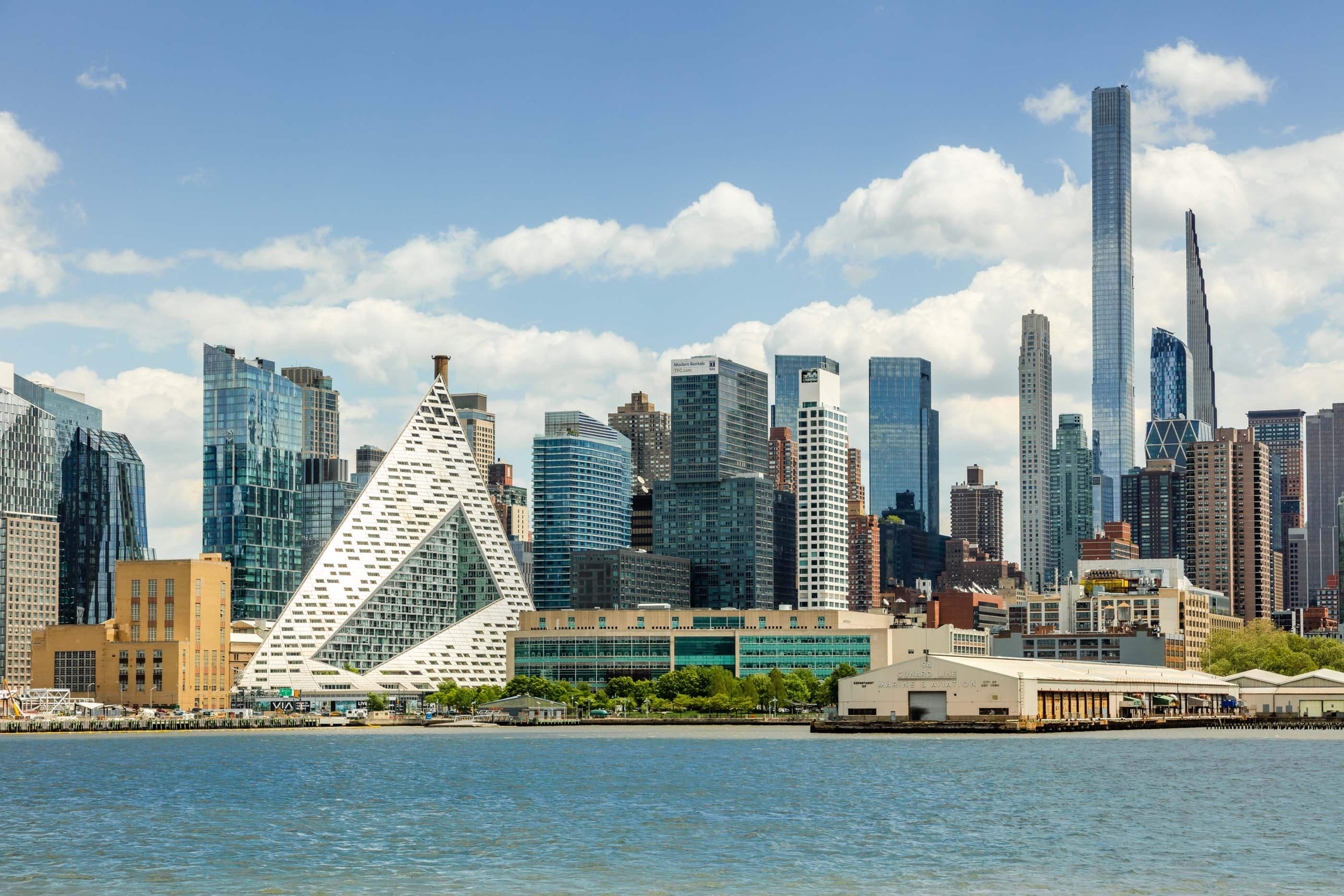
This is Siza’s second tower; his first, the New Orleans, completed in 2010, remains the tallest residential building in the Netherlands. Siza’s new tower shares basic formal qualities with this precedent—both towers have a distinct bottom, middle, and top. Each plinth is stretched into a landscape-format block, the structure’s bulk rises without stepped relief, and a cap is fashioned. 611 West 56th is also part of an “architect’s row”: BIG’s parabolic Via 57 is one block away; beyond that, Waterline Square, designed by Richard Meier and Partners (now Meier Partners); to the south, the S-shaped rise of TEN Arquitectos’ Mercedes House. The lack of surrounding towers (so far) means the building has views west over the Hudson, south to Hudson Yards, and east across to the supertalls lining Central Park South.
Local context shaped the scheme. “The proportions of the site allowed us to have a very elegant and delicate form,” Amit Khurana, of Sumaida + Khurana, who developed the project with LENY, told AN. (To make the numbers work, the developers purchased air rights.) He grew up in his family’s real estate business while his business partner, Saif Sumaida, trained as an architect at the Cooper Union before starting the construction company Foundations Group in 1993 to realize high-end projects. “There’s a difference between creating buildings and architecture,” Khurana said. “I think our work is about craft and subtlety.” Sumaida + Khurana, have distinguished themselves by bringing master architects to the U.S. to do their first buildings in a given context: They found early success with a building by Tadao Ando in Nolita.
The duo’s pedigree is obvious when visiting Siza’s tower, as every junction and reveal built by Foundations Group has been thoughtfully considered and executed. Khurana credits the construction company for its dedication, notably team members Himansu Patel, Jason Dierker, David Marabi, and Piotr Modzelewski. It takes a team of skilled individuals to make a building, so among them credit should be directed where it is due.
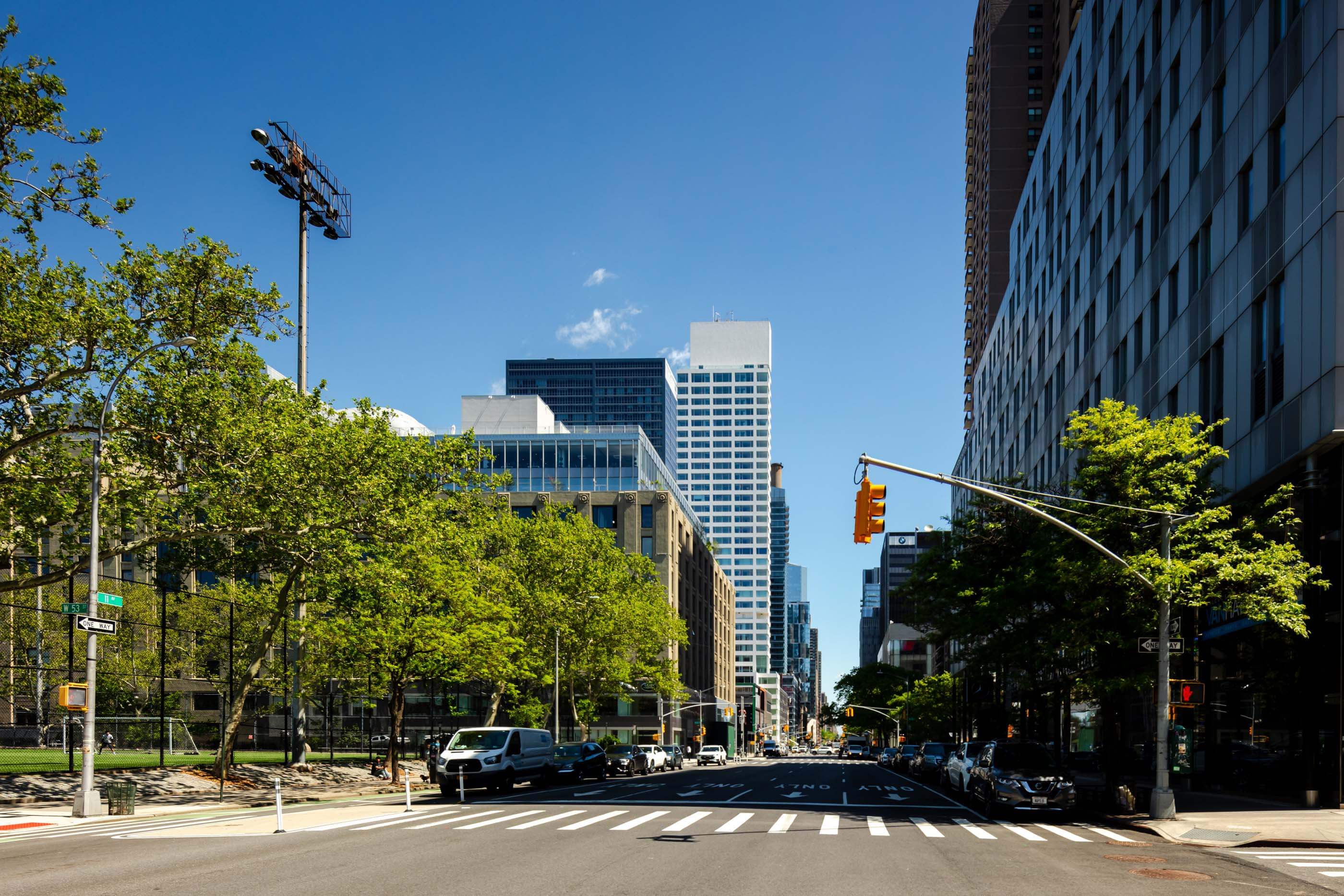
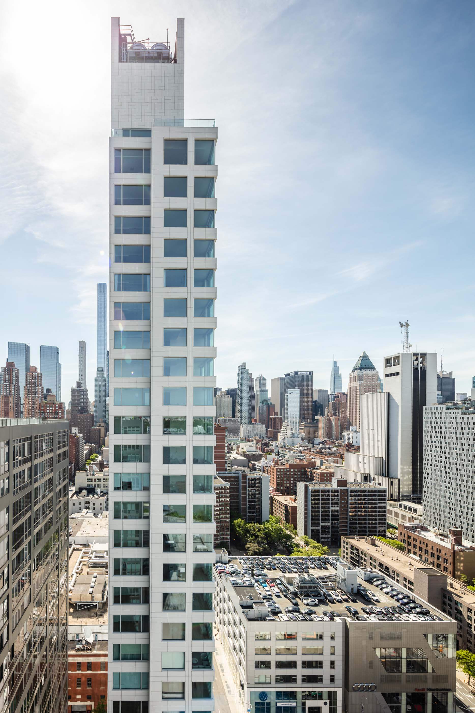
At 611 West 56th, Siza contributed his signature gesture, mainly through contouring the building’s overall shape, which is more minimal than in Rotterdam. The plinth’s corner—a prized retail location—is denied and inverted, and the tower’s width cantilevers over the entrance. Given the large, black-clad building set back from the street next door, Siza’s impulse resulted in a slender, white mass visually projecting itself out above 11th Avenue. A thinner, 53-foot-tall bulkhead, justified to the north, provides a crown, an abstracted nod to the Chrysler Building or the Empire State Building. Soffits at the entry and the penthouse are faced in a mirrored stainless, suggesting hollowness. The proportions have led Internet commenters to call this Siza’s “mohawk,” and the overall project a “giraffe,” but still a handsome one.
Aside from a wainscot of granite, common in Siza’s vocabulary, the building is sheathed in Turkish Perla Bianca limestone installed in an open-joint configuration. The grid of large horizontal windows is uninterrupted, save for double-height units where the tower meets the plinth and the taller ceilings of the penthouse. Each elevation is different. The southern exposure is a spreadsheet of windows; the tower’s verticality is enhanced by stone continuously running up the columns. The east and west exposures, only two rooms wide, are skeletal, with corner windows branching from a central spine. The north side, where the circulation and mechanical shafts are placed, is excitingly blank; above, its expanse merges with the bulkhead, making for nearly 30,000 square feet of uninterrupted stone cladding, arranged in a doubled herringbone pattern. To be so down with the flushness is a real victory, one arranged by Trevor Haav, a project manager at Foundations Group. A lesser developer would’ve value engineered the surface immediately, but Sumaida + Khurana kept it intact. Perhaps it’s Siza’s response to the end walls of Le Corbusier’s Secretariat building at the United Nations campus on the opposite side of Manhattan.
It wasn’t easy to convince Siza to take the gig. Prior communications went unreturned, so Khurana, armed with massing exercises by architect of record SLCE, trekked to Porto. The meeting worked.
“Siza’s genius naturalizes strangeness,” I wrote recently, summarizing common wisdom about the architect. His work’s mix of contextual sensitivity and formal oddity means that at its best, proposals feel at once carved out of the adjacent earth and uneasily creature-like. (Of course, there are entries in the discography that don’t rise to this level of expression.) In their plainness, his creations possess an inevitability made strange by some act of shaped invention—a kinked plan, a spiky roofline, an odd window, or, in a moment of denial, an expanse of blankness that if built in the United States would likely be ruined by stucco control joints.
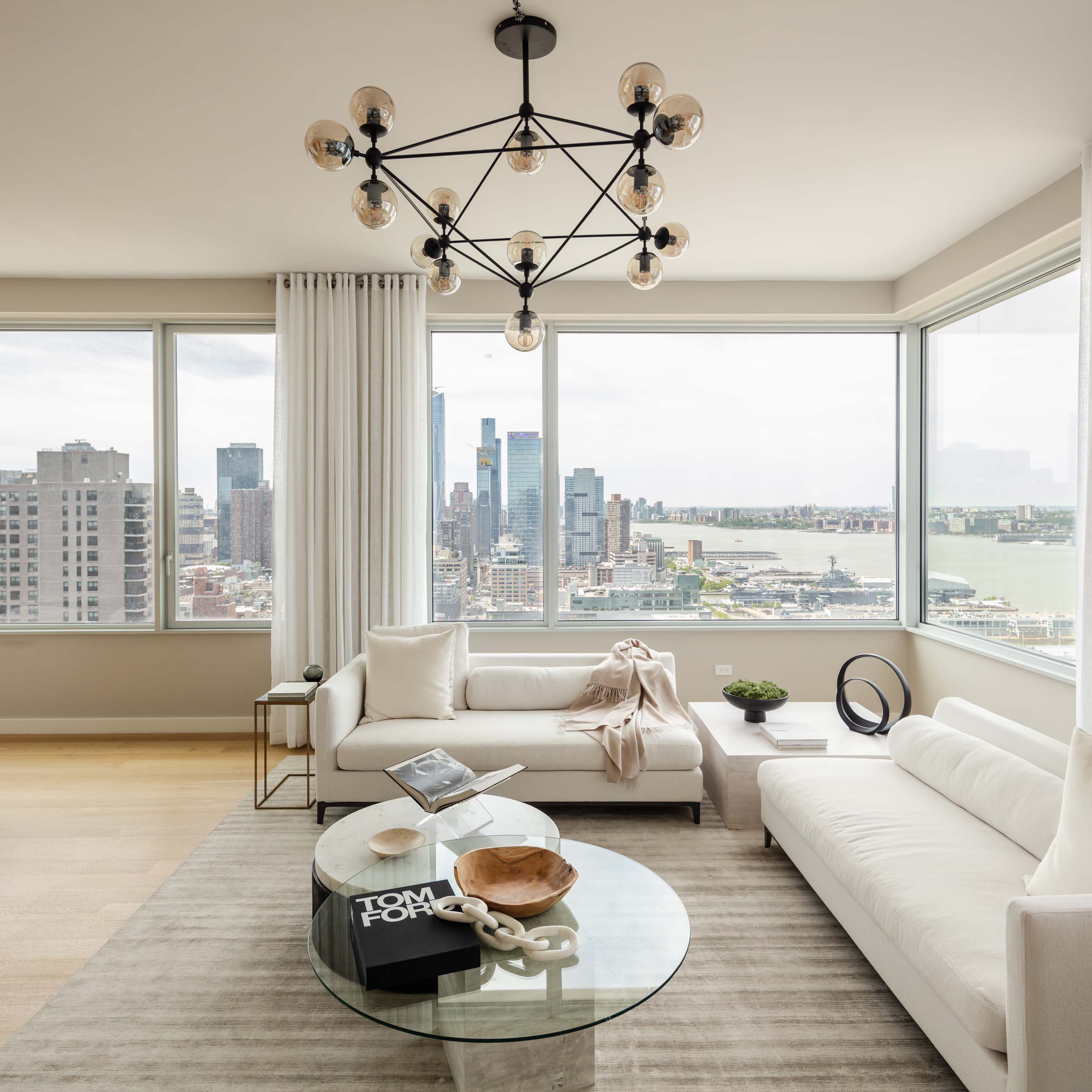
Here, Siza’s genius is also skin deep and amenity rich. The building’s 77 units range from a two-floor penthouse to half-floor offerings, double-height maisonnettes, and one-bedroom accommodations. The interiors, handled by Gabellini Sheppard Associates, feature knife-edge floating ceilings, obsessive millwork, and fully stoned bathroom compartments—excellent realizations of warm minimalism. Shocked into depression by sky-high New York real estate prices, the available units seem almost tame: A one-bedroom starts at $1.475 million, while the penthouse lists at just under $9 million.
As the initial massing and the interiors were by others, Siza figures as sculptor and brand ambassador. The luxury sours as offensive when seen against some of his masterpieces, notably his Communist housing projects like Bouça in Porto and the Quinta Malagueira in Évora. After a coup in 1974, Siza worked with the Serviço Ambulatório de Apoio Local (Local Ambulatory Support Service, or SAAL) to design low-cost housing defined only by solid white walls and voids of space. The spareness of the solutions—terrace and courtyard housing in various configurations, wisely lined up against the terrain—matched with the political ambition of the era is admirable. Setting these works against 611 West 56th isn’t exactly to lament the horror of late capitalism (though it is terrible) or to cast Siza as a pious monk who sold out (he is no stranger to nice things). It’s a means to appreciate the breadth of applications for architecture and a cautionary note that architects can serve all masters. I prefer to see fewer giraffes and more Bouças, though if the beasts of real estate speculation are unavoidable, I’d rather witness Siza’s creations than those designed by nearly anyone else.
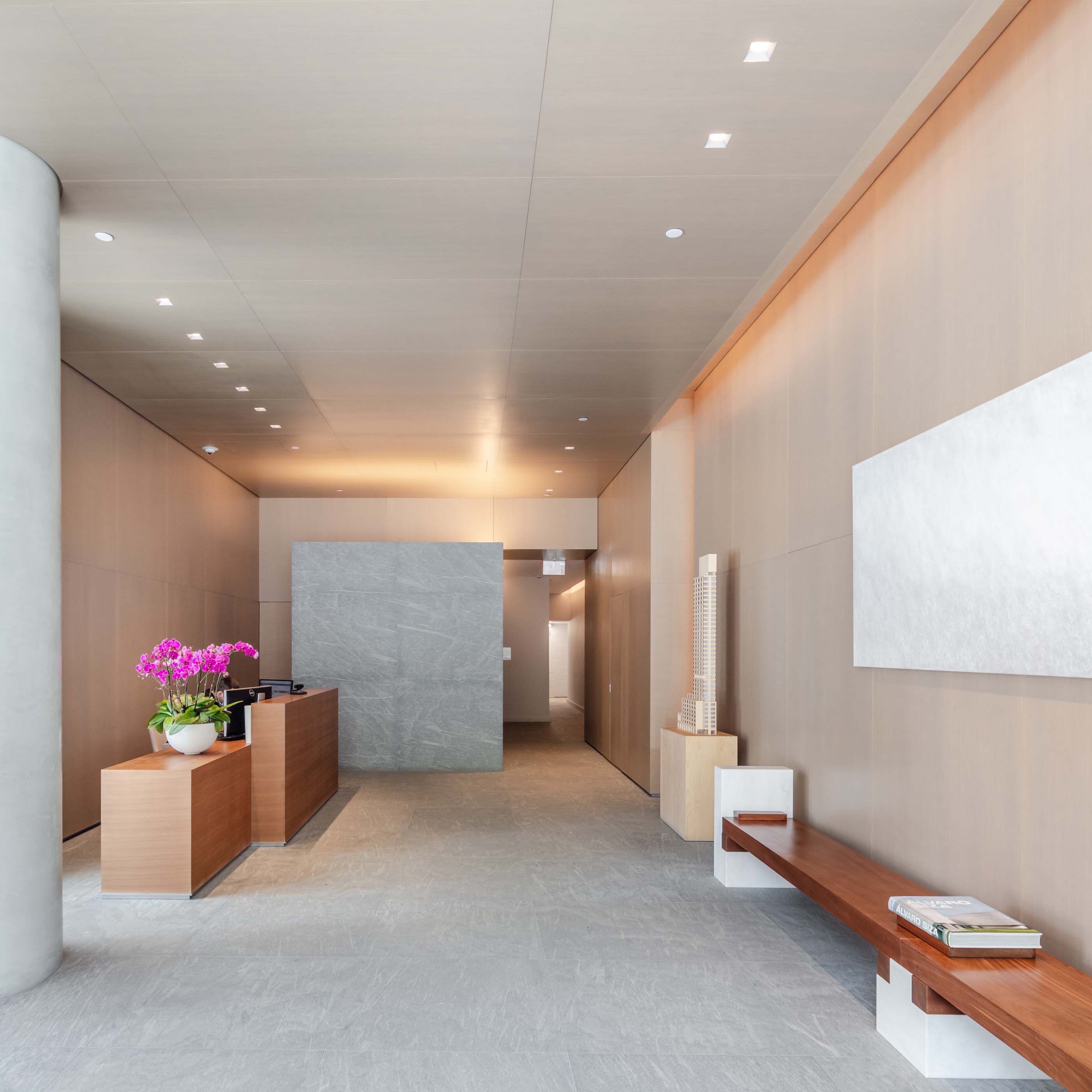
But I digress. Back in Hell’s Kitchen, the Siza-fest continues in the lobby, where a marble bench with wood supports was designed by the architect and assembled by local artisans. The air smells improbably Porto-esque due to a custom scent courtesy of Claus Porto, a fragrance company from the hilly city on the Douro River. Piano trios burble in the background: Siza also furnished the playlist, heavy on ECM-era Keith Jarrett. A model of the tower graces the space. It’s all very nice.
Sumaida + Khurana’s efforts continue to produce impressive works of architecture. Recently, AN announced that the duo, with Bizzi & Partners, will realize Spanish architect Alberto Campo Baeza’s first office building in the country. Earlier this year, the developers purchased a lot in Hudson Heights, time will tell what masterpiece rises there.
As for Siza, he recently turned 89. To mark the occasion, the Portuguese book publisher monade shared a list of 15 books that have inspired him. The collection, much like his architecture, is mostly poetry.


