Hyundai Department Pangyo-Uplex / Betwin Space Design
Hyundai Department Pangyo-Uplex / Betwin Space Design


Text description provided by the architects. The 4th floor of the Hyundai Department Store Pangyo branch has been renewed following The Hyundai Seoul. U-PLEX on the fourth floor is a shopping space for the MZ generation and all customers who enjoy a youthful lifestyle and has been designed as a unique premium space with a sense of YOUNG VIBE.

The design concept is TIME COLLAGE, which means a new space-time area, that is, the third space where different elements of the past and present coexist and provides a new trend created by a combination of space and completely different things that customers have never experienced before. It is a space that provides a new luxury mood and a fun and fresh experience that inspires MZ consumers. The space consists of the main building, a mall, and an iconic square that connects the two spaces.


As if the past and the future were mixed, the main building mixes classic and modern elements to form a new virtual space. Pendant lighting is added under the existing ceiling to form a mood of the entire space, and facades and pillars create a new luxury mood that is not heavy through details that combine modern mirror materials based on classic designs and materials. In addition, by creating a unique island system for each area, we tried to make the entire space look like a multi-brands store.


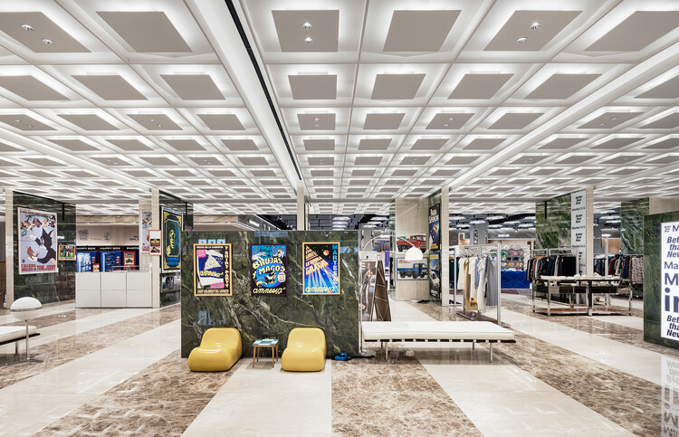
The island wall frame of the main building combines aluminum profiles, and each fitting room is finished with frost glass to give a modern design unity, allowing brands to create a unique look within the profile frame. The mall has a more futuristic mood, and the impactful design of the ceiling and vertical design elements were created using modern materials to create a space. Regular patterns were created by combining lighting ceiling with metal frames, and an island system was combined with the ceiling to create an identity of the entire space. Through the cross-shaped vertical bar connected to the grid on the ceiling, unity is created in the entire space, allowing individual brand exposure.

Iconic square is a space that connects the main building and mall to make a new experience space where customers can stay, in addition to its role as a PASSAGE. We created an impactful PASSAGE by reinterpreting the feeling of the lobby lounge of the past hotel and building. Big slab tiles with hued marble patterns were applied in different types depending on the side showing them, and a classic mood was created through the overall material and ceiling pattern.

The marble pattern was extended to the circulation to make it feel like a new space, and the regular wall also created a boundary between the circulation and the store while blurring it, becoming a space where customers could freely enjoy. By giving the space a strong identity, we tried to suggest a space where any brand can look different with a mixed-match feeling.


