How to Integrate Behr’s 2023 Color of the Year Into Your Space, According to Five Experts
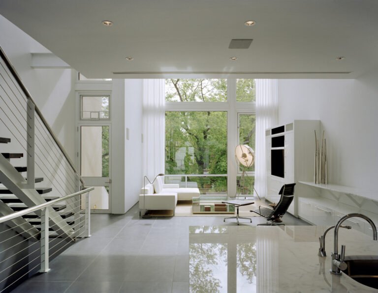
With the changing of seasons comes the transitioning of colors. Always ahead of the pack, Behr recently announced that their 2023 Color of the Year is Blank Canvas. As an off-white shade, Blank Canvas is a safe bet for the color-reluctant and a touch warmer than other beloved swatches from the brand like Frost or Polar Bear. This particular shade—a warm and barely off-white hue—is an invitation to embrace a fresh start.
Blank Canvas straddles the line between past and future, and offers a meditation on the present. In a world full of tumultuous headlines that feel like daily devastations, Blank Canvas feels like a deep exhale of calm and creativity. In an exclusive interview with AD, Erika Woelfel—Behr’s vice president of color and creative services—described the hue as “that perfect artistic color for people to start expressing their creativity.”
Katy Kelleher, a Maine-based writer and color enthusiast, thinks the most interesting thing about Blank Canvas is its name. “The name evokes another material—fabric—in attempts to add depth and interest to what is, essentially, just a faint shade of ivory,” she says in an email. Katy also notes that there’s not shortage of off-white names for fabric, “like shironuri (Japanese for unbleached silk), drab (named for rough homespun fabric), or ecru (unbleached linen).” She adds that the decision is “an overly safe choice—perhaps that’s the point.”
Curious about how you can incorporate Behr’s new color of the year in your own space? Take the theme to heart by repainting entire walls or sticking to smaller bursts of the warm white. We consulted with four additional experts for their takes on how to make Blank Canvas a shade of your own. Read on for their advice.
Start with an intention
Incorporating Blank Canvas into your space can be a spiritual inclination too. Nicole Pivirotto of Aesthetic Magic notes that “since white is all colors being reflected back at you, it can promote a sense of unity and wholeness.” Allow the warmth of this white to curate a vibe of tranquility and peace without the sterility associated with stark whites. Nicole loves the color as a primary room or as an accent. “It can make bright colors really pop and help balance them out so they don’t feel overwhelming. At the same time, it can really help hold neutral colors and have them not feel too drab, due to its warmth.” Take your color play to the next level by setting an intention for Blank Canvas, “which signifies new beginnings, ideation, and the possibilities for the future,” in your space. Envision the ways people will feel within its warmth, and manifest goodness within its walls to come.
Stick to walls
Victoria Sass’s design firm, Prospect Refuge, is known for its ingenious pops of unexpected color, justifying her first reaction to Behr’s 2023 pick. “At first it felt a bit like a missed opportunity to make a statement, to have a voice, to be unique,” she says. “I hope this is a color for beginnings, a starting place. Far from an accent, it’s a pleasant backdrop for your personality to shine.” Don’t know where to start with Blank Canvas? Use the natural and warm color on your walls. “We could all use a solid base from which to build layered and interesting spaces,” Victoria adds.
Pair with other neutrals
Use Blank Canvas as a kickstart to adding more neutrals in your home. According to Liz Lidgett, founder of Liz Lidgett Gallery + Design, taking note of the shade’s undertones is key to understanding what colors it might play nicely with. “You’ve got nothing but possibility with a color like this,” she explains. “Warmer whites have a yellow, red, or brown base to them, so think about woods and accent colors that have a similar base color to paint with it.” Liz feels the urge to go back to the classics just as much as Behr. She suggests pairing Blank Canvas with camels and leopard print to fit the bill.
All-white everything
According to Véra Kempf, co-founder of Singulart, warm whites like Blank Canvas are often found in French homes. “I find it much softer and cozier than stark white, yet just as bright,” she notes. Warm white walls are the ideal foundation for pulling in artwork and furniture that speaks to your own unique personality. Véra highly recommends pairing whites with shades of brown—or for the very daring, consider more shades of white. “It also allows you to play with materials,” she insists. “Brown leather, white curls, or pink velvet will become the flagship pieces of your interior and bring all the softness and comfort you aspire to.”


