How Coloration Impacts Structure
How Color Affects Architecture

Just as the colors of an abstract painting or photograph can produce a certain mood, so can the colors of a building or room profoundly influence how the people using it feel. Physiologically, study after study has shown that blue light slows the production of melatonin, keeping people more alert or awake even at night. Psychologically, people associate certain colors with certain feelings due to cultural symbols and lived experiences – for example, they might perceive the color red as menacing or frightening because of its connection to blood.
Altogether, the way a room is colored can have complex effects on how its users feel, while a façade can be perceived in dramatically different ways depending on how it is colored. Below, we summarize the emotional associations of every color, assessing their differing effects as each is used in architectural space.
Red
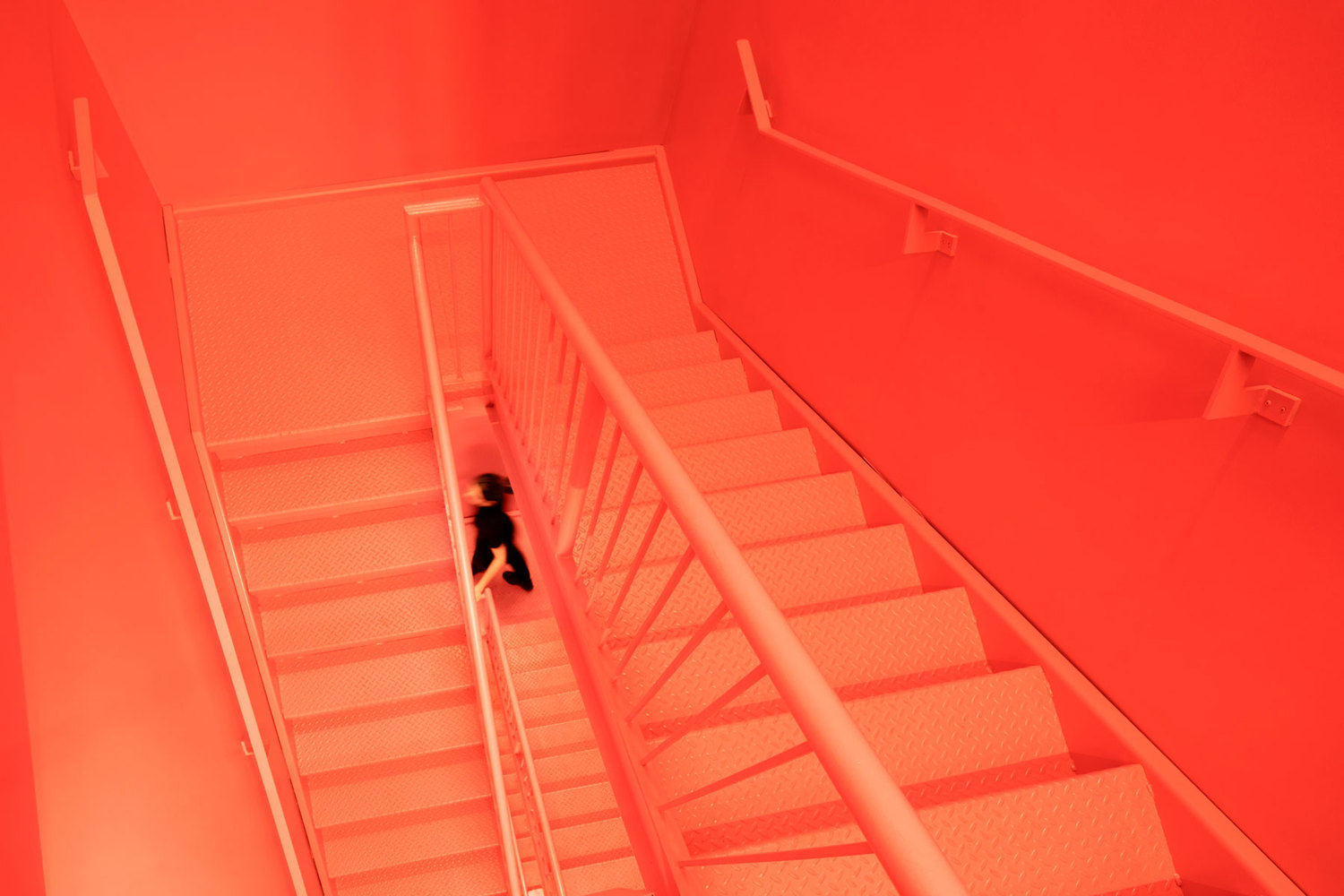
Red can connote passion, excitement, or warmth depending on its precise hue, but it can also be associated with fear or danger. The way the color is used and how the space is laid out can determine how exactly it is perceived. Darker, maroon hues may read as sultry and enticing, while bright, neon reds are friendly and eye-catching. All-encompassing red, if done poorly, may feel overbearing, but if done effectively can create a unique ambient experience. Touches of red in otherwise more neutrally colored spaces can also be a highly effective method of drawing people’s attention to specific objects or elements.


Orange
Though unusual, architectural uses of the color orange can create soothing, luminous, friendly spaces. Less ostentatious than red, orange spaces are calmer but still bright and jovial. Because it is less aggressive, it is also less risky for use in abundance.


Yellow
Yellow is consistently radiant and cheerful, and can be used both all over a space and to highlight specific elements in a way that does not overwhelm as much as red. Due to its friendly and quirky associations, it is used commonly in children’s spaces such as daycares and kindergartens, and due to its radiance is conducive to making any grey or somber space seem instantly livelier. Paler or more orange hues of yellow may appear calmer.


Green
Another unusual color for architecture, green – particularly emerald green or pastel green – is highly soothing and relaxing. Even neon green, however bright, generally appears calmer than other neon colors. However, yellow-green, if used poorly, may feel strangely clinical, particularly in juxtaposition with white. Externally, green walls and green roofs both suggest sustainability and connote friendly warmth.


Blue
Blue is cool, soothing, dignified, and secure. On ceilings, it connotes the celestial, while individual blue elements such as columns or furniture are among the most common uses of a primary color in architecture. Blue light installations are also among the most effective in outdoor spaces.


Purple
Purple, like blue, can be soft and relaxing, but to an even greater extent – particularly pastel purple in diffused light settings. Neon purple, particularly neon purple lights, are fun, bright, and exciting, and can make a lasting impression due to their uniqueness.


White
White walls are among the most common features of modern architecture for their connotations of purity and cleanliness. On exterior walls, they are conducive to dramatic shadows and flat, pristine facades, while interior white walls can make users feel calm but alert. White ceilings and walls also help diffuse light, making interior spaces seem brighter.


Black
Black buildings tend to appear cool and contemplative, though they may be perceived as ominous in certain situations as well. Thoughtful lighting within black interiors and on black exteriors can make rooms and facades feel less dark and oppressive. While black wooden architecture may appear rustic and introverted, black metal detailing often feels sleek and modern.


Evidently, color has enormous emotive power in both architectural interiors and exteriors. However, when designing with color, even something as simple or common as black and white, due consideration to lighting, material, and design is imperative as well. With each color often connoting a whole host of different emotions from the happiest to the most ominous, only cohesive and holistic design can ensure that color use generates the intended effect.


Editor’s Note: This article was originally published on December 19, 2019.


