Haiku Architecture: Poetic Simplicity Offers an Emotive Alternative to Minimalist Design
Last call: The clock is ticking as Architizer’s 12th Annual A+Awards enters its Extended Entry Deadline period. Submit your work before February 23rd for your chance at the global spotlight. Â
.けぶりして露ふりて無我な在所哉
keburi shite tsuyu furite muga-na zaisho kana
dew turns to steam
trickling down selflessly…
farmhouse
Kobayashi Issa – 1811
Simplicity and suggestion are the foundation of a successful Haiku, a form of traditional Japanese poetry that strips away all but the essential words and uses them to beautifully convey a single moment in time. In the familiar 5-7-5 pattern of seventeen syllables that make up a Haiku, kigo (seasonal words) and kireji (cutting words) anchor the poem in a specific season, allowing the reader to engage their imagination to recreate a scenario the writer is retelling. Haiku often celebrates the beauty and impermanence of the natural world and invites readers to find profound meaning in nature and everyday experiences.
In architecture, this same principle has been adopted by a number of architects, finding a shared ethos with haiku in pursuit of simplicity, emotional resonance and the power of suggestion. Architects who embrace this ‘haiku approach’ often favor natural materials to celebrate the living world and play with light and shadow to connect occupants with the natural rhythms of the day while creating fluid spatial transitions that suggest rather than dictate how spaces should be used or lived in. It is a minimalist style that is deeply emotive.
The goal of haiku principles in architecture is to build unique relationships between a building and its users that encourage a connection to the environment and each other. Just as haiku strips away all but the essential words to convey a moment, architectural haiku seeks to distill design to its most fundamental aspects — form, light, material and space — creating places that invite visitors to fill the space with their interpretations and emotions.
Casa Sexta
By All Arquitectura, CDMX, Mexico
Popular Choice Winner, 11th Annual A+Awards, Residential Interiors (>3000 sq ft)
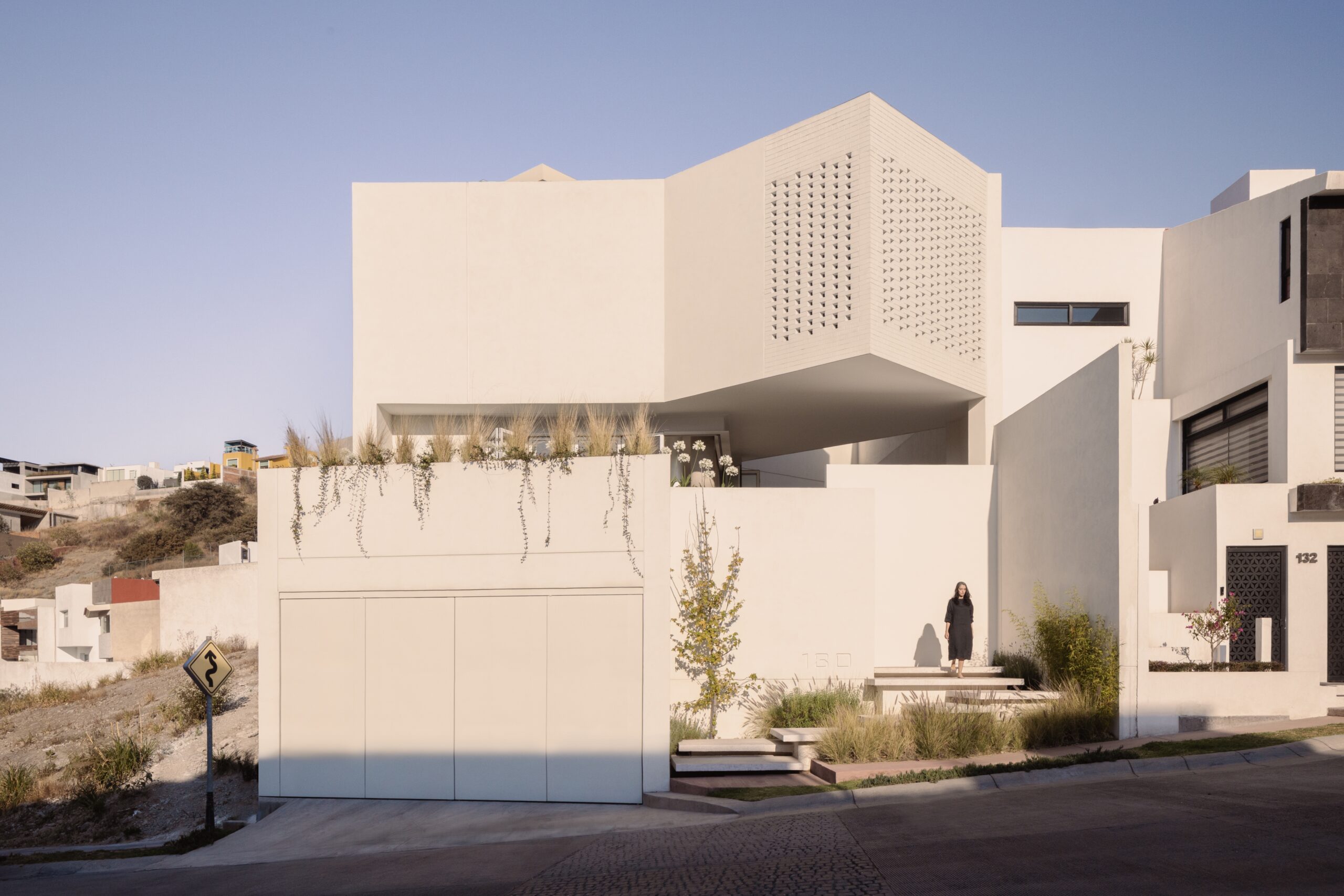
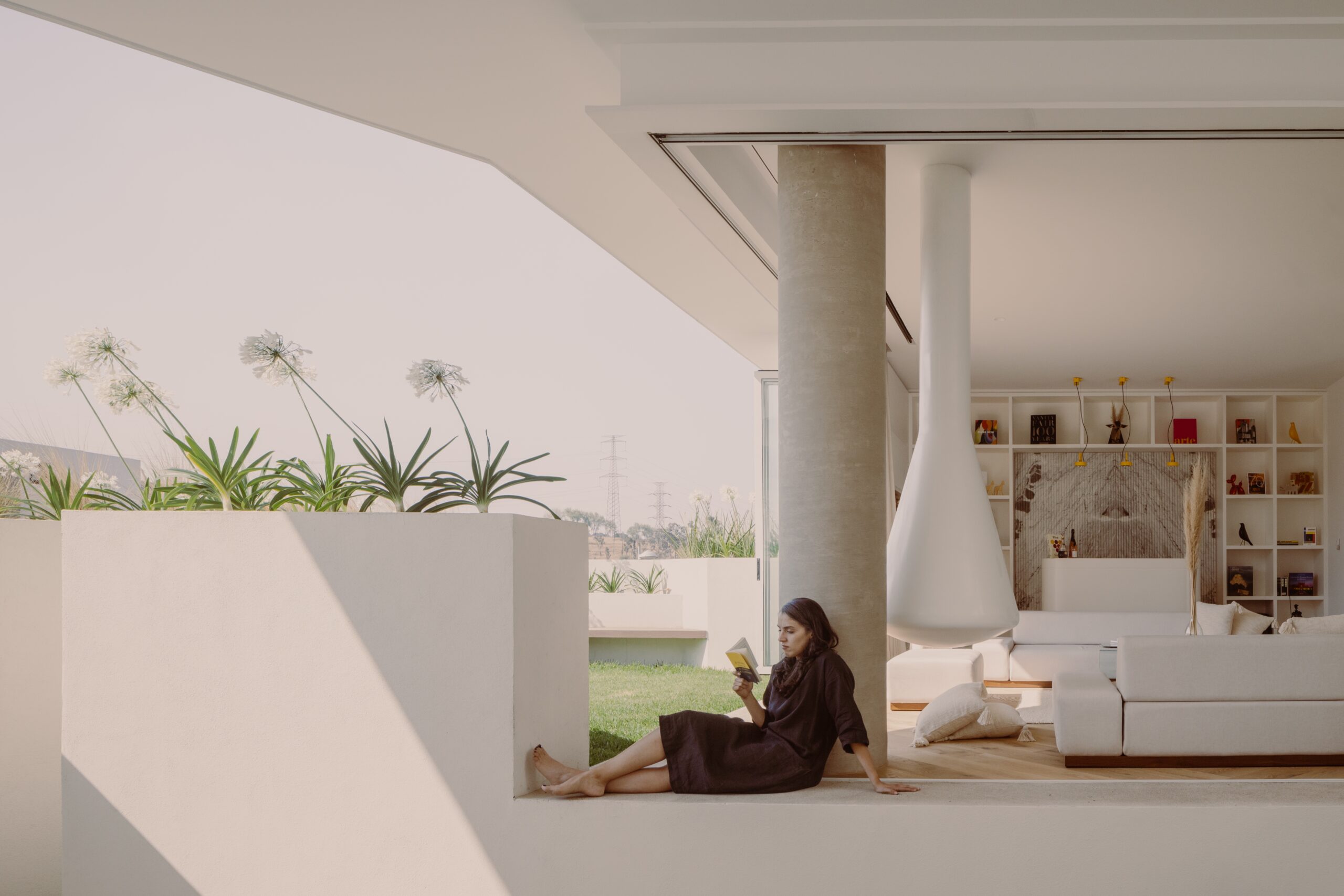
Casa Sexta by All Arquitectura, CDMX, Mexico. Photographs by Zaickz Moz.
The white stucco, green foliage, warm tones and light woodwork of Casa Sexta, designed by All Arquitectura, serve as the perfect pallet to celebrate nature’s beauty and impermanence. An idea that is so fundamental in Haiku. The design of Casa Sexta suggests rather than dictates how spaces are to be inhabited. By developing the program across three levels and orienting the walls at a 45º angle to capture sunlight through ten patios, the structure of Casa Sexta encourages a fluid movement between the various spaces.
Each room benefits from natural lighting and ventilation that promote a harmonious flow. Allowing the inhabitants of the home to define their own experiences while always being connected to the natural rhythms of the day. The presence of a black acacia tree at the heart of the project deepens this connection. The living centerpiece links the various spaces of the house while also physically documenting the passage of time.
Panorama Penthouse
By Bureau Fraai, Netherlands
Jury Winner, 11th Annual A+Awards, Residential Interiors (>3000 sq ft)
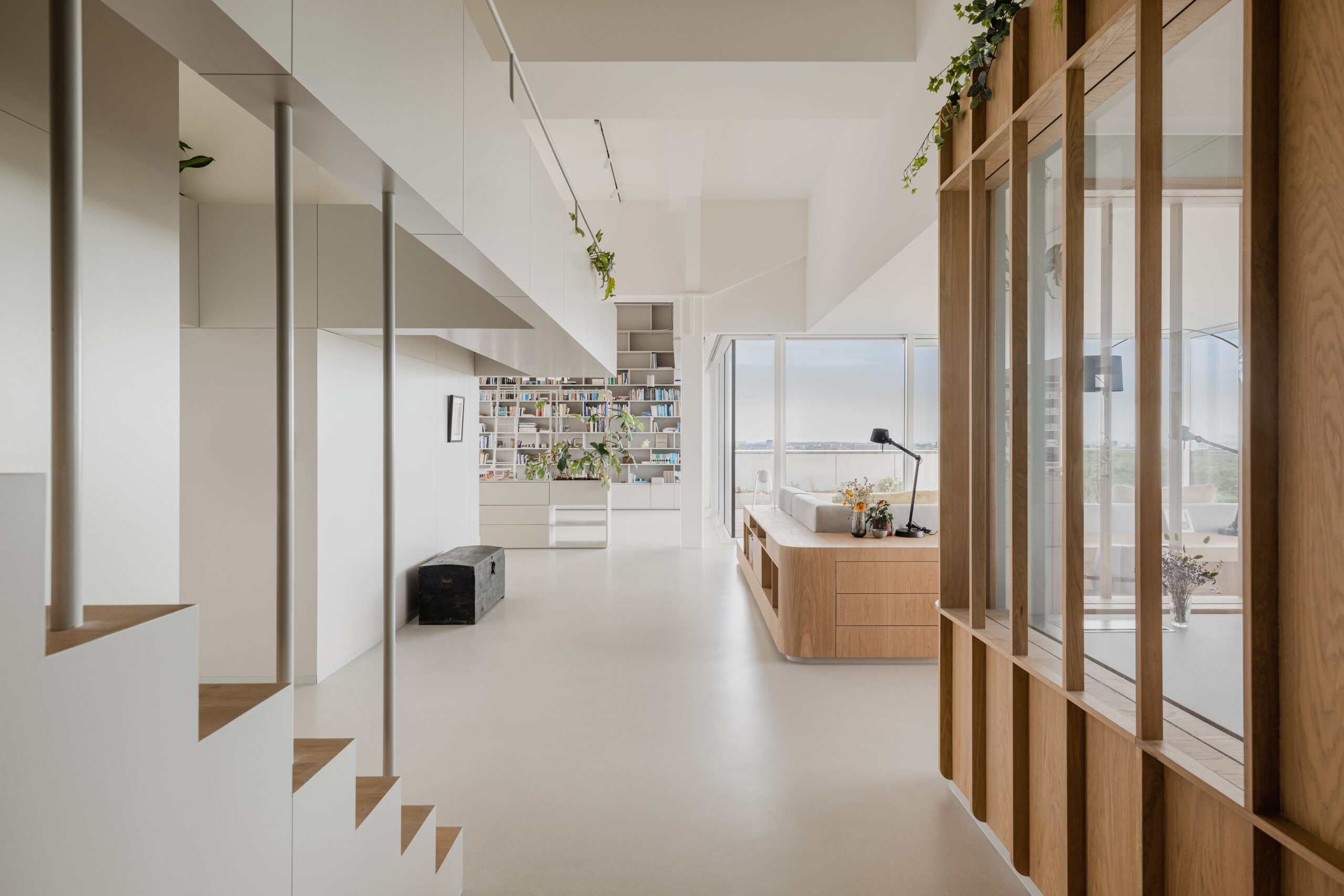
Panorama Penthouse by Bureau Fraai, Netherlands. Photographs by Flare Department.
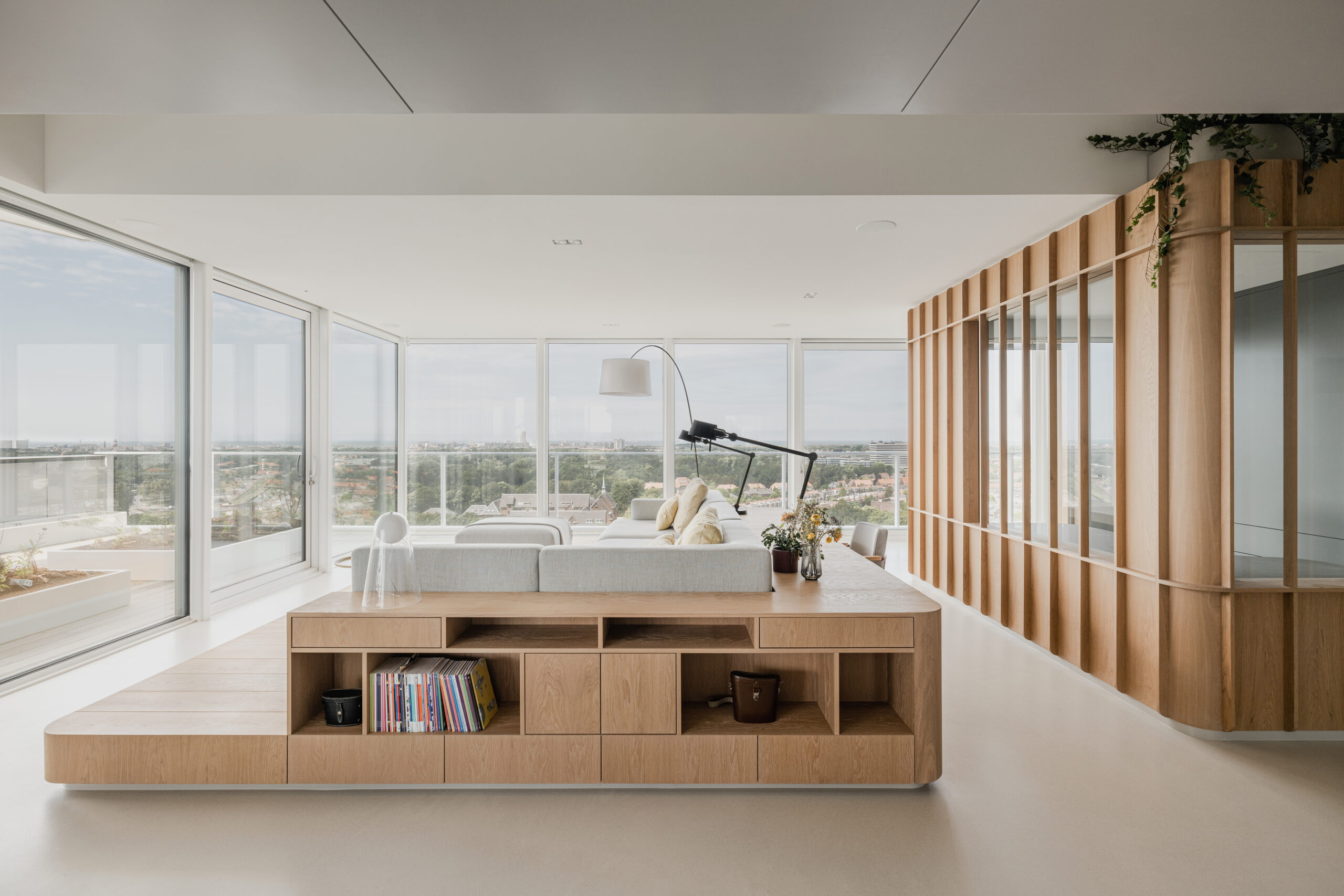
As suggested by its name, Panorama Penthouse was designed to amplify the relationship between the internal living space and the external skyline views. Opting for an open floor plan, the home provides unobstructed and simply breathtaking 180-degree panoramic views of the seaside and the city center. There are free-standing oak volumes that are built to house private areas such as the primary bathroom, office space and bedrooms in the evening. These structures add to the fluidity of the space while ensuring comfortable functionality.
The penthouse’s material palette was thoughtfully selected to reflect the visas beyond, echoing the haiku’s integration with nature. The light oak wood mirrors the dunes and beaches, while the muted grey cabinetry in the kitchen and dining room are intended to echo the distant city skyline. The design follows the capacity of a haiku to capture and convey the essence of a moment or scene – in this instance, the ever-changing colors of the skies, tides and urban landscape.
OG House
By Omar Gandhi Architects, Halifax, Canada
Jury Winner, 11th Annual A+Awards, Residential, Private House (M 2000 – 4000 sq ft)
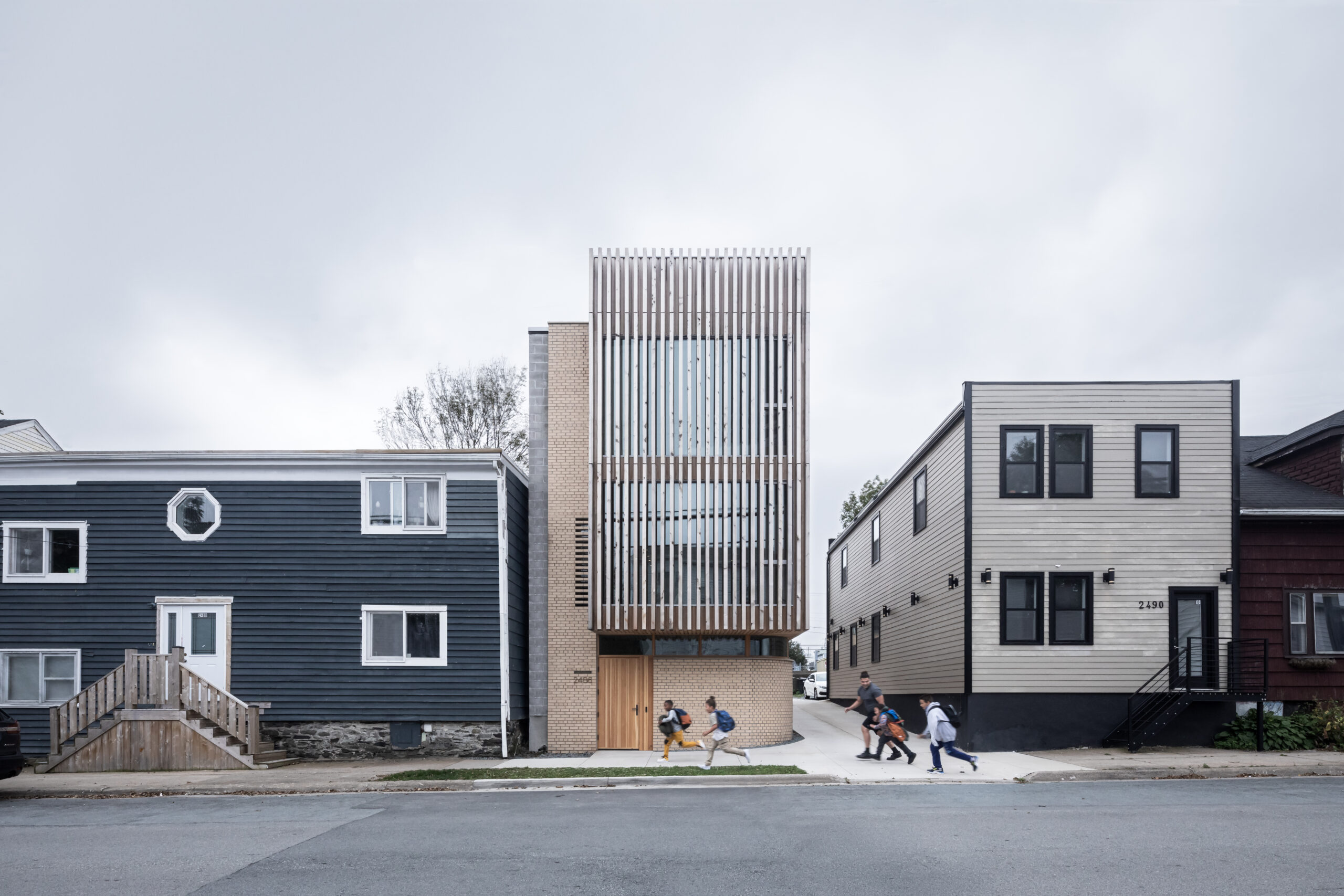
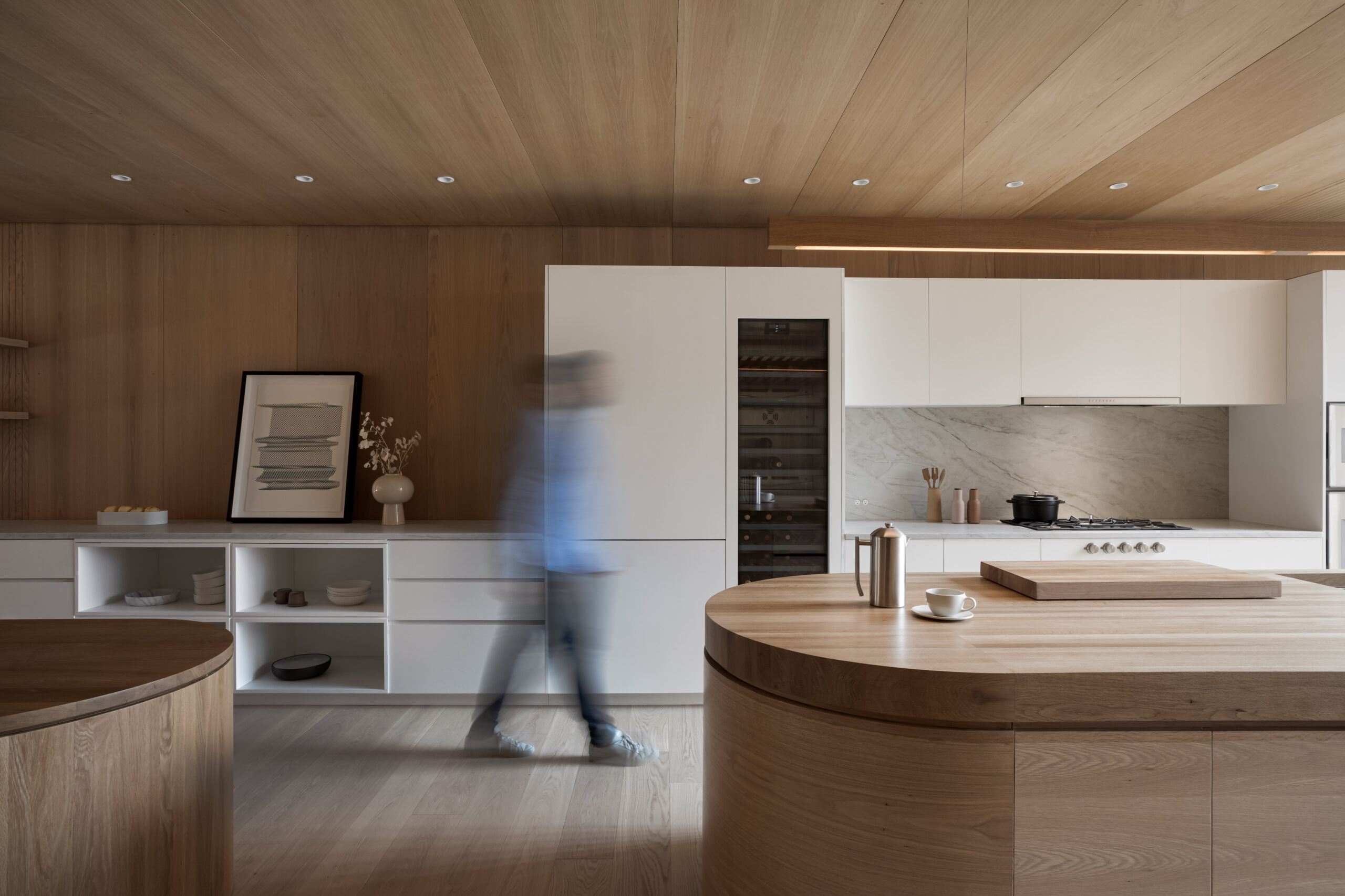
OG House by Omar Gandhi Architects, Halifax, Canada, Photographs by Ema Peter Photography.
On a site with deep community ties, OG House and architect Omar Gandhi reflect the principle of haiku in the building by grounding in a specific moment and setting. The transformation of the ground floor of the standout structure into a community studio dedicated to local projects and for local residents takes into consideration the site’s history as well as its present needs, creating a space that is deeply embedded in its community.
The choice of local materials, such as eastern white cedar, buff-colored brick, and white oak paneling, speaks to the project’s commitment to material honesty and the celebration of natural textures — a core of haiku poetry. The weathered cedar façade that blends with the neighborhood’s textures acknowledges the city’s architectural heritage and exemplifies a design that is both of and for its environment.
Within the space, the repeated use of gentle, rounded corners and the incorporation of organic shapes in the stairwells and handrails demonstrate an attention to form that is evocative of haiku elegance and subtlety. These design elements gently guide movement and focus within the house, inviting exploration and reflection.
Empire Loft
By Raad Studio, New York City, New York
Popular Choice Winner, 11th Annual A+Awards, Residential Interiors (>3000 sq ft)
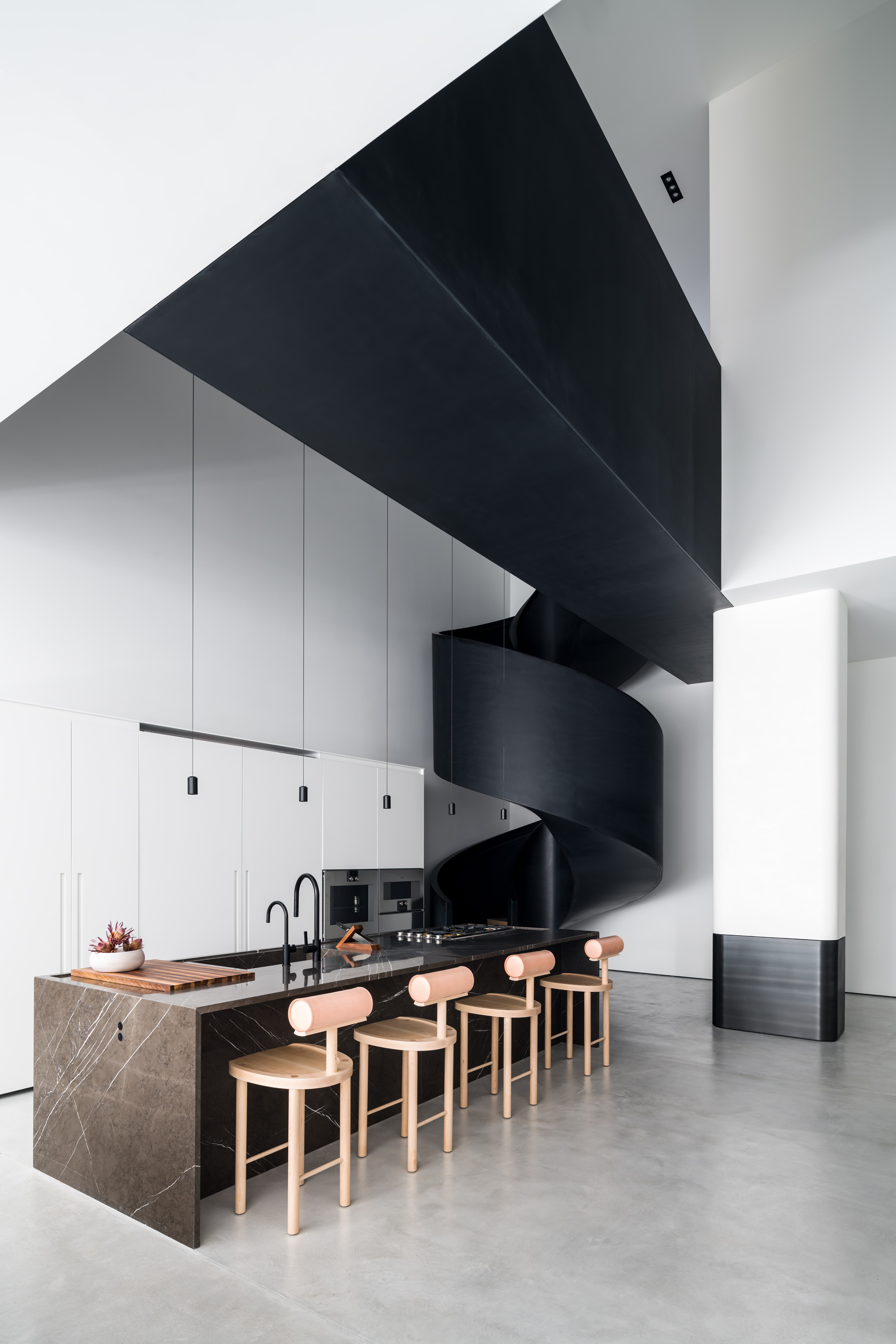
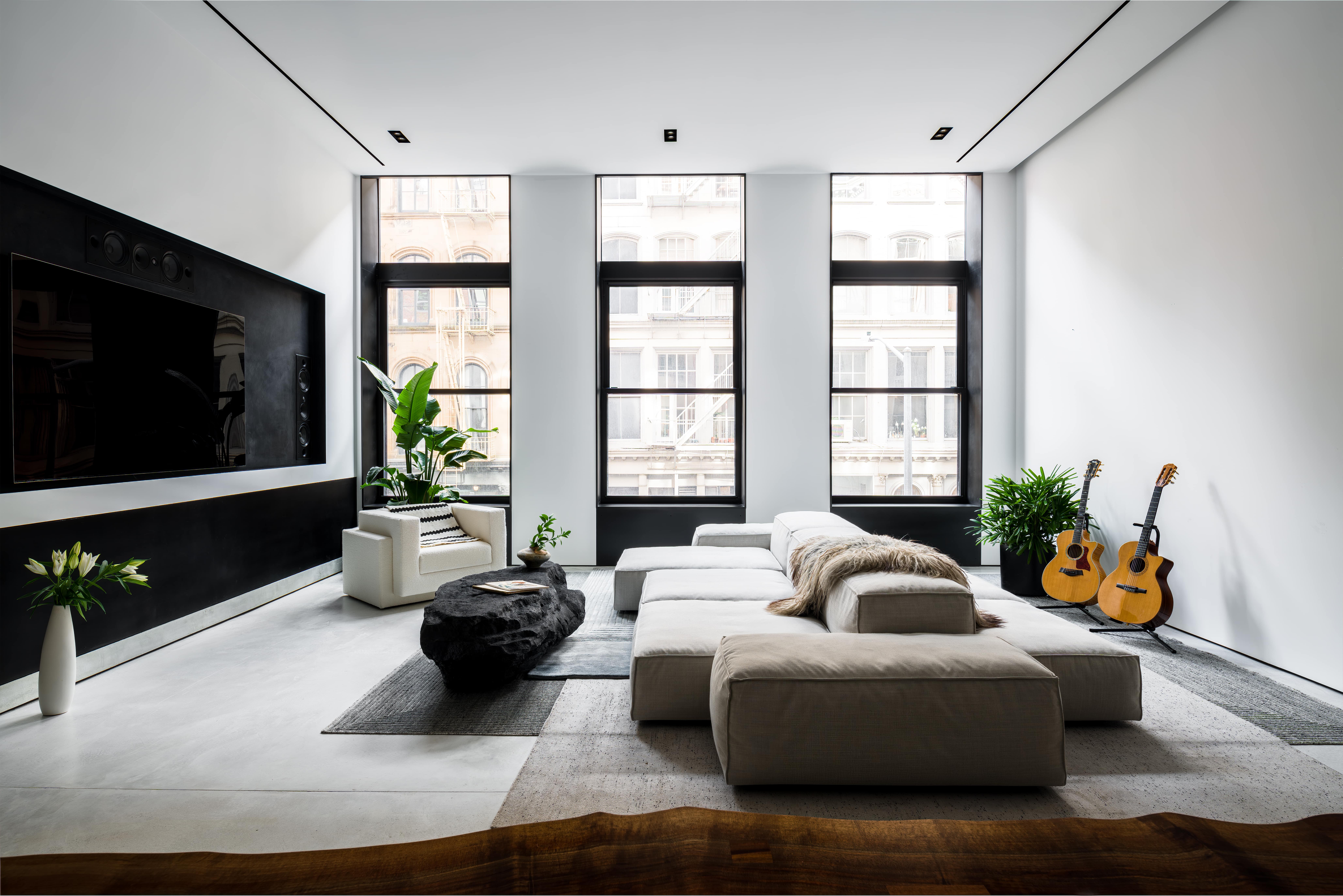
Empire Loft by Raad Studio, New York, NY, United States. Photography by Alan Tansey.
Through a series of deliberate spatial manipulations and material choices, Empire Loft is full of moments of elegance and unexpectedness. The dramatic cutaway of the second floor to introduce a suspended bridge is a bold spatial move that disrupts the traditional apartment layout, making the sinuous dark stone spiral staircase and the bridge focal points of movement and interaction, embodying the principle of simplicity in form yet complexity in experience that is fundamental in the creation of a haiku.
Mirrored elements throughout the apartment create illusions with the depth and boundary, inviting occupants and guests to reinterpret the apartment’s dimensions. Incorporating a recording studio wrapped in corrugated felt illustrates an understanding of sensory restraint—capturing haiku’s minimalist ethos. This thoughtful detail underlines the importance of not only visual comfort but also the management of all sensory experiences when striving for harmonious architecture.
Each design decision, from the layout to the material finishes, is part of a design strategy that aims to provide memorable moments of ordinary residential experience, elevating the every day through craftsmanship and creativity.
Last call: The clock is ticking as Architizer’s 12th Annual A+Awards enters its Extended Entry Deadline period. Submit your work before February 23rd for your chance at the global spotlight. Â
