Haight Clothes Retailer / AIA Estúdio + Raphael Tepedino
Haight Clothing Store / AIA Estúdio + Raphael Tepedino


Text description provided by the architects. The design for the Haight store at Shopping Leblon had the premise to create a welcoming environment and a consumption experience that brings something improbable in its essence. The mall’s ambiance, defined by its artificial elements and cold materiality is the opposite language of Haight’s conceptual basis – which is linked to natural landscapes.

Consequently, being inside a mall for the first time posed a significant challenge for the project. Accordingly, the design adopted a contrasting strategy between the store and mall – which, despite the rigid and controlled environment, offers opportunities such as the possibility of not having a door. Therefore, the project focused on an organic, procedural and layered language to represent Haight´s universe.


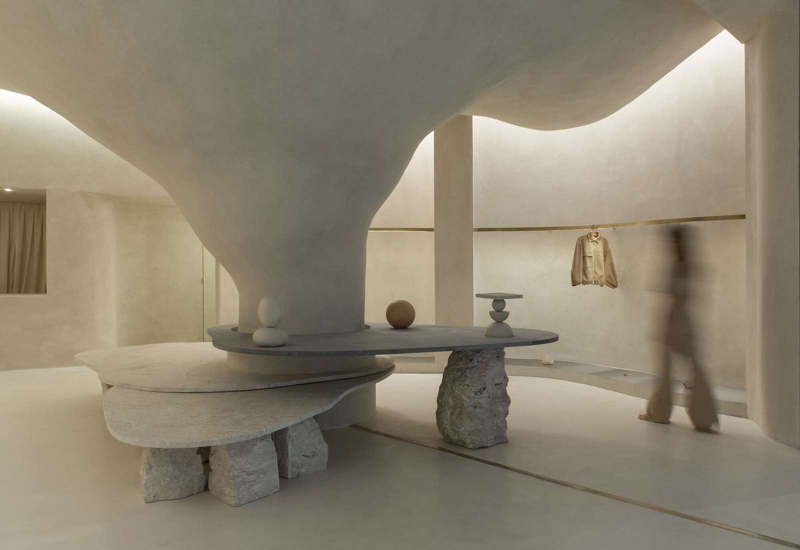
A large opening defines the entrance to the store, leaving access completely free, which on the one hand, emphasizes the proposed contrast and, on the other, establishes a kind of fusion between the interior and exterior. A pillar located in the center of the store – which could be interpreted as an obstacle – became the main spatiality generator. It is from the occupation around the pillar that the space fluidity is achieved. This disposition is enhanced by curved lines that define the path inside the store.


The volume created from the fusion between pillar and ceiling became an element in an organic way that refers to natural caves and gives unity to the whole. Around it, three stone plates of different heights act as an exhibition space and place to sit. Bahia beige marble and soapstone were the materials chosen to compose the center of the store. For structuring these plates, it was used rough Bahia beige. The way they are arranged – although independent with varying heights and materials – forms the unit that organizes circulation.

The “terracor” material, which covers all the walls and ceiling, gives unity to the ambiance through its rough texture that refers to natural surfaces. The infinite and diverse processes of erosion that form cliffs, caves, stalactites, sands, stones and the movements of water with its tracks and shapes led to our creative process being part of the concept developed for the store’s spatiality. This conceptualization was also explored from lighting, using indirect light as a fundamental element to create this atmosphere.

The exhibition interspace was thought of as a “cut” in the “walls,” an operation emphasized by the transition of materiality. This cut reveals a stainless steel plate in the base of the niche. Inside, there are exhibition racks in brushed brass, which, with their more solar aspect, contribute to subtly warming up the store’s ambiance, together with the soapstone and its grayer tone.


