Gehry Partners designs a new campus for Children’s Institute in Watts
In Frank Gehry’s oeuvre there are the big, career-defining projects—like Walt Disney Hall and the Louis Vuitton Foundation—and there are the minor works: buildings that have smaller footprints and more humble design ambitions but are fortified with good intensions. Gehry Partners has been dabbling in this latter category of late, first with the Beckmen YOLA Center, a community center and youth music conservatory built for the LA Phil’s youth orchestra housed in a retrofitted bank building in Inglewood, and recently, a new 20,000-square-foot campus for Children’s Institute in Watts.
The firm provided architectural services pro bono to the 100-year-old support organization, which addresses poverty and health inequity. It’s an imprimatur that is as much philanthropic as it is architectural—perhaps even more so, as Gehry’s name conveys instant recognition to board members and donors. “The Children’s Institute is about helping families who are victims of trauma and violence,” said Sam Gehry, associate at Gehry Partners and Frank’s son. “[Its mission] is something that we are passionate about.”
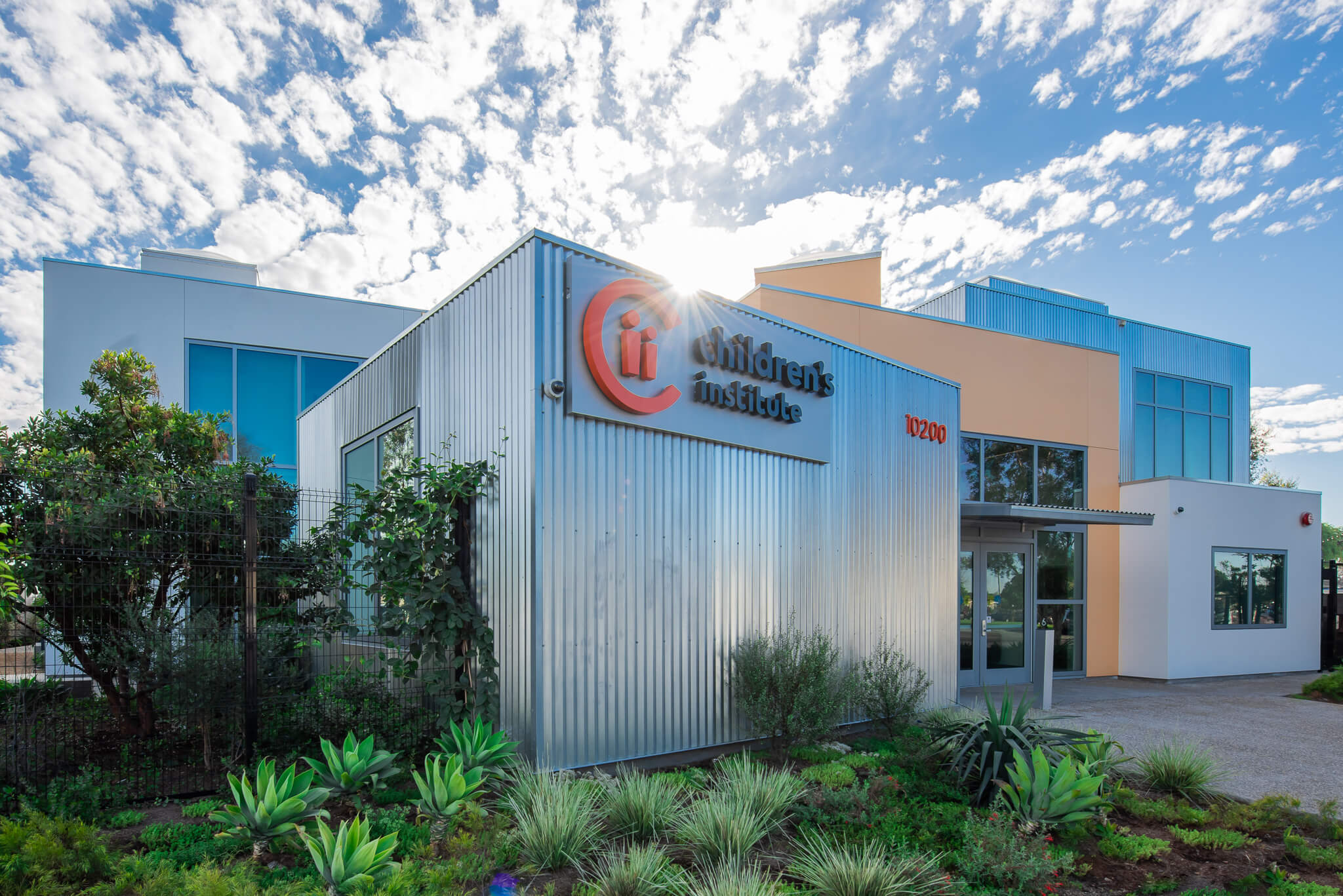
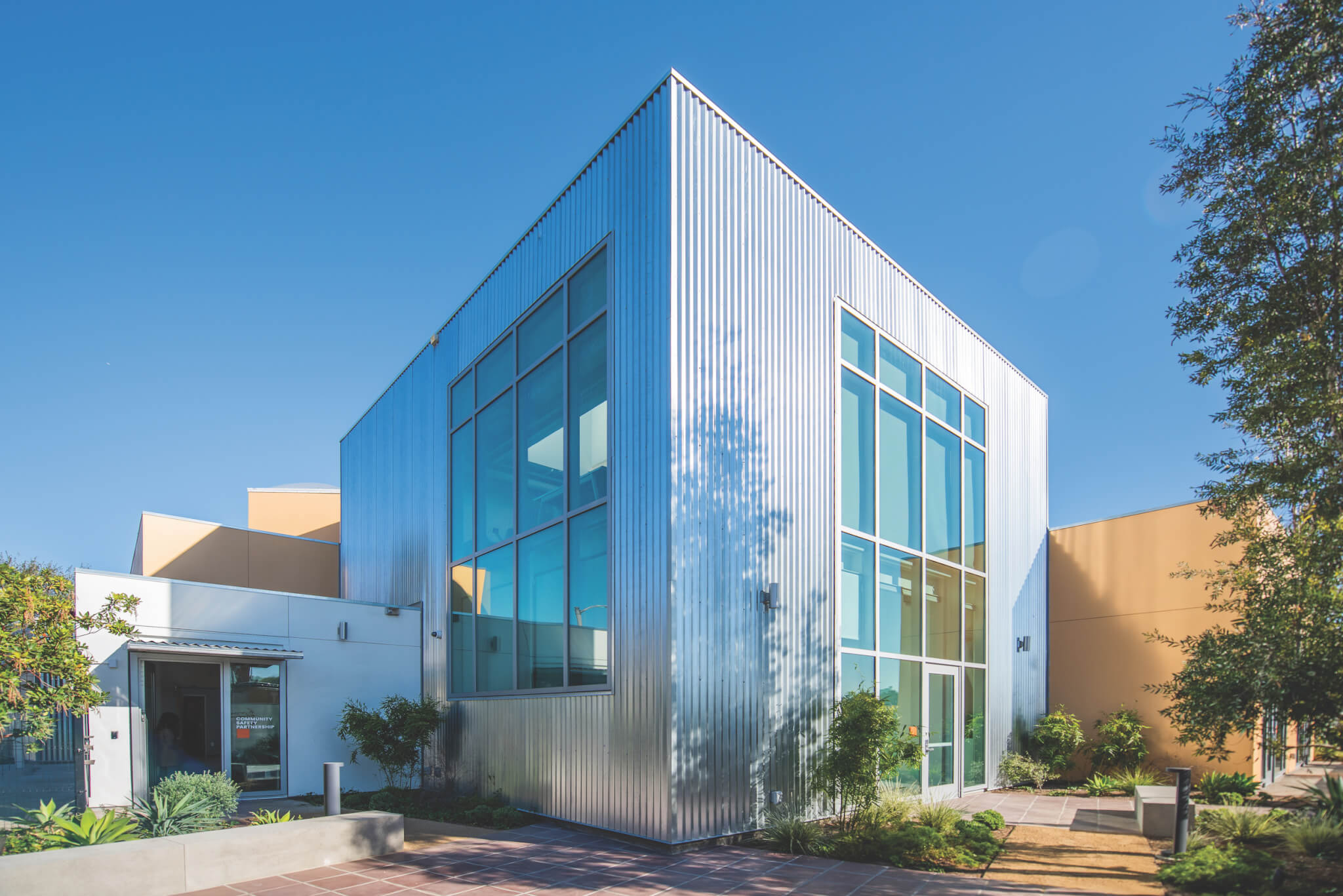
From a design perspective, however, this altruistic turn is less about novelty and computational flexing (the flashy formal stuff Gehry’s known for) and more reliant on revisiting familiar moves and materials. With Children’s Institute, the approach translates to a cluster of tan and white stucco boxes, some clad in corrugated aluminum—think FOG circa late 1980s–meets–suburban bank branch.
The nearly $26 million building is not the firm’s finest composition, but it does negotiate the constraints and histories of the surrounding context. Located in the heart of Watts on land donated by Los Angeles County, the project is less than a mile from the Watts Towers and directly across the street from Ted Watkins Memorial Park, a 28-acre green space that is the hub for many neighborhood services. To the north is Franklin Square, a group of 38 ranch homes that were relocated to Watts in the 1970s as part of a housing program to promote homeownership in the Black community. To the south is a construction zone soon to be home to a hulking Kaiser Permanente medical center by Perkins&Will.
Gehry’s design (as executed by architect of record Chait & Company) takes clues from its residential neighbors and places single-story boxes around the perimeter to break up the scale of the overall building. A garden by Elysian Landscapes softens the edges. Vines and hedges on the north side camouflage a security fence and cinder-block wall that protects the property. The overall scale and nonuniform facade were dictated by a 2018 zoning change, the Southeast L.A. Community Plan Implementation Overlay District, which was adopted to protect the character of the existing urban fabric. The campus for this Children’s Institute location tries hard to fit in and be hospitable, while also broadcasting security and architectural credibility.
This tension carries over to the interior, where the design bridges providing community gathering spaces and rooms for individual and group therapy. “All of our spaces are designed to be places with a feeling of calm, sanctuary, and kind of neutrality,” noted Martine Singer, president and CEO of Children’s Institute. “Even though we do a lot of mental health services, it’s more meeting, coaching, counseling, convening, without all those therapy labels. So the biggest message was ‘It must be a place where people feel safe.’”
While clunky on the outside, inside, the project seems poised for success—seems, because as of late June only a few programs had taken place on-site owing to COVID protocols. A set of doors leads visitors from the street to a small lobby, where a reception desk regulates entry into the central Otis Booth Foundation atrium, which is crowned by clerestory windows. According to Sam Gehry, the overall scheme is warehouse-like—a simple structural steel grid and a polished concrete floor. It is more complex on the ground level, where the plan follows a known Gehry strategy: loosely grouping different programs, like community meeting and individual therapy rooms, to form a small village around a double-height town square.
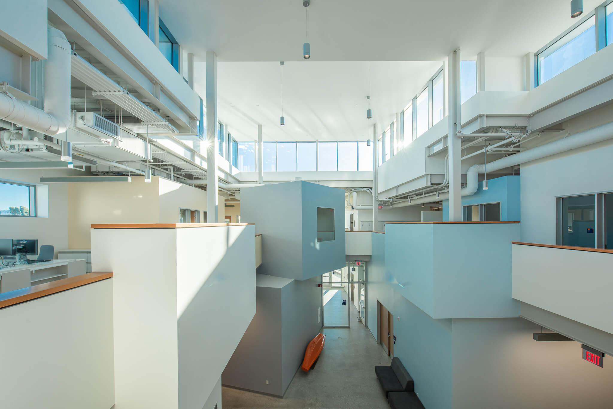
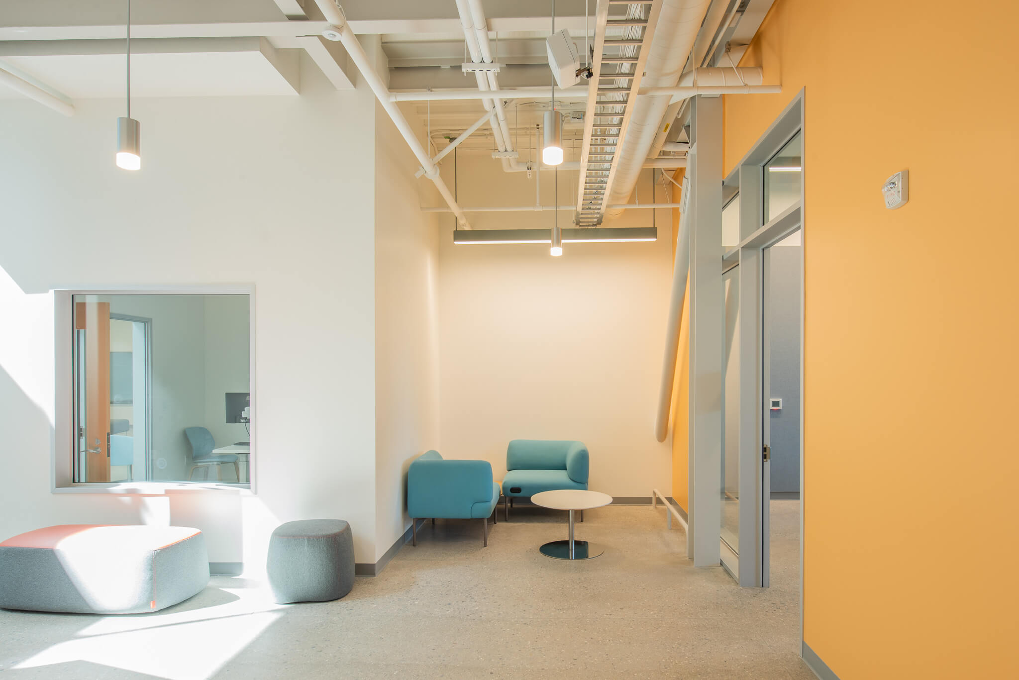
It is a happy surprise to find that the jumble of geometries so banally presented on the exterior find their calling inside. Intimate corridors lead to the more private areas, and the spaces in between boxes allow for ample natural light to reach each room. Generous windows look onto green landscaping. “We didn’t want to stigmatize therapeutic care or deny those spaces the natural light,” Sam Gehry said.
On the second floor, dedicated staff areas, hoteling desks, and seating areas ring the atrium, which is delineated by a low, wood-topped pony wall that traces an eccentric outline. One double stack of cubes pops up above the wall to form an enclosed meeting room with a large square window reminiscent of the “lifeguard tower” of Frank Gehry’s famous Norton House (1984) in Venice. The self-referential gesture works: The reference adds playful character to the potentially self-serious typology of a community services building. Still, whether it’s pro bono or not, one wonders what might result if Gehry Partners didn’t rely on the old playbook—certainly Watts deserves more experimentation.

While touring the building, Singer looked out one of the big windows overlooking the back garden and parking lot and recalled that the original design was 50,000 square feet, more than double the current size. It was slated to fill the two-acre campus but was scaled back because of budget limitations and shifting program needs. Conscious of how architectural intents can overwhelm delicate community relationships, she said, “It was gorgeous, but it was going to be too big, too expensive, too imposing, and too like a monument to us.”
