FRISTO, Frozen Market / EFEEME arquitectos
FRISTO, Frozen Market / EFEEME arquitectos


Text description provided by the architects. Among the transformations that have been taking place in the way of consuming food products in recent times, that of the frozen food market as an exclusive modality was something unprecedented in the city of Villa María. FRISTO was born as a brand with its own identity from this market opportunity, and established as a main goal to find a strategic place within the urban fabric to locate its commercial window.


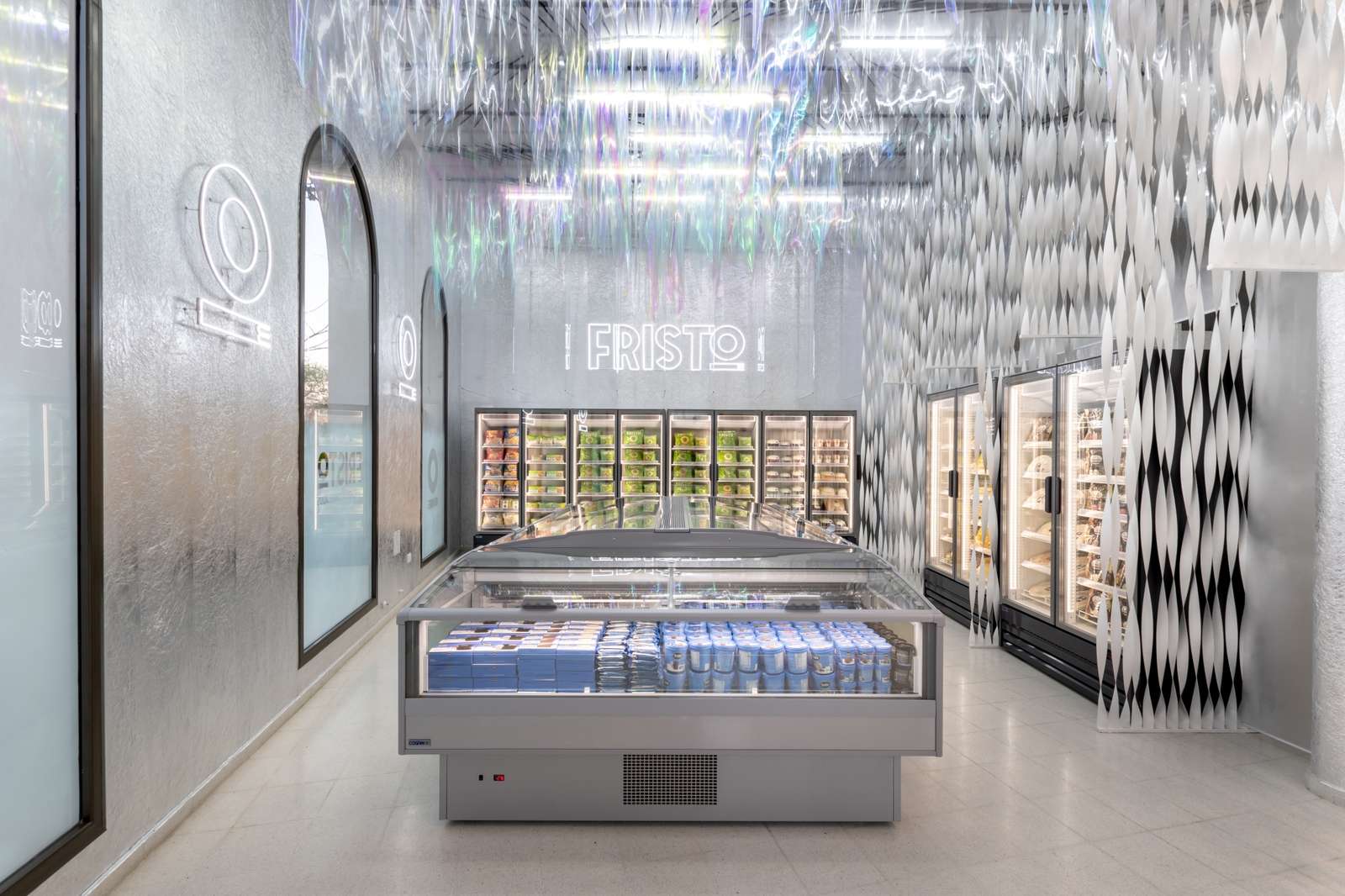
The design of this project raises this innovative item as a generator of the concept that guides its development with the use of materials, shapes and textures that evoke the cold, the icy, the frozen, and emphasize the exclusivity of these characteristics in each product offered.


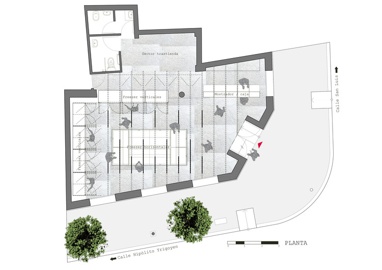
The needs program had pre-established elements that make up the essential infrastructure for the conservation and display of products. But although these modules could seem, at first, a spatial limitation, they became the opportunity to enhance the interior surfaces of the envelope as spaces to develop the proposal.

.jpg?1611782637)

The ceiling is used to display a series of pointed transparent pieces that, geometrically organized, run horizontally along lines creating an illusion of movement that imitates the freezing of water turning into ice crystals. This effect is materialized thanks to glass rubber panels, hung from metal rods attached to the ceiling, which progressively rotate and move along the axis of each of the strips delimited by the modulation of space, which is projected from the floor to the ceiling. through vertical lines composed of spiral metal tapes.

The superposition of transparent and iridescent elements generates an interesting visual game of brightness and tones that varies according to the impact of light. The logo and isotype of the brand, made with neon silhouettes, are reflected in the transparent panels of the ceiling, the glass of the windows and the counter, making Fristo’s identity present in different places that change according to the perspective.

From the entrance of the premises, the suggested route for the user can be fully visualized, which begins in the exhibition and self-service sector around an island of horizontal freezers surrounded by vertical freezers where the products are classified: red meat, fish, seafood, vegetables, fruits, bakeries, ice cream. Then, in the packaging and box sector, the seller completes the purchase operation and delivers the order.

The counter is a select piece of visual purity: a glass prism that seems to detach itself from the floor. There are exhibited some complementary products to purchases, whose silhouettes are blurred as the glass becomes translucent. This same effect is applied to the windows, which invite you to enter the room to fully see the interior, only leaving transparencies in the upper parts.


